
The brief: Create two books explaining and exploring the typographic and layout principles you have researched in this section.
Book 1: My Little Book of…Good Typography
Using the reference material that you’ve gathered throughout the exercises and research tasks in Part Three, design a book which explores traditional ‘good practice’ in typography. What is readability and, as a designer, how can you aid it? Visually explain the typographic principles that we’ve touched on in Part Three, such as type size, leading and line length. For example, you could demonstrate kerning by creating a page which looks at letter combinations applying this principle. Equally, explore good layouts and use of grids to help support and frame your typography. This is an opportunity to develop carefully considered
design layouts that feel easy and engaging to read and look at. Be creative in how you do this, developing a range of options and possibilities. Show off your good typography skills as well as talking about what makes good typography in your text. To support this, find quotes and type rules by other typographers and designers – perhaps revisit your research into book designers from part two. Find examples of good typography within book design you can present and talk about. Your booklet should be a celebration of good typography, whatever you think that is.
Book 2: My Little Book of…Bad Typography
The rules surrounding what constitutes ‘good’ typography are entrenched in tradition and convention, as you demonstrated in Book 1. Having looked at ‘the rules’ surrounding readability and legibility now is your opportunity to break them! Be inventive and experimental in how you explore what might constitute ‘bad’ typography. For example, negative leading, too-long line length and ‘inappropriate’ application of typographic principles may produce visually jarring and uncomfortable results. What does ‘bad typography’ mean to you and how might it manifest itself? Express your ideas in a visually imaginative way within your second book. This is an opportunity to be playful and push your design layouts, typography and ideas to the limits – celebrate bad typography through
your designs and content. Again, find quotations you can work with or examples of bad typography to draw on.
Your books should each take the form of a simple eight-page booklet – folded, stapled or stitched. Design the cover and contents for each. When creating your content for both books, be aware of your audience, and how you might want them to engage with your content.
While both these books are about typography, make sure you also include images within the text. These could be your own illustrations, photographs, or stand-alone typography pieces that accompany your text.
Use a flatplan to organise your content and indicate where important text and images occur, on a recto (right-hand) or verso (left-hand) page, or as a double-page spread. Suggest images by a crossed box, as in the example for ‘front cover’ in the diagram on the previous page. These crossed rectangles indicate image boxes in desktop publishing (DTP) software and are used in drafts and sketches to signify image material. There is no need to go into detailed drawing regarding text or image material at this stage. Text can be indicated by a series of thick horizontal lines, with main headings sketched in. Use the flatplan to familiarise yourself with the structure of a booklet. Note the blank pages and how they are organised to complement the preceding or following page. Note the extent (number of pages) in the book and whether it has been printed in signatures or sections.
As with previous assignments, see this as an opportunity to undertake a creative project that is more circular in nature than linear. Visualise initial ideas, assess them and return to your starting point to develop new starting points. Be experimental with your typography and take creative risks along the way. Focus on how you can visually document your creative journey as well as your reflections on what you are producing.
Your notes should cover why you decided to portray what you did, what you included and what you omitted. Reflect on how do you feel about the two completed books. For example, are there comparisons you can make between them, have any interesting design issues emerged through the process of making them?
What?

Primary Research
Typography Rules
I wanted to create a book that would be like a go to book for a little inspiration and advice. Something that could be carried around in your pocket and used for quick reference. So, using the layout of an 8 page booklet this would give me a front cover, a back cover and 3 spreads in between. This would mean that I could use 3 typographic rules for the interior of the book which could be elaborated upon within each spread. So I came up with a list of rules to adhere to when designing anything typographical.
- Contrast is King
- Skip a weight
- Double your point size
- Too many typefaces
- Kerning; leading; tracking
- Using the grid
- Breaking the grid
- Widows and orphans
- Alignment
I was not sure that I would use all of these rules as they may not all fit or work in my design.
Quotes
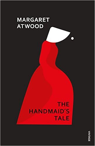
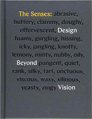
Which quotes to use? There are so many out there but which are appropriate to this particular assignment. I decided that I would stick to the classics of Müller-Brockmann and Vignelli as these were the ‘fathers’ of modern typography and layout. However, I would have to find the right ones.
Secondary Research
Dimensions
As I have mentioned above, I wanted these books to be pocket reference books that could be easily carried around and referred to quickly.
Looking back at the research into book sizing in the last assignment I thought that even B5 was too large to slip into a pocket easily.

So I decided that the books would use the width dimension of a B5 book and this would be replicated for the height giving a square book with the dimensions of 176mm x 176mm. Would this still be too big to fit in a pocket? I thought it was still a bit too big, so I reduced the size to 129mm square.
Papers
To give these books a more robust format I thought that they would need to be at least 250gsm thick stock and given some sort of coating to protect the books giving them a better longevity. Using the sample book from Solopress I thought that maybe a gloss or silk finish would help protect the books. I needed to have a look at some other booklets/leaflets to see other examples.
Initial ideas
So I scribbled down some initial ideas in my sketchbook and some of the type I thought I might use as well as font suggestions.


I think my initial thoughts were to keep it simple and let the illustrative elements draw the reader in and read the accompanying description. My idea was that there would be cover imagery and imagery on the verso pages of the books, type would be on the recto pages and the back cover.
I started thinking about the imagery and how I could use the ‘rules’ as images for the different pages. So I picked the first one ‘Contrast is King’ and did some rough sketches to see if anything jumped out. I was going to use the results of this to set the format for the rest of the book.

I liked the imagery of the crown combined with the type and decided to develop this idea digitally. Overprint had come up in my sketching and this was also a possibility as a lot of info needed to be presented in a small area in an eye-catching bold way.
I initially started with looking for a colour scheme for my first book. I used coolers.co to find a suitable palette by exploring their ‘trending palettes’. As the key word in this section was contrast I wanted a colour scheme with plenty of it. I settled on an orange/blue based palette that I tweaked slightly that I could pick my colours from. I also added black to the palette just-in-case.

I particularly liked the off-white colour that I thought would be good for the page colour and I wasn’t sure whether I’d use all of the other colours.
So I started in Illustrator with the first quote to try and create a style I liked which would then give me a starting point for the rest of the quotations and a style for my books. As these were typography books I needed to find some suitable typefaces to use and I had seen some Instagram posts using a bold sans-serif typeface which were very eye-catching. So I used Identifont to find out what the typeface was and found it to be Champion Gothic. As the quote suggests, I needed some contrast for this and used the site Typewolf to find a suitable pairing of a serif typeface which gave me Chronicle Text. However, these were both premium fonts which I wasn’t willing to pay for. Typewolf also gives you free Adobe alternatives to the premium fonts and the corresponding free font for Champion Gothic was Americane. For the serif typeface I used Stilson which was a good pairing and gave good contrast in it’s italic form. Adobe then went and discontinued Stilson and I had to search for something similar, which took a while! I eventually found Kepler which was the nearest match I could find to my original choice.
As well as the type I wanted to use some form of imagery/icon to represent each quote and decided for the first quote it would either be a crown or a chess piece. I decided to go with the crown as I felt this was a stronger image that was easier to interpret.
I set about designing the first page and used the off-white colour as the base and played around with the quote using different weights of type to give more contrast and reversed out the second half of the quote using an italicised version of the serif typeface. I used an icon of a crown which I layered over the text and changed the blend mode to give an overprint effect with the sans-serif type in the deep blue colour and the crown in the contrasting orange.

I was very happy with the resulting image and could use this style for the rest of my book. I was still unsure as to whether I would use more of the colour palette or just use the 3 colours I’d used in the first design.
The next 2 designs came together quite easily now that I had a template. For ‘Skip a weight’ I chose to use the icon of a weight, which I tried different shapes and the kettle-bell shape was the most visually interesting. I used only the serif typeface for this one as it was just about the differing weights of type and in this case I used the light version and the black version to give maximum contrast.

For the ‘double your point size’ image I used a single typeface in different sizes doubling each time again and used a large multiplication sign as the image.

So these were my images for my 3 spreads in the book but I still needed a cover image. I liked the contrasting type in the ‘Contrast in King’ and decided to use a similar style for the type on the cover with the word ‘Good’ in the bold sans-serif typeface overlaid with the rest of the title in the italic serif typeface apart from the word ‘Little’ which I ironically put in the bold sans-serif typeface.

I was very happy with the way these had turned out and felt that I had found a really good solution to the brief and the imagery for the next book would follow suit.
I was wrong!!!
Even with the prompts for some typography rules designing imagery for bad typography is harder than I thought. Deliberately trying to design bad typography goes against every fibre of my being!
I started with the prompt that I thought would be the most straight forward: Too many typefaces. Using the format of the first book for my designs I replaced the word ‘too’ with the number 2 and this was my dominant element. I used the same typefaces as before, to indicate its relationship with the first book, and then inserted a couple of letters in a different typeface to break up the cohesiveness of the design.

Initially I was going to give this book a brighter colour scheme of magenta and green, but following feedback from peers I dulled it down to give is a more uncomfortable and drab look.
For the cover of this book it had to be Comic Sans and Papyrus as the fonts as these are generally used as examples of bad type.
So I replicated the cover of the first book using these fonts which again indicated a relationship between the 2 books.

The next images proved a little more problematic. I couldn’t seem to get the look right for the prompts to do with spacing and using the grid. It then occurred to me that spacing was all about gaps, which them led me to the phrase ‘mind the gap’. I tried making it look like the London Underground signage but it didn’t work with the theme of the books. So then I just used the phrase and tightened the tracking and leading right up and used an outline version of the sans-serif type which was blended between the 2 colours used on the previous pages.

The grid page stumped me. I couldn’t get it to fit with the rest of the images.

I went back to the drawing board and played around with the grid and used it from a different perspective and overlaid the type in bold.

This was more like it and was more in keeping with the rest of the book.
Once I had the imagery sorted I moved into InDesign to produce the whole book layouts. I layed out the 8 pages and added the imagery to the covers and the verso pages.
I had jotted down some some ideas for the type elements in the above sketchbook pages. As before I started with the ‘Contrast is King’ spread and layed out the type using a 7 column grid with a wide margin as these books were meant to be held open. I also repeated the crown element from the image on the opposite page to add colour and interest.

This was the way to go for the rest of the spreads. I used the same formula for each of the type pages using an element from the image on the opposite page.


I now needed to sort out the back covers of each book. For these I wanted to use a classic quote and decided to go for Massimo Vignelli, the classic Italian graphic designer, who I admire greatly. I picked 2 of his most famous quotes that I felt represented good and bad typography. I placed these on the back covers and added a drop-cap and a large letter M representing the designer.


I also used the serif typeface for the quotes as it seemed more appropriate to do so and it was easier to read than the sans-serif version.


I then mocked up the books to show them as they should be.


I envisaged these books to be printed on 250gsm satin paper with the cover being thicker at 300gsm with a gloss finish to help protect the books as well as giving them more visual appeal.
Reflection
This assignment was really enjoyable and I think it shows in the end result. These designs were very well received by my peers and I got some very positive feedback from other students who had also completed this assignment. Personally I was surprised how tough it was to design something around ‘bad’ typography as everything I had learnt about type was telling me “no!”, however I think that they are interesting from a typography point of view.
I think that for this assignment I had a really strong idea from the start as to what I wanted to produce and I think I succeeded in visualizing my idea and designing an interesting piece of typography that could be useful as reference for designers new and old.


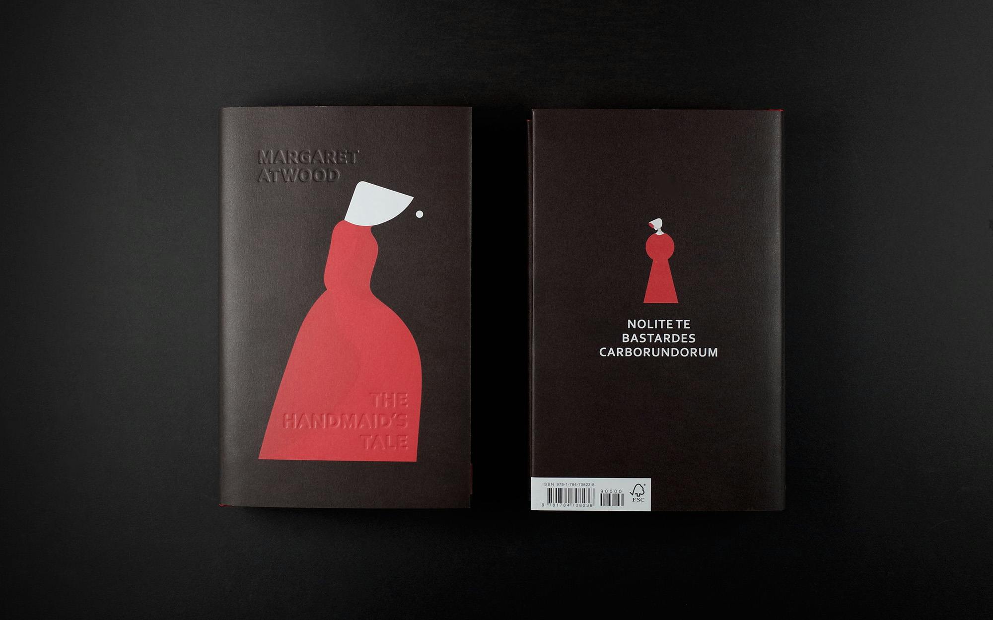
![handmaid-[Recovered]](https://craig519809.home.blog/wp-content/uploads/2020/04/handmaid-recovered.png)


