However you plan to work in the production of your book, spend some time now planning your workflow, using the notes above as a guide.
Think about how much flexibility you can allow yourself – don’t put yourself under too much pressure. At the same time, be aware of time constraints that may be outside your control. If you’re using a local printer, for example, make contact as soon as possible. Your printer may have a limited timeframe for doing your job and you’ll need to factor this into your workflow.
Scoping – 1-2 weeks
Contacting printers for costings and timescales is a major unknown for this assignment. Whether to use online or physical printers? Size and cost implications? Before or after Christmas?!
Research and content creation – 2 weeks
This will consist of online research as well as physical research, COVID restrictions allowing. There will be the need to select a subject matter, mind-map and create mood boards. This would then need to be streamlined into some semblance of order. Sourcing and creating imagery for my book and generating copy will need to be done and finalised.
Design – 2 weeks
This will involve deciding how the content will be displayed. This will be done by designing page layouts, covers and flat-plans and critiquing them to further hone the design. Other considerations will have to be decided on such as how the book is intended to be read(will it be a coffee-table read to thumb through or will it be held in hand for a long while?), what papers to use and what finishes it will have.
Pre-production – 2-3 days
Proofing and sure everything is correct. I’ll then prepare files for print, making sure that all images are 300dpi and CMYK and sufficient bleed is added. Make sure all files are backed-up and saved in the preferred format and quality that the printer prefers or recommends.
Printing – 1 week?
Liaising with the printer from the off is key to getting this stage right, whether that is online or in person. Can the printer do the binding on site or is that something else to consider? How will Christmas affect the timings? Can the printer provide the required finishes?
All this will need to be carefully considered as this is a complex process with some aspects that are out of my control which could cause problems with the timeline, Christmas being one and COVID the other. These could both impact on my ability to get my book printed. Physical printing may have to come later, perhaps just a digital copy submitted initially with printing to follow. However, the aspects of the process that are going to take up the most time are the research and design stages which will be needed to produce a good quality end result.
Image credit: BIS Publisher’s Wim Crouwel Alphabets written by Kees Broos with the forward by David Quay who also designed the book along with Rick Sellars.
Working with the outlined publishing models, identify the various roles you (and potentially others) will be undertaking for assignment five. For example, you’re likely to be writing your own content, designing your book, editing and reviewing it. You may also be involved in the production, printing and distribution process. Consider each aspect of the book assignment and briefly list what roles you think you’ll be doing, and what these roles entail. Also make notes of the roles of others who might be involved in your assignment and what their contribution is.
Roles
The traditional model for publishing is:
Writer – Publisher – Editor – Designer – Production – Printer – Distribution – Retail
However there are other models depending on the type of book to be produced; the scale at which it is produced; the cost; and who commissioned it etc.. Below are some more non-traditional publishing models:
Publisher – Writer – Editor – Designer – Production – Printer – Distribution – Retail
Editor – Publisher – Writer – Designer – Production – Printer – Distribution – Retail
Illustrator/Designer/Photographer – Writer –Publisher – Editor – Production – Printer – Distribution – Retail
Responsibilities
Assignment 5 would be most suited to a hybrid approach of the first and last examples where writer/illustrator/designer/photographer would be the starting point as it would be me creating most of the content for the book.
I again looked at Andrew Haslam’s Book design, where I knew there was a list of the different roles that could be involved in publishing a book. I wanted to see which were pertinent to what I was going to create for Assignment 5.
Author/Writer: This would be me and would consist of writing the brief for the chosen subject; researching and writing the content.
Agents: Not needed at this stage.
Publisher: As the book isn’t being sold, I won’t need a publisher.
Book Packager: This is mostly my role again as I will be the one creating the overall book except for production. Marketing would also be part of a book packager’s role.
Commissioning Editor: This role would not be needed as such, but I would be choosing which book to produce for the final design.
Editor: I would be responsible for editing the book with some input from my peers.
Proofreader: I would also be proofreader for the book, but may enlist someone else to double check my checking!
Consultant: This role is not needed. However, the book is supposed to be about something I know, so you could say I will be my own consultant.
Reader: This role would need to be someone impartial with a knowledge of the chosen subject. I suppose this would be my tutor of fellow designers.
Art Director: This role would be filled by myself with input from my peers.
Designer: As above.
Picture Researcher: This again would be myself and I would have to source suitable imagery for the book and check on any licensing that may be needed.
Permissions Manager: This role would be for me to sort out if any text or imagery used needs any specific permissions or fees paid.
Image-makers: Illustrator/photographer/cartographer: This again would be down to me in the case of this assignment. But external contractors could be used.
Rights Manager: Not needed for this assignment but would be needed if contracts etc. were required between different members of the publishing process.
Print Buyer/Production Manager: This role would be done by myself in this case, especially when it comes to production of a physical book with costings and liaising with printers etc..
Printer: The printer would most likely be an external company which would need to be researched and a relationship cultivated with to achieve the best results when producing the book.
Print Finisher: This would also be done in-house at the printers as this is a specialist role, unless the book is to be hand-finished.
Binder: As above
Distribution Manager: This role will not be needed for a job of this type unless it went into full production.
Sales Representative: As above.
Retailer: As above. However there is scope for a small run being sold independently.
The list below is showing a range of art book fairs, both independent publishers and independent designers and artists. Research the book fairs online and explore the wide range of books by independent publishers, to gain a better understanding of the variety of books and publishing possibilities. You might want to visit one of the fairs in the future and explore the books.
Offprint runs alongside Photo London and began in 2015 as a one-off commission for Yannick Bouillis of Offprint Paris from then director of Tate Modern, Chris Dercon and his curator of photography Simon Baker. Now in its fifth year, Offprint goes from strength to strength under the stewardship of Bouillis who invites guest curators and publishers to handle aspects of its programming each year.
Although Offprint trades in books, zines, magazines, CDs, posters, prints and more, Bouillis has always been keen to distance his event from the wider revival of the book form. Instead, he sees it as an opportunity for artists to reclaim their independence by controlling the dissemination of their work.
As a result, Offprint trades in works of highbrow conceptual content, not the twee or cute to which many self-publishing fares often subscribe.
Offprint London in the Turbine Hall of the Tate. Source: represent.uk.com
Art book Fair London
For four exciting days, creative and cutting-edge publishers, big and small, transform the Whitechapel Gallery into the London Art Book Fair. Discover a vibrant mix of art books and magazines from around the world.
Convened by associate curator Amy Budd this year’s public programme for the London Art Book Fair brings together some of the most innovative art publishers into dialogue around key questions in the industry today, alongside presentations by London-based artists, curators and poets working with text, publishing and performance.
Poster Workshop from Four Corners Books at the Art book Fair London. Source: Four Corners Books
Small Publishers’ Fair
Small Publishers Fair is an annual celebration of books by contemporary artists, writers, composers, book designers, and their publishers. It was set up by Martin Rogers of RGAP (Research Group for Artists Publications) and first took place in 2002, the Royal Festival Hall. The year after it moved to Conway Hall where it has taken place ever since.
Since 2012 Small Publishers Fair has been curated, organised and developed by Helen Mitchell. The Fair is independent, self-funding and not-for-profit. In 2019 a StartEast grant supported design of a typographic identity and programme, and the creation of a this new website.
BinBagBooks by Mette-Sofie D. Ambeck (Nov. 2019). Source: Ambeck Design
International Contemporary Artists’ Book Fair
Held at The Tetley since 2014 and co-curated with PAGES, the Book Fair coincides with The Hepworth Wakefield’s Print Fair on the same weekend. It is the longest-running artists’ book fair outside of London.
Zines by Izzy Kroese at the International Contemporary Artists’ Book Fair. Source: Izzy Kroese
The Sheffield International Artists’ Book Prize
The Sheffield International Artist’s Book Prize is as much about finding an interesting format in which to show, view and celebrate artists’ books as it is about creating a prize. The inaugural Prize was held in 2008 in an attempt to find an interesting, engaging and innovative way to show artists’ books: one that would allow them to be handled and encourage visitors to invest time with the books and see the breadth of work on offer in this field. As a result, the Prize is free to enter and takes the stance of showing all books submitted.
Books by Artovert who were first prize winners in the 2nd Sheffield International Artist’s Book Prize. Source: Artists Book Prize
Dublin Art Book Fair
Temple Bar Gallery + Studios is a thriving artists’ community in the centre of Dublin. Many of Ireland’s leading artists have worked in the studios and have exhibited in the gallery. Over its life-span, more than five hundred Irish and international artists have contributed to making the organisation a beacon in the story of visual arts into 21st century Ireland.
BABE Bristol Artists’ Book Event
Since 2007, BABE has established a great reputation as a relaxed and friendly event to meet and talk to book artists about their work and buy works of art.
Read This Out Loud Letterpress and inkjet 5 x 3″ 2020 designed by Big Jump Press(Exhibitors at BABE) in June 2020 in response to the murders of George Floyd, Ahmaud Arbery, and Breonna Taylor. Source: Big Jump PressEncyclopaedia is sections of the original Encyclopaedia Brittanica from 1771 printed on fabric by Big Jump Press. Source: Big Jump Press
“All books are visual. Even books which rely exclusively on type, or on unusual materials, or chose which contain only blank sheets have a visual presence and character. All books are tactile and spatial as well – their physicality is fundamental to their meaning.”
Johanna Drucker, The Century of Artists’ Books, 2004. Granary Books Inc. Page 197.
Using a found book, significantly alter the appearance of the pages to create a new volume that is personal to you. This can be any kind of book that is of interest to you. For example, a fiction book, a non-fiction book, a picture book or a photo book.
Approach the found book in a very physical way, manipulating the pages and paper inventively. If you need to, stitch or glue a number of pages together to reduce the ground you need to cover. Decide what to remove from the book, and what to add. Use the found book as a source of ideas and inspiration – the existing text may inspire illustrative, conceptual images, collages or typography as image. Embed, overlay and integrate your work into the existing pages using whatever materials, media and processes you feel necessary. This may be digital, hand-rendered, photographic, textile, or a combination of all these and more.
Think about the relationship between the content and the form, the design (text and images), the materials you use, such as papers. Perhaps you are creating a new sequence within the book?
Change the book from its original form into a different form, altering the appearance and/or meaning. Apply an inventive, intuitive response to materials and how these can be exploited within the context of the altered book.
Refer to your contextual research into artists and designers in the unit so far. Use elements of your research as inspiration and to inform your book-altering practice.
Reflection
Write a paragraph reflecting on the assignment and reflect on your process and decision making. Are you looking in a different way to meaning, materials, design and the form of the book?
Now is the time to take a good look at the assessment criteria in the introduction and make sure that your work meets the standards set. Ask your tutor whether they think you will be ready for assessment at the end of the course and what you need to improve upon.
My book
My chosen book for this assignment was Alice’s Adventures in Wonderland by Lewis Carroll. This book is a classic and was the first book I thought of when I read the brief.
We have a copy of the book in our collection, but I felt that my wife wouldn’t be too happy with ‘altering’ it! So I ordered a copy from eBay.
Our copy of the book
The copy I bought from eBay was also of sentimental value to someone else too.
My eBay purchase
Research
I started by mind mapping some ideas from the book.
I also made some notes in my sketchbook.
This gave me a lot of details to work from. But what direction could I take these in? I went back to my research from the previous exercise and took a deeper look at altered books. I scoured Pinterest for some examples of altered books and found an amazing amount of images of a variety of styles and approaches to altering a book. There were also a large number relating to the book I had chosen, and it appeared that Alice’s adventures were a popular subject for altered books. Prior to looking online for examples, I hadn’t considered that I had picked such popular subject matter. I even found a website dedicated to altered versions of the text: The Altered Alice.
Some of the Pinterest images I had found.
Finding all these images was a little disheartening in that I had no idea that I had picked such a popular subject, and the examples that I had found we all so good!
I was finding it hard to find a starting point for my book that had some element of originality. I had no clear idea and so many starting points. I needed to hone my ideas down.
My initial idea from my research was to split the book into its chapters and alter each one to relate to that chapter. This didn’t include the cover, which would be another element. This would be a hefty undertaking and I didn’t think I had the time or skill to complete such an elaborate plan.
Again, I simplified the premise even further. Rather than using all the characters in the book to create the imagery, why not focus on one particular character. This seem a much more manageable idea…now which character?
During my research I had found an image of a rabbit that I particularly liked.
Source: Pinterest
The use of the rabbit and the watches really caught my eye and answered the question of which character I was going to use. How to use it was the next question.
I had come across several books during my research that used real-world objects to embellish altered books.
Images from Pinterest
This gave me the idea of using an actual pocket watch in or on the book somewhere. I managed to find and order one from eBay. Also while perusing eBay I came across some Alice in Wonderland playing cards. I thought these might come in useful, but I wasn’t sure how. I bought them anyway!
I still wasn’t sure of what to do for the interior of my book. I liked the idea of cutting a design into the pages of the book but wasn’t sure whether to go down the rabbit or pocket watch route. I had found a great article about Japanese artist Tomoko Takeda on My Modern Met showing what could be achieved by doing this, but on a whole other level.
Two Years’ Vacation by Jules Verne – Tomoko Takeda
While looking at pocket watches, I had come across lots of horological images and these gave me the idea to use the interior of the watch in the design.
Horology is the study of the measurement of time.
I found some watch-part vectors and resized them to fit the pages of the book to form some sort of stencils for cutting out the pages of the book.
My stencils
Initially I had decided to use four different designs and use each one to cut out a quarter of the text block. But first I needed a hole for my watch. This was going to be the focal point for the cover, so I dove straight in and started cutting the hole in the cover. It felt very wrong and a bit weird cutting into a treasured book, but too late now!
My first cuts
Once I had the hole for my watch I started on the interior. I started with my first stencil and began cutting into the text block of the book. I started slowly, and using a piece of board to protect the pages below, cut out the first few pages.
This was harder than I thought and cost me several scalpel blades. This was going to be long and arduous. I decided to cut more pages next time which made the job even harder and cost me the rest of my blades(*picks up phone to order more from Amazon!). What I also hadn’t accounted for with my second round of cutting was to allow for the curvature of the book. This meant that the second lot of cut outs weren’t in line with the first. It was at this point I decided to simplify the design for the cutting and only remove certain parts of the stencil, which I regret doing as I think if I’d persevered with using just the one design the end result would have been better. My design was nowhere near as dramatic as I thought it would be, but once the pages are cut there is no going back. I was very disheartened by this, but I had no choice but to carry on.
I went back to the watch. For me to attach it to the book and disguise the gaping hole in which it was sat I needed to back the cover. This is where the playing cards came in. The thought had occurred to me that the inside cover could be the back of the cards and the cover the front. In order to do this I needed to do the front cover first and then cut the hole for the watch to sit in before doing the inside to attach the watch to.
Cards stuck to the cover and a broken scalpel blade
Attaching the cards to the covers was straight forward apart from the ones around the spine which took a lot of gluing and clamping. Once the cards were trimmed I attached the watch. I wasn’t sure whether to use the chain but the embellishments seen earlier made me want to include it. So I glued the end of the chain between the spine and the text block.
It was at this point I had another wobble and wasn’t at all happy with the book. I had to take some time away and come back to it with fresh eyes.
Coming back to the original story of the rabbit leading Alice deeper and deeper into the rabbit hole gave me the idea of following the rabbit’s footprints. I googled what rabbit footprints look like.
Rabbit tracks…who knew?
Desperate times called for desperate measures and out came the watercolours!!!
The kids’ poster paint came out too as the playing cards had a gloss surface that watercolours wouldn’t work on.
I painted a trail of footprints(paw prints) throughout the book and across the cover. It still needed something else…
Back again to the original text and to where the rabbit took Alice. The room with the cake and the potion that shrink and grow Alice was a good place for the tracks to lead. However, I didn’t want to use the cake and potion as these were obvious. I decided on a painting a tiny door on one of the back pages and cut some of the previous pages in defending size towards the door. Watercolours twice!!! This was better. A little disjointed, but better.
I was calling it done when I decided to add some type. Just some snippets from the rabbit, just to tie it all together. I added it to the front and back cover and on the final page with the door.
Now it’s done!
Reflection
I didn’t enjoy this assignment. It didn’t appeal to me and I think it shows(It made me get paints out!!!!). I think if I’d had more interest in the subject I’d have been a lot more motivated and not found it so hard to develop my ideas further. I found it difficult to know where to start and how to produce something physical that portrayed my ideas. This was so far out of my comfort zone that my comfort zone was a dot on the horizon. If I had the time again, I’m not sure if I would be able to produce something of a higher standard but would definitely try to motivate myself more and use the lessons learned from this assignment to produce a more all-rounded piece. I much prefer to work digitally and may possibly go down that route.
For the design itself, I didn’t realise how hard it would be to cut out all those pages and get them all to line up. I imagine that this would be die-cut in real life when using the same cut-out throughout. I have a new found respect for artists who produce these books and have learned some valuable lessons into how these works of art are produced and the creativity used in making them.
I have also found getting back into studying after returning to work after being furloughed due to COVID very hard. It has affected my workflow a lot and managing my time around work and family has been tough. Hopefully going into a second lockdown won’t have the same effect.
Having printed your images from the previous exercise, take the opportunity to view all of the pages, reflect on them and evaluate before moving on to the next step of collating and binding the pages together. Which pages are successful? Which pages have not turned out as well as you had hoped? Are there any visual surprises, or happy accidents? Given the experimental and open-ended nature of this exercise, the answers may be quite subjective, but it is important you reflect on these and other questions, to sharpen your self-critical awareness and assessment of your own progress.
You may want to re-work some of the images, and the printing process, and this is your opportunity to do that. You may end up with more and more pieces of printed paper.
Select and collate
Evaluate the strengths and weaknesses in your work and then begin a process of selecting up to 16 pages that work well together as a whole. Do these pages have images on each side of the page, or will the images appear on facing pages only? If you want to create back-to-back images you can work manually to cut and paste images and pages, using spray mount or similar. Equally, you can collage elements of printed ephemera onto and into the pages. Again, the brief is to be experimental, so work inventively with the process, cutting, gluing, pasting and arranging as you see fit. Collate these pages, putting them into a running order from beginning to end.
Binding
Drawing on your understanding of bookbinding so far, bind your 16 pages into a small book format. How will the pages be held together? Consider how the pages might be bound and experiment with solutions. Will you create a cover? Will the pages be stitched, sewn, glued, stapled or will you use another inventive approach?
There are many ways to bind a book, either by hand or by machine. A few examples of bookbinding are saddle stitch, Japanese binding, coptic binding or perfect binding. Consider which binding is most appropriate for your book. There are some good tutorials online of bookbinding and this might be useful for you to have a look at. Try to use one of the bookbinding techniques mentioned above for your own book.
Document the whole process, photograph the book and incorporate them into your learning log, accompanied by supporting work, including pages and images you chose not to include into the final book form.
Reflection on my images
I was happy with my final imagery for the last exercise. If I could say that I had a least favourite it would be the image of the woman and the bridge. This was one of the first images I did and it seems very simplistic compared to the others, however it did convey it’s message very well.
My personal favourite was the cows and oranges which is a slightly surreal nod to the poem and also adds some humour to the overall design. How that would be viewed at the time the poem was written is a different matter. To me the poem seems very serious and solemn with little room for humour.
The idea of using the bird’s squeal and writing it in the Cyrillic alphabet worked well and gave an essence of authenticity to the piece as well as a nod to the propaganda of the communist state.
I had somehow jumped ahead in the last exercise and displayed my images as a concertina-fold publication with the images on both sides in a non-linear format. I had also had them printed out to scale by a company called Printspace but they could only do them single sided. I thought that maybe I could stick the 2 sides together to form the booklet but wasn’t sure whether it would work. I decided to give it more thought.
My prints from Printspace
Binding
As I’d already imagined my design as a concertina-fold publication I wanted to replicate this as ‘proper’ book.
I began researching how hardback books were made and watched several YouTube videos on how to make a book cover. One in particular was very useful:
This was purely about making the cover for a pre-made text block and was very easy to follow and I felt I could replicate something similar.
I began by cutting out the board which would make the book’s cover.
For the cover of the book IO used some of the GF Smith paper that I had collected. I wanted to give the effect of a concrete texture on the paper(as this was a Concrete Poem) and picked a be-speckled paper called Gmund Bier that is made using the waste material from the brewing process which gives it its texture and feel. On this paper I printed my piece from the Concrete Poetry exercise to use as my cover.
I then lined this with more GF Smith paper, this time a scarlet colonnade paper from their Colorplan range. I was pretty chuffed at the result at this stage, not bad for a first attempt!
I then concertina-folded my printed images to stick into the cover. I had decided to keep them separate and attach on to each side of the cover and then they could fold out when the book was opened.
I was relatively happy with the result, but if I were to do this again I would think about lining the reverse side of the pages, maybe with the scarlet paper in a lighter weight, and possibly some form of band or fastener for the two sets of pages as they didn’t open easily as two separate sets of pages.
I thought that this style of book wasn’t really bound. I decided to try something else. I divided my images into individuals and thought about stitching them together, but the images didn’t have enough of a border on which to stitch them. This then led me to have a go a perfect binding as this wouldn’t impede on the imagery. I went back to Youtube and found a tutorial on DIY prefect binding:
I thought I’d give it a go and began by gluing my images together.
I applied 3 coats of glue in all to bind the edges of my images together. Once dry I added some of the scarlet paper which I would then use to attach the pages to the inside of the cover. I made another cover, smaller this time to fit the contents better, which I finished in the same way as the previous version and stuck the perfect bound images into it by attaching the red papers to the insides of the cover.
This was more of a traditional way of displaying the images but it had worked better than I’d anticipated. It was an interesting process which on the whole was a success. On reflection the cover for this could’ve been a little larger as there wasn’t much room top and bottom inside the book.
Reflection
This was an interesting exercise that made me think more about how books are constructed and the things to bear in mind when putting books together such as margins, what type of binding to use and how the book would be read. This exercise has given me a lot more to think about when continuing to design books in the future and I hope to use some of the lessons I’ve learned here going forward.
In this exercise you’re going to create images which you’ll then print onto the papers you collected in the first exercise. You have been working with the poem Tango With Cows in the exercise ‘Concrete Poetry’, to create an experimental text. Using your interpretation of the poem as a starting point, develop a set of images that you can sequence into a narrative. You can choose to create these images yourself or use existing images.
Idea generation
Create a series of images which will build a narrative sequence over about 16 pages.
Use keywords from the poem as a starting point. Work with images you have created before, developing and changing their contents, or use fresh new ideas and imagery related to the poem. Remind yourself of the creative design process.
Explore the sequential narrative over the folds. Produce a folding document (2 sided) with the images you have created. Try one of the folding systems discussed in part two of the course, Form and Function: Paper folding.
Research and development
A visual narrative is a way of communicating some form of ‘story’. It may be that you interpret ‘narrative’ in a conventional way, using chronological images of how your identity has changed over time, with a beginning, middle and an end. Or perhaps you’ll work in a less obvious way, exploring how your images can be exploited through abstraction and print processes, using the term ‘narrative’ as a vehicle on which to hang your concept of the poem.
The purpose is to interpret the brief to create images that are meaningful to you, plus extend your understanding of image qualities. These images may be paintings, photographs, drawings, film stills – they can be at any scale, in any media and about whatever you want them to be, in the context of exploring the concept of the poem. This is your opportunity to explore some of the features of digital imaging software, such as Photoshop, to layer images, cut out images, experiment with opacity, filters, hue, brightness, contrast and halftone screens, among other things.
For example, can we approach text as image? What happens if you ‘rasterize’ text, then begin to manipulate it, in the same way as you would montage image material. Be creative! Explore!
Remember you have access to Bridgeman and Oxford art libraries online also, if you want to download images and work in this way, but originating your own images will make the project more personal to you.
Design
For this exercise I started by picking out a few of the key phrases from the poem.
I ended up with picking out 10 hey phrases that stood out. I had some ideas for some of the phrases but others needed some work.
The first phrase that I had an idea for was “Or better still – we’ll get a record player. Well, to hell with you!”. The idea was to have a vinyl record being engulfed in the flames of Hell.
This was achieved by layering different sized images of flames in front and behind the record which colour was altered to reflect the colours of the flames. I also desaturated some of the flames to give the impression of smoke. I was happy with the resulting image and thought it was a good starting point. Upon returning to the poem and re-reading it, it occurred to me that the punctuation of the poem meant that it the part about the record player and the flames of Hell were two separate parts and didn’t relate to one another directly. So I went back to the drawing board.
I moved on to the phrase “Perhaps we’ll drink a glass of wine to the health of comets”. I couldn’t quite get my initial idea of a comet in a glass of wine right. I decided to simplify the idea and used an image of a raised glass desaturated and cut out placed on top of a saturated image of a comet streaking across the sky. I also tried multiple raised glasses of different scales and angles but this didn’t work as well as the single glass. I liked the way the cutout glass sat on the colour image, there was something Terry Gilliam about the image.
I was happy with this and moved on to my next image. “kings of orange groves and cattle” was an image I toyed with for a while. Which was the dominant word in the phrase? What needed emphasising the most? I couldn’t decide, but I knew that orange would be the dominant colour in this particular image. I tried looking for images of orange groves that would inspire me but couldn’t find anything. I then came across an image of just some oranges…
I had the comedic idea a to insert cows in between the oranges wearing crowns, a little surreal I know!
This made me and my peers laugh, so that decided it…it was in.
The next phrase was “…and to build bridges from the tears of bovine jealousy to the tears of crimson girls”. I decided to split this phrase into 2, the crimson girls and the bovine tears. I started with the ‘crimson girls’ half of the phrase and used an image of a tearful woman which I desaturated and overlaid a crimson red filter. I then used an image of a bridge which I laid over the top and used a gradient to mask some of the image so that the crimson woman showed through.
The next phrase was the easiest to put into pictures. “With tinned mirth…” was an obvious one and just required some type manipulation and the addition of some highlights to make make it look more realistic.
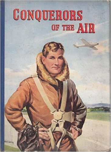
Next was “…conquerors of the air…”. There is a book called Conquerors of the Air by Harry Harper.
This made me think of the Communist propaganda posters showing off their supremacy. I started with the type and used a font called DDC Hardware from Aaron Draplin which has a utilitarian look and feel. I replaced the Q of the word conquerors with the hammer and sickle and stacked the type. I set the type on top of a communist propaganda poster displaying air power which I overlaid with a red filter. I still wasn’t happy with the design so I added another layer on top which was the blueprints of the Russian MIG-25 aircraft and added a paper texture to make it look like a poster.
I was really starting to enjoy this form of creating imagery from a piece of text.
The phrase “Well, to hell with you! hornless and ironed!” lead me to rethink my original ‘record player hell’ due to misinterpreting the punctuation. The ‘hornless and ironed’ part of the phrase conjured up the image of a cowhide rug. I found an image of a cowhide being tanned. This coupled with an image of some lava gives a dramatic and interesting result.
Next up was the first line of the poem, “Life is shorter than the squeal of a sparrow”. I had the idea of giving this the look of some of the propaganda posters I had seen, a call to arms. I used a desaturated image of a sparrow and added geometric lines and shapes to make it look as the sparrow was ‘squealing’. Rather than using the actual word squeal, I translated the word into the Cyrillic alphabet to give it more of a Russian feel and a nod to the poem’s origins.
I thought that this would make a very good and powerful cover for the book.
7 down, 3 to go. I decided to return to the record player line, this time without the fires of hell! Again I wanted to give it a propaganda look, but this time a little more modern. Using black and white imagery of a retro record player and a strong geometric background I gave it more of a retro look by changing the whites to a faded cream colour. This gave it a softer look but there was still too much whitespace. I then added one of the cows from the ‘oranges’ image which gave it a more quirky look but worked very well. There was still too much space around the image so I added the description of a record player from Google Dictionary in the DDC font I used earlier.
Onto the other half of the phrase “…and to build bridges from the tears of bovine jealousy”. For this image I didn’t want it to be in the same style of the other half of the phrase. I started with the colour green as this was associated with jealousy. I used an image of a bridge with the water underneath substituted with a green overlay. I then needed a crying cow which I gave green overlaid tears. this somehow didn’t look right until I added a green circle in the centre of the image, over the cow’s eyes.
I couldn’t finish the series of images without visualising the tile of the poem which is also used in the line “I want one – to dance one tango with cows…”. I began with an image of some ballroom dancers which I substituted the heads with those of cows. I then placed these into and image of some farmland and a barn. The image of the dancers seemed quite traditional in nature as opposed to the modernist nature of the poem. I decided to embrace the contrast and used a filter to give the image a more classical painted look.
Now I had my images. I wanted to put it on a concertina-fold book with 5 images on each side. I just had to decide the order in which they appeared. Do they need to be in linear order or would a more disjointed approach work?
I drew a flat-plan to help me envisage what order the images needed to be on the book.
This was harder than I thought and took a while to get my head around. I knew which images would be my front and back covers, but getting them in the right sequence needed thinking about to make sure when the book was folded they would be in the correct positions. As for the rest of the images, I decided to randomise the order as I thought that they could be treated as individual images as well as one poem.
It took me a while to get into this exercise, it stumped me for a while. But once I had found a starting point the creative juices began to flow. It also gave me a chance to re-familiarise myself with Photoshop which I hadn’t used for a while. I enjoyed manipulating and layering the images and also injecting some humour into the imagery. I feel that I have given the poem a modern twist while using the imagery to nod to its communist/modernist roots.
To begin: Collect a wide variety of paper samples and other paper ephemera across a range of weights, textures and surface finishes. This builds on your previous paper sample exercise from Part Two. Aim to collect a wide range of unprinted papers, such as blotting paper, tracing paper, lined paper, graph paper, rice paper and handmade papers. Look out for papers with special print finishes – metallic, embossed, shiny and matt. Aim to collect paper that is light as a feather and heavier, more dense, paper. Collect papers that will run through a conventional desktop printer, or indeed the print output options you have available to you – this may include board.
In addition, collect paper ephemera that you find interesting or that appeals to you in some way. This may include tickets, flyers and similar printed material or mementos or souvenirs of exhibitions, occasions and days out. Create a stack of these papers for use in your next few exercises.
In your learning log, document some of these papers and their attributes. Use a reflective approach and simple, descriptive words. For example, it may be that a heavy, coarse coloured paper reminds you of primary school, or the particular smell and shine of a paper puts you in mind of glossy magazines, or the fish and chip shop. Document these associations, however bizarre, into your learning log and/or ongoing paper sample book – you may revisit the words and phrases you use here later on in this process.
New Samples!
This doorstop of a tome is my new favourite thing. After seeing this on social media I had to hunt it down and finally got my hands on it. This is 449 pages of paper loveliness in weights from 90 – 1400gsm and in an amazing range of colours, textures and finishes. It contains papers from mills all around the world including Germany and Japan which are perfect bound together to produce this monumental resource.
I also was invited onto a webinar for the launch this new sample range which was very informative and went into great detail about the origins of the papers, the manufacturing process and the ethics behind the sustainability of the production process of some of the papers. It also covered the process of making the sample book itself including how the thumb-dividers, which divide the sections, were all cut by hand.
hand-cut thumb-dividers
I also ordered some samples from G F Smith to get a better idea of some of the tactile qualities of the paper.
Living in a house with young children means that we are never short of various types of crafting materials including paper along with the usual suspects.
Tissue Paper
We probably have every colour under the sun of tissue paper in the house. This particular type of paper reminds me of primary school, screwing up balls of tissue to stick to some creation or other. It also conjures up the smell of PVA glue. This could be printed on by hand as the nature of the paper makes it very delicate to mechanically printed.
Corrugated Paper
This was also in the ‘craft box’. It’s more of a corrugated paper rather than a card. It is very tactile and quite course, I think it was used as packaging for some wine glasses from New York so it reminds me of our time there. It would be possible to print on to this, but again I think it may need to be hand printed.
Dotted Paper
This is the interior of my sketchbook. I have recently switched to using it and I like the combination of the freedom and rigidity the dotted layout gives you. It isn’t the smoothest paper and is slightly transparent, which can be useful for tracing.
Lined Pad
We have several of these in the house and they are used for notes, shopping lists and general day-to-day use. The paper is quite opaque and very robust and will happily handle a biro or a marker pen. It would also easily fit through a desktop printer. It reminds me of the pads that we used to use to write the bottling-up list on at the end of the night when working in a pub. This one is my wife’s from when she worked at the Guardian, not one from a bar in Torquay!
Black(ish) paper
This paper feels cheap and nasty. It’s the type of paper that was used to mount your schoolwork on. It’s thin and rough to touch, but I’m sure would run through a printer. However, it would be tricky to print a decent image on it due to its dark colour.
Kraft Paper
We have a huge roll of this. It gets used for drawing on and as environmentally friendly wrapping paper. It reminds me of how we used to write specials in a restaurant I worked in. We had a huge roll on the wall which we would write every day with a big Sharpie marker and reminds me of that smell. This could easily be printed on, but I’m not sure how the ink would take as it has a slightly glossy finish.
Mounting board
This was what I used to mount my work for submission fro Core Concepts. It is very thick and has a shiny side and a matt side. It is too thick to go through a printer but could be hand printed or pressed.
Cromatico Digital
Cromatico Digital is the first pure white translucent paper designed specifically for all HP Indigo digital presses and dry toner technologies. Available in three weights, it is widely used by some of the world’s most respected luxury brands. Each sheet incorporates a silver strip at each end that activates the photoelectric cells when the paper is fed onto press. It can be folded, scored, embossed, foiled, varnished and die-stamped.
This feels very silky to touch and has a luxurious feel. It has a matt texture
Gmund Blocker
Gmund Lakepaper Blocker offers a new level in opacity for paper. Complete opacity has previously meant using heavy paper weights but as the name suggests, Blocker uses unique ingredients with special ‘blocking’ additions in the paper making process to create fine lightweight sheets with maximum opacity. Blocker is perfectly suited for jobs where high ink coverage and minimum show-through is required.
This is 80gsm in weight and is almost completely opaque. It has a high quality feel and is very smooth to touch. It reminds me of very high quality book pages with a matt finish.
Takeo Pachica
Takeo Pachica is one of the most technically advanced papers in the world. Brought exclusively from Japan to the UK by G . F Smith, it has a luxurious tactility. It also has a hidden special property; by debossing an area of the paper with a heated die, the impressed area becomes transparent.
This is a very special paper that feels like fabric and when it is debossed as described above it gives an amazing finish that is very unique and looks very high-end.
Ephemera
Besides all the samples I have from printers I have a large collection of menus, tickets and rugby paraphernalia. This ranges from tickets with multiple finishes on them such as varnishes and foiling to full-colour glossy programs to laminated passes. I have menus and table-talkers from various places I have worked with varying levels of finishes.
Once you start looking around you start to notice the types of paper, the different finishes and printing techniques and appreciate what has gone in to producing it.
Concrete poetry, sometimes referred to as visual poetry, is a form of experimental typography where the use of letter and word arrangements enhance the meaning of a poem. The typographic treatment of words within concrete poetry starts to add additional resonances through their scale, placement, overlay and styling, suggesting new ways to see and say the poem. Early examples of concrete poetry were by artists such as Kurt Schwitters and Vasily Kamensky. The development of experimental typography flourished during the 1950s and 1960s with artists such as Dom Sylvester Houédard, Ian Hamilton Finlay and Carl André. Often letterpress and the typewriter were used for experimental typography during this period.
“Inspired by the pioneering work of Mallarmé, Apollinaire, the ‘zaum’ poets, Futurism, Dada, and drawing on the more recent example of Lettrism, the central focus of Concrete Poetry was on the written word as a visual phenomenon. Typography was therefore a central concern, with letterform, weight, scale and page layout all contributing to the meaning of the work.”
Simon Morley, Writing on the wall: word and image in modern art, 2003. London: Thames & Hudson.
“Generally speaking the material of the concrete poem is language: words reduced to their elements of letters (to see) syllables (to hear). Some concrete poets stay with whole words. Others find fragments of letters or individual speech sounds more suited to their needs. The essential is reduced language. The degree of reduction varies from poet to poet, from poem to poem.”
Mary Ellen Solt, Concrete Poetry: A World View, 1968. Indiana University Press.
Critical writing task
Identify an example of concrete poetry and write a short critique of the content, design and the relationship between the content and form. How has the use of typography, layout, and space been employed to help generate meaning? Print out a copy of the poem and add notes directly onto the page. Write a brief summary of your thoughts, feelings and reflections on how concrete poetry creates new meanings.
As a starting point you may want to look at the following artists who practiced Concrete Poetry:
● Dieter Roth ● Max Bense ● Eugen Gomringer ● Ian Hamilton Finlay ● Henri Chopin ● Öyvind Fahlström ● Emmett Williams ● Geraldine Monk ● Mary Ellen Solt ● Ilse Garnier
To explore concrete poetry in more depth you may want to read Mary Ellen Solt’s 1968 Concrete Poetry: A World View, available via UBU: http://www.ubu.com/papers/solt/ Or research the work of individual visual poets at UBU: http://www.ubu.com/vp/
Visual task
Use one typeface to create a playful design for the Tango with Cows, 1914, by Russian Futurist Vasily Kamensky (poem shown below). Explore and experiment with the relationship between the meaning of the text and the form you present it. Think about what kind of typeface you choose as well, does it reflect the content of the text? How does the paper relate to the design? Decide on an appropriate scale and format for this page. Create a series of sketches and ideas, and chose one to develop into your final design. Print your design on one of the papers you have collected in the previous exercise
Poem: Tango With Cows
Life is shorter than the squeal of a sparrow. Like a dog, regardless, sailing on an ice floe down the river in spring? With tinned mirth we look at our destiny. We – the discoverers of countries conquerors of the air kings of orange groves and cattle. Perhaps we will drink a glass of wine to the health of the comets, expiring diamond blood. Or better still – we’ll get a record player. Well, to hell with you! hornless and ironed! I want one – to dance one tango with cows and to build bridges from the tears of bovine jealousy to the tears of crimson girls.
Write a short paragraph reflecting on the relationship between the form and content of your design in your learning log.
Critical writing task
Concrete poetry is a new concept to me, I had not heard the term before and needed to do some research on the subject before I started.
Concrete poetry – noun
Poetry in which the meaning or effect is conveyed partly or wholly by visual means, using patterns of words or letters and other typographical devices.
Researching concrete poetry led me to see that in the previous exercise: Experimental Typography I had created something similar to concrete poetry for the Jules Verne passage in manipulating the text to look like water or the sea monster to help illustrate the type instead of simply reading it.
I found a piece I liked that was similar to what I had created in the above exercise.
Here the artist has just used a typewriter to create the type but has emphasised parts of the type by typing over the top giving the image depth and a three dimensional feel depicting the ‘gravitational waves’ of the piece. It gives form to something that is normally invisible to the human eye and hints at their repetitive nature. The large are of whitespace around the type helps draw the eye to the type and tweaks the reader’s curiosity as to what the piece is about. The pice looks very textural due both to its design and the paper it is printed on. I personally think that this piece is very architectural, each line built on top of the other with just the right amount of characters to form the geometric shape. To enable the piece to fit its shape there is a letter missing. On the third line from the bottom, the last word should be ‘for’ but the ‘r’ is missing. This is probably to enable the artist to evenly distribute the type within the confines of the rectangle.
Another piece I thought was clever is this one by John Cage which is held by the Museum of Modern Art.
It took me a while to see the significance of the layout. The paragraphs are all aligned along a central axis where vertically the letters read ‘Mary Sisler’ 3 times which is the name of the woman to which the letter meant for. The names are in a slightly larger font size to the rest of the letters to emphasise amongst all the other capitalised type. The larger font however bleeds into the lines above and below due to the line height being fixed for the smaller type but this does give a feeling of closeness and fondness for the letter’s recipient. I think that this a very clever piece. It doesn’t necessarily depict anything in particular but it is very well worked out and is visually interesting and makes you look twice at the piece.
Reflection
As I have said above, Concrete Poetry was a new term I had not heard before. I really like the way it can be used in so many differing was to depict elements of a piece of type such as movement, rhythm, feelings. It can give form to words or pieces of text to help tell a story which wouldn’t normally evident when seeing the poem/type written normally on a flat piece of paper. New meaning can be created by adding emphasis to a word or letter through the use of capitals, spacing, repetition, punctuation, deliberate misspelling or scale.
Concrete poetry definitely adds impact to the written word as well as a new dimension of engagement, whether that is through touch, as many concrete poems take on a tactile, three dimensional form, or through ‘sound’ as although there is no sound the creation of rhythm through spacing and the emphasis of the sounds and volume of certain words means that the brain can add these attributes as you are reading it.
Visual task
To start, I need to know more about the poem ‘Tango with Cows’.
Tango With Cows: Ferro-Concrete Poems is an artists’ book by the Russian Futurist poet Vasily Kamensky published in Moscow in 1914 with a print-run of only 300 copies. Tango with Cows is also the name of a poem contained within the book. The book contains 14 pieces of Ferro-Concrete Poetry in total, 8 of which are poems that use multiple fonts and unusual spacings to express sounds and textures, with the remaining 6 being of diagonal grids representing maps, floor-plans and aerial views said to be a nod to Kamensky’s role as an aviator.
The poem Tango with Cows is a look at how concrete was changing the face of urban Moscow and used the words and letters of the poem to represent the dynamism of the changing cityscape. It is printed on cheap wallpaper which is said to be a parody of urban bourgeois taste in that they nouveau-riche bought cheap commercial printed wallpaper to appear wealthier than they were. Kamensky used it here instead of printing paper as it was actually cheaper. The poem is also a commentary on the tension developing between the modernity influencing Russia’s cities and the want to hark back to the country’s rural past. There is also a nod to the dance craze influencing the urban socialites of Moscow ‘Urban Tango’. The ‘Urban Tango’ was a racy Parisian dance that reached Russia in 1913, bringing with it a perceived threat to traditional values and the rural way of life due to its sexual connotations, closeness of the dance partners and association with brothels and night clubs. By juxtaposing the urban tango with the cows of rural Russia, Kamensky captured the tension poets and artists felt between the recovery of a rural past and the allure of an urban present in creating their art of the future.
Initial ideas
I started by mind-mapping my initial thoughts on what jumped out from my research. I hadn’t even studied the content of the of the actual poem yet, these were just my thought about the history of the piece.
So I thought I’d better take a look at the content of the poem and make a list of the words that could possibly be illustrated by manipulating the type.
Shorter
Sqeal
Sailing
River
We
Discoverers
Conquerers
cattle
glass of wine
comets
diamond blood
record player
hell
hornless
ironed
tango
bridges
tears
crimson girls
These were the words that I thought had the best possibilities to create imagery with. As well as starting to look at the wordplay of the list above, I started to look for some visual inspiration. I began looking at other examples of Concrete Poetry for inspiration as well as things that had come up in my brainstorming. I added these ideas to my Pinterest board.
I also started to look for a suitable typeface/font in which to create my design and had a look at what I’d got in my collection as well as suitable ones I found on the internet.
As I wasn’t sure which direction my design was going to take I wasn’t sure on the type-style to go for. However, I did know that I didn’t want to be too cliché with the choice, so the faux-Russian(Cyrillic) typefaces were confined to the trash.
During my research I came across a couple of pages of a Russian book from 1928, which I know is a little later than the poem, but I liked the design.
I have no idea what the book is about but I did like the style of printing with use of minimal colour and overprinting. I wondered if I could do something similar.
At this point I was feeling very uninspired and was banging my head against a brick wall!
I went back over my research and took another look at what I’d highlighted and to see if anything new jumped out at me. Rather than looking at individual words I began to look at the poem as a whole and its rhythm. What was the poem in its simplest form? It was about a metaphorical dance, an Argentine tango. Could I use this as a base for my design? Could the rhythm and the feel of a dance be used to depict the poem? I started to research the dance and there was lots of imagery of the raunchiness of the dance but there were also diagrams of the steps, instructions on how to do it. I thought that this could be a good starting point for the design…but where to start?
It took me a long time to find inspiration to start the design process, my mind kept drawing a blank! I then stumbled on the diagram below of the steps involved in the Argentine Tango.
This was different from previous diagrams that I’d seen as it seemed more technical and didn’t have the footprints, not that I had any idea what it meant!
After sleeping on the idea of using the diagram as a basis for my design I had formulated a plan of what it would look like and how I would go about it.
Initially I imported the diagram into Illustrator to use as a guide. I then traced the 3 main lines relating to the movement of the dancers. I kept the dashed line to keep the instructional essence of the diagram and the 2 curvy lines that showed the movement and discarded the rest.
The curvy lines I used as a base on which to type some elements of the poem. I used some of the lines to as a nod to the original dance steps along the curved lines. The typeface I chose to do this was Chandler42 which is a typewriter-style typeface that has a mixture of weights that I thought would work well for this design. It also gave a utilitarian look to the type which I thought echoed some of the Concrete Poetry I’d seen and also a nod to the communist state and its distressed look gave an edgy, urban feel.
Chandler42 Lite
I began to emphasise certain words in the text that I felt were important by changing their size, weight and style. I also illustrated some of the words with type that I had highlighted earlier in my research e.g.: ‘shorter’ had its tracking narrowed; ‘down’ was dropped below the baseline; ‘comets’ was made to look like a comet; ‘hell’ is upside-down. I also thought that the serifs on the uppercase V and W in ‘bovine’ and ‘cows’ looked like horns, so these were emphasised too. Even though it isn’t the start of the poem, I thought the ‘We’ at the start of the 5th line was quite important as I felt it referred to the communist state again, which is why it’s the largest type element on the page.
I put the type elements on a angle reflecting some of the propaganda posters I had researched.
After all the fuss of not knowing where to start I was happy with the way that this had turned out. It was unusual in its design but I felt it gave an element of rhythm to the piece with certain words being given individual treatments to emphasise their characteristics or importance.
With the paper choice for this piece, I wanted to give it that utilitarian look and the thing that sprang to mind was newspaper. This was the paper of the masses and I thought would be appropriate for this genre of poetry. The design was quite type-heavy and would struggle to be read on ‘fresh’ newspaper, but a faded, old newspaper would work. So I found an old Russian newspaper from 1906 to use as a background.
Source: google.com.au
I then used a texture to give it an aged appearance and took the opacity down. I wanted to add some more overprint elements as mentioned earlier so I added some communist propaganda elements on top of the paper giving it a Letterpress print look.
This is the final design
Reflection
I found this exercise very challenging in that I struggled to find a stating point. I am definitely way out of my comfort zone with this but hopefully I have managed to produce something interesting and evoking that does the original poem justice. Once I had found a way to relate to the poem visually I found it much easier to relate to the style of Concrete Poetry. I will be looking into Concrete Poetry further as this is another typographical approach to design that I find very clever.
Find two artists’ books that you feel demonstrate an interesting relationship between their form and content through the materials that the artist has chosen to use. Reflect on these books in your learning log.
If you have physical access to libraries such as The British Library, Tate Library Special Collection, or Leeds University Library, visit them and have a look at examples of artists’ books in their special collections. Libraries have online resources as well with access to their collections, for example the V&A National Art Library. Alternatively, return to the The Smithsonian Library’s online archive of artists’ books: https://library.si.edu/collection/artists-books
You may also want to reread the Artists’ Book section in Part One of this unit.
This book caught my eye as it reminded me of the Robinson Crusoe assignment from earlier in this module. The 3D effect is created with 4 folios mounted on dowels with one of the 8 images on each side. This pen and ink illustration shows lots of detail which is down to the medium used, which I think this book needs. It is then cut out to give the 3D feel and create depth which works really well for the Kraken’s tentacles engulfing the stricken vessel.
Another nautical book, this time representing Nemo’s Nautilus. This is layered tunnel-book depicting the infamous submarine in the deep along with the sea monster from Jules Verne’s novel. This book also comes in a presentation box with a porthole through which the scene can be viewed.
This concertina book shows the evolution of a single square(pulsar) into a complex geometric pattern printed from a woodblock design. This book tells a story without words but still has a sequential plot.
Reflection
Both artists have their own unique style when it comes to their books. However, both artists use shape to help tell the story as well as not necessarily conforming to what would be regarded as a traditional book.
Carla Busquets uses detailed imagery to draw the reader in and in turn uses elaborate ‘packaging’ for her books. This ‘packaging’ is not just part of the book but a work of art in itself and eludes to the contents within. The ‘packaging’ also forms part of the books’ overall feel and tells a part of the story and can be as elaborate as the books themselves. The cutout technique also adds to the shape of the books and gives them a more in depth and tactile feel.
Esther K Smith uses letterpress printing in her work which gives it a simplicity that is in contrast to Busquets. This printing lends itself to type and bold shapes that Smith uses to tell her stories. There is some detail in on the wings of the ‘moths’ which has been achieved using type ornaments to create repeating patterns. The cutout shape of the moth gives a decorative and illustrative part to the poem with using any imagery at all.
Feedback for part 2 was overall very good. My tutor commented on the ‘professional’ standard of some of my work and that some of my research was very thorough. Again, the lack of sketchbook use was mentioned again and I must try to use them more as this is a recurring theme!
Overall, I really enjoyed this part of the module and enjoyed creating my interpretations of the various briefs and I think this shows. I feel that I now have a better understanding of book design process especially the use of papers and finishes and I’m slowly growing my sample collection. I have also now have more understanding of the make-up of a book is dependant on its use and the environment it is to be used in.
I seem to have missed a research task but I have taken it on board as this is evident in using ‘book terminology’ in the subsequent exercises and assignment.
One point my tutor raised was there wasn’t much evidence of independent work in my sketchbook. Obviously time is a major contributor, working full-time and having a young family leaves little time to myself other than to conduct my college work. I will try and find some time for myself but can’t promise anything!
I feel that I am becoming more aware of what goes into book design and find myself examining the papers of a book or it’s binding when I pick them up. This is something that I’ve taken for granted previously.