Read the reviews by Campany and Colberg and, if you haven’t already done so, use them to begin the contextual section of your learning log. Try to pick out the key points made by each writer. Write about 300 words. If you wish, you could add a screen-grab of an image from Ruff’s jpeg series, and one or two of your own compressed jpegs (taken on auto mode of course!). You can achieve the effect quite easily by re-sizing a photograph to say, 180 x 270 pixels, and saving at ‘zero quality’ compression. If you use Photoshop’s ‘save for web’ you can see the effect immediately without having to save, close and reopen the file.
Thomas Ruff is a German-born Photographer and has been described as ‘a master’ of edited and reimagined images.
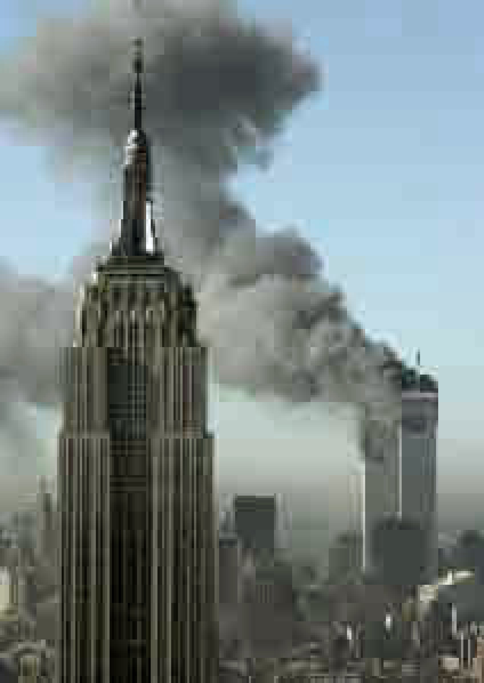
Thomas Ruff – ny01 2004
Campany says that Ruff offers very particular kinds of pleasure, both aesthetic and intellectual but also cold and dispassionately wilful, searching and perverse but also ‘beautiful’. He states that Ruff has a preference for working in series. Ruff has said that his work is ‘internet-based’ from searching links from one site or another, he calls the internet is an ‘archive of archives’. Ruff has done a great job of creating “art of the Pixel” and the images are blown up beyond their photorealist resolution, he has replaced the grain of photographic film into electronic data.
Joerg Colberg makes the points that Ruff might be “one of the most creative and certainly inventive photographers of our time”, however, most people will deny that his work is actually photography. Colberg points out “it’s not photography then what else, are not terribly exciting, and there is no need to get into them here. What is more interesting is to look at that work and to see what it does (call it photography, graphic design, visual art, whatever).” Ruff came up with the idea of ‘JPEGS’ when his negatives from the attack on the World Trade Centre were blank so he downloaded images from the Internet but they were really low quality, so managed to modify them into visually poor but still visually recognisable images.
I agree with both Campany and Colberg, Colberg sees Ruff as ‘one of the most inventive photographers of our time’ but also that it’s more art than Photography, whereas Campany sees his work as “cold and dispassionate but also beautiful”. Today it is expected that the camera is a tool to capture that ‘perfect image’, but Ruff’s images hark back to the days of grainy-imperfection as well as the early days of digital photography and its limitations.
The final exercise of this project makes use of the viewfinder grid display of a digital camera. This function projects a grid onto the viewfinder screen to help align vertical and horizontal lines, such as the horizon or the edge of a building, with the edge of the frame. Please check your camera manual (or Google search) for how to display the grid in your viewfinder. If your camera doesn’t have a grid display, just imagine a simple division of the viewfinder into four sections.
Take a good number of shots, composing each shot within a single section of the viewfinder grid. Don’t bother about the rest of the frame! Use any combination of grid section, subject and viewpoint you choose.
When you review the shots evaluate the whole frame not just the part you’ve composed. Looking at a frame calmly and without hurry may eventually reveal a visual coalescence, a ‘gestalt’.
Gestalt: an organised whole perceived as more than a sum of its parts. (Google Search using the define: operator)
Select six or eight images that you feel work both individually and as a set and present them as a single composite image. Add to your learning log together with technical information such as camera settings and two or three lines containing your thoughts and observations.
Gesalt
Images used
ISO 200 50mm f/2.8 1/100
ISO 200 50mm f/3.5 1/200
ISO 100 50mm f/3.5 1/160
ISO 200 50mm f/4.0 1/200
ISO 200 50mm f/2.8 1/100
ISO 200 50mm f/5.6 1/400
ISO 400 55mm f/10 1/200
ISO 100 50mm f/1.8 1/500
ISO 200 50mm f/2.5 1/100
Reflection
So this exercise helped me to understand how important it is not to stick in the rules, but to experiment, to try new positions for the subject, to put it in different parts of the frame, sometimes to imbalance the picture, to achieve certain result cohesive result.
For this exercise I just went out and photographed a number of trivial and maybe stupid things without thinking too much about the subject(harder than you think!!). The form of the objects was more important in the majority of the images and these seemed to be the stronger images than the more generic ones.
Keeping the images all monochrome helps form a relationship between the images and adds to the coherence of what individually seem like random images.
Take a number of shots using lines to create a sense of depth. Shooting with a wide- angle lens (zooming out) strengthens a diagonal line by giving it more length within the frame. The effect is dramatically accentuated if you choose a viewpoint close to the line.
Around the time Atget took the photograph above, two developments coincided to challenge illusionism in photography. Although simple hand-held Kodak cameras had been readily available since the late 1880s, it was the introduction of the 35mm Leica in 1924 that finally freed photographers from the restrictions of a large and cumbersome plate camera mounted on a tripod. And from recent developments in painting there came the sudden recognition of the photograph as a flat surface.
László Moholy-Nagy was a crucial figure for photography in the Bauhaus, the radical German school of art and design. By the time it closed in 1933, having been successively expelled from the cities of Weimar, Dessau and Berlin, the Bauhaus had made an indelible stamp upon the future development of art, design and photography. It also became a ‘point of origin’ for art schools, including the OCA. László Moholy-Nagy encouraged his students to use the new 35mm camera technology together with a high viewpoint perpendicular to the subject to create pictures with a flat, abstract quality.
Now take a number of shots using lines to flatten the pictorial space. To avoid the effects of perspective, the sensor/film plane should be parallel to the subject and you may like to try a high viewpoint (i.e. looking down). Modern architecture offers strong lines and dynamic diagonals, and zooming in can help to create simpler, more abstract compositions.
Review your shots from both parts of Exercise 1.3. How do the different lines relate to the frame? There’s an important difference from the point exercises: a line can leave the frame. For perpendicular lines this doesn’t seem to disrupt the composition too much, but for perspective lines the eye travels quickly along the diagonal and straight out of the picture. It feels uncomfortable because the eye seems to have no way back into the picture except the point that it started from. So another ‘rule’ of photography is that ‘leading lines’ should lead somewhere within the frame.
In The Photographer’s Eye, the influential American curator John Szarkowski (1925–2007) identified’ the central act of photography’ as a decision about what to include and what to reject, which, ‘forces a concentration on the picture edge…and on the shapes that are created by it’
(Szarkowski, 2007, p.4).
In his essay ‘Photographs of America: Walker Evans’ in ‘Walker Evans American Photographs’ (2012) Lincoln Kirstein writes, ‘The most characteristic single feature of Evans’ work is its purity, or even its puritanism. It is “straight” photography not only in technique but in the rigorous directness of its way of looking. All through the pictures in this book you will search in vain for an angle-shot. Every object is regarded head-on with the unsparing frankness of a Russian ikon or a Flemish portrait.
(2012, p198)
The original 1938 edition of American Photographs contained the following statement: THE REPRODUCTIONS PRESENTED IN THIS BOOK ARE INTENDED TO BE LOOKED AT IN THEIR GIVEN SEQUENCE. While there are plenty of images from ‘American Photographs’ available on the web, to view the sequence and truly appreciate the transcendental quality of Evans’ framing you probably need to find a copy of the book, which has recently been reprinted in a relatively affordable edition by Tate Publishing.
For Victor Burgin (b. 1941), composition is ‘a device for retarding…recognition of the frame’ (Burgin, 1980, p.56). Looking back at some of your compositional exercises from earlier in Part One, would you agree that in the less conventionally successful shots, there is the feeling of a ‘cropped view’ rather than a ‘transparent window to the world’? Alfred Stieglitz’s (1864–1946) cloudscapes, the Equivalents, illustrate Burgin’s point. They don’t appear to be composed at all; instead they’re ‘equivalent’ in that any section of the sky would seem to do as well as any other. Because there’s no sense of composition our eye is drawn to the edges, to the frame. For its time, this sense of a cropped rather than a composed view made the Equivalents feel uniquely photographic.
Lines
Contrast plays a big part when defining lines, whether that be light and shade; hues and colour; textures and shapes. Lines are stronger elements than ‘points’ in the previous exercise. They give context, structure, position in static images, but they can also depict movement along their length.
Horizontal lines are the most pleasing to the eye as they give images a grounding. They draw the eye from left to right and back again. They can also give the impression of breadth and distance with the horizon as an example.
Vertical lines can prove more uncomfortable to the eye than horizontal ones. They tend to work better in multiples as opposed to a single vertical element. The vertical line is however, the main axis when photographing people and give more of a sense of movement better than horizontals.
Together, horizontal and vertical lines compliment each other bringing balance to an image.
Diagonal lines are less set in stone as the previous two. They don’t have to conform to to the fixed axis of the horizontal and vertical. Diagonal lines give images a more dynamic look and give a more exaggerated sense of direction and speed. Diagonals can be given more visual effect by changing the viewpoint which can exaggerate perspective by the lines converging at a steeper angle.
Lines used to start a movement
With the emergence of the Modernist movement in the late 19th/early 20th centuries, it was the turning point of photography and made it an art form in its own right. Prior to this, photgraphy was being used to place beauty, tonality, and composition above creating an accurate visual record known as Pictorialism.
Steerage by Alfred Stieglitz 1907
Modernist Photography (1910-1950) moved away from the Pictorialist mode that had dominated the medium for 50 years, in the United States, Latin America, Africa and Europe. Influenced by Modernism or to make something “new”, photographers created sharply focused images, with emphasis on formal qualities, exploiting, rather than obscuring the camera as an essentially mechanical and technological tool. Instrumental for this trend was critic Sadakichi Hartmann’s 1904 “Plea for a Straight Photography” rejecting the artistic manipulations, soft focus and painterly characteristic of Pictorialism and promoting the straightforward, unadulterated images of modern life in the work of artists such as Alfred Stieglitz. Innovators like Paul Strand and Edward Weston, through their work techniques, would further expand the artistic capabilities of photography helping to establish it as an independent art form.
In 1932, Edward Weston along with 10 younger photographers like Ansel Adams, founded the Group f/64 based on the ideals of straight photography and became the most progressive association of its time.
My shots
I started to wonder where I could find strong enough lines in my local area. I settled on the village of Staverton which has its own steam railway. The railway lines were the perfect, if not a little obvious, use of lines.
Canon EF-S 10-18mm f/4.5-5.6: ISO 100 f/4.5 1/320Canon EF 50mm f/1.8: ISO 100 f/5 1/320Canon EF-S 10-18mm f/4.5-5.6: ISO 100 f/5.6 1/200Canon EF-S 10-18mm f/4.5-5.6: ISO 100 f/5.6 1/250Canon EF-S 10-18mm f/4.5-5.6: ISO 100 f/5.6 1/100
These shots all give a sense of depth and distance. They lead the eye, which allows the photographer to direct the viewer’s eye to where they want it to go.
Using a flat plain lines can still be effective in showing depth. Whether that be modernist/brutalist architecture (there isn’t much in the local area) or more agricultural forms or using shadows to create interest.
Canon EF-S 10-18mm f/4.5-5.6: ISO 100 f/5.6 1/250Canon EF-S 18-55mm f/3.5-5.6: ISO 400 f/4.0 1/40Canon EF-S 50mm f/1.8: ISO 100 f/1.8 1/4000
Reflection
The different shots in this exercise all use lines. The first set of images use lines to draw the eye of the viewer to a certain point. They give depth and a feeling of movement towards the destination. The second set use lines in a more structural way, but the detail of the subject offers the interest and the linear elements give it form with the repetition of the lines are a strong graphical element which makes the image appealing to the eye.
A point is the smallest graphical element, if you join many points together you make a line. In mathematics, a point doesn’t have any weight at all, it indicates a place. So compositionally, a point has to be small within the frame and its position is generally more important than its form (see the example of the white polystyrene cup underneath the chair below).
Take three or four photographs in which a single point is placed in different parts of the frame. When composing the shots use these three rules: the place of the point shouldn’t be too obvious (such as right in the middle), the composition should hold a tension and be balanced (the golden section or rule of thirds) and the point should be easy to see. Evaluate the shots according to these rules and select which one you think works best.
Then take a few more shots without any rules, just being aware of the relationship of the point to the frame. Without the rules, how can you evaluate the shots? That will be a key question throughout the whole degree programme.
Add the photographs to your learning log together with brief observations.
I struggled with finding a point initially. But, following feedback from my tutor in which he said to keep things simple, I chose an item that was out of place. Technically when you have small children nothing is out of place! I saw one of the boys’ balls on its own on the patio which seemed like an ideal point.
My tutor had also suggested using a fixed lens during these early parts of the course, so I used my ‘pancake’ lens for this one – a Canon EF 50mm f/1.4 and as I would be shooting outdoors I kept the ISO at 100 due to the bright conditions.
Of the 4 chosen images, the first 3 are all of roughly the same scale. Although the point is in different positions in the frame they don’t offer much of much variety of image. The fourth image is a bit more of an extreme positioning of the point and is vastly different from the other 3. All the images follow a grid setup in one form or another whether it be the rule of thirds or Fibonacci. These give the images balance even in their simplicity, even the fourth one!
I then tried to ignore the rules and placed the point wherever I wanted. This was quite hard as I am always looking out for compositional elements such as the rule of thirds and leading lines. Without rules the photos can look chaotic and uncomfortable. It’s a lot harder to break the rules than follow them.
I may have oversimplified this exercise with the image only having one item in it. However, this exercise did show me that the focal point does need to be considered in the image, but it doesn’t necessarily have to be central. It also illustrated to me that taking lots of images from lots of different perspectives and focal lengths can give more variety of imagery even if it is just a blue sponge ball.
Take three or four exposures of the same scene. Don’t change anything on the camera and keep the framing the same.
Preview the shots on the LCD screen. At first glance they look the same, but are they? Perhaps a leaf moved with the wind, the light changed subtly, or the framing changed almost imperceptibly to include one seemingly insignificant object and exclude another. Time flows, the moment of each frame is different, and, as the saying has it, ‘you can’t step into the same river twice’.
Now bring up the histogram on the preview screen. The histogram is a graphical representation of exposure – the camera’s sensitivity to light. As you page through the images you can see small variations in the histograms. Even though the pictures look the same, the histogram data shows that in a matter of seconds the world changes, and these subtle differences are recorded by the camera. If you refine the test conditions – shooting on a tripod to fix the framing, moving indoors and closing the curtains to exclude daylight – still the histogram changes. Probably some of the changes are within the camera mechanism itself; still, the camera is a sensitive enough instrument to record them.
Add the sequence to your learning log with the time info from your camera’s shooting data as your first images for Part One.
Image
I hadn’t really paid much attention to the histogram on the camera before, and due to its age my cameras on-screen histogram was a bit naff to say the least, it was so tiny.
I’d ventured into the garden for this one. I had picked a windy day that I hoped would help with this exercise in that it would give a bit of movement to the scene. I took a few shots with the boundary hedge and the Acer tree with the bird feeders on to try and catch the most movement, be it the wind or any flying visitors. I took the photos freehand and kept with the 18-55mm lens.
Due to the size of the histogram on the cameras screen I imported the photos into Lightroom and previewed the histogram there.
Even though the photos all looked alike, the histogram showed some subtle and some not-so-subtle variations in its output. Whether this was due to movements in the scene or the slight movements of the camera when holding and pressing the shutter button, it was interesting to see how the histogram changed for each shot.
After earlier dismissing the camera’s histogram, I did some more research around how to interpret what the histogram values meant. After a lot of searching and reading various articles on the internet I found a straight forward and simple ‘cheat sheet’ for interpreting the histogram.
I now have a basic insight into what the histogram tells you and how you can use it to improve the quality of your photos by addressing any exposure problems as well as using it when editing them later on.
Reflection
Having looked into the histogram, I now understand how it can help the photographer with image selection and composition. It has also highlighted the relevance of the Heractlitus quote ‘you can’t step into the same river twice’, in that this exercise has shown that to the naked eye all of the pictures may look the same, but in fact there are subtle differences meaning that you can’t shoot the exact same picture again due to changes in light or the movement of the clouds or trees.
I also think that the Alexander Shelley quote rings true to this exercise, or even the course. as understanding the technicalities of the camera and its uses will, without doubt, change and can only improve the way you approach photography going forward.
I think I will pay more attention to the histogram in future as it is a useful tool for examining the tonal values of the shots you take, both there and then or when editing later.
In our earliest years we know a patch of ground in a detail we will never know anywhere again – site of discovery and putting names to things – people and places – working with difference and similitude – favourite places, places to avoid – neighbours and their habits, gestures and stories – textures, smells – also of play, imagination, experiment – finding the best location for doing things – creating worlds under our own control, fantasy landscapes. (Professor Mike Pearson)
Photographers and artists have always found inspiration in their immediate location. There is a concept within Welsh culture called Y Filltir Sgwar (The Square Mile), described above by Professor Mike Pearson. It is the intimate connection between people and their childhood ‘home’ surroundings. Use this ‘sense of place’ as the starting point for your first assignment.
Brief
Make a series of six to twelve photographs in response to the concept of ‘The Square Mile’. Use this as an opportunity to take a fresh and experimental look at your surroundings. You may wish to re-trace places you know very well, examining how they might have changed; or, particularly if you’re in a new environment, you may wish to use photography to explore your new surroundings and meet some of the people around you.
You may wish to explore the concept of Y Filltir Sgwar further, or you may deviate from this. You may want to focus on architecture and landscape, or you may prefer to photograph the people who you think have an interesting connection to the square mile within which you currently find yourself. You’ll need to shoot many more than 12 photographs from which to make your final edit. You should try to make your final set of photographs ‘sit’ together as a series. Don’t necessarily think about making a number of individual pictures, but rather a set of photographs that complement one another and collectively communicate your idea. You may wish to title your photographs or write short captions if you feel this is appropriate and would benefit the viewer.
Think of this assignment as a way to introduce yourself to your tutor. There’s no ‘right’ or ‘wrong’ way to respond to this brief, as long as you try to push yourself out of your comfort zone in terms of subject matter. Try out new approaches rather than sticking to what you think you’re most successful at.
Research
These are just a few practitioners who have worked within their locality and/or in an autobiographical way. Spend some time looking at their work to help you generate some ideas. Document your research and your initial ideas in your learning log.
Email or otherwise electronically transfer your photographs to your tutor in the following format: 1500 pixels along the longest edge Adobe (1998) colour profile, RGB jpegs.
Include a digital contact sheet (no more than 36 thumbnails per page) of all the photographs you shot for this assignment. (Read forward to Part Three, Project 1 for how to do this.)
Also send to your tutor a written analysis of your work of no more than 500 words. This should contextualise your project by briefly outlining:
your first impressions and initial response to the brief, and how your idea(s) developed
which practitioners you looked at for inspiration and how their work influenced you duringthe project
your technical approach and any particular techniques you incorporated
the strengths and weaknesses of particular photographs and your project as a whole (self-assessment)
any thoughts on how you could develop this project in the future.
This should be either Microsoft Word, a Google Doc or PDF format, under 4 Mb in size.
If you’d prefer to submit a hard copy, you may post prints, no larger than A4, to your tutor together with your contact sheet and written contextual analysis. Make sure your prints are carefully labelled with your name, student number and the assignment number.
It’s important that you try to complete this assignment as soon as possible. Your tutor will use your assignment to get a rough sense of your current level of technical, analytical and creative skills. Whilst you should commit to the exercise and pursue an idea that interests you, it primarily has a diagnostic purpose so don’t labour it.
Reflection
The later assignments on this course ask you to check your work against the assessment criteria listed in the introduction to this course guide before you send it to your tutor. You’ll get some guidance on how to use the assessment criteria at the end of Part One, but have a go now, if you wish, and make some notes in your learning log about how well you believe your work meets each criterion.
Reworking your assignment
Following feedback from your tutor, you may wish to rework some of your assignment, especially if you plan to submit your work for formal assessment. If you do this, make sure you reflect on what you’ve done and why in your learning log.
Initial thoughts
First step was to dust off my 10 year old Canon EOS 450D. Since buying the camera I hadn’t used the camera to its full potential and thought that this was a waste.
I had enjoyed photography when I did my original graphic design diploma in the early 90s. Back then there were no DSLRs and everything was done in the darkroom. This seemed to be the natural next step.
My initial thoughts when reading the brief were that of ‘how can I do this during lockdown?’. I wouldn’t be able to venture far from the sleepy Devon village where I was based. I felt somewhat hemmed-in when it came to subject matter for my shoot. I needed some inspiration, so I took a look at some of the photographers listed above.
Keith Arnett’s ‘Walking the Dog’ series appealed to me because they were just images of various people going about their business just walking their dogs. They showed people from different walks of life all on equal footings because of their love of their four-legged friends.
Gawain Barnard’s work ‘Journey’s by Train’ comprise of images taken from a train. Obviously this isn’t possible at the moment, but his images capture architecture and life from the perspective of the passenger.
Karen Knorr’s ‘Belgravia’ is a series of ‘non-portraits’ picturing the residents of the London borough. These photographs focus on the people as well as their surroundings during the late 70s.
George Shaw
A fellow student introduced me to the work of George Shaw, who yes is a painter by trade, but his imagery is of the mundane urban landscape of his childhood home of the Tile Hill Estate in Coventry.
With the country being in lockdown for the third time, my options for locations were limited. The extent of my outdoor antics were limited to the school run to the village school (I’m classed as a key-worker) and going to the Co-op in the village. I started taking my camera on the journey to and from the school and taking detours from the usual route to see what I could see. The village have been inhabited in some form for hundreds of years with earliest records dating back to 952AD and is mentioned in the Doomsday Book. The village is now more of a commuter village for nearby towns and cities but retains its thatched, rural feel.
While taking photographs in and around the village, I seemed to be drawn more to the village’s past rather than what it is now. I found myself concentrating on parts of the village and its surrounds that looked back at its past and what has happen to some of its infrastructure since then.
I deliberately restricted myself to using the one lens for my photos to the standard 18-55mm to see what I could achieve.
Reflection
I initially thought that this was quite a daunting task due to the restriction imposed due to Covid 19. However, once I got my head around what was being asked of me I enjoyed the challenge. The research that I did prior to stating taking photographs helped me to develop an outline of what I could take pictures of, especially the work of George Shaw(even though he’s not a photographer). His pictures of where he lived really helped to inspire me and give me a starting point.
As said above, I deliberately restricted myself to using a single lens to help me re-familiarise myself with my camera and not to over complicate things. This helped me to work with the tools I’d got and try to get the best out of them.
I enjoyed the assignment as a whole, it helped me view my surroundings in a different way. I particularly enjoyed photographing some of the surrounding farm buildings, lyme kilns and the older fixtures and fittings in the village.
The first 2 photographs above are probably my favourites. The colours and the lines in the first photograph give it a very rigid, structured look that I like, that contrasts with the deterioration of the building itself. The second has some good contrast and draws the eye up the path to the old barn. The modernity of the subject of some of the photos didn’t seem to work as well as the more rustic subjects.
I’d like to develop this project further, as the weather curtailed my wanderings. There is still an old 1960/70s telephone exchange in the village that interests me as well as many more country lanes to explore.
Your final assignment asks you to draw on all the skills, insight and experience you have gained so far, by designing and producing a book of your choice. Use the following options to as a starting point or alternatively identify your own project.
● Influential book designers Identify one or more book designers to present through your book. Find ways to develop your own creative responses to their ideas and visual approaches. Delve into their work, find suitable quotations, investigate their influences, and find ways of communicating this material, and your interpretation of it, to an audience through effective use of layout, narrative, and choices of material.
● Typography Extend your exploration of typography by continuing to develop creative approaches to how typography, layout and your material choices can help generate meaning. Develop a book that explores one aspect of typography in more detail, or combines a variety of approaches. Just because your project explores typography it doesn’t mean you can’t also include images, colour and narrative.
● Found and altered books Use an existing book as a creative starting point. This could be an extension of exploring altering books in some way, or as a research project into a specific book that will generate content and creative ideas for a new book. Find a physical book to work with or pick one of your influential books from Part One.
Research the subject in depth and think about the editorial structure (described in Part Three) of your book. What is the flow of the content, would you write articles or create imagery or both? What do you want to tell about the subject and how would you communicate this? And who is your audience? Make a flatplan before you start designing your book, and have a look at other books on the subject to see a different design approach on the subject. You may want to look at the work of designers you inspired by, in order to develop your own design approaches.
You may have identified an alternative area you wish to pursue. This is fine as long as you check this out with your tutor first and document the reason(s) for your choice.
Follow the creative design process in developing your creative thinking and how you will approach the workflow, in terms of content and timescale. Decide on your subject and start researching, creating content, editing content, making decisions about the materials you want to use, and designing your book. Frame this process within an overview of your workflow to help plan the production of your book. Planning the process of generating content, and how this can then be
developed, is key to successfully finishing a designed physical book. Keep notes to accompany the process of making of the book in your learning log, and reflect on your design process.
You can use any medium or materials you want to in the production of your book. You may want to research and explore hand-binding, or work digitally with print on demand for production. You may want to combine these approaches and you may want to consider whether you want to produce a one-off copy or a small edition. If you would like to use a particular paper for your book, make print proofs before printing the whole final book. Test the paper, the colours and how your design works on the paper.
Explore the materiality of books in more depth by considering the paper, printing and bookbinding of books, both as content and form. Think about how books are held, interacted with, and the associations of the materials you might use. Explore how these choices can start to create meaning within your book.
Reflection
Give yourself a final self assessment check against your assessment criteria to see how well you think you’ve done. Use this process to help reflect on your work and your achievements on the course as a while. It will also help to identify to you and your tutor any areas you may need to work on prior to submitting for assessment.
Sharing your work
Digital companies such as blurb.com have an online ‘sharing’ facility – this would be a useful way for your tutor to see the whole work without the need for expensive mail costs.
My choice
For my choice for the final assignment was an easy choice for me. I wanted to do something in and around typography, but I wasn’t initially sure which direction to take.
I started by mind-mapping a few things to se if anything jumped out at me.
I had so many directions to choose from when it came to typography. Should I use all or focus on just one? I started making some notes to see if that focused my thoughts a little better.
This actually confused the matter even more! I had given myself ‘too many’ choices of what to include in my book. I needed to hone my ideas down, as I thought that I needed to specialise.
As well as trying to find a niche for my book I began collecting some inspiration via Pinterest. I already had a well establish typography board to draw from, but I also started a layout board to collate images of interesting layouts or layout elements.
I also found this video on YouTube which I thought was fun.
After mulling over what direction to go in for this assignment I had managed to whittle it down to 3 ideas:
Different styles of type
Type designers
History of typography
I am fairly familiar with the different classifications of type, and I had done some work around type history in my previous module: Graphic Design Core Concepts. So this left type designers…..decision made.
So now I could write myself a brief…
Having a clear direction and an actual brief helped focus my ideas and I was able to begin the design process.
Design
Firstly I needed a list of designers. I hit the books and scoured the net to find a list of suspects. The most useful tool I found was my copy of ‘A Visual History of Type by Paul McNeil‘. It covers 320 of the most influential typefaces of the last 500+ years.
I worked my way through the book and picked out some of the typefaces that I personally thought were important and listed who designed them.
A couple of the typefaces I had chosen didn’t have specific designers which was a little disappointing and some of the designers had very little information about them. I wrote these off with one exception: Akzidenz Grotesk which was the basis for Helvetica, which was too important not to include.
I eventually got the list down to 18 designers:
Johannes Gutenberg – Gutenberg
William Caxton – Caxton
Claude Garamond – Garamond
John Baskerville – Baskerville
Firmin Didot – Didot
Giambattista Bodoni – Bodoni
Robert Besley – Clarendon
Berthold Akzidenz – Akzidenz Grotesk
Morris Fuller-Benton – Franklin Gothic
Paul Renner – Futura
Eric Gill – Gill Sans
Stanley Morrison – Times New Roman
Howard Kettler – Courier
Max Miedinger – Helvetica
Jan Tschichold – Sabon
Carol Twombley – Myriad
Eric Spikermann – FF Meta
Tobias Frere-Jones – Gotham
My 18 designers fitted neatly into 6 time periods(by design) which were to be my 6 chapters. Technically this was only 18 pages unless they were all to be double-page spreads. This needed some more thought.
I decided to move on to the format of the book. What type of book would this be? Referring back to the brief, I had identified the audience as people who would specifically be interested in typography and its history. Therefore, I felt that the book would be some sort of coffee table read with a high-end feel, something that people would want to pick up and browse through. It had to be tactile and eye-catching. This would be achieved by the choice of finishes for the book.
I had started to sketch out page layouts in a traditional portrait format based on my Pinterest research.
However, the more I sketch, the less I felt the format worked. I felt the book would work better in landscape format as this gave a larger overall width to the spreads which would carry the information better.
I drew up a flatplan consisting of 36 pages to start with, which gave me a double page spread for each designer.
I added a cover and back cover. I then realised I needed to think about the inside cover and contents/index etc..
I din’t really want to go over the 40-page mark, so I made the decision to give my designers a single page rather than a spread.
This didn’t really work, as the page count wasn’t enough.
I laid out a 36-page document in InDesign to see if it made more sense. I set the document up as 36 facing pages with an outside, top and bottom margins of 15.4mm and an inner margin of 40mm. I lated out the page with 8 columns with an 8.5mm gutter. Also, as a matter of process, I set up a rich black colour in the swatches menu as this gives a better result when printed than the default black. The settings were: C25 M25 Y25 K100.
In response to the part of the typography unit about grids, I decided to use the same grid/column structure for each page and demonstrate how type could be laid out in different ways using just one grid. I started with just one page, and my first designer.
I found an image of Johannes Gutenberg on Wikipedia and began with that.
I placed the image on the page and added some filler-type to try and get the layout right. I also added a title and page number. I needed to decide what typeface or faces to use for this publication.
I wanted to create contrast in the book and wanted to use typefaces that would do this. I wanted to use both serif and sans-serif typefaces to achieve maximum contrast and began with one of the typefaces that was a possibility in my initial stages of research: DIN 1451. This was discounted as one of my subjects as there was no evidence of who created it, but I liked it as a minimal, no nonsense, German sans-serif. I used this as my headline on the page in all caps to identify the designers.
Next came the page numbers. Rather than straight forward numbers, I wanted the pages to have classical numbering and used Roman numerals. These would look better in a serif typeface and for this I chose IKANSEEYOUALL by Swiss Typefaces which has a high-contrast of stroke width.
For the body I chose Helvetica Neue as this was a modern, easily readable typeface. To create even more contrast, and building on the Good/Bad Typography exercise, I wanted to use the same typeface in different sizes and weights.
Once I’d laid it all out on the page using the grid, I realised it was a little monochrome. I decided to add some red. I changed the page numbers to red and added an underline covering the width of one column. I then added the designer’s initial as a red overlay on the image in DIN 1451 to mirror the title.
Once I had the basis for the first page layout, I went on to create variations for the other 17 designers I had chosen. I decided to keep the image in the same position on all of the pages as well as the title and page number, these elements were added to the master-page so that the layout would repeat throughout the book. Any images that weren’t black and white I took into Photoshop and desaturated and changed the contrast to fit with the non-photographic images.
As I had divided my designers into 6 chapters of 3, I needed to set up a contents page and clearly define the chapters.
I started with defining the chapters by inserting whole-page dividers with over-sized numbers indicating the different chapters. These were again done using DIN 1451 reversed in white out of a rich-black background.
I then needed to sort the contents page. I did this as a double-page spread and used the over-sized type to write the word ‘contents’ across the spread and lowered the opacity so that I could then write the contents over the top. I did this by numbering the chapters using IKANSEEYOUALL and then I had to decide on titles for my chapters that I then labelled in Helvetica Neue. I confined these to single columns and hyphenated the all-caps chapter titles that I had named:
Originators
Timeless
Distinctive
Groundbreaking
Modernity
Digital.
I now needed a cover. During my research of designers, I came across Saul Bass’ famous quote of “Design is thinking made visible” and decided to use a variation for my book title. I used ‘Thinking Made Visible’ as my book title and added the subheading of ‘The Art of the Type Designer’. I again used DIN as my typeface of choice, but this time I outlined it and lowered its opacity but gave the word ‘visible’ a gradient to make it look as if it was becoming more visible. The subheading was given the same opacity as the title and Helvetica was used.
I found another quote which I wanted to use on the back cover. I didn’t want to mess with it this time and just used it as is with some hanging punctuation, reversed out of the back cover.
I now had my page layouts, my covers and contents. Now all I had to do was to write the content!!!
I had calculated with by using the placeholder type that I needed 200 – 300 words of type for each designer. This was going to be a daunting task. Using the book I mentioned earlier and the internet I began researching my designers. This was much harder than designing the book itself. After I had collated the type for the first 9 of my designers I was relieved to be halfway through. This prompted me to create a double-page spread with the word ‘half.’ written across it in IKANSEEYOUALL, in the red that I’d used earlier.
This led me to produce another spread with the word ‘full.’ at the end of the book. The book didn’t seem balanced. It needed another similar spread at the front of the book, so I added a spread to the front of the book with the word ‘type’ across the spread.
I felt that the book was lacking context. It needed an explanation as to the meaning behind the book. I decided to add a summary section…more writing! I managed to write a few more words to summarise the development of type design over the last 500+ years.
This, again, was reversed out of a black background. The type needed a little more spacing for these to help with the legibility of the paragraphs, as white type appears larger than its black counterpart so the leading and line height need to be larger.
It also gave me the opportunity to add the information about the typefaces used in the book. This seemed to make the book more cohesive. I went on to mock it up.
Now I had to prepare it for print. I had set up my document with a 3mm bleed, which is pretty standard. I had to make sure all my images were linked correctly and at the correct dpi and all colour were CMYK.
I had decided to use Mixam as my printer of choice due to Covid restrictions and they require pdfs to be uploaded as seperate pages which meant my spreads needed to be separated and an extra bleed added to the inner edge. Another point made by a fellow student, that was confirmed by the printers, was that if I was planning to perfect-bind my book, that any ‘read-across’ elements of my book would need to allow for binding to make them legible. This meant that I need to add an extra 4mm to the inner edge of the affected pages, namely the large, single word spreads and the contents page. The printer suggested that I print out the pages at full size with crop marks with the 4mm added and then fold along the 4mm line and then see it the type meets and is continuous across the spread.
Taking into account the crossover.
The printers were very helpful and communicated with me with any problems and offered lots of useful advice.
I had opted to print the book on 150gsm silk paper with a 250gsm silk cover with a matt lamination to be perfect bound. I felt that the pages would be thick enough at 150gsm and the matt laminate would give the book a high-class feel. The cost for a print run of just 3 copies was approximately £30.
The printers turned the job around in less than a week and I received 6 copies of the book instead of 3. I was amazed at the quality and finish of the book and the time that they took to produce.
The final printed book
Reflection
I really enjoyed this last assignment. It was good to go through the whole process of designing a book and following through to dealing with printers and having the physical book in hand.
I really like the design and feel that I fulfilled the self-defined brief. It has a classy look and feel and I think it would appeal to the target audience. I think that the book has a defined form and function, but also has an element of fun within it. It would make a good coffee table book.
Over the course of the assignment I have explored typography, grid use, layout design, curating images, material choices, finishes and the print process. I feel that using the body type to demonstrate different layouts on the same grid worked really well and showed the flexible possibilities even in the confines of 8 columns.
I have used a vast amount of online and offline research for both the design process, the content writing and the print process. It was a daunting task, but I actually enjoyed the process. Filling the roles of both designer and copywriter gave me a lot of creative freedom in how the book layout worked. I had the ability to fit the content to the design, rather than having pre-written content that couldn’t be edited to fit.
The print process was an area that I didn’t know too much about. This exercise gave me the chance to find out more in regards to what a printer requires from me as the designer and things to bear in mind when designing layouts, such as crossovers(where images or type cross over facing pages on a spread). Having direct contact with the printer and having this explained clearly was invalid.
References
Images
Johannes Gutenberg – Wikipedia.com William Caxton – Britannica.com Claude Garamond – WordPress.com John Baskerville – WordPress.com Firmin Didot – Pinterest.com Giambattista Bodoni – Museobodoniano.com Robert Besley – Pinterest.com Herman Berthold – Bahoe.de Morris Fuller-Benton – morrisbenton.com Paul Renner – Pinterest.com Eric Gill – alchetron.com Stanley Morrison – Twitter.com Howard Kettler – comarts.com Max Miedinger – Pinterest.com Jan Tschichold – WordPress.com Eric Spiekermann – edenspikermann.com Carol Twombley – Pinterest.com Tobias Frere-Jones – frerejones.com
Books
A Visual History of Type by Paul McNeil Production for Graphic Designers by Alan Pipes
In this exercise you can use any images created elsewhere in the course, to print onto the paper samples you collected earlier.
You are encouraged to be experimental in these exercises; it doesn’t matter if you make a mess or get things wrong in the images you make. It is important to reinforce this message at this point in the creative process, as often people tighten up when they think they are embarking on the final piece, and lose some of the fluidity and spontaneity of their original ideas. We want to keep the visual outcome of this exercise fresh and not stultified by perceived conventions of what is ‘right’.
When you’re exploring visual ideas and processes, the outcomes may not always be what you thought they would be at the outset. You won’t always get it right the first time, and this is how it should be. By repeatedly trying out and experimenting with the materials and ideas at hand, you’ll discover new ways of working. Occasionally ‘mistakes’ turn into happy accidents and prompt a way of working, or technique, that you might choose to deliberately recreate and integrate into your next project. For example, one colour may bleed into another, or your coffee cup might leave a stain on your working paper. Instead of throwing these elements away, you could integrate them into your design process.
When you’ve created a set of images, scan or photograph these to create digital files – JPEGS or TIFFs on your computer. Make sure the resolution is set at 300dpi. Having gathered all the images together in one folder, consider how you’re going to print them. What order will the images appear in? At what size? How will the image appear on the page? Which paper will you use for which image? Do you have a particular image in mind for a particular piece of paper? Will you try printing the same image on different sheets of paper?
Draw a simple flatplan as a guide to working out how and where the image will be placed on the page, whether you will include any text, and to explore how the idea of ‘narrative’ might work. You might set up your page layout in DTP software, and work with your images digitally in this way, or you may simply print direct from your photo editing software onto the paper samples.
You may choose to use a desktop printer to output your images, or you may research other print methods such as screen-printing or etching. Print at least 16 pages using the images you’ve created on the paper samples you have collected.
Ideas
For this exercise I thought that the best images to use would be the ones from the ‘Tango with Cows’ exercise as this had produced some really nice imagery. But which ones to use? The only one that was immediately ruled out was the one with type already on it and was already made up of several layers of imagery.
As the exercise calls for 16 pages I thought that this could be divisible by the 4 ‘cow’ pictures from the exercise. I already had these saved on my computer as high resolution jpegs but I felt that this exercise would suit better if they were monochrome, so I desaturated them in Photoshop and upped the contrast.
These could now be printed onto any type of paper and have type or colour overlays as long as my inkjet printer could handle it!
I set my document in Illustrator with 16 art-boards of 1080px square. I then had a play around with my images and lated them over the flatplan to spread the image over all 16 art-boards, similar to an Instagram carousel.
Then, referring back to the exercise, I laid out the images over the flatplan at different scales and formed one large image that spilled over all the pages. I then, in keeping with the original poem, overlaid this with Soviet symbols and also some pages of the Communist Manifesto by Karl Marx.
I then tried printing some of the ‘pages’ on different types of papers that I had lying around. I had a couple of suitably sized pieces left from my G.F. Smith samples that would run through my printer and I had a role of brown paper for Christmas wrapping.
Colorplan Vermillion. The red, corrugated paper from G.F. Smith that I used to line my book in the exercise. Brown Kraft paper G.F. Smith Chromatico translucent paperG.F. Smith Heaven 42 pure white
Reflection on the papers
G.F. Smith Colorplan Vermillion Colonade
This paper went through the printer easily and absorbed the ink really well. It didn’t smudge when it came out of the printer and had a matt finish. Whether it was because of the absorbency of the paper, but image seems to be a little mottled and some of the paper showed through. Also, the paper being red, it didn’t show much in the way of the red areas of the image.
Brown Kraft Paper
I was worried about running the kraft paper through the printer as it had come from a roll and was holding its rolled-shape pretty well. However, it went though without a hitch. The paper absorbed the ink well with no smudging. I liked the effect it gave to the image, as the brown paper gave it the look of the everyday which led back to the origins of the poem. The red also showed better on this paper with a matt finish and good opacity.
G.F. Smith Chromatico
Cromatico Digital is a pure white translucent paper designed specifically for all HP Indigo digital presses and dry toner technologies. Each sheet incorporates a silver strip at each end that activates the photoelectric cells when the paper is fed onto press. I don’t have an HP Indigo digital press, but I gave it a go through the inkjet. It when through with no problems. This paper didn’t absorb the ink very well initially, it smudged when I removed it from the printer. Once the ink had dried the colours held well and had a slight sheen to them.
G.F. Smith Heaven 42
This paper is whiter than white. It feels so smooth to touch and very high end. It went through the printer without a hitch. The ink was still a little wet when it came out of the printer, but I was careful not to smudge it. The colour on this paper was a lot more vibrant than the other papers and had a glossy appearance.
Reflection
I was interesting how different papers reacted to being printed on. How it affected the colours and their opacity was interesting that the same ink and imagery can be affected by the type of paper and finish. Obviously this was only on an inkjet printer and not on a commercial press and result would differ depending on the printing process. This exercise has given me more of an insight into how the type of paper used can affect the end result. This will be useful when choosing the papers and finishes for my final assignment.
Begin by reflecting upon the sorts of projects, exercises and assignments you have enjoyed most:
Do you enjoy the creative freedom of working with your own text and images from scratch, or do you prefer working with text and images that are provided to you?
Do you prefer working in a ‘hands-on’ way, physically manipulating paper and materials, or do you prefer working digitally, laying out the pages and page elements on-screen? Which of the subjects covered in this unit have interested and engaged you?Below are some pointers of what has been covered in this unit, as a reminder. They are very broad areas, so as you’re reading through the list, reflect upon the more extensive content of each. Consider what aspects you enjoyed the most (and the least!) and make notes in your learning log.
Contextualisation: Researching designs and designers
Typography: Principles and experimentation
Colour: Colour management and working with images
Paper: Properties and qualities
Printing and bookbinding: Processes – traditional, digital
Try to identify a specific topic within one of these subject areas that you are interested in and can look into with more detail. You might know immediately and instinctively what you want to pursue. You may want to know more about traditional methods of bookbinding, for example, or hand-making paper. You may be interested in the mathematical principles underpinning the Golden Mean and Fibonacci series, and how these principles apply to page layout. You may want to design your own typeface. You may want to extend and adapt one of the projects and exercises you’ve already undertaken on the course. The focus of your interest may be quite specific. Identify it through this exercise by exploring each of your interests in turn and taking note of your resulting thoughts in your learning log.
Reflection
Looking back on previous parts of the unit I found that I am definitely more accustomed to to working digitally than physically. I struggled a lot with the parts of the unit that required producing something physical especially the altered book unit. I did enjoy the physical research into paper types as this gave me more of an insight into paper processes, the types of products available and print production.
Specific parts of the course I have enjoyed are:
Part 1: The Future Book. This was one of the early exercises that I liked. I played to my strengths in this exercise but produced the final design in a different way, which was well received by my tutor and my peers.
Part 2: Book Designers. This research-heavy exercise was quite daunting in the number of designers to research. However, I enjoyed learning more around the approaches that different designers have and how these influenced the final product.
Part 2: Designing a cover & Form and Function. These were probably up there as some of my favourite parts of the course. I thoroughly enjoyed the process of creating alternative covers for The Handmaid’s Tale and then taking this forward for Robinson Crusoe and producing different variants before deciding on the final design.
All of Part 3: As with my previous module, GDCC1, I feel drawn to the world of typography. This is where my strength lies and the part of design that interests me the most. I think the most difficult part of this part was designing the ‘bad’ typography book for the assignment, which went against everything I know about typography and this stifled my response a little.
Part 4: Concrete Poetry. It took a while to get my head around this exercise, but once I did I enjoyed myself. The exercise lent itself to typography and, as mentioned before, this was my strength. However, generating images for the second part of the exercise gave me the chance to play in Photoshop a little(I predominantly work in Illustrator) and create some fun and intriguing imagery.
The parts I didn’t like I have mentioned above. They were the ones that forced me to work in a more physical way, which I didn’t enjoy and I feel that these parts of the module I struggled with the most and found it hard to motivate myself to start them.
This module has helped me to build on my knowledge of layout and print design which I have already found very useful. It has made me think a lot more about colour management, page layout and print finishes which will hopefully go towards my final assignment. I now have a fascination with paper types and the processes they are used for and have amassed a large number of sample books!
Adrian Pipes’ On Press chapter, from his 2009 Production for Graphic Designers manual, provides a thorough overview of the print process, both historically and practically. Exploring paper, the raw materials that make it, recycled, handmade and manufactured paper, and other stocks; various qualities of inks; various printing processes, including emerging technologies; print finishing and binding; and interviews with a number of book designers.
Chapter Six – On Press (p.165 – 219) in Pipes, A. (2009) Production for Graphic Designers, 5th Edition, London: Laurence King Publishing, is available to you as a resource on the OCA student site.
“There is a long-standing misconception to to learn the craft part of any profession can be a chore. The temptation is to jump right in there and get on with the creative stuff. Print production, in particular, with its many different stages and processes, can seem dull… [however] Graphic designers are both artists and craftspeople… And when you have learnt all about print production, the creativity will be able to come shining through.”
Alan Pipes, Production for Graphic Designers (5th Edition), 2009. London: Laurence King Publishing. Page 11
Consider which aspects of the print process might feed into your creative decision making process. Where do the connections between artist and craftsperson sit within your work? Use your learning log to reflect on this.
Identify your nearest local printer. If possible, introduce yourself with the aim of arranging a short tour of their production process, from computer through to finished article. Seeing the printers at work helps to put the theory into context and can clarify certain parts of the process you may be unsure of. If the printer you find does print books then so much the better, but any medium-sized printers will no doubt print flyers, brochures and similar material. They will certainly have machines for reproduction, printing, folding and binding, which would be relevant to your research into printing books. Don’t be shy about getting in touch. When you explain you’re a student, printers often enjoy taking time out of their regular schedule to show people ‘round the works’ – but be aware that they do have busy schedules, so take advantage of any time they offer you! Take your camera and ask permission to photograph the machinery and production line, as an aide-memoire. Similarly, take your notebook and document the visit – you can incorporate this research later into your learning log.
Alternatively, you may want to concentrate on online options, such as PDFs or print on demand. Investigate these through internet research, documenting your key findings in your learning log.
Any visit may provide valuable research material for you, and of course the printer may prove a good contact for you in the future.
Print Process
These are the elements of the print process that I need to consider when designing my book for assignment 5.
Size and format of book (portrait, landscape or square): A4, A5, Square?
Colour printing or B&W: Full colour, limited palette, B&W
How the book is printed?: Probably be digitally online or at the printers due to it being a short run
How the book is bound?: Depends on the form of the book in the final assignment
Paper stock: Cover will be thicker than the block. Endpapers? Dust Jacket? Cloth Bound? Types of paper? Recycled? Gloss? Silk?
Finishing: Gloss, silk or uncoated? Foiling or spot colours/UV.
Production: Making sure all files etc. are ready and in the correct format.
Printers
Newton Print
My visit to Newton Print proved a great insight during GD Core Concepts and I took a lot from the visit with regards to preparing the artwork ready for print, and the best format for the printer to work from.
This time around I wasn’t able to visit them again due to COVID. I did manage to get on a few of their webinars and found the one below very useful and informative when it comes to their printing processes and what they offer and how they could help with the design/print process.
Newton Print also have some helpful guides on their website which are helpful in setting up your artwork…
How to add foiling to your design…
How to prepare your document for die-cutting…
I found these resources really useful and can see why Newton Print have such a good reputation.
Mixam.co.uk
Mixam is an online printing company that was recommended by a fellow student.
They offer a variety of print solutions and have a great system for uploading and editing your final design before it being checked by their in-house staff before being printed.
Mixam offer a lot of information on their website that sets out how your artwork needs to be prepared including CMYK imagery, pdf files for upload, how much bleed and how to embed elements into your design.
Mixam, like Newton Print, has lots of useful guides on adding special elements to your design(spot UV, foiling etc..) in all of the 3 main Adobe products. These guides aren’t as interactive as Newton’s but do contain a lot of detail:
I knew Newton Print were very good thanks to my previous visit and their reputation. However, I didn’t know too much about Mixam and was surprised at their offering and how much information and help they offered to make sure your product was produced with minimum fuss and error.
I am waiting for my copy of Alan Pipes, Production for Graphic Designers to arrive as I ordered it a few days before starting this exercise.