‘If you are not willing to see more than is visible, you won’t see anything’
Ruth Bernhard (1902-2006)
Alberto Giacometti had already mastered the art of drawing when he discovered the problem of seeing both the whole figure and the detail simultaneously. When he concentrated on the whole, the details disappeared and conversely, the whole disappeared when detail took over. He didn’t know how to draw without compromising one or the other. The only reasonable solution was to let the brain choose the right movement without concentration.
Find a good viewpoint, perhaps fairly high up (an upstairs window might do) where you can see a wide view or panorama. Start by looking at the things closest to you in the foreground. Then pay attention to the details in the middle distance and then the things towards the horizon. Now try and see the whole view together, from the foreground to horizon (you can move your eyes). Include the sky in your observation and try to see the whole visual field together, all in movement. When you’ve got it, raise your camera and release the shutter. Add the picture and a description of the process to your learning log.
My images
Canon EOS 450D EF-S10-18mm ISO 100 f/4.5 1/200 secsCanon EOS 450D EF-S10-18mm ISO 100 f/11 1/80 secsCanon EOS 450D EF-S10-18mm ISO 100 f/4.5 1/4000 secsCanon EOS 450D EF-S10-18mm ISO 100 f/4.5 1/1600 secs
While on holiday in Cornwall, I spent some time wandering around the very busy Kynanace Cove. It was hard to find a quiet spot to take some photos but there were some relatively unpopulated vistas. Using my camera and wide-angle lens I took some images with this exercise in mind which incorporated details of the foreground, mid ground and distance including the skyline. The inclusion of all these elements give the images a sense of scale as well as the added interest of all the different elements from small to large.
Reflection
I personally like the first image best, however, the second image is probably the clearest image due to using more suitable settings on the camera giving the image a better overall clarity even if it isn’t the best composition.
Watch the Henri Cartier-Bresson documentary ‘L’amour de court’ (‘Just plain love’, 2001) available on Vimeo: https://vimeo.com/106009378
Write up your research on the decisive moment in your learning log taking care to give a proper account of the three differing views offered above, and any further research you’ve undertaken independently. What do you feel personally about the decisive moment as a visual strategy, or just as a way to take pictures? Conclude your post with your own perspective on the debate at this point in time.
Whenever you read or watch something, get into the habit of noting down full bibliographic details. If you do this, you won’t have to spend ages hunting for half-remembered references later – and you won’t inadvertently plagiarise someone else’s work. Always use Harvard referencing; print out the study guide on the student website and keep it to hand.
Be very careful about what you put on your blog. Take a moment now to read what the OCA learning blog study guide says about copyright law and fair use or fair dealing.
Thoughts…
The documentary isn’t just about Cartier-Bresson and his photography but also about several other photographers and the work they do. The documentary title translates as ‘Just Plain Love’ and it is that love of image making that comes across from all involved.
Henri Cartier-Bresson comes across as a very vocal and opinionated person. Someone who was very aware of the world around them. A person who was critical of their own work, to the point that he criticises some of the images that a curator of his work as chosen at one point during the film.
I also think that he is very grounded in his work. He is very single minded though and knows what he’s looking for.
Watching the documentary I found myself drawn to some of the things that he said when discussing photography.
“We live in a privileged world, we don’t have to go to far to see”. The current situation has forced us to look at the world around us, we don’t have the freedom to go wherever we want and so have to pay particular attention to things that we might normally have ignored. You don’t have to wander far from your door to find “moments”.
“Its always luck”, “Luck is all that counts”, “If you’re open it will come.” When talking about his photograph Cartier-Bresson says that he didn’t have a clear view of what was happening, he managed to get his lens through the bars but couldn’t frame the image intentionally to get the figure running. Such an important image, an important concept for photographers which comes down to luck and pressing the shutter release at the right time.
France. Paris. Place de l’Europe. Gare Saint Lazare. 1932. Photograph: Henri Cartier-Bresson/Magnum Photos
In his article, O’Hagan, S. (2014), about Sean O’Hagan says “The decisive moment has come to mean the perfect second to press the shutter.” In 1932, when Henri Cartier-Bresson took this image, there were no digital cameras, just film. Capturing the image was a matter of pressing the button at the right moment. Today, with digital cameras and the ability to set the to capture high speed bursts of images, it isn’t so much a case of pressing the button at the perfect second but being aware that something is about to happen so you can release the shutter and capture a period of time, including the particular moment you are after.
Cartier-Bresson states that for him “Form comes first. Light is like perfume for me” and that is well illustrated by his photograph taken in Hyères, France. Composing the image, getting the shapes right and then waiting for the right light makes this a great image. Having the cyclist come through just at the right moment is luck, although it is possible to have an insight that they are coming through, catching them at the exact moment they were opposite the bottom of the staircase is challenging, and requires a little bit of luck of was it actually staged?
There are so much that we can learn from Henri Cartier-Bresson but the one, really important, thing that we can learn by watching this documentary is when he says:
“You need to learn to love to look. You can’t look at something you don’t love.”
If we can’t look at something because we don’t love it, then how can we expect to capture those Decisive Moments when they happen. We need to be ever-present…just in case!
References
Vimeo. 2021. H. Cartier-Bresson: l’amour tout court. [online] Available at: <https://vimeo.com/106009378> [Accessed 10 September 2021].
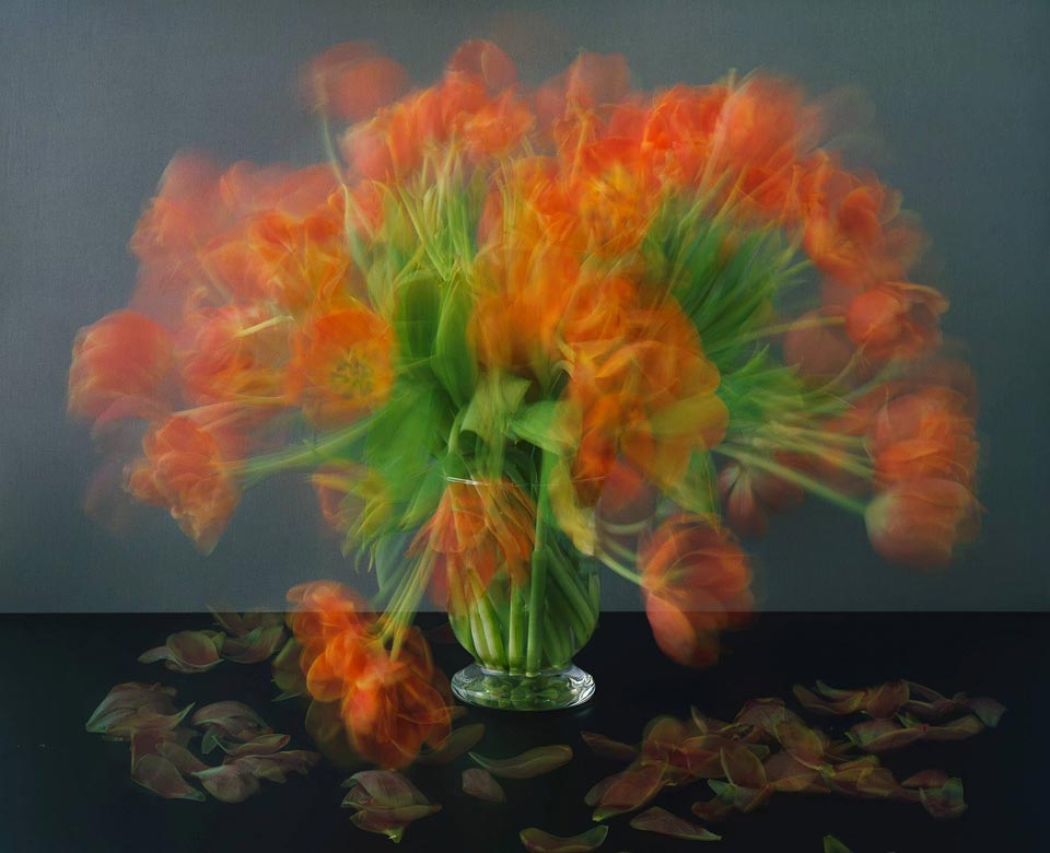
Start by doing your own research into some of the artists discussed above. Then, using slow shutter speeds, the multiple exposure function, or another technique inspired by the examples above, try to record the trace of movement within the frame. You can be as experimental as you like. Add a selection of shots together with relevant shooting data and a description of process (how you captured the shots) to your learning log.
Research
Robert Capa (B 1913-D 1954) was a Hungarian born war photographer and known for some of the greatest combat and adventure photographs in modern times. he was the only civilian on omaha beach (D-Day), his images were known as the ‘magnificent eleven’ that were captured on that day. He stated he captured 106 photos but only eleven survived and were published in Time magazine, June 19th 1944.
Capa shots from that day have a quality of movement that have a movie-like feel, perhaps from an old cine camera. They give a sense of the hectic chaos that these soldiers were walking into. They are exhilarating and terrifying at the same time to look at and give both a sense of the enormity and the individuality of the situation. There is an urgency to the images that comes from the subject matter and the scenario that Capa finds himself in.
Hiroshi Sugimoto (B 1948 is a Japanese photographer and spoken of his work as an expression of ‘time’ exposed serving as a time capsule for a series of events. In 1978 he photographed his series Theatres he started the exposure at the beginning of the movie, then stopping at the end of the movie. These feel like a nod to modern viewing habits of consuming films alone at home. They also give life to the thought of what happens when the film has finished at the cinema and the audience has left? He is also well known for his Seascapes photos which have a haunting, timeless look about them created by giving equal space to vast expanses of air and water seemingly frozen in time.
Michael Wesely B 1963 German born photographer known for very long-exposures of landscapes, cities and still life. His work is fascinating as his exposures can take up too 2 years to create a dream-like quality to them. Wesely has said “Time is more like the vehicle i use to arrive at images and photos. The extreme length of exposure leads to a shift in perception. It’s no longer the motif alone that counts—that is often a more invisible than visible, merely looming presence. But peripheral conditions such as light, movement, and other atmospheric elements emerge differently as focal points”
I am intrigued by the techniques used by Wesely and the technology used to achieve the ultra-long exposures over weeks/months/years. The images are effectively time-lapse films captured in a single frame.
Alexey Titarenko B 1962 While researching Michael Wesely I came across the work of Titarenko, a contemporary of Wesley. His long-exposure urban scenes depicting the hustle of Russian people going about their business and are meant to depict both present and past of 20th century Russians. The way his images are staged, to me, make them look etherial and look like a cloud, a fog passing through the scene.
I wanted to get some shots of good movement and the opportunity of the fair being in town was too good to miss. I could have gone down in the daylight, but the lights at night were too tempting.
It appears I took quite a few snaps! Not all are usable due to camera shake as they were all hand-held shots.
Having looked through the images I selected a few that I edited in RAW then brought into Photoshop.
Canon 450D EF-S 10-18mm f/4.5-5.6 f/14 ISO 100 0.8 secsCanon 450D EF-S 10-18mm f/4.5-5.6 f/4.5 ISO 100 1/4 secsCanon 450D EF-S 10-18mm f/4.5-5.6 f/4.5 ISO 100 1/4 secsCanon 450D EF-S 10-18mm f/4.5-5.6 f/14 ISO 100 0.8 secsCanon 450D 70-300mm f/22 ISO 100 0.8 secsCanon 450D EF-S 10-18mm f/4.5-5.6 f/16 ISO 100 0.8 secs
Reflection
Once I’d chosen my subject matter, this was an enjoyable shoot experimenting with slow shutter speeds. I also tried a little focus-pulling with the 1st and 4th images above with some success.
My favourites are the 2 images of the waltzers. The static foreground and the cars and their occupants in motion give a nice juxtaposition between the 2 elements. However, I think all of the images give a great sense of movement.
References
100 Photographs | The Most Influential Images of All Time. 2021. See The Story Behind One Of the Most Courageous Images In Photojournalism. [online] Available at: <http://100photos.time.com/photos/robert-capa-d-day> [Accessed 29 July 2021].
Start by doing some of your own research into the photographers discussed above. Then, using fast shutter speeds, try to isolate a frozen moment of time in a moving subject. Depending on the available light you may have to select a high ISO to avoid visible blur in the photograph. Add a selection of shots, together with relevant shooting data and a description of process (how you captured the images), to your learning log.
Primary Research
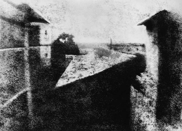
Joseph Nicéphore Niépce
Joseph Nicéphore Niépce, – View from the Window at Le Gras, c. 1826 “The World’s First Photograph” Harry Ransom Humanities Research Center, The University of Texas at Austin
Long before the first public announcements of photographic processes in 1839, Joseph Nicéphore Niépce, a scientifically-minded gentleman living on his country estate near Chalon-sur-Saône, France, began experimenting with photography. Fascinated with the craze for the newly-invented art of lithography which swept over France in 1813, he began his initial experiments by 1816. Unable to draw well, Niépce first placed engravings, made transparent, onto stones coated with light-sensitive varnish of his own composition. These experiments, together with his application of the then-popular optical instrument, the camera obscura, would eventually lead him to the invention of the new medium.
In 1824 Niépce met with some degree of success in copying engravings, but it would be two years later before he utilized pewter plates as the support medium for the process. By the summer of that year, 1826, Niépce was ready. In the window of his upper-story workroom at his country house, Le Gras, he set up a camera obscura, placed within it a polished pewter plate coated with bitumen of Judea (an asphalt derivative of petroleum), and uncapped the lens. After a day-long exposure of eight hours, the plate was removed and the latent image of the view from the window was rendered visible by washing it with a mixture of oil of lavender and white petroleum, which dissolved away the parts of the bitumen that had not been hardened by light. The result was the permanent direct positive picture you see here—a one-of-a-kind photograph on pewter. It renders a view of the outbuildings, trees and landscape as seen from that upstairs window.
An ultimately doomed attempt to interest the Royal Society in his process—which he called “Heliography”—brought Niépce and the first photograph to England in 1827. Upon his return to France later that year, he left his precious artifact with his host, the British botanist Sir Francis Bauer, who dutifully recorded the inventor’s name and additional information on the paper backing of the frame that held the unique plate. Niépce formed a partnership with the French artist, Louis Jacques Mandé Daguerre, in 1829, but produced little more work and died, his contributions chiefly unrecognized, in 1833.
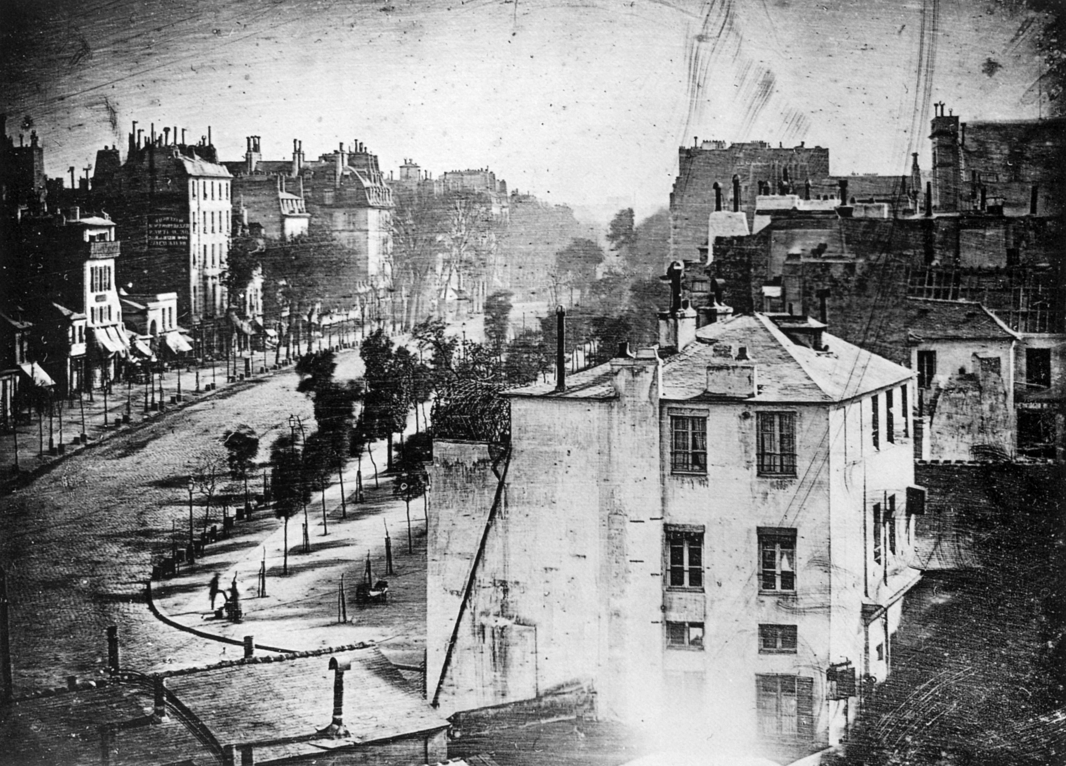
Louis Jacques Mandé Daguerre
View of the Boulevard du Temple, taken by Daguerre in 1838 in Paris, includes the earliest known photograph of a person
In 1829, Daguerre formed a partnership with Nicéphore Niépce, who had been working on the problem of how to make a permanent image using light and chemistry—and who had achieved primitive but real results as early as 1826. By the time Niépce died in 1833, the partners had yet to come up with a practical, reliable process.
Daguerre’s process was revealed on August 19th 1839 and seemed magical. Each daguerreotype is a remarkably detailed, one-of-a-kind photographic image on a highly polished, silver-plated sheet of copper, sensitized with iodine vapors, exposed in a large box camera, developed in mercury fumes, and stabilized (or fixed) with salt water or “hypo” (sodium thiosulfate). Although Daguerre was required to reveal, demonstrate, and publish detailed instructions for the process, he wisely retained the patent on the equipment necessary to practice the new art. From its inset, photography had a dualism about it—as a medium of artistic expression and as a powerful scientific tool—and Daguerre embraced both.
Eadweard Muybridge
In 1878 Muybridge set out to answer the question “When a horse trots or gallops, does it ever become fully airborne?”. Muybridge developed a way to take photos with an exposure lasting a fraction of a second and, with reporters as witnesses, arranged 12 cameras along a track on Stanford’s estate. When the horse ran by it tripped wires connected to the cameras which produced a series of images that showed the horse completely off the ground. This led to the idea that photography could be used to capture truth through technology. Muybridge’s work was an early form of animation that led to the beginnings of the motion picture industry. Muybridge went on to capture more animals and people in his locomotion photos.
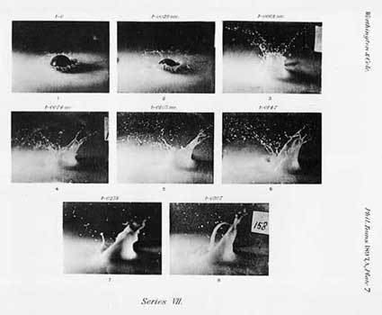
A M Worthington
“The splash of a drop is a transaction which is accomplished in the twinkle of an eye…”
Worthington’s experiments in trying to freeze an image in time using faster shutter speeds are most famously seen in his images of splashes in his fluid mechanics publication of 1908.
Harold Edgerton
Edgerton took the work of Worthington and refined it with his most famous work being that of a milk droplet splashing on to a gloss red plate.
Edgerton synchronized his electronic stroboscope with a special high-speed motion-picture-camera so that with each flash, exactly one frame of film was exposed. The number of flashes per second determined the number of pictures taken.
Motion pictures are normally exposed and projected at 24 frames per second, but when pictures are made at a higher rate and projected at normal speed, the apparent movement is slowed down. Edgerton designed high-speed motion-picture cameras that could expose as many as six thousand to fifteen thousand frames per second. When these films were projected at normal speed (24 frames per second), very high-speed events appeared – and could be studied – in extremely slow motion.
Edgerton’s splash work reminded me of the branding for Crown Paints, which obviously took its inspiration from it.
Philip-Lorca DiCorcia
DiCorcia’s ‘Heads’ is a collection of 17 images taken on the streets of New York in which the subjects were unaware that their photos were being taken. This form of street photography was taken in broad daylight which disguised the strobe lighting used to highlight the passers-by as they went about their daily business. The light was used to illuminate the most minute details of the subjects while the background fades away.
Controversially, one of diCorcia’s subjects sued the artist and his gallery for exhibiting, publishing, and profiting from his picture, arguing that it was taken without his permission and therefore violated his right to privacy (and his religious beliefs). DiCorcia countered that he did not seek consent because, “There is no way the images could have been made with the knowledge and cooperation of the subjects.” The artist ultimately won the case.
Shots
My initial thoughts were to do something with the children’s Lego, maybe dropping it from height and photographing it bouncing as it landed. This would require making noise, and being limited to evenings while the boys were asleep this would prove tricky.
So, plan B was to come back to the water experiments of Worthington and Edgerton. But how to capture an image that I could use with water in the limited free time I had.
As it was the hottest part of the year, the sprinkler was on the garden most evenings and wouldn’t take much to use this as it was the type of sprinkler that sends out pulses of water and I thought I would see if I could capture the individual pulses of water that weren’t normally clearly visible.
I took my camera and my 50mm prime lens and my 70-300mm zoom into the garden and tried my best to dodge the jets of water and take a good shot while keeping my camera dry.
I started with my 50mm and had the camera set to shutter priority with a high speed setting. I had to get quite close to the subject to get a shot. This was the result…
Canon EOS 450D EF50mm/f1.8 1/4000 sec f1.8 ISO 800
This was OK, but not what I had in mind. I wasn’t sure that the 50mm was the right lens for this. So I switched to my zoom.
This lens helped me keep out of the range of the sprinkler! It also gave me a wider field of view. I switched to manual focus here too as I felt it gave me better control over the focal point of the image I wanted to capture. With the high shutter speed, I also set the camera to burst mode to continually shoot when the shutter release is pressed.
I took quite a few shots, most of which weren’t of any use. However, there were a couple that I particularly liked which had some depth of field while focusing on the water pulse…
Canon EOS 450D 70-300mm 1/4000 sec f4.0 ISO 1600
This image was more like what I was looking for and it had captured drops of water in mid-flight with a shallow(ish) depth of field with the evening light glinting on the water pulse.
Close-up of the water drops
I had also captured another similar shot which I felt was better as the depth of field in the water was shallower…
Canon EOS 450D 70-300mm 1/4000 sec f4.0 ISO 800 Close-up of water drops
I feel that this is a stronger image than the first due to the water being clearer with more bokeh.
Reflection
Overall, I think I was initially overthinking this exercise. I think that keeping it simple with the sprinkler gave some good results and I was surprised with the amount of detail I could capture with the camera in-hand. Obviously with the shutter speed being so high, getting light through the lens by upping the ISO affects the clarity of the images when you zoom in or blow them up, so this would be a problem for large format reproduction.
Follow up
I decided to have another go in the garden for some movement capture. I decided to again focus on the front garden, but this time I chose a subject a little more natural – the plentiful supply of bees buzzing around the lavender. Due to their speed, trying to focus on a single bee would prove difficult! I decided to focus on the foliage and try to capture the bees when they were in the vicinity. I set the camera to burst setting with maximum shutter speed and largest ISO and went out to see what I could get. It took a lot of photos with the aim of capturing the bees with their wings frozen in time. This was harder than it looked down to the insect speed being greater than my ageing camera’s speed. However, I did manage to capture one successful image that froze a single bee in time with some amazing detail. After some editing in Lightroom to remove some of the graininess produced by the high ISO and some colour correction I was happy with the result.
‘Fragments of a vessel which are to be glued together must match one another in the smallest details although they need not be like one another.’
(Walter Benjamin, [1936] 1999, p.79)
The Walter Benjamin quote above expresses the idea that a collection should reflect a single coherent idea, but you’ll also need technical rigour to match the photographs to each other ‘in the smallest details’. Start by choosing your focal length, aperture and viewpoint combination in advance.
Visually, similarities correspond so they’re easy to look at, but be careful of duplicates because repetition is boring. Differences are interesting because they contrast, but randomly changing your framing or allowing a confusion of detail into your backgrounds will distract from the viewing.
Brief
Create a series of between six and ten photographs on one of the following subjects:
Things
Views
Heads
Albert Renger-Patzsch’s photobook ‘The World is Beautiful’ upset Walter Benjamin when it first appeared in 1928 and he railed against it in his famous essay ‘A Short History of Photography’ (easily available on the internet). He thought that this kind of photography denied social contexts – ‘the world is beautiful’ because that’s all you’ve got to say about it. However, Renger- Patzsch’s book was originally called ‘Things’ and rather than present a superficial beauty the point was more to let things speak quietly for themselves.
In ‘Species’ OCA tutor Andrew Langford recalls the sense of dislocation that he experienced visiting natural history collections as a child,
‘These specimens were very carefully arranged within the total black picture space and, for me, evoked a personal memory as a child of visiting natural history collections and experiencing the highly detached, organizational systems of presentation. These systems seemed so at odds at the time with my real life sense of ‘the natural’ as a fully integrated phenomenon, to which I sensed that I was seamlessly connected’.
And for a theoretical discussion on the distinction between landscapes and views have a look at ‘Photography’s Discursive Spaces: Landscape/View’ by Rosalind Krauss (also available online).
For ‘Views’ you’ll probably either need a driver or be prepared to do some walking. Either way if you keep the weight of your equipment to a minimum you’ll see more.
‘The resulting portraits aren’t what you’d normally expect from portraiture. The subjects are not engaging with me or with the camera, it is almost as if they are in a different world’.
(Bettina von Zwehl (2007) p71)
You can find more on von Zwehl’s approach to portraiture in Charlotte Cotton’s ‘The Photograph as Contemporary Art’ that you will have received when you started EYV.
Heads don’t have to be deadpan, or even human. There’s a fair amount of variation in Mårtin Lange’s ‘Citizens’ series but there is no questioning its overall visual coherence: https://martenlange.com/works/citizen/#1
Some of the examples given above are for collections of photographs, others for photographs of collections, but whichever way you go, your set will be stronger if it relates in some way to your interests in life and photography.
Research
“…In order to photograph with any degree of continuous passion, you must have a fascination for the subject…”
Bill Jay on ‘The Thing Itself’
Looking at the photographers mentioned above, I was drawn to Andrew Langford’s Species because of its abstract look at everyday objects and how they looked like cross-sections of shells and orchids.
I really like the symmetry in the everyday objects viewed from a different perspective.
26 Gasoline Stations by Ed Ruscha reminded me of the village petrol stations you see in the more rural parts of this country, not as shiny as the big name petrol companies, run down and kind of rustic. This could be an angle as there are a couple of independent garages near to where I live. During my research, I came across a modern tribute to Ruscha’s work by Eric Tabuchi, a French photographer, taken 45 years after the initial publication.
A modern tribute to Ed Ruscha’s 26 Gasoline Stations by Eric Tabuchi 2002-2008
Initial ideas
Things to take from the brief:
You’ll need technical rigour to match the photographs to each other ‘in the smallest details’
Start by choosing your focal length, aperture and viewpoint combination in advance.
Similarities correspond and are easy to look at, but be careful of duplicates because repetition is boring.
Randomly changing your framing or allowing a confusion of detail into your backgrounds will distract from the viewing.
I will try to stick to these guidelines as much as I can with the equipment that I have.
Of the 3 subjects I wasn’t initially sure which to choose.
Heads: This was the the one that inspired me the least. Living in a small village limited my subject matter, not sure how the local residents would react to a bit of street photography and would I get the chance to get several together? Portraiture could be a possibility, with limited subjects.
Views: This seemed to be fairly open ended subject and gave options for the view from the windows of the house, to venturing further afield to the moors or the coast.
Things: this subject had me referring back to the Bill Jay quote about familiarity with your subject matter. This got me thinking about other interests of mine such as rugby, scuba diving, DIY, food and the garden.
Things
I decided to go for ‘Things’.
Andrew Langford’s Species had reminded me of some of the photography I have in one of my cookbooks from my previous life. Unlike most food photography, the shots in Modernist Cuisine are a bit more abstract and show the food and cooking processes in a whole new light.
This was given to me as a gift from my wife and I was instantly captivated by the tome’s imagery and how the shots had been composed.
The photographs were taken by Nathan Myhrvold, ex-Microsoft Research founder and prominent scientist. Myhrvold holds a doctorate in theoretical and mathematical physics, as well as a master’s degree in mathematical economics, from Princeton University. His master’s degree in geophysics and space physics, as well as his bachelor’s degree in mathematics, are from the University of California, Los Angeles.
Food and cooking have been passions of Myhrvold since childhood. While at Microsoft, he worked nights at a Seattle restaurant with chef Thierry Rautureau and then obtained a culinary degree at Ecole De La Varenne in Burgundy. In 2007, he founded The Cooking Lab, a culinary research laboratory, photo studio, and publishing company. In 2011, he published a five-volume, 2,500-page cookbook, Modernist Cuisine: The Art and Science of Cooking. That book and its 2017 sequel of even greater length, Modernist Bread, both won James Beard cookbook awards. His one-volume book Modernist Cuisine at Home (2012) has been translated into seven languages. Building on his 2013 book The Photography of Modernist Cuisine, Myhrvold opened a gallery of his food photography in Las Vegas in 2017. Modernist Cuisine Galleries have since opened in New Orleans, Seattle, and La Jolla.
Of the images created by Myhrvold, the macro shots were probably the ones that I could take inspiration from even though I don’t own a macro lens…yet! I wanted to see what I could create in a similar vein to this. I wanted to create something that wouldn’t be instantly recognisable and somewhat abstract at first where the eye initially can’t distinguish what it is looking at.
Without a dedicated macro lens I’d have to make do with what I had.
My improvised setup: Canon EOS 450D and Sigma 70-300mm f4-5.6 DG OS
I wanted to create something using food, so I started with raiding the fridge. This didn’t prove too fruitful(pardon the pun!) and all I could find was some broccoli. But I thought that I could at least practice on the broccoli and see what I could get from the greengrocer’s later in the week. I was surprised what I could achieve with the lens I had…
Canon 450D Sigma 70-300mm 1/50 sec f5.6 ISO 100
I was really happy with the abstract feel of this shot. I wasn’t sure to use it in full colour or black and white, which I also liked…
Canon 450D Sigma 70-300mm 1/50 sec f5.6 ISO 100
Next was a trip to the shops to try and find something a little more exotic than some broccoli! My trip was reasonably successful, as much as it could be in sleepy Devon and I tried to recreate my earlier success with the brassica.
I found it hard to recreate an image in a similar style to my first image and couldn’t achieve the same success in black and white. This answered the question about colour or black and white. The ‘collection’ idea would come from the subject matter rather than the image style due to my lack of success replicating my initial success.
I decided upon playing with different scales and visual depth to add interest to the subsequent images with varying success.
Canon 450D Sigma 70-300mm 1/10 sec f5.6 ISO 100Canon 450D Sigma 70-300mm 1/8 sec f5.6 ISO 100Canon 450D Sigma 70-300mm 0.4 sec f5.6 ISO 100Canon 450D Sigma 70-300mm 1/30 sec f5.6 ISO 100Canon 450D Sigma 70-300mm 1/25 sec f5.6 ISO 100Canon 450D Sigma 70-300mm 1/50 sec f5.6 ISO 100Canon 450D Sigma 70-300mm 1/8 sec f5.6 ISO 100
The Collection
Reflection
Once I found a direction that I could use I found this assignment enjoyable. I was impressed with what a telephoto lens could achieve in regards to macro/micro photography. The level of detail that could be seen and the depth of field that could be achieved, especially at such high magnification and zoom. I also liked the way that it isn’t completely obvious in some of the shots what the subject is. I could have gone a step further and just used black and white imagery, but I don’t think I could’ve achieved the same amount of contrast and vibrance that the coloured versions give.
I personally think that my initial broccoli image is the strongest and chives what I set out to do. The others aren’t as strong, but they do work as a collection.
Find a subject in front of a background with depth. Take a very close viewpoint and zoom in; you’ll need to be aware of the minimum focusing distance of your lens. Focus on the subject and take a single shot. Then, without changing the focal length or framing, set your focus to infinity and take a second shot.
As you review the two shots, how does the point of focus structure the composition? With a shallow depth of field the point of focus naturally draws the eye, which goes first of all to the part of the image that’s sharp.
Achieving deep depth of field might appear easy compared to the difficulties of managing shallow depth of field. We’re surrounded by images made with devices rather than cameras, whose short focal lengths and small sensors make it hard to achieve anything other than deep depth of field. The trick is to include close foreground elements in focus for an effective deep depth of field image. Foreground detail also helps to balance the frame, which can easily appear empty in wide shots, especially in the lower half. When successful, a close viewpoint together with the dynamic perspective of a wide-angle lens gives the viewer the feeling that they’re almost inside the scene.
Again without moving the camera, select a very small aperture (perhaps one stop above the minimum to avoid diffraction) and find a point of focus that will give you acceptable sharpness throughout the entire field, from foreground to infinity. Take a third shot and add it to the first two to make a set.
The exercise is also a way of thinking about attentional focus. According to some of the most recent thinking in neuroscience, the left hemisphere of the brain attends more to detail while the right hemisphere attends more globally. It’s rather like a woodpecker pecking an insect out of the tree while at the same time keeping an eye out for predators. In photography, you could say that having a good grasp of detail allows you to master the technical aspects while seeing the connections between things makes meaning. You’ll return to this point in Exercise 3.3.
First Shot
I was fortunate enough to stay with friends in an amazing property with large grounds and a walled garden which gave a great backdrop for this exercise. The walled garden had some very decorative doors which I thought would be a good place to to focus my attention.
The first shot I focused on the door’s decorative panel and used a shallow depth of field to blur what was beyond it.
Second image
Not only was I fortunate enough to be in this location, I was also lucky enough to catch one of the resident peacocks (not a woodpecker!) wandering inside the walled garden.
Third image
This was the trickiest of the 3 images and I didn’t really achieve what I set out to achieve with the shot. I did however like the shot and the fact the focal point was just beyond the door but you could still make out the various elements of the composition. I also had to remove a security light above the door in photoshop as it spoiled the feel of the image.
Reflection
Overall. this exercise has illustrated to me how to achieve a good range depth of field, even with a large zoom lens. I didn’t fully understand the brief initially and as a result the third image doesn’t have the depth of field I set out to achieve. I do believe that the 3 images do create a very nice series though.
Find a location with good light for a portrait shot. Place your subject some distance in front of a simple background and select a wide aperture together with a moderately long focal length such as 100mm on a 35mm full-frame camera (about 65mm on a cropped-frame camera). Take a viewpoint about one and a half metres from your subject, allowing you to compose a headshot comfortably within the frame. Focus on the eyes and take the shot.
Wide apertures create shallow depth of field, especially when combined with a long focal length and a close viewpoint. In human vision the eye registers out-of-focus areas as vague or indistinct – we can’t look directly at the blur. But in a photograph, areas of soft focus can form a large part of the image surface so they need to be handled with just as much care as the main subject.
Don’t forget that the camera’s viewfinder image is obtained at maximum aperture for maximum brightness and therefore at the shallowest depth of field. Use the depth of field preview button to see the actual depth of field at any particular aperture. It’s surprising to see the effect that a single f stop can have on the appearance of an image.
My shot
Canon EOS 450D 70-300mm ISO 100 133mm f/4.5 1/100 sec
Conclusion
Focussing on the subject even closer, with the widest aperture the lens will allow, gives even more contrast between the subject and the background. The shallow depth of field makes the subject stand out more from the background. The lack of focus in the background makes the eye concentrate on the in-focus subject. This technique could have a wide variety of applications and is often used in media and sport to accentuate what is happening in the scene.
‘I’m inclined to think that there is no such thing as a photojournalistic image, only a photojournalistic use of an image.’
(David Campany)
Read around the photographers above and try to track down some of the quotations, either in the course reader (Liz Wells) or online. Write up your research in your learning log.
Now look back at your personal archive of photography and try to find a photograph to illustrate one of the aesthetic codes discussed in Project 2. Whether or not you had a similar idea when you took the photograph isn’t important; find a photo with a depth of field that ‘fits’ the code you’ve selected. Add a playful word or title that ‘anchors’ the new meaning.
The ability of photographs to adapt to a range of usages is something we’ll return to later in the course.
Wim Wenders
‘The most political decision you make is where you direct people’s eyes.’
(Wim Wenders (1997) quoted in Broomberg & Chanarin, 2008)
Wim Wenders, ‘Drive-in at night’, Montréal, Canada, 2013. Image courtesy the artist and BlainSouthern
As photographers we see things and then try to capture them in a way that reflect that vision and share that with other people. A lot of the photographs that people take are for family albums or to share online with family and friends. In the majority of these cases, very little thought is given to positioning of the subject within the image, or where the eye might be drawn.
Wenders also once said that photography is akin to “watching death at work,” as the contents of the image will inevitably change, fade, or cease to exist. This leads to photographs being unique and impossible to recreate.
Andre Bazin
‘Deep focus give the eye autonomy to roam over the picture space so that the viewer is at least given the opportunity to edit the scene himself, to select the aspects of it to which he will attend.‘ Bazin (1948)
Deep focus cinematography brings everything that can be seen in the foreground, mid-ground and background of a frame into focus at the same time. To achieve this, the cinematographer must manipulate lighting, composition, camera lens and depth of field. The depth of field refers to the distance from the object or character at the front of the image to the object or character at the back. To achieve deep focus there is usually a large depth of field, which refers to a large distance between the foreground and the background. The use of deep focus means that the mise-en-scène is more significant and meaningful, as everything can be seen very clearly.
The human eye does not naturally focus from close up to infinity at the same time. The eye focuses on certain things while allowing other things to lose focus, to blur. It would seem natural then for photographs to show scenes in a similar way, which would also allow the photographer to direct people’s eyes as indicated in the quote by Wenders above.
However, that isn’t how the world exists. The world around us doesn’t drift in and out of focus as people look at it. Instead it is constants. It’s the way our eye focuses and interprets the light that hits our retina that governs how we see it.
F/64 Group
The name of this Group is derived from a diaphragm number of the photographic lens. It signifies to a large extent the qualities of clearness and definition of the photographic image which is an important element in the work of members of this Group. The chief object of the Group is to present in frequent shows what it considers the best contemporary photography of the West; in addition to the showing of the work of its members, it will include prints from other photographers who evidence tendencies in their work similar to that of the Group. Group f/64 does not pretend to cover the entire of photography or to indicate through its selection of members any deprecating opinion of the photographers who are not included in its shows. There are great number of serious workers in photography whose style and technique does not relate to the metier of the Group. Group f/64 limits its members and invitational names to those workers who are striving to define photography as an art form by simple and direct presentation through purely photographic methods. The Group will show no work at any time that does not conform to its standards of pure photography. Pure photography is defined as possessing no qualities of technique, composition or idea, derivative of any other art form. The production of the “Pictorialist,” on the other hand, indicates a devotion to principles of art which are directly related to painting and the graphic arts. The members of Group f/64 believe that photography, as an art form, must develop along lines defined by the actualities and limitations of the photographic medium, and must always ‘remain independent of ideological conventions of art and aesthetics that are reminiscent of a period and culture antedating the growth of the medium itself.’ The Group will appreciate information regarding any serious work in photography that has escaped its attention, and is favourable towards establishing itself as a Forum of Modern Photography. (Group f/64 Manifesto , 1932)
The f/64 Group consisted of a number of photographers of the calibre of Ansel Adams, Edward Weston and Imogen Cunningham. Their aim was to produce images that were sharply focused, carefully composed and which did not rely on any of the techniques associated with art prior to the development of photography, and especially those techniques that were related to painting. There are ideas, techniques and rules used in painting that are useful to photographers who are starting out. The Rule of Thirds, Golden Ratio, the use of light and shadows, these have been explored and refined over centuries in order that artist can produce works that are pleasing to the eye and invoke emotions in the viewer. Learning these rules and techniques is very useful. Knowing how to do something correctly is the first stage in being able to break the rules. The same applies with photography, once you are aware of the techniques then you are able to move away from them in an informed manner that will enable you to produce works that fit with your vision. Images where most, if not all of the image, is sharply focused are good but images that are softly focused or make use of blurring of elements can equally produce results that are pleasing to the eye.
Fay Godwin
One-way bridge at Trafalgar, by Fay Godwin
Fay Godwin didn’t want to be seen as a landscape photographer, preferring to be considered a documentary photographer. Her interest is not in the landscape (and thus, she has no interest in producing conventionally aestheticised landscape images: in a 1986 South Bank Show interview she states that she is ‘wary of the picturesque’), but rather in human engagement with, material impact on and use of the landscape. Her work uses predominantly large depth of field and was integral to her landscape and close-up work.
Gianluca Cosci
Cosci doesn’t consider himself a photographer but an artist that uses the camera simply as a medium.
His work “Panem et Circenses” which is latin for “bread and circuses”. This phrase was supposedly coined by Juvenal (AD 100, a Roman satirical poet), describing the cynical formula of the Roman emperors for keeping the masses happy with ample food and entertainment.¹
On Cosci’s web site there is a an interview with Kevin Byrne in April 2016, Byrne, a teacher and a photographer based in Taranto Italy, gives some insight to Cosci’s thinking and the Circenses work. Cosci says that when he came to London, a world capital, from Bologna and that he was overwhelmed by it, he said he was both fascinated by the city’s confidence, superiority and authority but also repulsed by places such as Canary Wharf and the City of London, displaying obscene amounts of wealth and power. (Byrne, 2016)
I could relate to this comment as I had similar feelings when I originally moved to London from ‘sleepy’ Devon and being in awe of the 24/7, high speed nature of the city which was exhilarating and terrifying in equal quantities.
His work made I think as a reaction to the feeling of fascination and repulsion and how images can have an underlying meaning or message, rather than just capturing a moment in time. The photographs in Panem et Circenses have a very shallow depth of focus, examining detail in narrow slithers of focus. The unfocused areas blur into confusion and the eye is always brought back to the detail. Details of weeds, for example, claiming patches of land do indeed give the feeling of desolation and abandonment, which is interesting as there is not much other content visible.
Mona Kuhn
Kuhn’s (2019) website displays 12 images from her Evidence series.
In ten of these twelve images people can be seen. In the others there is a noticeable absence of a person but there remains evidence of their existance which tells something about the person.
The image Closer has a voyeuristic edge to it, as a figure, that I assume is Kuhn, can be seen reflected in the window taking the photograph. The eyes of one of the figures looking directly at the photographer, and the partially turned head of the second figure, give the impression that something private has been interupted. Although all the figures in the images are naked, as far as can be told with regards to those images where the whole figure cannot be seen, Kuhn’s use of depth of field provides them with a level of privacy while also sharing intimate moments.
Kim Kirkpatrick
I found when searching for both the website that was linked to in the course notes and also using online search mechanisms that finding out about Kim Kirkpatrick was very difficult, especially when it came to examples of his work.
Guy Bourdin
Tate and ICP search results show very different examples of Bourdin’s work. The Tate examples are in black and white, while the International Center of Photography examples are all colour and from a series called Sighs and Whispers. These latter has the feel of a magazine fashion shoot to them, in particular for a more high end fashion magazine or label.
Each of the ICP images has an intensity to it, whether that is from the looks that the models appear to be giving the viewer, a sense that the figures are waiting for something to happen.
The Tate examples are from an earlier period in Bourdin’s career. Even so it is possible to see some of what would be used in his later fashion work. An image of bleached bones and carcusses on a floor looks menacing as does an image of a rusted door lock.
David Campany
‘I’m inclined to think that there is no such thing as a photojournalistic image, only a photojournalistic use of image.’ David Campany
The above quote is in response to a comment on an article that Campany(2013) wrote in May 2013.
The discussion was the result of an article that Campany had publised that discussed the work of Eve Arnold and Don McCullin that had appeared in The Sunday Times magazine. In contrast with the McCullin piece, which used some of his images captured in Vietnam, the Arnold piece used images captured in North Carolina at a facility built to replicate a North Vietnamese village that could be used to train American troops before they embarked for a tour in Vietnam. McCullin’s piece showed how things were in country, while Arnold’s piece was a step removed from this and the dangers soldiers, journalists and photographers faced while in the war zone.
Whereas McCullin photographs were more immediate and could not be planned out easily. Arnold had the luxury of being able to take more time over her shots and to achieve results that could be influenced by other areas of photography, for instance fashion photography. In response to the comment Campany argues that all images can be seen as forms of different genres of photography, for instance fashion, portrait, landscape, architectural etc. It is the use of the image to report on events that makes them photojournalistic.
With the use of mobile phones to capture images and video as events play out, by members of the public, who are by their very nature not journalists but either bystanders, or actual participants, in the events they are capturing, Campany’s point is a lot easier to understand. It is not the actual image but how it is used that defines how we see it.
My Image
‘High Point’ Haytor, Devon – ISO 100 133mm f/5.6 1/200
Does zooming in from a fixed viewpoint change the appearance of things? If you enlarge and compare individual elements within the first and last shots of the last exercise you can see that their ‘perspective geometry’ is exactly the same. To change the way things actually look, a change in focal length needs to be combined with a change in viewpoint.
Select your longest focal length and compose a portrait shot fairly tightly within the frame in front of a background with depth. Take one photograph. Then walk towards your subject while zooming out to your shortest focal length. Take care to frame the subject in precisely the same way in the viewfinder and take a second shot. Compare the two images and make notes in your learning log.
As you page between the two shots it can be shocking to see completely new elements crash into the background of the second shot while the subject appears to remain the same. This exercise clearly shows how focal length combined with viewpoint affects perspective distortion. Perspective distortion is actually a normal effect of viewing an object, for example where parallel train tracks appear to meet at the horizon. A ‘standard lens’ – traditionally a 50mm fixed focal length lens for a full-frame camera (about 33mm in a cropped-frame camera) – approximates the perspective distortion of human vision (not the angle of view, which is much wider). A standard lens is therefore the lens of choice for ‘straight’ photography, which aims to make an accurate record of the visual world.
My shots
Canon EOS 450D ISO 100 300mm f/5.6 1/100 secCanon EOS 450D ISO 100 70mm f/5.6 1/100 sec
Once I’d convinced my wife to take part, and the weather had finally turned into something that resembled spring, I took my camera and tripod into the garden and set up at the bottom of the drive. I positioned my subject at the other end of the drive in a suitable spot for the camera’s maximum focal length.
The first shot(with a grumpy subject) was cropped quite close by the lens and gave a fairly shallow depth of field.
The second shot, with the shortest focal length captured much more of the surroundings with a more ‘wide-angled’ view. It gives more of a sense of depth than the first shot as it is closer to the ‘standard lens’ length and therefore gives a truer view. Below are the highlighted areas of the photograph that can be seen with a shorter focal length.
Reflection
I hadn’t previously looked too closely at what effect the zoom had on a subject, its surroundings and the perception of the subject matter. This exercise has highlighted what a longer lens can do and what advantages and disadvantages it has. The focal length of my 70-300mm lens definitely exaggerated this.
‘ …there is no approach, approach suggests moving nearer, getting closer, suggests that we are not already near or close enough’
Stanley Cavell
Find a scene that has depth. From a fixed position, take a sequence of five or six shots at different focal lengths without changing your viewpoint. (You might like to use the specific focal lengths indicated on the lens barrel.) As you page through the shots on the preview screen it almost feels as though you’re moving through the scene. So the ability to change focal lengths has an obvious use: rather than physically move towards or away from your subject, the lens can do it for you. But zooming is also a move towards abstraction, which, as the word itself tells us, is the process of ‘drawing things away’ from their context.
Zooming also allows you to capture details at higher resolutions and this has been memorably explored in cinema. The film Blade Runner (Dir. Ridley Scott, 1982) provides a prescient vision of the future of photography from just before the dawn of the digital age.
The blade runner Deckard (played by Harrison Ford) treasures his old, silver-based family photographs but, like us, he uses a screen for viewing images at work. With his ‘Esper’ machine he can navigate around an image in virtual three dimensions by using voice commands. The resolution is incredible (think Google Earth) but at maximum resolution where you would expect to see pixels the image just dissolves into film grain.
In Michelangelo Antonioni’s film Blow Up (1966), David Hemmings plays a disaffected young photographer (based partly on David Bailey) who accidentally photographs a murder. Hoping to understand the situation that he’d unwittingly witnessed, he frantically ‘blows up’ the negatives to the limit of intelligibility, but the result is inconclusive. The frustratingly unresolved situation is a favourite motif of Antonioni as a comment on modern life.
‘Google Arts and Culture’ offer a digitally immersive exploration of cultural institutions around the world through a combination of very high-resolution images and Google’s own ‘Street View’ technology. While Holbein’s ‘The Ambassadors’ shot on a gigapixel camera is admittedly impressive, zooming in to it ultimately just resolves to craquelure and dust.
Taking inspiration from the examples above or from your own research, create a final image for your sequence. In EYV the important thing is to present your work in context, so make it clear in your notes what you’ve been looking at and reading. The focus here is on imagination and research skills rather than the technical aspects of zoom.
Zoom
Esper
Blade runner is an iconic film in the cinematic world and also one of my favourites. Having it used as research in this module has surprised me and I had to watch it again.
The Esper is a super computer used by the police in Blade Runner. It is briefly described in the official Blade Runner Souvenir Magazine, but a 1982 presskit for the film provides the most detail:
“A high-density computer with a very powerful three-dimensional resolution capacity and a cryogenic cooling system. The police cars and Deckard’s apartment contain small models which can be channeled into the large one at police headquarters. This big apparatus is a well-worn, retro-fitted part of the furniture. Among many functions, the Esper can analyze and enlarge photos, enabling investigators to search a room without being there. Bryant briefs Deckard with the help of an Esper and Deckard examines Leon’s photos with one as well.”
I had a vague recollection of seeing this film at some point but wasn’t too sure. I researched the film to refresh my memory and put it into the context of this exercise.
Don McCullin created the iconographic photographs that in the film are blown up by Thomas to discover something about the alleged crime. However, the blow-ups only offer ambivalent proof as they become more and more blurred and abstract by the continuous enlarging. Even photography that supposedly represents reality like no other form of media cannot help in shedding any light on the mysterious events in the park.
I took a look at the Google Arts and Culture site and the image taken of Holbein’s The Ambassadors and zoomed in as far as I could. I took a screenshot of the result depicting the craquelure.
All 3 of these references show the limitations of the zoom function in both fiction and factual. I also looked at the limitations of Google Earth /Maps which uses a combination satellite and aerial photography to form composite images that still have their limitations when it comes to zooming in.
For the final image, I took it into Photoshop and reduced its size and resolution as far as I could. This made the image unrecognisable due to the lack of detail. It did give what was left an unreal and somewhat etherial qualities.
However, taking inspiration from the film Blow up, I rendered a magnifying sphere in the centre of the image focusing on the detail.
This seemed a little surreal and reminded me of MC Escher’s Hand with Sphere.
Reflection
This exercise has helped me to understand how the same image can be framed differently using the cameras lens rather than moving the camera itself. However, it does have its limitations on quality and clarity of the final image.


