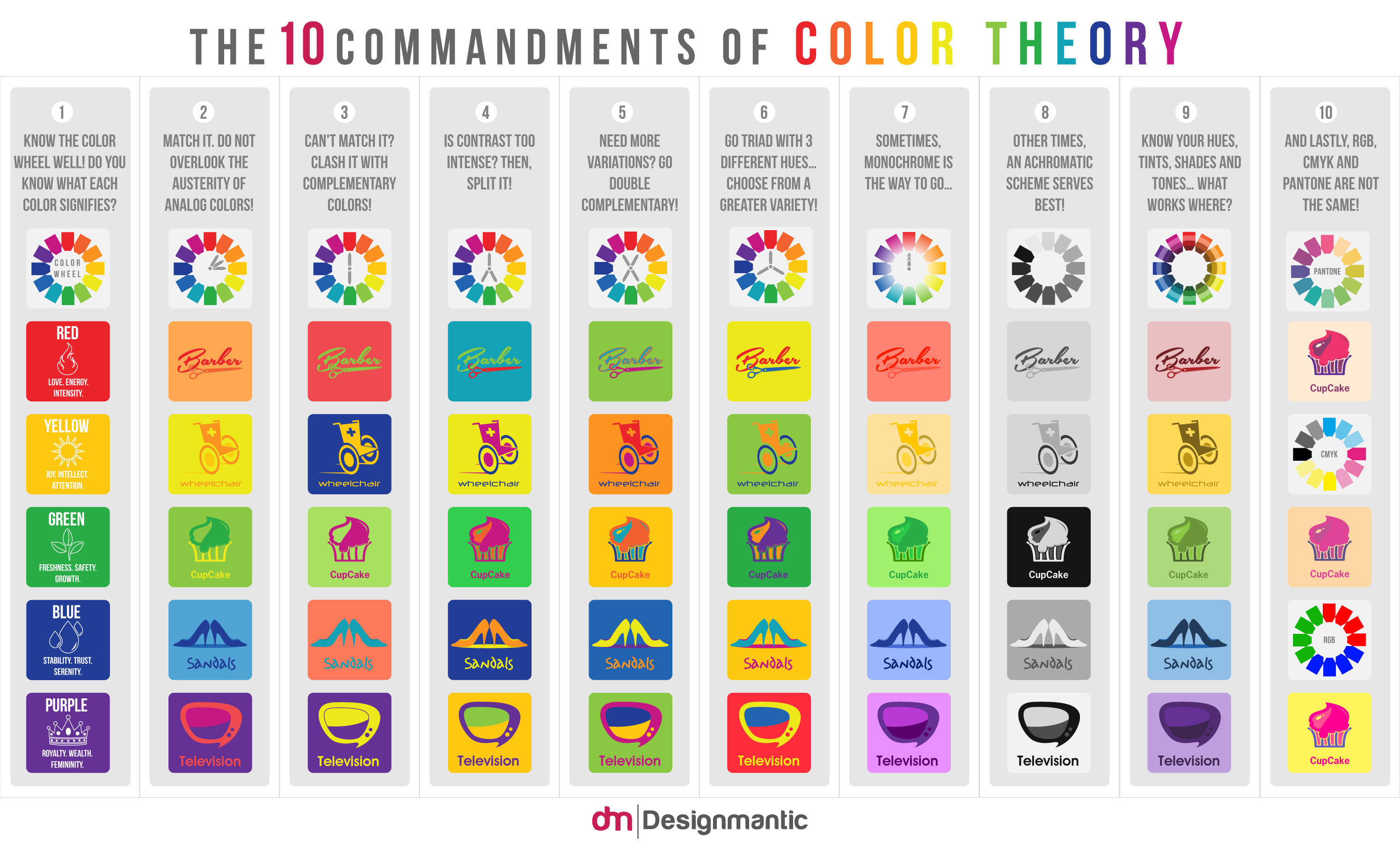
Source: Designmatic
The Designmatic infographic hinted at the emotions associated with different colours. I then found the image below which gives more info on colours and the emotions and feelings they are linked with.

Source: Colour Wheel Pro
Cultural relevance of colour
The importance of understanding the relevance of colour to your audience is something else that needs to be taken into account when designing anything involving colour. What a colour means to one culture may mean something completely different to another…

Western cultures (North America and Europe) Red is the colour of passion and excitement. It has both positive and negative associations — danger, love and excitement and when used with connection with the former Eastern block, it represents communism. Red is also associated with power and has some religious undertones when used with green to represent Christmas. The multiple, and varying, Western associations with the colour are a combination of different meanings from other cultures.
Eastern and Asian cultures Red is the colour of happiness, joy and celebration. It is often the colour worn by brides on their wedding day because it is thought to bring luck, long life and happiness. It is also a colour often associated with Chinese, because of the associations with luck and happiness. Specifically in India, the colour relates to purity and in Japan it is associated with life, but also anger or danger.
Latin America In Mexico and some other Latin American nations, red is the colour of religion when used with white.
Middle East Red evokes feelings of danger and caution. Some also consider it the colour of evil.
Around the world Red is worn to celebrate the Chinese New Year to bring luck, good fortune and prosperity.
Western cultures (North American and Europe) Orange is the colour of harvest and autumn. In the United States, for example, the colour is associated with Halloween and Thanksgiving. It is also associated with warmth and citrus fruits. In The Netherlands, where it is considered the national colour, the most common use of orange is to signify royalty.
Eastern and Asian cultures The hue, especially saffron (a yellowish orange that matches the colour of the plant) is sacred in Indian cultures. In Japan, orange tones are symbolic of courage and love.
Latin America Orange is considered sunny; it is also associated with the earth in some countries because of the reddish-orange ground colour.
Middle East Orange is associated with mourning and loss.
Around the world The colour can also have religious associations: It is the colour of gluttony in Christianity.

Western cultures (North America and Europe) The bright cheery nature of yellow is the predominant meaning in most Western nations. It is associated with warmth (the sun), summer and hospitality. In the United States, specifically, the colour is associated with transportation — taxis and school buses are yellow as are many different types of street signage. Tea maker Lipton, for example, uses yellow to market worldwide but there are changes in what colours people are wearing in advertising material if you toggle between sites aimed at different countries. In Germany, yellow is associated with envy (which is described as green in most other Western cultures).
Eastern and Asian cultures Members of the royal ruling class often wear this hue and the colour is considered sacred and imperial. In Japan, that definition is expanded to include courage (which is expected of rulers) and is the colour of commerce in India.
Latin America On the contrary, yellow is associated with death and mourning in many Latin cultures.
Middle East Though in Egypt, yellow is most closely associated with mourning (in much the same way as Latin American nations), it is more widely connected to happiness and prosperity in the Middle East. The associations with yellow are closely related to those of Western cultures.
Around the world In many African nations, only people with high rank in society can wear yellow. The more gold variations of the colour are universally associated with money, quality and success in most world cultures.

Western cultures (North America and Europe) The most popular colour for bank logos is blue because it represents trust and authority. The colour is also masculine and used to represent the birth of a boy. Blue is also considered to be calming, soothing and peaceful although it can also be associated with depression or sadness.
Eastern and Asian cultures The hue is ever-lasting in its association with immortality. In Indian culture blue is the colour of Krishna — a central figure in Hinduism and one of the most popular Hindu gods. Many Indian sports teams use the colour as a symbol of strength. Unlike in western cultures, where blue is associated with men, it is considered a feminine colour in China.
Latin America Because of the high Catholic population of Central and South America, blue is often associated with religion as the colour of the Virgin Mary’s robe or headscarf. Moreover, blue can cause an emotional stir because of its association with mourning. It is also the colour of trust and serenity in Mexico, and is the colour of soap in Colombia.
Middle East Blue is safe and protecting. It is the colour associated with Heaven, spirituality and immortality.
Around the world In Thailand, blue is the colour associated with Friday. Blue is often considered the most positive and safest colour for a global audience. Skype, the international web-based telephone company, uses a blue colour scheme for each of its sites around the world.

Western cultures (North America and Europe) Green is the colour of the Irish (think St. Patrick’s Day and it is also the national colour of Ireland) and represents luck throughout most of the West. Green also refers to nature, the environment and protection of environmental causes, such as “green business” or “green household cleansers.” Green is also associated with Christmas, when used in combination with red. It is also the symbol of progress — green means “go” — but can also represent of envy.
Eastern and Asian cultures Green is the colour of nature and new life in much of the East. It also represents fertility and youth. However, it can have equally negative connotations: green is the colour of exorcism and infidelity; in China, wearing a green hat is associated with cheating on your spouse.
Latin America In many Latin and South American cultures, green is the colour of death.
Middle East For the majority of the Middle East the strongest association with green is that of Islam. It represents strength, fertility, luck and wealth.
Around the world In the United States, green is the colour of money and is often associated with jealousy. Green, superficially olive green, is the colour of almost every active military in the world.

Western cultures (North America and Europe) Purple is the colour of royalty and is often used for the cloaks and robes of kings and queens in modern movies. It is associated with wealth and fame. It is also symbolic of modernism and progression.
Eastern and Asian cultures Purple is also a colour of wealth and nobility in the East. The exception is in Thailand, where purple represents mourning, where a widow wears the colour after the death of her husband.
Latin America The theme of sorrow is also evident in South American nations such as Brazil, where purple is associated with mourning and death.
Middle East Wealth and purple are synonymous. In Egypt, the definition of purple also extends to include virtue.
Around the world A lighter shade, amethyst, is considered sacred to Buddha and rosaries are often made from this purple stone in Tibet.

Western cultures (North American and Europe) Pink is the colour of femininity and is used to signify the birth of a daughter. It also represents sweetness, it is often the colour used for cake or sweet shops, childhood or fun.
Eastern and Asian cultures Pink is also considered feminine in the East where it also signifies marriage. In Korea, however, the colour is more closely associated with trust. For many years, the Chinese did not recognise the colour; it was finally brought into the culture due to increasing Western influence.
Latin America Pink has much looser associations and is often used as a colour for buildings, consequently it can have associations with architecture.
Middle East Pink does not have any distinct meaning in Middle Eastern cultures.
Around the world Prison holding cells around the world have been painted pink to help reduce behavioural problems because the colour can be mentally stimulating whilst simultaneously being somewhat calming.
Western cultures (North America and Europe) Brown is earthy but can be associated with either health or barrenness. It is the colour most often used for packaging (think of the highly successful transport company UPS) and food containers. Brown is stable, dependable and wholesome, as association which comes from the colour of grains.
Eastern and Asian cultures The most common colour association is that of mourning. In Chinese horoscopes, brown is used to represent earth.
Latin America Contrary to the uses of brown in North America, the colour has the opposite effect in South America. Brown actually discourages sales in Colombia and is considered disapproving in Nicaragua.
Middle East Brown is harmonious with earth and comfort.
Around the world The meanings associated with brown may be among the most universal in the rainbow; it is frequently called a non-colour because of its neutral tendencies and general appeal in design.

Western cultures (North America and Europe) Black is the colour of finality, death, formality and mourning in North American and European cultures. It is also considered powerful and strong and can imply control or force.
Eastern and Asian cultures Black can be connected to masculinity and is the colour for boys in China. It also represents wealth, heath and prosperity. In Thailand and Tibet though, black is most closely associated with evil.
Latin America Latin cultures also associate the colour (or strictly speaking, tone) with masculinity and is the preferred colour for men’s clothing. It is also linked to mourning.
Middle East Black has somewhat contrasting but symbiotic meanings – it represents both rebirth and mourning. Evil and mystery are also associated with black.
Around the world Black is associated with magic and the unknown in almost all cultures.

Western cultures (North America and Europe) White is the colour of purity and peace. It is often associated with weddings and is the colour most often worn by brides. White is also clean and sterile and used to represent hospitals and even holiness. In Italy however, white is used for funerals and traditionally, white Chrysanthemums are placed at grave sites.
Eastern and Asian cultures White is also the colour of death in the East. It is used at funerals and represents sterility, mourning, unhappiness and misfortune.
Latin America White has many of the same associations as in North America and is connected to purity and peace.
Middle East Both purity and mourning are associated with white. In Iran for example, that definition expands to include holiness and peace and in Egypt wearing white is a symbol of a person’s high ranking status.
Around the world The white flag is the universal symbol of truce.
Marketing
Since colour is an important factor in the visual appearance of products as well as in brand recognition, colour psychology has become important to marketing. Recent work in marketing has shown that colour can be used to communicate brand personality.
Marketing teams must be aware of the application of colour in different media (e.g. print vs. web), as well as the varying meanings and emotions that a particular audience can assign to colour. Even though there are attempts to classify consumer response to different colours, everyone perceives colour differently. The physiological and emotional effect of colour in each person is influenced by several factors such as past experiences, culture, religion, natural environment, gender, race, and nationality. When making colour decisions, it is important to determine the target audience in order to convey the right message. Colour decisions can influence both direct messages and secondary brand values and attributes in any communication. Colour should be carefully selected to align with the key message and emotions being conveyed in a piece.
Research on the effects of colour on product preference and marketing shows that product colour could affect consumer preference and hence purchasing culture. This is mostly due to associative learning. Most results show that it is not a specific colour that attracts all audiences, but that certain colours are deemed appropriate for certain products.
Although colour can be useful in marketing, its value and extent of use depends on how it is used and the audience it is used on.
Color Psychology as therapy
Several ancient cultures, including the Egyptians and Chinese, practiced chromotherapy, or the use of colours to heal. Chromotherapy is sometimes referred to as light therapy or colourology and is still used today as a holistic or alternative treatment.
- Red was used to stimulate the body and mind and to increase circulation.
- Yellow was thought to stimulate the nerves and purify the body.
- Orange was used to heal the lungs and to increase energy levels.
- Blue was believed to soothe illnesses and treat pain.
- Indigo shades were thought to alleviate skin problems.
Source:verywellmind
Colour psychology and sporting performance

Source: Absolute Magazine
Colour psychology is sport also extends to the surroundings. The England Rugby home changing rooms at Twickenham Stadium are bright white and red as opposed to the away changing rooms that are a lot duller which is meant to stimulate the home team and subdue the opposing side.
Colour Blindness
Colour maybe difficult to perceive however if you are colourblind. There are several types of inherited colour blindness:
Anomalous Trichromacy
In people with this condition all of their three cone types are used to perceive light colours but one type of cone perceives light slightly out of alignment, so that there are three different types of effect produced depending upon which cone type is ‘faulty’.
- Protanomaly which is a reduced sensitivity to red light
- Deuteranomaly which is a reduced sensitivity to green light and is the most common form of colour blindness
- Ritanomaly which is a reduced sensitivity to blue light and is extremely rare.
Dichromacy
People with dichromatic colour vision have only two types of cones which are able to perceive colour i.e. they have a total absence of function of one cone type. Specific types are:
Protanopes are more likely to confuse:-
1. Black with many shades of red
2. Dark brown with dark green, dark orange and dark red
2. Some blues with some reds, purples and dark pinks
3. Mid-greens with some oranges
Deuteranopes are more likely to confuse:-
1. Mid-reds with mid-greens
2. Blue-greens with grey and mid-pinks
3. Bright greens with yellows
4. Pale pinks with light grey
5. Mid-reds with mid-brown
6. Light blues with lilac
The most common colour confusions for tritanopes are light blues with greys, dark purples with black, mid-greens with blues and oranges with reds.
Monochromacy
People with monochromatic vision can see no colour at all and their world consists of different shades of grey ranging from black to white, rather like only seeing the world on an old black and white television set.
About 4.5% of the British population is colourblind. This is probably a large enough segment of the population to take into account when using colour in design.
Source: colourblindnessaware.org
The exercise
I started creating a set of blocks in colours that I like and then a corresponding column in colours that I didn’t. Then I married them up together. Some of the pairings didn’t work but there were a couple which inadvertently came out as complimentary colour pairings.
I then went on to set out pairs of blocks for each of the words in the exercise and based on my research tried to add colours that I thought fitted the words and the result is below.
Feedback
I asked other people about my choices to see if they agreed with my colour choices. Some they agreed with and others they didn’t, but when I explained my choices they could see where I was coming from. However it was very interesting how different people interpret different colours and combinations.


 Research


 Chris is my current man–crush. He is a motion designer and graphic designer based in L.A.. His studio now has a sideline in teaching elements of design and the business of design which I am an avid follower of.
 So, after years of writing off the possibility of returning to graphic design I now find myself in a position to do so after a 25 year “break”. After working my way up the catering ladder in kitchens in the south-west and London, the arrival of my twin boys made me re-evaluate what I wanted out of life which didn’t include working in hot, sweaty kitchens evenings and weekends! I still needed a creative outlet and it was obvious to all around me that I needed to do something about it. I had also come to the same conclusion and began researching any possible way that I could complete my graphic design training and prove to myself that it is what I should have been doing all along while still holding down a job and bringing up a young family. I found a few choices of part-time online course providers and whittled it down to the OCA. I also found out that I could fund my studies with student finance which helped alleviate the financial worries of becoming a student again. With the full support of my wife and friends I decided to take the leap into the unknown which is why I am here now, a little excited and daunted by what lies ahead.
large.jpg)