Research Point

Watch the Henri Cartier-Bresson documentary ‘L’amour de court’ (‘Just plain love’, 2001) available on Vimeo: https://vimeo.com/106009378

Write up your research on the decisive moment in your learning log taking care to give a proper account of the three differing views offered above, and any further research you’ve undertaken independently. What do you feel personally about the decisive moment as a visual strategy, or just as a way to take pictures? Conclude your post with your own perspective on the debate at this point in time.

Whenever you read or watch something, get into the habit of noting down full bibliographic details. If you do this, you won’t have to spend ages hunting for half-remembered references later – and you won’t inadvertently plagiarise someone else’s work. Always use Harvard referencing; print out the study guide on the student website and keep it to hand.

Be very careful about what you put on your blog. Take a moment now to read what the OCA learning blog study guide says about copyright law and fair use or fair dealing.

Thoughts…

The documentary isn’t just about Cartier-Bresson and his photography but also about several other photographers and the work they do. The documentary title translates as ‘Just Plain Love’ and it is that love of image making that comes across from all involved. 

Henri Cartier-Bresson comes across as a very vocal and opinionated person. Someone who was very aware of the world around them. A person who was critical of their own work, to the point that he criticises some of the images that a curator of his work as chosen at one point during the film. 

I also think that he is very grounded in his work. He is very single minded though and knows what he’s looking for.

Watching the documentary I found myself drawn to some of the things that he said when discussing photography. 

“We live in a privileged world, we don’t have to go to far to see”. The current situation has forced us to look at the world around us, we don’t have the freedom to go wherever we want and so have to pay particular attention to things that we might normally have ignored. You don’t have to wander far from your door to find “moments”.

“Its always luck”, “Luck is all that counts”, “If you’re open it will come.” When talking about his photograph Cartier-Bresson says that he didn’t have a clear view of what was happening, he managed to get his lens through the bars but couldn’t frame the image intentionally to get the figure running. Such an important image, an important concept for photographers which comes down to luck and pressing the shutter release at the right time.

France. Paris. Place de l’Europe. Gare Saint Lazare. 1932.
Photograph: Henri Cartier-Bresson/Magnum Photos

In his article, O’Hagan, S. (2014), about Sean O’Hagan says “The decisive moment has come to mean the perfect second to press the shutter.” In 1932, when Henri Cartier-Bresson took this image, there were no digital cameras, just film. Capturing the image was a matter of pressing the button at the right moment. Today, with digital cameras and the ability to set the to capture high speed bursts of images, it isn’t so much a case of pressing the button at the perfect second but being aware that something is about to happen so you can release the shutter and capture a period of time, including the particular moment you are after.

Cartier-Bresson states that for him “Form comes first. Light is like perfume for me” and that is well illustrated by his photograph taken in Hyères, France. Composing the image, getting the shapes right and then waiting for the right light makes this a great image. Having the cyclist come through just at the right moment is luck, although it is possible to have an insight that they are coming through, catching them at the exact moment they were opposite the bottom of the staircase is challenging, and requires a little bit of luck of was it actually staged?

https://www.metmuseum.org/art/collection/search/286639

There are so much that we can learn from Henri Cartier-Bresson but the one, really important, thing that we can learn by watching this documentary is when he says:

“You need to learn to love to look. You can’t look at something you don’t love.”

If we can’t look at something because we don’t love it, then how can we expect to capture those Decisive Moments when they happen. We need to be ever-present…just in case!

References

Vimeo. 2021. H. Cartier-Bresson: l’amour tout court. [online] Available at: <https://vimeo.com/106009378&gt; [Accessed 10 September 2021].

Metmuseum.org. 2021. [online] Available at: <https://www.metmuseum.org/art/collection/search/286639&gt; [Accessed 10 September 2021].

the Guardian. 2021. Cartier-Bresson’s classic is back – but his Decisive Moment has passed. [online] Available at: <https://www.theguardian.com/artanddesign/2014/dec/23/henri-cartier-bresson-the-decisive-moment-reissued-photography&gt; [Accessed 10 September 2021].

Exercise 3.2: Trace

Start by doing your own research into some of the artists discussed above. Then, using slow shutter speeds, the multiple exposure function, or another technique inspired by
the examples above, try to record the trace of movement within the frame. You can be as experimental as you like. Add a selection of shots together with relevant shooting data and a description of process (how you captured the shots) to your learning log.

Research

Robert Capa (B 1913-D 1954) was a Hungarian born war photographer and known for some of the greatest combat and adventure photographs in modern times. he was the only civilian on omaha beach (D-Day), his images were known as the ‘magnificent eleven’ that were captured on that day. He stated he captured 106 photos but only eleven survived and were published in Time magazine, June 19th 1944.

Source: http://100photos.time.com/photos/robert-capa-d-day
Source: https://www.atlasgallery.com/exhibition/magnificent-11-robert-capa

Capa shots from that day have a quality of movement that have a movie-like feel, perhaps from an old cine camera. They give a sense of the hectic chaos that these soldiers were walking into. They are exhilarating and terrifying at the same time to look at and give both a sense of the enormity and the individuality of the situation. There is an urgency to the images that comes from the subject matter and the scenario that Capa finds himself in.

Hiroshi Sugimoto (B 1948 is a Japanese photographer and spoken of his work as an expression of ‘time’ exposed serving as a time capsule for a series of events. In 1978 he photographed his series Theatres he started the exposure at the beginning of the movie, then stopping at the end of the movie. These feel like a nod to modern viewing habits of consuming films alone at home. They also give life to the thought of what happens when the film has finished at the cinema and the audience has left? He is also well known for his Seascapes photos which have a haunting, timeless look about them created by giving equal space to vast expanses of air and water seemingly frozen in time.

Source: https://youtu.be/iRngA5JeOBY
Teatro dei Rinnivati, Siena, 2014
Teatro dei Rinnivati, Siena, 2014  Source: https://www.ft.com/content/baedab88-2792-11ea-9a4f-963f0ec7e134
Source: Hiroshi Sugimoto, Aegean Sea, Pilion, 1990

Michael Wesely B 1963 German born photographer known for very long-exposures of landscapes, cities and still life. His work is fascinating as his exposures can take up too 2 years to create a dream-like quality to them. Wesely has said “Time is more like the vehicle i use to arrive at images and photos. The extreme length of exposure leads to a shift in perception. It’s no longer the motif alone that counts—that is often a more invisible than visible, merely looming presence. But peripheral conditions such as light, movement, and other atmospheric elements emerge differently as focal points”

Source: https://birdinflight.com/inspiration/experience/time-shows-ultra-long-exposure-in-works-of-michael-wesely.html
Source: https://birdinflight.com/wp-content/uploads/2015/05/Wesely_16.jpg

I am intrigued by the techniques used by Wesely and the technology used to achieve the ultra-long exposures over weeks/months/years. The images are effectively time-lapse films captured in a single frame.

Alexey Titarenko B 1962 While researching Michael Wesely I came across the work of Titarenko, a contemporary of Wesley. His long-exposure urban scenes depicting the hustle of Russian people going about their business and are meant to depict both present and past of 20th century Russians. The way his images are staged, to me, make them look etherial and look like a cloud, a fog passing through the scene.

Vasileostrovskaya Metro Station, 1992 (Crowd 1)
Source: http://www.alexeytitarenko.com/#/cityofshadows/
corowd2variant1LOWR.jpg
Source: https://craig519809.home.blog/wp-content/uploads/2021/09/e3a80-corowd2variant1lowr.jpg

The fair is in town!

I wanted to get some shots of good movement and the opportunity of the fair being in town was too good to miss. I could have gone down in the daylight, but the lights at night were too tempting.

It appears I took quite a few snaps! Not all are usable due to camera shake as they were all hand-held shots.

Having looked through the images I selected a few that I edited in RAW then brought into Photoshop.

Canon 450D EF-S 10-18mm f/4.5-5.6 f/14 ISO 100 0.8 secs
Canon 450D EF-S 10-18mm f/4.5-5.6 f/4.5 ISO 100 1/4 secs
Canon 450D EF-S 10-18mm f/4.5-5.6 f/14 ISO 100 0.8 secs
Canon 450D 70-300mm f/22 ISO 100 0.8 secs
Canon 450D EF-S 10-18mm f/4.5-5.6 f/16 ISO 100 0.8 secs

Reflection

Once I’d chosen my subject matter, this was an enjoyable shoot experimenting with slow shutter speeds. I also tried a little focus-pulling with the 1st and 4th images above with some success.

My favourites are the 2 images of the waltzers. The static foreground and the cars and their occupants in motion give a nice juxtaposition between the 2 elements. However, I think all of the images give a great sense of movement.

References

100 Photographs | The Most Influential Images of All Time. 2021. See The Story Behind One Of the Most Courageous Images In Photojournalism. [online] Available at: <http://100photos.time.com/photos/robert-capa-d-day&gt; [Accessed 29 July 2021].

2021. [online] Available at: <https://www.atlasgallery.com/exhibition/magnificent-11-robert-capa&gt; [Accessed 29 July 2021].

Ft.com. 2021. Hiroshi Sugimoto: how I photographed an entire movie in a single frame. [online] Available at: <https://www.ft.com/content/baedab88-2792-11ea-9a4f-963f0ec7e134&gt; [Accessed 29 July 2021].

Tate. 2021. ‘Aegean Sea, Pilion’, Hiroshi Sugimoto, 1990 | Tate. [online] Available at: <https://www.tate.org.uk/art/artworks/sugimoto-aegean-sea-pilion-p77624&gt; [Accessed 29 July 2021].

Kozlova, E., Касьянова, Д., Касьянова, Д. and Pochkhua, L., 2021. Time Shows: Ultra-long Exposure in Works of Michael Wesely — Bird In Flight. [online] Bird In Flight. Available at: <https://birdinflight.com/inspiration/experience/time-shows-ultra-long-exposure-in-works-of-michael-wesely.html&gt; [Accessed 30 July 2021].

Alexey Titarenko. 2021. Alexey Titarenko. [online] Available at: <http://www.alexeytitarenko.com/#/cityofshadows/&gt; [Accessed 30 July 2021].

Research – Campany & Colberg

Reviews by Campany and Colberg

Read the reviews by Campany and Colberg and, if you haven’t already done so, use them to begin the contextual section of your learning log. Try to pick out the key points made by each writer. Write about 300 words.
If you wish, you could add a screen-grab of an image from Ruff’s jpeg series, and one or two of your own compressed jpegs (taken on auto mode of course!). You can achieve the effect quite easily by re-sizing a photograph to say, 180 x 270 pixels, and saving at ‘zero quality’ compression. If you use Photoshop’s ‘save for web’ you can see the effect immediately without having to save, close and reopen the file.

Thomas Ruff is a German-born Photographer and has been described as ‘a master’ of edited and reimagined images.

thomasruff - ELEPHANT
Thomas Ruff – ny01 2004

Campany says that Ruff offers very particular kinds of pleasure, both aesthetic and intellectual but also cold and dispassionately wilful, searching and perverse but also ‘beautiful’. He states that Ruff has a preference for working in series. Ruff has said that his work is ‘internet-based’ from searching links from one site or another, he calls the internet is an ‘archive of archives’. Ruff has done a great job of creating “art of the Pixel” and the images are blown up beyond their photorealist resolution, he has replaced the grain of photographic film into electronic data.

Joerg Colberg makes the points that Ruff might be “one of the most creative and certainly inventive photographers of our time”, however, most people will deny that his work is actually photography. Colberg points out “it’s not photography then what else, are not terribly exciting, and there is no need to get into them here. What is more interesting is to look at that work and to see what it does (call it photography, graphic design, visual art, whatever).” Ruff came up with the idea of ‘JPEGS’ when his negatives from the attack on the World Trade Centre were blank so he downloaded images from the Internet but they were really low quality, so managed to modify them into visually poor but still visually recognisable images.

http://jmcolberg.com/weblog/2009/04/review_jpegs_by_thomas_ruff/

I agree with both Campany and Colberg, Colberg sees Ruff as ‘one of the most inventive photographers of our time’ but also that it’s more art than Photography, whereas Campany sees his work as “cold and dispassionate but also beautiful”. Today it is expected that the camera is a tool to capture that ‘perfect image’, but Ruff’s images hark back to the days of grainy-imperfection as well as the early days of digital photography and its limitations.

Exercise 1.3: Line

Take a number of shots using lines to create a sense of depth. Shooting with a wide- angle lens (zooming out) strengthens a diagonal line by giving it more length within the frame. The effect is dramatically accentuated if you choose a viewpoint close to the line. 

Around the time Atget took the photograph above, two developments coincided to challenge illusionism in photography. Although simple hand-held Kodak cameras had been readily available since the late 1880s, it was the introduction of the 35mm Leica in 1924 that finally freed photographers from the restrictions of a large and cumbersome plate camera mounted on a tripod. And from recent developments in painting there came the sudden recognition of the photograph as a flat surface.

László Moholy-Nagy was a crucial figure for photography in the Bauhaus, the radical German school of art and design. By the time it closed in 1933, having been successively expelled from the cities of Weimar, Dessau and Berlin, the Bauhaus had made an indelible stamp upon the future development of art, design and photography. It also became a ‘point of origin’ for art schools, including the OCA. László Moholy-Nagy encouraged his students to use the new 35mm camera technology together with a high viewpoint perpendicular to the subject to create pictures with a flat, abstract quality.

Now take a number of shots using lines to flatten the pictorial space. To avoid the effects of perspective, the sensor/film plane should be parallel to the subject and you may like to try a high viewpoint (i.e. looking down). Modern architecture offers strong lines and dynamic diagonals, and zooming in can help to create simpler, more abstract compositions. 

Review your shots from both parts of Exercise 1.3. How do the different lines relate to the frame? There’s an important difference from the point exercises: a line can leave the frame. For perpendicular lines this doesn’t seem to disrupt the composition too much, but for perspective lines the eye travels quickly along the diagonal and straight out of the picture. It feels uncomfortable because the eye seems to have no way back into the picture except the point that it started from. So another ‘rule’ of photography is that ‘leading lines’ should lead somewhere within the frame. 


In The Photographer’s Eye, the influential American curator John Szarkowski (1925–2007) identified’ the central act of photography’ as a decision about what to include and what to reject, which, ‘forces a concentration on the picture edge…and on the shapes that are created by it’ 

(Szarkowski, 2007, p.4). 

In his essay ‘Photographs of America: Walker Evans’ in ‘Walker Evans American Photographs’ (2012) Lincoln Kirstein writes, ‘The most characteristic single feature of Evans’ work is its purity, or even its puritanism. It is “straight” photography not only in technique but in the rigorous directness of its way of looking. All through the pictures in this book you will search in vain for an angle-shot. Every object is regarded head-on with the unsparing frankness of a Russian ikon or a Flemish portrait. 

(2012, p198) 

The original 1938 edition of American Photographs contained the following statement: THE REPRODUCTIONS PRESENTED IN THIS BOOK ARE INTENDED TO BE LOOKED AT IN THEIR GIVEN SEQUENCE. While there are plenty of images from ‘American Photographs’ available on the web, to view the sequence and truly appreciate the transcendental quality of Evans’ framing you probably need to find a copy of the book, which has recently been reprinted in a relatively affordable edition by Tate Publishing. 

For Victor Burgin (b. 1941), composition is ‘a device for retarding…recognition of the frame’ (Burgin, 1980, p.56). Looking back at some of your compositional exercises from earlier in Part One, would you agree that in the less conventionally successful shots, there is the feeling of a ‘cropped view’ rather than a ‘transparent window to the world’? Alfred Stieglitz’s (1864–1946) cloudscapes, the Equivalents, illustrate Burgin’s point. They don’t appear to be composed at all; instead they’re ‘equivalent’ in that any section of the sky would seem to do as well as any other. Because there’s no sense of composition our eye is drawn to the edges, to the frame. For its time, this sense of a cropped rather than a composed view made the Equivalents feel uniquely photographic.

Lines

Contrast plays a big part when defining lines, whether that be light and shade; hues and colour; textures and shapes. Lines are stronger elements than ‘points’ in the previous exercise. They give context, structure, position in static images, but they can also depict movement along their length.

Horizontal lines are the most pleasing to the eye as they give images a grounding. They draw the eye from left to right and back again. They can also give the impression of breadth and distance with the horizon as an example.

Vertical lines can prove more uncomfortable to the eye than horizontal ones. They tend to work better in multiples as opposed to a single vertical element. The vertical line is however, the main axis when photographing people and give more of a sense of movement better than horizontals.

Together, horizontal and vertical lines compliment each other bringing balance to an image.

Diagonal lines are less set in stone as the previous two. They don’t have to conform to to the fixed axis of the horizontal and vertical. Diagonal lines give images a more dynamic look and give a more exaggerated sense of direction and speed. Diagonals can be given more visual effect by changing the viewpoint which can exaggerate perspective by the lines converging at a steeper angle.

Lines used to start a movement

With the emergence of the Modernist movement in the late 19th/early 20th centuries, it was the turning point of photography and made it an art form in its own right. Prior to this, photgraphy was being used to place beauty, tonality, and composition above creating an accurate visual record known as Pictorialism.

Steerage by Alfred Stieglitz 1907

Modernist Photography (1910-1950) moved away from the Pictorialist mode that had dominated the medium for 50 years, in the United States, Latin America, Africa and Europe. Influenced by Modernism or to make something “new”, photographers created sharply focused images, with emphasis on formal qualities, exploiting, rather than obscuring the camera as an essentially mechanical and technological tool. Instrumental for this trend was critic Sadakichi Hartmann’s 1904 “Plea for a Straight Photography” rejecting the artistic manipulations, soft focus and painterly characteristic of Pictorialism and promoting the straightforward, unadulterated images of modern life in the work of artists such as Alfred Stieglitz. Innovators like Paul Strand and Edward Weston, through their work techniques, would further expand the artistic capabilities of photography helping to establish it as an independent art form.

In 1932, Edward Weston along with 10 younger photographers like Ansel Adams, founded the Group f/64 based on the ideals of straight photography and became the most progressive association of its time.

My shots

I started to wonder where I could find strong enough lines in my local area. I settled on the village of Staverton which has its own steam railway. The railway lines were the perfect, if not a little obvious, use of lines.

Canon EF-S 10-18mm f/4.5-5.6: ISO 100 f/4.5 1/320
Canon EF 50mm f/1.8: ISO 100 f/5 1/320
Canon EF-S 10-18mm f/4.5-5.6: ISO 100 f/5.6 1/200
Canon EF-S 10-18mm f/4.5-5.6: ISO 100 f/5.6 1/250
Canon EF-S 10-18mm f/4.5-5.6: ISO 100 f/5.6 1/100

These shots all give a sense of depth and distance. They lead the eye, which allows the photographer to direct the viewer’s eye to where they want it to go.

Using a flat plain lines can still be effective in showing depth. Whether that be modernist/brutalist architecture (there isn’t much in the local area) or more agricultural forms or using shadows to create interest.

Canon EF-S 10-18mm f/4.5-5.6: ISO 100 f/5.6 1/250
Canon EF-S 18-55mm f/3.5-5.6: ISO 400 f/4.0 1/40
Canon EF-S 50mm f/1.8: ISO 100 f/1.8 1/4000

Reflection

The different shots in this exercise all use lines. The first set of images use lines to draw the eye of the viewer to a certain point. They give depth and a feeling of movement towards the destination. The second set use lines in a more structural way, but the detail of the subject offers the interest and the linear elements give it form with the repetition of the lines are a strong graphical element which makes the image appealing to the eye.

Feedback on Part 2

Feedback for part 2 was overall very good. My tutor commented on the ‘professional’ standard of some of my work and that some of my research was very thorough. Again, the lack of sketchbook use was mentioned again and I must try to use them more as this is a recurring theme!

Overall, I really enjoyed this part of the module and enjoyed creating my interpretations of the various briefs and I think this shows. I feel that I now have a better understanding of book design process especially the use of papers and finishes and I’m slowly growing my sample collection. I have also now have more understanding of the make-up of a book is dependant on its use and the environment it is to be used in.

I seem to have missed a research task but I have taken it on board as this is evident in using ‘book terminology’ in the subsequent exercises and assignment.

One point my tutor raised was there wasn’t much evidence of independent work in my sketchbook. Obviously time is a major contributor, working full-time and having a young family leaves little time to myself other than to conduct my college work. I will try and find some time for myself but can’t promise anything!

I feel that I am becoming more aware of what goes into book design and find myself examining the papers of a book or it’s binding when I pick them up. This is something that I’ve taken for granted previously.

Book designers

This exercise hopes to broaden your understanding of other book designers’ work by looking at their cover designs. Start to identify the kinds of book covers you are drawn to, and critically assess why you think these designs are successful.

1. Undertake a combination of library and internet research into the following designers, identifying a number of book cover designs for each. Reflect on their conceptual and/or expressive approaches to design. Write a very brief description of your selected cover designs and a brief overview of the designer – try to focus on keywords rather than long descriptions. Do this in note form, using the designer and the chosen example design to visually inform how the information appears in your learning log.

    • Phil Baines
    • Coralie Bickford-Smith
    • Derek Birdsall
    • Kelly Blair
    • Irma Boom
    • Suzanne Dean
    • Julia Hastings
    • Linda Huang
    • Jost Huchuli
    • Ellen Lupton
    • Peter Mendelsund
    • Paul Rand
    • Paula Scher
    • Jan Tschichold
    • Wolfgang Weingart

2. Compare and contrast some of the cover designs. For example, how does the cover of Peter Mendelsund’s Kafka series compare with Coralie Bickford-Smith’s gothic horror series for Penguin? Are these expressive or conceptual in nature? Are they both conforming to genre expectations, or are they challenging them in some way? Do Jan Tschichold and Ellen Lupton’s cover designs have anything in common? Make a drawing, sketch or tracing of the covers you’re comparing to help give you a better understanding of the imagery, typography, and arrangement within the design. Use your learning log to reflect on your comparisons, identifying which covers you think are the strongest and why.

3. Now, select three or more designers from the list that you are particularly drawn to, either because you like their work or because you don’t understand their approach, and research their design careers in more depth. Think about how they’ve responded to very different design challenges, whether they have an underlying conceptual and/or expressive approach, and how their work has evolved over time. Continue to use your learning log to record their work visually, explore these covers through drawing, and your responses in note format. See this as a quick-fire activity rather than a long essay.

4. Finally, identify at least three different book designers you find visually engaging. To do this you might want to visit a library, bookshop, or browse online. Identify who designed these covers and find out more about them. Try to work out why you are drawn to them. Is it to do with genre or their approach to design? What is it about the design that captures you? What sort of imagery, if any, is used on the cover? How does the text relate to the image? What atmosphere or style does the cover evoke? Summarise your thinking in your learning log – focusing on the kinds of book covers you are drawn to and why – and continue to document what these covers look like.

Phil Baines

Phil Baines is a British typographer, graphic designer, and Professor of typography at Central St Martins College of Art & Design. He gained his BA in Graphic Design (1985), an MA in Communication Arts and Design (1987) at the RCA, and became a Fellow of the Higher Education Academy (2002). He has worked freelance since then for publishers such as Penguin Books, Phaidon, and Thames and Hudson. In addition to design work, he contributes to Eye magazine and other journals and has written four books: ‘Type and typography’ with Andrew Haslam (Laurence King 2002); ‘Signs, lettering in the environment’ with Catherine Dixon (Laurence King 2003); ‘Penguin by design, a cover story 1935–2005’ (Allen Lane 2005); and ‘Puffin by design, 70 years of imagination’ (Allen Lane 2010).

Source: UAL

These designs by Phil Baines have a typographical approach, which given his background is understandable. The colour palette is limited to just two or three colours. They are very minimal in design and have a lot of white-space on the covers. The way the designs look makes the books seem very serious and sophisticated reads for the more dedicated reader.

Coralie Bickford-Smith

Coralie is a British designer, illustrator, and author who currently works as an in-house designer for Penguin books. She is probably most famous for her work on the Penguin Classics cloth-bound editions.

5SHERLOCK.jpgGreatGatCov.jpg4.jpg

Source: Coralie Bickford-Smith

Mostly she uses repeating patterns in her book designs reflecting elements from the novel. However, I did like the 50’s horror feel given to her Sherlock Holmes series. Again, the designer has used a limited palette and the books mostly feel sophisticated and elegant.

Derek Birdsall

Derek Birdsall is a British graphic designer and teacher who has, over the years, designed a wide variety of things from Penguin books to Pirelli calendars. He has designed books for the likes of the Tate, the V&A and even the Church of England.

Image result for Derek Birdsall

Image result for Derek Birdsall

Source: Orchard.co.uk

I really like these designs. They are clever, bold and don’t pull any punches. They are mostly conceptual and not too literal when it comes to the contents of the book. They entice the reader in by not giving away too much but just enough to tweak their curiosity with some sort of hidden meaning. They seem very stern and serious in nature.

Kelly Blair

Kelly Blair is the art director of Pantheon Books, an associate art director at Knopf, and freelance illustrator.

LakePeople.jpgBollClown.jpgFallingOutofTime.jpg

Source: Kelly Blair

There is a lot more variety of style with this designer. She uses imagery and symbolism to convey the concept of the books while not giving too much away. A limited palette gives simplicity and strength to the designs. The typographical hierarchy changes in the designs, some highlight the title while others highlight the name of the author.
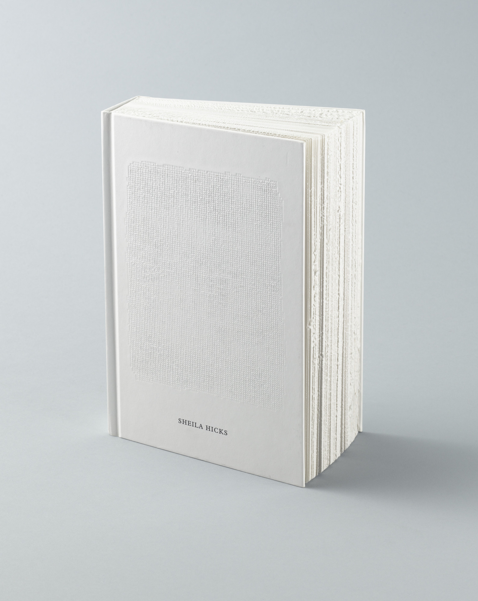
Irma Boom

Dutch graphic designer born in 1960.  She studied graphic design at the AKI School of Fine Art in Enscheden. Irma Boom specialises in making books. She is a multi-award winning and her books are a part of the collection at MoMA in New York and the University of Amsterdam.

Image result for irma boom booksImage result for irma boom booksImage result for Lichtjahre: Zumtobel 2000-1950

Source: Moma

This artist plays with the form of the book as well as different printing techniques. The books are quite textural and seem to the reader a more of a rounded experience involving more of the senses than just a straight forward read. The books are very conceptual and don’t give much away as to the literal contents.

Suzanne Dean

Suzanne Dean is a British graphic designer who heads up the design team at Vintage, working on cover designs for contemporary and classic novels by Ian McEwan, Virginia Woolf and Haruki Murakami.

Image result for suzanne dean book coversImage result for suzanne dean book covers

I was instantly drawn to the James Bond covers by this designer with the bold colours and typography and elements from the stories. The simplicity of the designs appeals to my love of minimalism. Depending on the type of book and the target audience the techniques used vary, whether that is overprinting or embossing. Some of her books have dust covers, some are printed directly on the cover and some combine both.

Julia Hastings

Julia Hasting (born 1970 in Bremen, Germany) lives and works in Zürich.
She is the creative director of Phaidon Press. She studied graphic design at the Staatliche Hochschule für Gestaltung in Karlsruhe, Germany, and finalized with a diploma. From 1993 to 1998 she has been designing corporate identities, posters and books for cultural clients, then she moved to London to design books for Phaidon Press, working closely with Alan Fletcher. In 2000 she moved to New York to run the new design department as the Art Director for Phaidon Press Inc., and in 2007 she has taken over the design direction at Phaidon Press and moved to Zürich, Switzerland. She taught Publication design at the design faculty of the Cooper Union School of Art in New York from 2001 to 2003. She has given lectures about her work at the BRNO Biennale of Graphic Design, The AIGA New York, Pentagram New York, F.I.T., the University of Lima, Peru, Integrated Design Conference, Antwerp, and has been a jury member in numerous international design competitions. Since 2003 she has been contributing illustration work to The New York Times and The New York Times Magazine. She is a member of the AGI since 2000.

Image result for julia hastings book coversImage result for WA: The Essence of Japanese DesignImage result for SOTTSASS book

Source: Linda Hastings

These books were very interesting due to the ways that the designer pushed the boundaries of what a book should look like. Whether it is the Japanese Watoji style binding or the extra cover-board and spine to further encase the book’s contents. These books are all of very high quality and the production values reflect that.

Linda Huang

Linda Huang is a graphic designer based in New York. Her work has been recognized by The Type Directors Club, Print Magazine, The New York Times, 50 Books | 50 Covers, and It’s Nice That, among others. She is currently an associate art director at Vintage & Anchor Books, an imprint at Penguin Random House.

Source: Linda Huang

I like the simple colour palettes used for these books as well as the playful typography. Interest and depth are generated using subtle textures. The Agatha Christie uses bold bright colours to give it a retro edge as does the typography for the H.G. Wells novel.

Jost Hochuli

Jost Hochuli is a world-renowned book designer living in St. Gallen, Switzerland. He is the author of numerous books on graphic design and typography, including Designing Books.

Image result for Jost Hochuli book coverImage result for Jost Hochuli book coverImage result for Jost Hochuli book cover

These books speak Swiss typography all over them! The use of hierarchy, alignment, use of the grid, contrast and limited palette all point towards the classic style. They are all expressive as they give a hint as to the contents of the books.

Ellen Lupton

Ellen Lupton is a writer, curator, educator, and designer. She is Senior Curator of Contemporary Design at Cooper Hewitt, Smithsonian Design Museum in New York City. New projects include the books Health Design Thinking and Extra Bold, a feminist career guide for designers. Lupton is founding director of the Graphic Design MFA Program at MICA (Maryland Institute College of Art) in Baltimore, where she has authored numerous books on design processes, including Thinking with Type, Graphic Design Thinking, Graphic Design: The New Basics, and Type on Screen. Her book Design Is Storytelling was published by Cooper Hewitt in 2017. She received the AIGA Gold Medal for Lifetime Achievement in 2007. Recent exhibitions include Face Values: Understanding Artificial Intelligence and Herbert Bayer: Bauhaus Master. The Senses: Design Beyond Vision, Beauty—Cooper Hewitt Design Triennial, How Posters Work, and Beautiful Users. She was named a Fellow of the American Academy of Arts & Sciences in 2019.
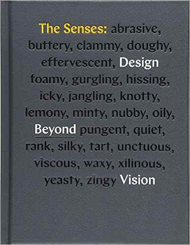
Image result for ellen lupton booksThe ABC's of Triangle, Square, Circle - 9781616897987

Source: elupton.com

I particularly liked these covers as they were design-based.  Thinking with type clearly expresses what is inside the book with its theme based around type design and function. The Senses: Design Beyond Vision loos to be a very tactile book which fits with the theme of the book. This book is conceptual as the words on the cover evoke feelings, tastes and sounds. The third book appeals to me as it is a clear and simple cover which is conceptual in nature that portrays its message in the simplest form which fits with the Bauhaus movement.

Peter Mendelsund

Peter Mendelsund has worked as a dishwasher, a bookseller, a butler, a classical pianist, chicken farmer, teacher, cover designer, house painter, commercial composer, branding consultant, & writer. He is the author of four books: What We See When We Read, (“Welcome and fascinating”—Tim Parks, The New York Review of BooksCover (“Cover pushes us to reconsider what we think we know about the graphic representation of words and ideas.”—The New Republic) The Look of the Book, a forthcoming non-fiction work (Crown/TenSpeed, Fall ’19)—as well as Same Same, a novel (Vintage/Anchor, Winter ’18). He is the former Associate Art Director of Alfred A. Knopf and is currently heading-up a redesign of The Atlantic magazine while completing his second novel: The Delivery. Mendelsund has been described by the New York Times as “one of the top designers at work today,” and his design work has been described by The Wall Street Journal as “the most instantly recognizable and iconic in contemporary fiction.”

salle2.jpgflame.jpg

These 3 of Mendeslsund’s cover designs jumped out to me in particular. 2 used repeating patterns, one of which looks like cutout paper giving it a 3D feel, and the other is part of a series that all share the repeated pattern theme which helps identify them as part of the same series. The middle one is very clever and ironic. It plays with the typographical hierarchy and yet you still accurately read the title.

Source: petermendelsund.com

Paul Rand

Born Peretz Rosenbaum in 1914 and died in 1996, Paul Rand is a graphic design legend. Throughout his 60-years long career, he changed America’s opinion on visual communication. With his editorial designs, advertisements, and visual identity works, Rand brought avant-garde European ideas to the United-States, mixing visual arts and commercial design. His colourful combinations, the approach of typography and use of media translate his desire to “defamiliarize the ordinary“. His style consequently still have an impact on graphic design today.

Source: grapheine.com

Image result for art and illusionImage result for the second man edward grierson paul randImage result for evangelical theology karl barth paul rand

I knew Paul Rand as a logo designer but not as a book designer. These book covers I have chosen stood out to me for various reasons. The first I liked the overprinting and the geometric pattern made me think of M.C. Escher’s work. The second is made to look like overprint and has an air of mystery about it which lends itself to the novel. The third I picked as I thought that it could be interpreted differently by whoever was looking at it. I interpreted it as the blue and red representing heaven and hell and we were the thin line in between. However, I could be wrong…!

Source: paulrand.design

Paula Scher

Paula Scher is one of the most influential graphic designers in the world. Described as the “master conjurer of the instantly familiar,” Scher straddles the line between pop culture and fine art in her work. Iconic, smart, and accessible, her images have entered into the American vernacular. Scher has been a partner in the New York office of Pentagram since 1991. She began her career as an art director in the 1970s and early 80s when her eclectic approach to typography became highly influential. In the mid-1990s her landmark identity for The Public Theater fused high and low into a wholly new symbology for cultural institutions, and her recent architectural collaborations have re-imagined the urban landscape as a dynamic environment of dimensional graphic design. Her graphic identities for Citibank and Tiffany & Co. have become case studies for the contemporary regeneration of American brands.

Source: Pentagram

Paula Scher’s book covers for her own publications are mainly typographic in nature and vary from a monogram of her initials, to the typographic maps she painted where the cover folds out to a 3′ by 2′ poster portion of her map World Trade, To the oversized letters of her name playing on the designers’ joke about clients wanting to “make it bigger!”.

Jan Tschichold

Jan Tschichold was a prominent twentieth-century German typographer and book designer. He was a remarkable teacher and an author as well. He is best known for writing Die Neue Typographie and Typographische Gestaltung which became standard textbooks for the next generation of typographers. During his stay in England in the late 1940s, he was requested by Penguin Books to redesign their paperbacks, thus he supervised the redesign of 500 books. Furthermore, Jan Tschichold wrote a guideline based on typographic and composition instructions for editors and compositors at Penguin, the Penguin Composition Rules.

Source: Famous Graphic Designers

Gallery Tschichold: Design for the penguin paperback edition of The Great Gatsby by TschicholdImage result for Die neue TypografieImage result for jan tschichold book covers

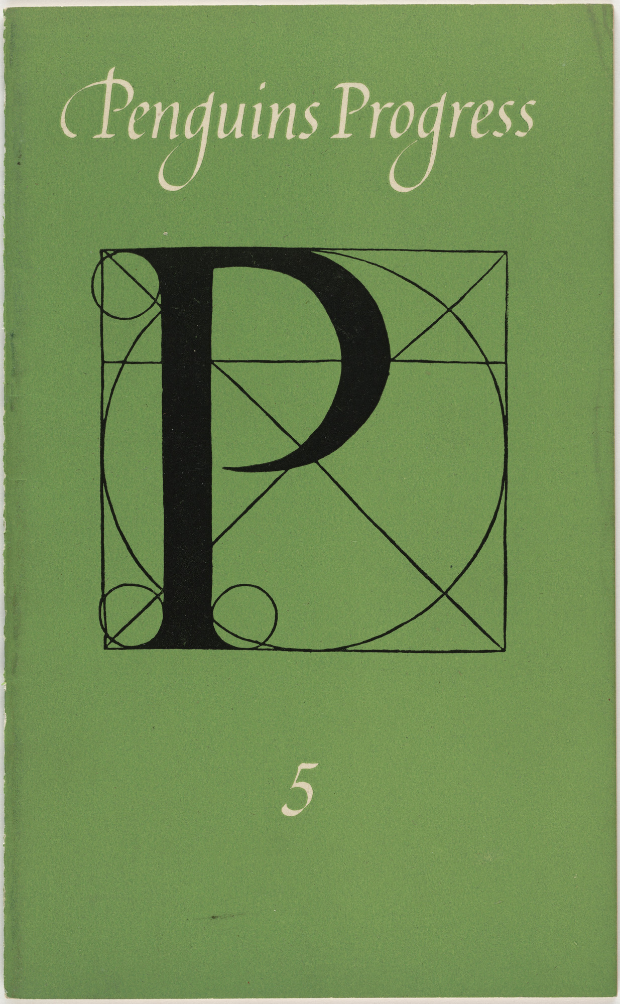
These covers are all minimalist which give the bare minimum of information needed in the most straight forward way. The Penguin covers are a staple of anyone’s collection and were refined by Tschichold in the 1950s. The other 2 are typographic with the Penguins Progress showing the design of the letterform and Die Neue Typographie showing all that’s necessary on the cover.

Wolfgang Weingart

Weingart was born near the Swiss border of Germany, in the Salem Valley, in 1941. He enrolled in a two-year course in applied art and design at the Merz Academy in Stuttgart in 1958. There he discovered the school printing facilities and, at the age of 17, set metal type for the first time. After graduating, he undertook a rigorous apprenticeship as a typesetter at Ruwe Printing in Stuttgart.

Wolfgang Weingart is an internationally recognized figure for his iconic body of work in the field of graphic designing and typography. His work is characterized as Swiss Typography. Moreover, he is deemed the pioneer of ‘New Wave’ or Swiss Punk typography.

Source: AIGA

Source: Famous Graphic Designers

Image result for Wolfgang Weingart book coversWWeingart4Image result for Wolfgang Weingart book covers

I hadn’t heard of this guy before, but as soon as I saw his work I was immediately hooked. He was one of the pioneers of experimental typography and this shows in the above covers. There are typographically led and aim to break the rules and the grids of traditional typography. They use type to add interest and as a design element rather than just to convey information.

Part 2

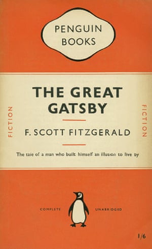
The first 2 covers I have compared are Designing Books by Jost Hochuli and The Great Gatsby by Jan Tschichold.

img_2736

I started off by trying to figure out the grid used on the covers of which some elements were very similar, Both books had vertical type elements down either side of the cover; both had the titles aligned to the centre; both had non-typographical elements on the cover to help divide it up; there is a clear use of hierarchy on both covers with the title being the most important piece of type; both use a single font to give a coherent feel. The Penguin book does have a lot more elements on the cover and the publisher is a lot more prominent in the design. The spacing of the elements on both covers has been given a lot of thought to where they should be placed and aligned carefully to the underlying grid. The image of the penguin is the only imagery used on these books as both are fairly minimal and give just the necessary information to the reader. The Penguin book is visually more attractive as this is aimed at a wider audience than the other which is quite a niche reference book. However, saying that, I prefer the Jost Hochuli cover because of its Swiis utilitarian simplicity and minimalism.

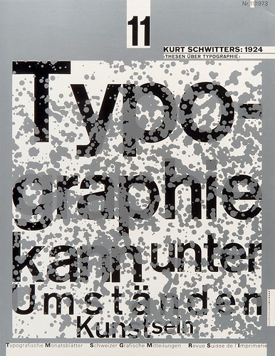
Next, I picked Wolfgang Weingart and Ellen Lupton.

img_2749

Both of these covers appeal to me. The Bauhaus simplicity with specific rules to be followed of Ellen Lupton’s book and, what appears to be, the chaos of Weingart’s. The Bauhaus shapes of Lupton’s book dictate the placement of the other elements on the page which gives it a very pleasing and ordered look. The title and the sub-heading take second-stage to the imagery in this case with the authors coming last. I did have some trouble trying to work out what the authors’ names were lined up with, but found it eventually. The chaotic cover of the other book leads you to believe that there is no reason for the placement of the typographic elements. It is only when you add a grid to the work that it makes more sense. Having gone back to my sketch of the grid on this one did I begin to wonder if there was some sort of golden ratio/Fibonacci spiral going on which adds weight to the placement of the type. Some non-typographical elements help to balance the design and lead the reader’s eye to where the designer wants it to go. There is some very strong typographical hierarchy here which doesn’t pull any punches about what order you are supposed to read the type. As I said earlier, I like both of these covers but I am drawn to the Weingart cover as I find this more intriguing and interesting to look at.

The final 2 covers I have chosen are by Linda Huang and Paul Rand.

img_2738

I chose to compare these covers because at first glance they are a million miles apart in their design. However, both covers are divided straight down the middle, both vertically and horizontally. Both designs maintain the proportions set out by the grid which gives them both a cohesive look. Linda Huang’s title font maintains its weight in proportion to its size and even though they differ in size and weight they all align with each other. The cover has some texture within its colour by being bespeckled with white and orange representing the dust of the title. This gives it an expressive feel. Paul Rand’s cover has a very strict grid which is set out by the geometric pattern in the image. Each of the 4 segments created by the centre lines is divided into equal thirds with the type aligning to them. Rand brakes up the page using blocks of colour and overprinting, adding to its geometric look. I think of these 2 books I prefer the Paul Rand design because of the geometry used which, as I have said earlier, reminds me of Escher’s work.

Part 3

Derek Birdsall

I was particularly drawn to Derek Birdsall’s work predominantly by the covers he designed for the Penguin Books Education Series in 1971.

Image result for Derek Birdsall

I really liked the clever use of typography and the no holds barred, in your face approach to these books. They are very thought-provoking and can be controversial. These covers are conceptual in nature as they have an underlying message within them.

As well as these books he has had a very varied design career. He designed the first Pirelli calendar in 1964 that set the bar for every calendar to follow. He has designed for Monty Python right through to the Church of England.

Looking at his work overtime, it seems to have matured and become a lot less in-your-face and a little more mainstream.

Source: Graphic Journey
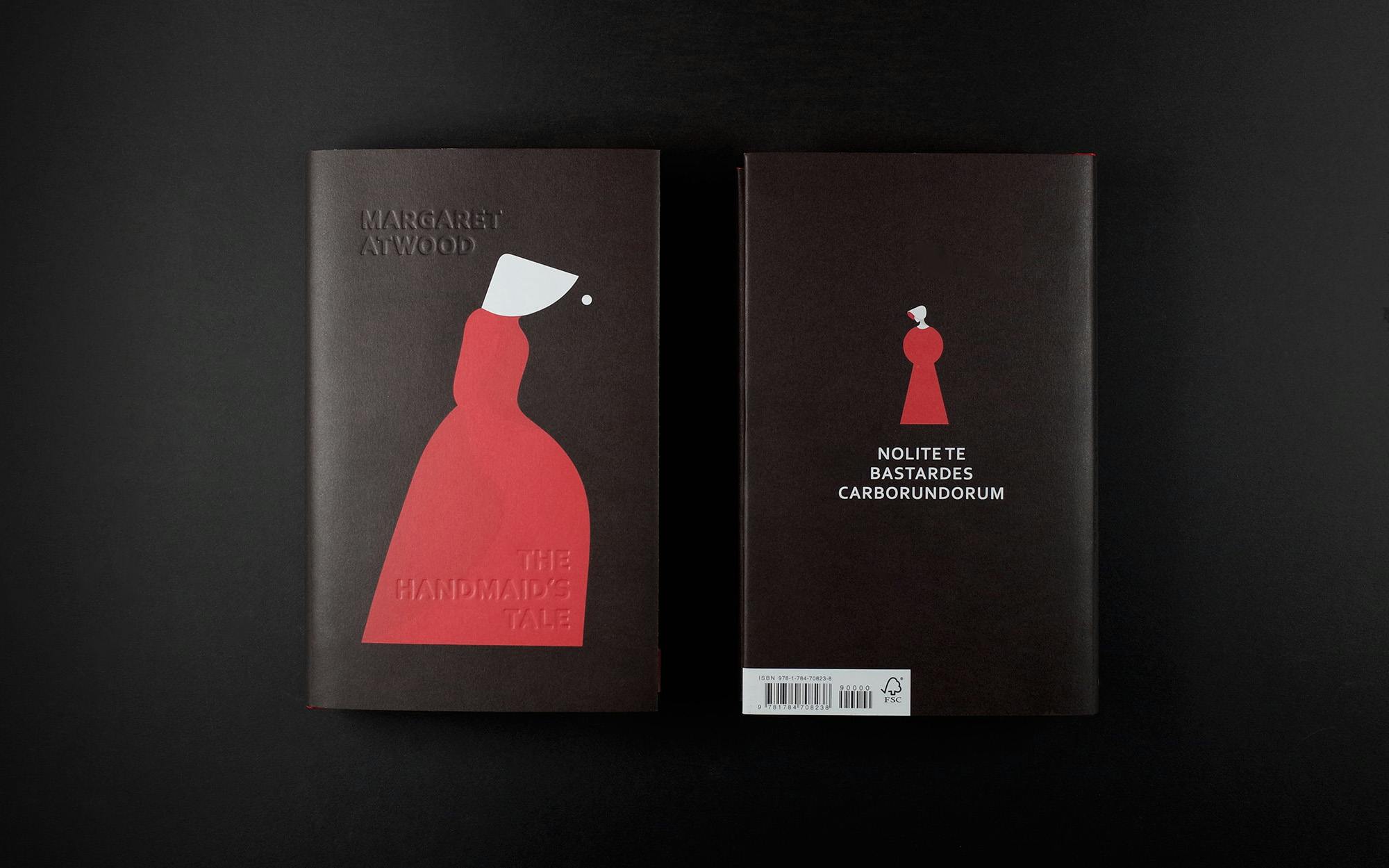
Suzanne Dean

The designer has worked at Vintage (part of Penguin Random House Group) for almost 20 years and has created covers for iconic titles and bestsellers from The Handmaid’s Tale to the Curious Incident of the Dog in the Night-Time. She has also created visual identities for Vintage series – including collections by Jane Austen, Haruki Murakami and Virginia Woolf

As previously stated, I was drawn to Suzanne Dean’s work with the use of bold colours, type and imagery to give the reader an instant idea of what was inside.

Her Bond covers do this particularly well giving them an air of mystery, even though you know that they are about Ian Flemming’s most famous creation. Even though they are all different in their use of type and imagery, you can still tell that they are all part of a series. These covers are conceptual in nature as they give you an insight into some of the stories’ elements, but they also have that nostalgic feel to the covers which also makes them expressive.

Image result for suzanne dean book covers

Her cover for Margaret Atwood’s The Handmaid’s Tale is a favourite of mine due to its pared-back simplicity. It gives an impression of the bleakness of the tale compared with the stark contrast of the bright red uniforms worn by the handmaidens which come to symbolise the resistance against the state. This is a very expressive cover design.

Source: Creative Review

Wolfgang Weingart

Wolfgang Weingart is recognized for his typographic explorations and teaching at the Schule für Gestaltung Basel, and who, through the work of his students, created a more experimental and expressive approach to typography that was influential around the world and was awarded the 2013 AIGA Medal for his body of work.

Image result for Wolfgang Weingart book covers

I was really drawn to this particular piece of Weingart’s work because it stood out as a piece of design that to the unfamiliar eye doesn’t look ‘designed’. This is definitely a conceptual book cover as it is very direct and tells you exactly what is inside.

Image result for Wolfgang Weingart book covers

This is the cover of his book covering his life’s work first published in 1999. I feel that the cover of this book again is conceptual but is aimed at a more mainstream market and isn’t as experimental as his earlier work. There are still elements of the Swiss-style minimalism in the way that the bare minimum of the title is shown without it becoming unreadable and the grid structure is very clear.

Source: AIGA

Part 4

Tom Lenartowicz

Tom is a graphic designer based in Oslo, Norway. He graduated from Falmouth College in 2009 before moving to Norway.

I’m not sure if these designs are real or just an exercise, but I really like them in their simplicity and cleverness. They all use typography very cleverly to illustrate the stories within. I particularly like the first 2 and think that the use of type to depict the title and story are used brilliantly.

Adronauts

Adronauts is a creative collective founded 2013 in Vienna. Patrick Pichler and Wolfgang Warzilek working together in the creative fields of Advertising, Graphic Design, Illustration and Branding.

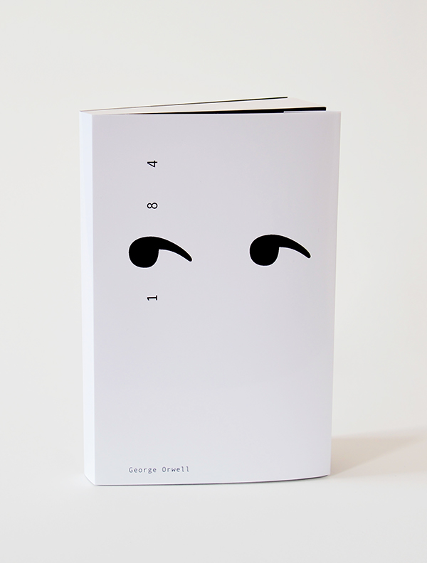
This again is a simple yet clever use of typography to depict the cover of this classic Orwell novel using the nine from the title and repeating it to give the impression of prying eyes watching you.

Another cover by these guys for a novel entitled Kidnapped again uses clever typography depicting one of the letters missing, presumably kidnapped.

Sara Comer

Sara comer is a designer and illustrator based in New York.

I like the way that the designer has cleverly used typography to illustrate the book’s title. It reminds me of the Suzanne Dean cover for the Handmaid’s Tale but this one is more typographic in nature. This cover is a conceptual cover as it alludes to the main character in the book.

These 50 awesome book covers will inspire you | Best book covers ...

Paul J Bartlett

Paul J Bartlett is a freelance art director, designer, and illustrator based in Madison and Milwaukee.

This is a very clever cover combining 4 photographs of the main characters to form one single image for the cover with an overlaid colour to tie them all together. This time the typography is not the main element and is fairly minimal, but works very well with the imagery.

Mark Robinson

Mark Robinson is an interesting chap. He classes himself as a designer; art director; filmmaker; and musician. I couldn’t find much information on his design career, just lots on his musical escapades.

This book cover really amused me, both as a designer and as an ex-chef. The idea of food running out and this being depicted on the cover as an empty food carton with the label used to display the type was an unusual and ingenious way of illustrating the book’s subject matter. I really liked the quirkiness of the idea and the execution is spot-on. The image is so convincing, it looks like it is sat on top of the book cover.

book, The End of Food by Paul Roberts

Conclusion

This has been a tough one to get into. But once I did and began to research the various book designers I found it very interesting. I hadn’t heard of the majority of the designers and some led me to discover new styles of designing book covers and new art styles. This has given me more of an insight into how books are designed, and how various designers approach the subject differently.

I feel that I am drawn more to typography-based book cover designs and covers that are clever in their approach to the subject matter as these appeal to my creative leanings and my sense of humour. Hopefully, I can use some of this research as inspiration for future projects.

Research task: Artists’ books and fanzines

Browse the American based Smithsonian Libraries’ Artist Book archive to identify books that you find interesting or questions the notion of the book in some way.

https://library.si.edu/collection/artists-books

Explore fanzines in more depth by reading Teal Trigg’s chapter Definitions and early days (pages 6–43) from her book Fanzines: A do-it-yourself revolution (2010). This chapter is available as a course resource on the student site.

Document visual examples of work you find interesting with annotations in your learning log. You’ll be using some of this research in your first assignment.

Artists’ books

These are a phenomenon that I haven’t encountered before. I found them very unusual in that they weren’t what you would conventionally call a book. They made me question what a book was? According to the Concise Oxford English Dictionary, a book can be either a ‘portable written or printed treatise filling a number of sheets fastened together’ or a ‘literary composition that would fill a set of sheets’. The Encyclopedia Britannica gives 2 more descriptions as either ‘a written (or printed) message of considerable length, meant for public circulation and recorded on materials that are light yet durable enough to afford comparatively easy portability’ or an ‘instrument of communication’ (Encyclopedia Britannica I 1964, vol. III, p. 870). Geoffrey Ashall Glaister gives the book value in The Encyclopedia of the Book 1996 in that he describes it as ‘for statistical purposes the British book trade once assumed that a book was a publication costing sixpence or more’ and ‘other countries define a book as containing a minimum number of pages; a UNESCO conference in 1950 defined a book as “a non-periodical literary publication covering 49 or more pages, not counting the covers”.’ Andrew Haslam gives his own description of a book in Book Design as ‘a portable container consisting of a series of printed and bound pages that preserves, announces, expounds, and transmits knowledge to a literate readership across time and space.’

I liked the description of a book as a container of some kind. A container for words. Containers come in all sorts of shapes and sizes and there’s no reason why this couldn’t apply to books. This is what I feel that artists books are – various interestingly shaped word/message containers.

Of the artists’ books in the Smithsonian the following caught my eye:

SIL-Purgatorypiepress1_39088017554452_crop

Description: “a geometric story by Esther K. Smith from a wood block pattern by Dikko Faust”–Colophon. Folded accordion style, with 9 panels.

This one caught my eye because of its simple geometric design that seems to evolve into a more and more complex shape. It reminded me a little of Bauhaus and also Victorian/Georgian mosaic tiled floors.

SIL-NPG_N7433.4.D38_Davidson

Description: “This the fourth in a series of tunnel books, each depicting beloved views”–Colophon.

The pages of this book create the layers of the scene. Each one with different details on it that when put together form the whole picture. The separate pages/layers give the image its depth.

SIL-NPG_N40.1_L324L3_2000_Larned

Description: “Each of the three titles in the Seeing trilogy is in an edition of 25”–Accompanying pamphlet (“75books”).Limited ed. of 25 boxed sets.Issued in a case, 16 x 14 x 16 cm.

This is made to look like an old camera and I can only assume that the book is to be viewed through the ‘camera lens’ so that everything in the periphery is obscured and your view is focused on the book pages.

SIL-NPG_N_7433.4_T48_G55_2011_Glimpse

Description: “Inspired by a conversation about how a person translates their life experience into a narrative form: prominent events may stand out as the nameable moments, yet it is the space between these events that life, in fact, is lived.”–Vamp & Tramp Booksellers website.”Created and produced by Julie Chen and Barbara Tetenbaum. Julie: sleeve text, image and design. Barb: card text, image and design. Julie and Barb: binding design. Printed letterpress from hand-set type, wire, antique news cuts, dingbats and photopolymer plates.”–Colophon.

Limited ed. of 100 numbered and signed copies.

“The mid-century photo album structure contains text written by Chen … Her text is printed on both surfaces of each of the 15 hinged sleeves. Windows in the sleeves reveal small glimpses of the pull-out cards, each written and printed by Tetenbaum and containing dates and events of the non-important moments of her life. These texts are supported by diagrams, grids, and mundane imagery.”–Vamp & Tramp Booksellers website.

“Pages formed by envelope sleeves open-ended on right. Each sleeve with miniature square window cutouts, and no sleeve with the same cutout pattern. In the form of a tablet with overlapping staggered 7.5 x 3.5″ pages. Sleeve enclosure is attached to box of cloth-covered boards with title tipped on front. Signed by both artists”–Vamp & Tramp Booksellers website.

Issued in cloth-covered drop-spine box with letterpress-printed title collaged onto the front of the box.

AAPGAB 39088016101180 has limited ed. copy no. 64 of 100.

AAPGAB copy 39088016101180 has bookplate: Smithsonian Institution Libraries, Gift from Margery Masinter Foundation Endowment for Illustrated Books.

I liked the way that this book was as much about what you could see as what you can’t. The cards’ position gives you an insight into the mundane elements of the artist’s life without giving you the whole story which draws you in further.

SIL-NPG_N_40.1_P9547P75_2001_Price

Description: In 28 x 23 cm. box with wooden inserts by Nichols Woodworking.

“Texts printed were excerpted from [several] sources and used with permission”–P. [73].

“An edition of sixty letterpress copies”–Colophon.

“First and last sections of the book are collated consistently; the middle four signatures vary. Each copy is unique. Bound by Emily K. Larned, the book is sewn onto cords attached to sanded plexiglas covers”–Colophon.

AAPGAB copy 39088010098333 is no. 56.

With this one, I liked the way that the artists had printed on paper over previously printed works. It reminded me of some of Roy Cranston or David Carson’s’ work where they reuse material in their designs.

SIL-NPG_N_40.1_F364_H3_2013_Flynn

Description: Accordion fold, offset printing, Malmero Perla paper; a metallic acid-free paper portfolio with two laser cut walnut page holders. Includes instruction sheet.

AAPGAB copy 39088016913071 gift from Susan R. Frampton.

This is another creative use of the book in that you can project the images on to a wall by shining a torch through them. Each page is accompanied by a short excerpt of text. These are beautifully cut images that I am sure would create a very striking story.

SIL-95-391

Description: An artist’s book, with a structure based on the wishing stars (lucky stars) from Hong Kong.Cover title.

Publisher and date of copyright from colophon; possible place of publication from label on box.

Consists of one continuous strip of paper (5 x 64 cm.) printed on both sides in black and gold and folded into a pentagonal shape (9 cm.), inside which five small colored paper wishing stars (1-2 cm.) are hidden.

“Handset in Centaur, letterpress printed on Mohawk and written and designed by Katherine Ng …” –Colophon.

I picked this one purely because of its unusual shape which stood out from all of the other artists’ books I’d seen. A very clever and beautiful origami solution.

Zines

Fanzines were something I had little knowledge of. The only thing that came to mind at first was some of the underground punk publications of the 70s and 80s but I had nothing specific. I then went on to read the suggested chapter from Teal Trigg’s book. I had no idea that fanzines had such a rich history and were the basis for many modern day publications and had been the start of so many well known people’s careers. Other than music, I hadn’t realised that so many other genres had their own zines. I would imagine that if there is an interest in something, there is probably a zine about it.

Zine characteristics were that they were focussed on a particular subject; they displayed characteristics of being homemade and not mass-produced; they didn’t conform to the rules of typography and layout; they were often anti the establishment; they were unofficial; they often used mixed media and they used imagery as much as they did type to convey their message.

The punk-style zine gave itself to the Sex Pistols when they hit the mainstream and needed a style for their publicity and album/single covers.

london-outrage-fanzine-by-jon-savageNever_Mind_the_Bollocks,_Here's_the_Sex_Pistols

Some zines that I found stood out to me…

doublefanzine5prophit-punk-624x893

I liked the cut and paste look of these and they reminded me of some of David Carson’s work for Raygun magazine in the 90s and were possibly an influence for his work. I liked the idea of reusing other pieces of type/images to create new ones.

I liked the use of overprinting to introduce colour to this selection of zine covers. Budget was obviously a little higher on these as the printing costs would be higher. These possibly had a larger readership in order to justify the costs.

1b9812b99fe2672af746cefda86be5f9

I couldn’t resist getting a Star Trek reference in here! Spockanalia was first printed in 1967 and was the first Trek-only fanzine printed just a year after the show’s launch. These types of fanzines gave fans a voice and were often a way of communicating directly with the writers and stars as well as other like-minded fans. Stories, artwork, letters and poems could be submitted by fans on their chosen subject (not necessarily Star Trek).

STK366809

Full colour fanzines are now easier than ever to produce thanks to technology and this perfectly lends itself to comic book fanzines but could be used for any subject and can be a lot more designed and refined.

6193b3ce8f5baf1e2ca4516b50d53c8e-970-80

Conclusion

Before beginning this task I knew very little about artists’ books or fanzines and their origins and uses. I now have a better understanding of the subjects and understand their place within book design and graphic design as a whole and how they have contributed to its development.

If the face fits

Create your own sample book of typefaces on your computer that you can refer to. Organise them into:

  • Serif for continuous text; readable at small sizes and those suitable for headings.
  • San-serif for continuous text; readable at small sizes and for headings.
  • Script fonts that look handwritten with a pen or brush.
  • Decorative fonts only suitable for headings or ‘fun’ uses.
  • Fixed width, techno and pixel fonts for use on the web or to give a computer appearance.

Identify which typefaces have bold, italic, black or light fonts.

Now identify which fonts you might use in each of the following commissions:

  • A short story in a woman’s magazine entitled “I thought I loved him; now I’m not so sure”. The story is 1300 words long so you will need to identify a text font and a headline font.
  • An advertisement in a parish magazine asking for more helpers on the flower rota. The finished size is A6 landscape and the text reads: “Can you add that important artistic flourish to our church? We desperately need more volunteers to join the flower rota. If you can help or would like more information please contact Jennie jennie@vicarage.co.uk.”
  • A poster to advertise an after-school club for boys aged 13 – 14. The poster will be A3 size and the copy reads: “Bored? Feeling got at? Nowhere to go? Then why not come and join us on Tuesdays and Wednesdays after school in the Old Gym. We’ve got football, ping pong, table soccer, computers, Karate, cooking and lots more. All free just come along.”
  • Your friends’ engagement party. They want a flyer A5 size to send to their friends as if advertising a club night. The copy reads: “Mandy and Josh are finally going to do it…well almost!!!!! Come and join them on Friday 24 March from 8pm at the Golden Calf to celebrate their long awaited engagement… and yes lots of presents would be gratefully received particularly if we can drink them!!!!!

Then have a go at mocking up each of these. Try different fonts to see how each changes the feel of the text and make notes in your learning log about which works best and why.

Initial Research

The first research I did was to look into typography samples. I found a lot of samples of typography posters displaying different typefaces and their history. I began collecting examples of these on a Pinterest board.

I didn’t find many examples of an actual sample book, but my thought process took me back to my diploma days and I remembered the old Letraset catalogues that we used to covet at college.

14872b3c23078734b9b37e911f7c0d35

These had pages upon pages of different typefaces and their fonts which you could then get the transfer sheets of the fonts/typefaces you want for your design.

LETRASET_033-banner_1024x1024

This was how it was done pre-Adobe!!!

Back to the research…The particular typography posters that caught my eye were the ones with overlaid text. I thought I could use a similar effect for my typography sample book.

I also needed to decide which typefaces to use for my sample book. I wanted to use some classic typefaces for this exercise as they would have the history that I could use to contextualise the individual typefaces. I decided to use 3 sans–serif typefaces, 3 serif typefaces, 1 script, 1 decorative and 1 monospaced.

The typefaces I chose were:

  • Helvetica
  • Futura
  • Meta Pro
  • Times
  • Clarendon
  • Butler(Can’t afford Bodoni!)
  • Snell Roundhand
  • Stencil
  • Courier

I decided to do each typeface as a double page spread and that one page would be decorative and the other would display the font options and the history of its design.

I started with the sans–serif typefaces and went back to the overlaid type idea and thought that it might look good to do the letters spelling the typeface in outline form on a coloured background. I started with Helvetica as this seemed the most simple and straight forward to start with as the colour for the background had to be red for the famous Swiss typeface. I started with the decorative page of the spread first.

I started in Illustrator for the pages as they were going to be easier to make up and then drop the images on to the pages in InDesign.

I also set up a 20 page document in InDesign (cover, 9 double page spreads and the back cover) with a 3mm bleed and a grid to align all the elements.

I set up an A4 document in Illustrator, again with a 3mm bleed and a 10×15 grid. I then coloured the background red and began with the letters that made up the word Helvetica. I tried overlaying the letters all with the same opacity but this looked too flat and messy. I then counted the letters in the word – 9. I then changed the opacity of each letter by 10% starting with the H at 100% right down to the A at 10%. But Helvetica has 2 letter Es which wouldn’t be visible in the final design so I removed 1 and the opacity was now from 100% to 20%. This created the effect I was looking for but it didn’t look balanced because of the ascenders of the H, L and T. I added a Swiss cross to balance out the composition and add an element that indicated the font’s history. I was very happy with the result. This would be the template for my other typefaces.

ifthefacefits-helvetica

Now for the second page. I wasn’t sure as to what direction this was going to take. However, during my research into which fonts to pick I came across the website for the designer of the Butler font. I picked Butler because I originally wanted to use Bodoni but didn’t have the typeface on my computer. I did however have Butler on there and it was based on Bodoni.

Screenshot 2019-07-09 at 15.21.23

Butler Typeface

I liked the way that the type designer had laid the letters out in a grid format. I wanted to recreate it for my book. I laid out the letters in a 5×5 grid in which the I and J were combined into one cell of the grid. I then overlaid another grid of lowercase letters and changed the opacity of the uppercase grid. As well as the letters themselves I decided that there didn’t need to be numbers as they would be represented by the sample point sizes on the page. Also I wanted a bit of the typeface’s history to be displayed on the page so I had to research the typeface’s origin. The fonts contained in the typeface needed to be on the page too.

Using the grid I had set up I placed the elements needed onto the page and played with the arrangement until I was happy with the result. I thought that some of the elements could be displayed partially but still be legible, while adding interest to the design. The second page needed something to balance again due to the large amount of white/negative space and I decided to repeat the Swiss cross in line with the block of letters vertically and horizontally with the point sizes. I now had a plan for how to go about the typeface information page.

Untitled-13

Obviously I wanted each page to be different from the rest but have a common theme linking them. I decided to repeat the pages for each of my typefaces with slight differences in the display page design and layout of the second page. With the subsequent typefaces after Helvetica I wanted an element on the display pages that reflected the history of the typeface and decided to put the date on each of when the typeface was designed. I felt that Helvetica didn’t need this as putting 1957 on there was a bit cliché. I wanted to do the date in different ways and formats on each display page. The page colours were determined by my own feeling of the colour I associated with the particular typeface.

ifthefacefits-futuraifthefacefits-metaifthefacefits-timesifthefacefits-clarendonifthefacefits-butlerifthefacefits-snellUntitled-116ifthefacefits-courier

I then applied those colours to the information pages and changed the layout of each of the pages. Some of the pages needed some non–objective elements added to help balance the layout and others didn’t. All the typography on the page was done in the relevant typeface as to display it in use.

Untitled-15Untitled-17Untitled-19Untitled-111Untitled-113Untitled-115Untitled-117Untitled-119

I was really happy with the way all these had come out and the feedback I got from everyone I asked was very positive and the way I‘d made each page slightly different but the same was commented on by everyone in regards to how cohesive it all looked.

I dropped all the images into InDesign and the book was starting to take shape. I still needed a cover. I left the cover white and then took the first letter of each typeface I had used and overlaid them in the order that they appeared in the book in their relevant colour and added a title in Butler as it gave it a more classy look.

ifthefacefits-cover

This really finished off the book and was the icing on the cake. I then added all the images to the InDesign layout

Screenshot 2019-07-09 at 16.08.29

Then I mocked up the designs.

The mockup really brought the design to life and I was very happy with the result. I received lots of positive feedback and the college has even asked to use them in future publications.

This part of the exercise took me much longer than anticipated and I struggled to motivate myself for the second half.

The second half…

The next part of the exercise involved using different typefaces to convey messages on certain types of publication and to compare how the choice of typeface influences the message of the piece.

funny-memes-for-designers-6

I decided that I would only use the typefaces from my sample book for this part of the exercise.

The first one I looked at was the poster for the youth club. I went for a purely typographic approach to this. It needed to be big and bold to hit the target market of 13–14 year old boys.

The first idea involved some long shadow text and the interesting angles that it would produce. It would need to be a sans–serif typeface to give that bold look and give the clean lines needed for the long shadow. The colour scheme needed to be bright and bold to attract attention to the poster as this is its purpose. I chose Helvetica for the main headline and chose Meta for the detail because of its legibility.

ifthefacefitsyouthclubmockup1

With the second I wanted to base it around the Stencil typeface. I thought that this would give the poster a more utilitarian feel so I paired it with Courier which is purely utilitarian in nature. I gave the poster a military style colour scheme, also influenced by Stencil. The poster was given a distressed look with a rusted metal overlay to give it that vernacular typography look.

ifthefacefitsyouthclubmockup2

For the third I wanted to give it a more stylised look so I positioned the type at various 90 degree angles and skewed the whole composition to make it more interesting and eye–catching. I kept the colour scheme simple using only black, white and red. I again used a sans–serif typeface Futura for the main headline and Meta for the details.

ifthefacefitsyouthclubmockup3

Of the 3 posters I think that the first design is the most successful as it hits the target audience better than the other 2.

The different typefaces used for the posters do give them a different feel. But also how they are used on the poster changes the feel. The use of colour and hierarchy also affects the feel. I think that sans–serif typefaces are easier to read from a distance and probably better to use on posters which should be legible from a distance. Also sans–serif typefaces are viewed as more modern and would appeal to a younger audience.


The next commission was for an A6 landscape advertisement in a parish magazine. This would be a more conservative approach due to the target audience being possibly slightly older, they could be church goers and have the time to commit to the position.

The first advert I designed was a fairly simple one. It involved a floral background I downloaded from Pexels.com with the script typeface Snell Roundhand for the main message and then I used Futura for the secondary text.

ifthefacefitschurch1

ifthefacefitschurchmagazine2

With the next advert I went a little more modern approach and singled out the word “flourish” and used it in conjunction with an image of a flower that I downloaded from Pexels.com. I used Photoshop to interlace the text with the type and the flower. The sans–serif typeface(Futura) was paired with a serif typeface(Times) for the contact details etc. at the bottom of the ad. The hierarchy draws the eye in and the contact details are italicised and highlighted in a colour picked from the flower image to attract the reader’s attention.

ifthefacefitschurch2

ifthefacefitschurchmagazine1

For the third I wanted a more subdued look to appeal to the more mature church volunteer. This time I picked an image of some decorated church pews from Pexels.com which I altered the appearance by subduing the colours and giving it a coloured overlay. I then placed this on an off–white background. For the type I used Times again to appeal to target audience for both the headline and the body text. I picked out the words artistic and flourish as the primary text and made them larger in the headline to draw the viewer in. The body text was italicised to differentiate it from the headline and again to attract the reader’s eye.

ifthefacefitschurch3ifthefacefitschurchmagazine3

Of the 3 adverts I think that the second is the best. It is attractive, bold and modern. This may not appear to all church goers but to me it is the best design. The third may appear to the more conservative reader which maybe a more appropriate advert it would depend on the type of church. The first is the least successful as it is too busy and difficult to read even when the type is made bolder.


Next was the magazine article. I wanted to try different styles of magazine and try to use the appropriate type to convey the desired feel for the various magazine styles. I chose to use an older teen magazine, a trashy, T.V. style magazine, a more mature magazine and a high–class magazine.

All 4 designs were done in InDesign. I wanted to explore the software more and become more familiar with it. The first 3 designs I used a 3 column grid and used a more complex grid for the fourth.

I generated the body copy from Lipsum.com.

For the first magazine I picked an image from Pexels.com that would be large enough for the background. As this was a dark image I would have to reverse the type out of the background. The typeface I used for the headline was Futura to give it a bold modern look that would appeal to the younger audience. I chose Butler for the body copy as it is easy to read in a small point size. Aligning the body copy “flush left, rag right”, I had to make sure there weren’t too many “widows” or “orphans” and also the body copy had to be of the right point size to fit within the constraints of the page.

ifthefacefitsmagazine1

The second was more straightforward to layout. I picked 2 images form Pexels.com that were related to each other as I wanted an image on each page. I used bold colours to highlight the first column and also the headline which I split over the 2 pages. I used Stencil for the headline type to give the impression of scandal and injustice as well as importance. This time I used Helvetica for the body copy which was still clearly readable in 10pt. However, 10pt Helvetica takes is larger than 10pt Butler so the copy took up more room on the page.

ifthefacefitsmagazinemockup2

This time I wanted to see if I could fit a larger point size of body copy. This meant that imagery would be minimal. I placed the body copy on to the page first in 12pt Times to see how much space I’d have for the title and any imagery. Because of the use of larger body copy I used only part of an image which I cropped on the right of the spread. I shaped the body copy around the image which was tricky to not leave any widows. I made the headline a feature by giving it large quotation marks to draw the eye to it without having to make the type any bolder. I used Butler for the headline as it is a lot more subtle than Times and made it look more sophisticated.

ifthefacefitsmagazinemockup3

The fourth design was something I did for myself to see if I could play around with column widths and type sizes all within the page giving the impression of lots of different elements while still having the required number of words on the page. I put 5 columns on the first page and 7 on the second. On the spread there is 250pt Snell Roundhand; 8pt, 10pt, 12pt,15pt and 18pt Futura; 12pt and 29pt Times. The use of different typefaces in different sizes helps to emphasise certain parts of the article and gives the type its hierarchy. I again chose an image form Pexels.com to represent the story being told.

ifthefacefitsmagazinemockup4

Of all the designs I think I prefer the first one. It has big impact due to the hierarchy and the body copy being reversed out of the black background.

The fourth design is interesting and I really like the use of different typefaces but I think it’s a little disjointed and doesn’t really look like a single article but it I did enjoy doing it as a self-lead exercise and like the layout as it’s a bit different.


The final part was to design a flyer for an engagement party. Initially I missed a key piece of information in the brief that said it was themed around a “club night”. So my first designs weren’t hitting the brief. Back to the drawing board! I wanted to make sure these were predominantly typography based but some imagery would need to be used in order to convey the flyer’s message which I would get from Pexels.com.

For the first flyer I found an image of a DJ that I used as the background. I then added the type in Futura as this seemed the right typeface for the modern, clean look I was going for. I separated the date out to make it an element on its own. For balance I added some non–objective elements which framed the design. The names were made the main element of the design with the rest of the type in a smaller point size and italicised. I chose bold colours for the different elements to give the flyer a club feel.

For the second flyer I again used an image of a club scene as a background which I blurred as I didn’t want it to detract from the type while still adding a little colour. This time I wanted to make the date the primary piece of type. I chose a serif typeface(Butler) for this flyer as I wanted to give it a more mature, sophisticated look. The date was stacked and the kerning on the slashes to bring them in a little tighter so that the stacked date didn’t look off balance. I then split the body type into 3 and aligned it with the 3 rows of numbers. The names and RSVP were added top and bottom but only slightly larger than the body type as to not detract from the date being the primary element.

The third flyer I did in landscape because of the image I chose for the background was orientated that way. I wanted the flyer to be bold like the first on and chose Helvetica for the typeface to give it a clean look. As with the second church advert I wanted to interlace the type with the image and did this in Photoshop before importing it into Illustrator to finish off the design. I added the body type and highlighted the important pieces of information such as the venue and date.

Of the 3 designs I think that the first 2 are the better of the group. The first gives that party/club feel due to the bold sans–serif typeface and brightly coloured type. The second is my personal favourite as the type is the star and not the image. It is more refined and looks a lot more classy than the others.

Dyslexia

As part of my current job role I teach functional skills including English. On a recent course the subject of dyslexia came up and it was interesting to find out how people with dyslexia tend to read. Dyslexics read the shape of words rather than the individual letters. They also prefer sans–serif typefaces as opposed to serif ones as the serifs alter the appearance of the words. During the conversation the question was asked, “which typefaces/fonts would work best for people with dyslexia?”. I felt that it would be a sans–serif typeface like Helvetica, but was surprised to find that one of the easiest typefaces for people with dyslexia to read was Comic Sans as the word shapes are clearly defined.

The following article I found explains it in more detail:

Best Fonts for Dyslexia

Conclusion

I really enjoyed this exercise but it was a long slog!

The first part of the exercise designing the sample book was my favourite part. I thoroughly enjoyed the task of trying to display the different typefaces in different and creative ways while making them cohesive throughout the book. I think this shows in the final mockups. I also got a little more familiar with InDesign which I haven’t had much to do with in the past.

The second part of the exercise was a little more in-depth. It involved a lot of work doing 3 variations for each of the 4 publications. The posters, ads and flyers were the easy ones. I used software I was familiar with and the briefs for these were straight forward. The article was a bit more difficult as I was unfamiliar with InDesign and had to learn how to set up documents and text boxes and how to drop images into documents. It was tricky to fit all of the type in and adjustments had to be made to accommodate all 1300 words.

The exercise did however serve its purpose. It showed me how type can influence the design of various documents and the feel of the overall publication. It also depended on the target audience as to which typefaces would be appropriate for them. The type of publication can influence what typefaces should be used and who they appeal to.

This exercise was really useful in making me more aware of how type and the way it is used can have a big impact on what is being designed.

Images downloaded from Pexels.com

Butler typeface available from fabiandesmet.com


Research point

Vernacular typography can be very well crafted but it can also be crudely created signs done in a hurry. Either way it is using typography and lettering to create visual communications. Take a look around you and identify some vernacular typography that you find interesting. Document it through drawing, photography or by collecting examples. Remember to ask permission if you are photographing inside train stations, markets, shops, museums or shopping centres for example. Getting permission is usually straightforward, especially when people know you are working on a student project. In your learning log note down why you selected the examples you did.

Vernacular

noun: vernacular; noun: the vernacular

the language or dialect spoken by the ordinary people in a particular country or region.
“he wrote in the vernacular to reach a larger audience”

Synonyms: everyday language, spoken language, colloquial speech, native speech, conversational language, common parlance, non-standard language, jargon-speakcantslangidiomargotpatoisdialect

Antonyms: formal language, Latin
the terminology used by people belonging to a specified group or engaging in a specialised activity.
plural noun: vernaculars
gardening vernacular
architecture concerned with domestic and functional rather than public or monumental buildings.
“buildings in which Gothic merged into farmhouse vernacular”
adjective: vernacular

(of language) spoken as one’s mother tongue; not learned or imposed as a second language.(of speech or written works) using the mother tongue of a country or region.

vernacular literature

(of architecture) concerned with domestic and functional rather than public or monumental buildings.

vernacular buildings


I had heard the term vernacular before but wasn’t sure of the meaning. In reference to typography the images it conjures up are hand written signs, circus and promenade show signage and greengrocers’ pricing. However, I now understand that it refers to a lot more than that. It refers to everyday typography used in everyday situations and how it has been manipulated and transformed to fit its purpose, situation and time; it relates to how the typography fits its function and setting; it is the context in which it’s used.

I have collected photos of vernacular typography around the village where I live to illustrate its uses in everyday forms as well as pieces that I like from the internet.


The above images were taken in and around the village I live in. The majority are utilitarian in their usage. However, they are all very different and vary in age from pre-war to the modern day.

Above are examples of the images of vernacular typography that I have on my Pinterest typography board. I like the creative works added to walls to advertise or to put across a message. I am also drawn to utilitarian typography that appears on day to day and how creative and beautiful it can be. I particularly like some of the old London Underground typography and mosaics.

A designer that I follow who uses a lot of vernacular typography, especially for his merchandise is Aaron Draplin who is based in Portland, Oregon USA.

Vernacular typography is everywhere and most of it goes unseen every day. It can be used for anything from the label in your clothing to a billboard on the side of the road.

Through this exercise I now have more appreciation for the typography around me.

Research point

The alphabet is only part of a typeface that contains lots of different characters such as numbers, punctuation, mathematical and monetary symbols and ligatures. Ligatures are where two letters are combined together to make printing easier. Explore you computer keyboard to find some of the other characters. You will need to use your shift, alt and ctrl keys.

Choose a magazine, for example the Big Issue or Heat, and look at the main typefaces they use for the body text and headlines. Go to http://www.identifont.com and use the programme to identify the fonts. Look at the ranges of typefaces all around you and try to identify their distinguishing characteristics. Make notes in your learning log.

Exploration

I started to look into what special characters could be found on the mac keyboard. I knew a couple of them but there were a lot more than I thought. I compiled a list and placed them into a table below.

There are also options for typing accents.

Accent Example Small Letter Capital Letter
Acute á Á [Option + E] Vowel [Option + E] [Shift + Vowel]
Circumflex â Â [Option + I] Vowel [Option + I] [Shift + Vowel]
Grave à À [Option + `] Vowel [Option + `] [Shift + Vowel]
Umlaut ë Ë [Option + U] Vowel [Option + U] [Shift + Vowel]
Cedilla ç Ç Option + C Option + Shift + C
Eszett ß Option + S Option + S

Alternatively, press and hold the special letter key to view the options similar to iPhone or iPad keyboard. In order to show the options for capital letters press and hold shift with the special key.

There is also the option of using the keyboard viewer from which you can copy and paste special characters.

Magazine typography

For this part of the exercise I popped to the village post office to peruse their limited selection of magazines. The best of the bunch was Devon Life magazine (Yes, I’m getting old!).

tP3H45gZSoaOzc16oxHeaA

I then used Identifont.com to try to identify the fonts used. I have used it before and found it very useful and much better than most of the onscreen font identifiers such as WhatFont, Fontface Ninja and Adobe Capture.

Initially I thought the title font for the magazine was Baskerville and Identifont seemed to agree. However, as I investigated more Baskerville seemed less likely and it seemed more like Times Roman. It was difficult to tell as the magazine title had been distorted.

Next I used Identifont to identify the condensed sans–serif font. It identified it as Block Gothic Condensed.

The numbers on the cover again were something different. My research with Identifont and also comparing fonts it was something like Bodoni. This was also the same font used for the bold italic sub–headings.

The main article headline seemed to be in yet another font! Through trying to identify it the nearest I could find was Century Schoolbook as it wasn’t quite Didot.

I then tried to replicate the cover in Illustrator.

Devon-Life

I didn’t have all the relevant fonts on my computer but tried to find the nearest I could. Times Roman was replaced with Times New Roman. The terminals on the lower arm of the capital E weren’t quite right. Block Gothic Condensed was replaced by GoodPro–XCondBlack which was a very close match. The Bodoni–like font used for the numbers and sub–heading type was replaced with Stilson which is a Bodoni derivative. The main headline was done in Century Schoolbook but this wasn’t quite right as the serif were too bold.

Overall I think it is similar to the original but I think that some of the type on the magazine cover had been distorted, especially the title.

The interior articles used both serif and sans–serif fonts. Using Identifont I identified the serif font used for the headlines as JHA Times Now Extra Light. A version of Times was used for the body type. I doubt it was the same as the headline font as it wouldn’t be legible at smaller sizes. The sans–serif font I identified as Suprema which was used in a variety of weights.

As well as the stretched type on the cover their was also a spelling mistake and I noticed in one particular article that the leading on one of the headlines had cause the descender and ascender to overlap making it look very messy.

I then tried to capture examples of type around me in as many different settings as I could within the confines of the village.

Type is everywhere! A good book that puts this point across very well is Stop Stealing Sheep & Find Out How Type Works by Erik Spiekermann and E.M Ginger which I have just finished reading and it gives some good insights into what typefaces are used and why depending on what they are used for and how legible it needs to be.

While doing this exercise I also watched the documentary film about Helvetica and it’s origins and usage all around the world and it’s Marmite reputation. I really enjoyed it.

220px-Helvetica-film

Conclusion

This was a struggle. I found it hard to motivate myself to search for fonts and procrastinated a lot! However I did learn the importance of being able to identify fonts and their uses. This will prove useful going forwards in selecting fonts and checking that they are fit for purpose and how they work together.