Watch the Henri Cartier-Bresson documentary ‘L’amour de court’ (‘Just plain love’, 2001) available on Vimeo: https://vimeo.com/106009378
Write up your research on the decisive moment in your learning log taking care to give a proper account of the three differing views offered above, and any further research you’ve undertaken independently. What do you feel personally about the decisive moment as a visual strategy, or just as a way to take pictures? Conclude your post with your own perspective on the debate at this point in time.
Whenever you read or watch something, get into the habit of noting down full bibliographic details. If you do this, you won’t have to spend ages hunting for half-remembered references later – and you won’t inadvertently plagiarise someone else’s work. Always use Harvard referencing; print out the study guide on the student website and keep it to hand.
Be very careful about what you put on your blog. Take a moment now to read what the OCA learning blog study guide says about copyright law and fair use or fair dealing.
Thoughts…
The documentary isn’t just about Cartier-Bresson and his photography but also about several other photographers and the work they do. The documentary title translates as ‘Just Plain Love’ and it is that love of image making that comes across from all involved.
Henri Cartier-Bresson comes across as a very vocal and opinionated person. Someone who was very aware of the world around them. A person who was critical of their own work, to the point that he criticises some of the images that a curator of his work as chosen at one point during the film.
I also think that he is very grounded in his work. He is very single minded though and knows what he’s looking for.
Watching the documentary I found myself drawn to some of the things that he said when discussing photography.
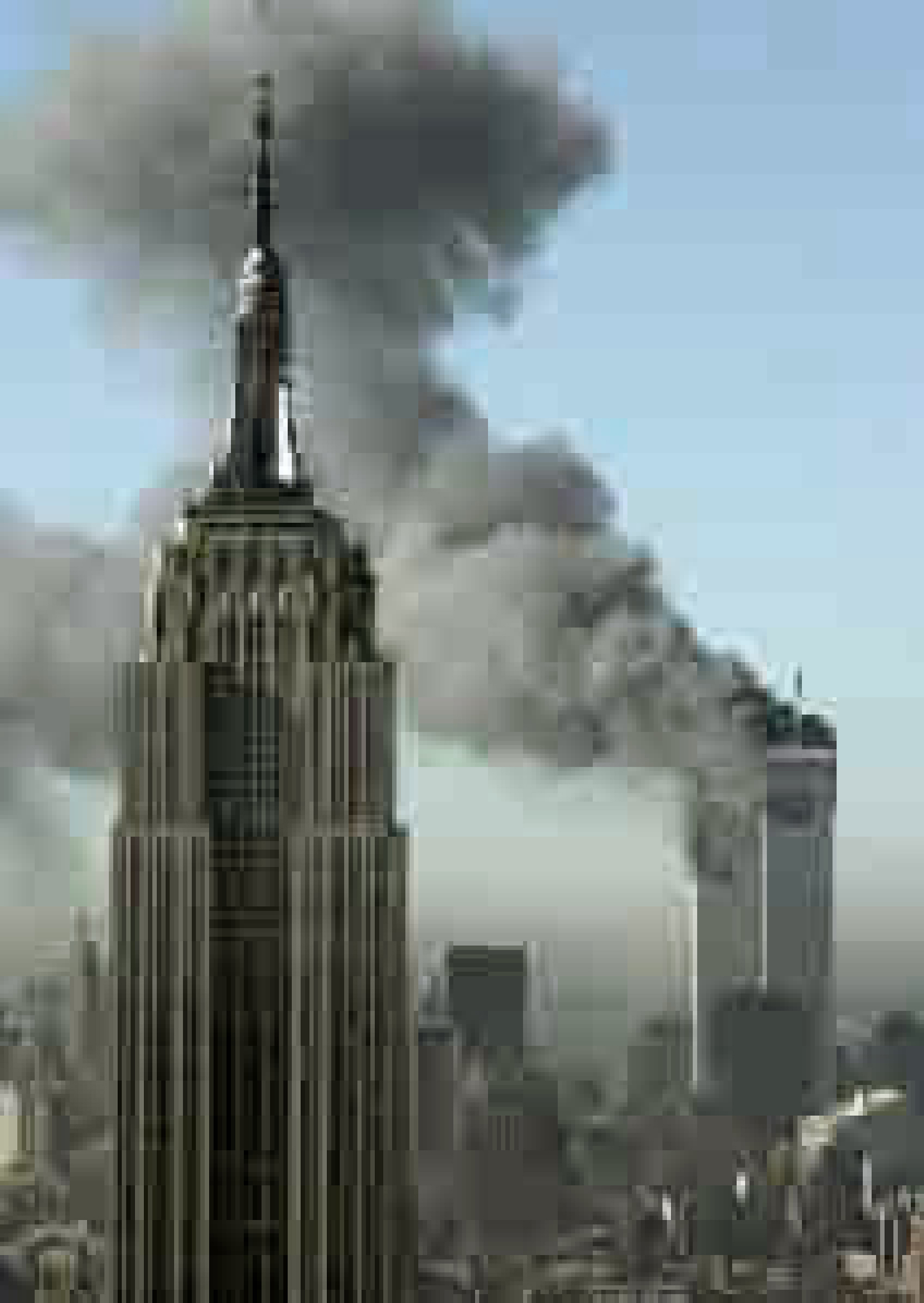
“We live in a privileged world, we don’t have to go to far to see”. The current situation has forced us to look at the world around us, we don’t have the freedom to go wherever we want and so have to pay particular attention to things that we might normally have ignored. You don’t have to wander far from your door to find “moments”.
“Its always luck”, “Luck is all that counts”, “If you’re open it will come.” When talking about his photograph Cartier-Bresson says that he didn’t have a clear view of what was happening, he managed to get his lens through the bars but couldn’t frame the image intentionally to get the figure running. Such an important image, an important concept for photographers which comes down to luck and pressing the shutter release at the right time.
France. Paris. Place de l’Europe. Gare Saint Lazare. 1932. Photograph: Henri Cartier-Bresson/Magnum Photos
In his article, O’Hagan, S. (2014), about Sean O’Hagan says “The decisive moment has come to mean the perfect second to press the shutter.” In 1932, when Henri Cartier-Bresson took this image, there were no digital cameras, just film. Capturing the image was a matter of pressing the button at the right moment. Today, with digital cameras and the ability to set the to capture high speed bursts of images, it isn’t so much a case of pressing the button at the perfect second but being aware that something is about to happen so you can release the shutter and capture a period of time, including the particular moment you are after.
Cartier-Bresson states that for him “Form comes first. Light is like perfume for me” and that is well illustrated by his photograph taken in Hyères, France. Composing the image, getting the shapes right and then waiting for the right light makes this a great image. Having the cyclist come through just at the right moment is luck, although it is possible to have an insight that they are coming through, catching them at the exact moment they were opposite the bottom of the staircase is challenging, and requires a little bit of luck of was it actually staged?
There are so much that we can learn from Henri Cartier-Bresson but the one, really important, thing that we can learn by watching this documentary is when he says:
“You need to learn to love to look. You can’t look at something you don’t love.”
If we can’t look at something because we don’t love it, then how can we expect to capture those Decisive Moments when they happen. We need to be ever-present…just in case!
References
Vimeo. 2021. H. Cartier-Bresson: l’amour tout court. [online] Available at: <https://vimeo.com/106009378> [Accessed 10 September 2021].
‘I’m inclined to think that there is no such thing as a photojournalistic image, only a photojournalistic use of an image.’
(David Campany)
Read around the photographers above and try to track down some of the quotations, either in the course reader (Liz Wells) or online. Write up your research in your learning log.
Now look back at your personal archive of photography and try to find a photograph to illustrate one of the aesthetic codes discussed in Project 2. Whether or not you had a similar idea when you took the photograph isn’t important; find a photo with a depth of field that ‘fits’ the code you’ve selected. Add a playful word or title that ‘anchors’ the new meaning.
The ability of photographs to adapt to a range of usages is something we’ll return to later in the course.
Wim Wenders
‘The most political decision you make is where you direct people’s eyes.’
(Wim Wenders (1997) quoted in Broomberg & Chanarin, 2008)
Wim Wenders, ‘Drive-in at night’, Montréal, Canada, 2013. Image courtesy the artist and BlainSouthern
As photographers we see things and then try to capture them in a way that reflect that vision and share that with other people. A lot of the photographs that people take are for family albums or to share online with family and friends. In the majority of these cases, very little thought is given to positioning of the subject within the image, or where the eye might be drawn.
Wenders also once said that photography is akin to “watching death at work,” as the contents of the image will inevitably change, fade, or cease to exist. This leads to photographs being unique and impossible to recreate.
Andre Bazin
‘Deep focus give the eye autonomy to roam over the picture space so that the viewer is at least given the opportunity to edit the scene himself, to select the aspects of it to which he will attend.‘ Bazin (1948)
Deep focus cinematography brings everything that can be seen in the foreground, mid-ground and background of a frame into focus at the same time. To achieve this, the cinematographer must manipulate lighting, composition, camera lens and depth of field. The depth of field refers to the distance from the object or character at the front of the image to the object or character at the back. To achieve deep focus there is usually a large depth of field, which refers to a large distance between the foreground and the background. The use of deep focus means that the mise-en-scène is more significant and meaningful, as everything can be seen very clearly.
The human eye does not naturally focus from close up to infinity at the same time. The eye focuses on certain things while allowing other things to lose focus, to blur. It would seem natural then for photographs to show scenes in a similar way, which would also allow the photographer to direct people’s eyes as indicated in the quote by Wenders above.
However, that isn’t how the world exists. The world around us doesn’t drift in and out of focus as people look at it. Instead it is constants. It’s the way our eye focuses and interprets the light that hits our retina that governs how we see it.
F/64 Group
The name of this Group is derived from a diaphragm number of the photographic lens. It signifies to a large extent the qualities of clearness and definition of the photographic image which is an important element in the work of members of this Group. The chief object of the Group is to present in frequent shows what it considers the best contemporary photography of the West; in addition to the showing of the work of its members, it will include prints from other photographers who evidence tendencies in their work similar to that of the Group. Group f/64 does not pretend to cover the entire of photography or to indicate through its selection of members any deprecating opinion of the photographers who are not included in its shows. There are great number of serious workers in photography whose style and technique does not relate to the metier of the Group. Group f/64 limits its members and invitational names to those workers who are striving to define photography as an art form by simple and direct presentation through purely photographic methods. The Group will show no work at any time that does not conform to its standards of pure photography. Pure photography is defined as possessing no qualities of technique, composition or idea, derivative of any other art form. The production of the “Pictorialist,” on the other hand, indicates a devotion to principles of art which are directly related to painting and the graphic arts. The members of Group f/64 believe that photography, as an art form, must develop along lines defined by the actualities and limitations of the photographic medium, and must always ‘remain independent of ideological conventions of art and aesthetics that are reminiscent of a period and culture antedating the growth of the medium itself.’ The Group will appreciate information regarding any serious work in photography that has escaped its attention, and is favourable towards establishing itself as a Forum of Modern Photography. (Group f/64 Manifesto , 1932)
The f/64 Group consisted of a number of photographers of the calibre of Ansel Adams, Edward Weston and Imogen Cunningham. Their aim was to produce images that were sharply focused, carefully composed and which did not rely on any of the techniques associated with art prior to the development of photography, and especially those techniques that were related to painting. There are ideas, techniques and rules used in painting that are useful to photographers who are starting out. The Rule of Thirds, Golden Ratio, the use of light and shadows, these have been explored and refined over centuries in order that artist can produce works that are pleasing to the eye and invoke emotions in the viewer. Learning these rules and techniques is very useful. Knowing how to do something correctly is the first stage in being able to break the rules. The same applies with photography, once you are aware of the techniques then you are able to move away from them in an informed manner that will enable you to produce works that fit with your vision. Images where most, if not all of the image, is sharply focused are good but images that are softly focused or make use of blurring of elements can equally produce results that are pleasing to the eye.
Fay Godwin
One-way bridge at Trafalgar, by Fay Godwin
Fay Godwin didn’t want to be seen as a landscape photographer, preferring to be considered a documentary photographer. Her interest is not in the landscape (and thus, she has no interest in producing conventionally aestheticised landscape images: in a 1986 South Bank Show interview she states that she is ‘wary of the picturesque’), but rather in human engagement with, material impact on and use of the landscape. Her work uses predominantly large depth of field and was integral to her landscape and close-up work.
Gianluca Cosci
Cosci doesn’t consider himself a photographer but an artist that uses the camera simply as a medium.
His work “Panem et Circenses” which is latin for “bread and circuses”. This phrase was supposedly coined by Juvenal (AD 100, a Roman satirical poet), describing the cynical formula of the Roman emperors for keeping the masses happy with ample food and entertainment.¹
On Cosci’s web site there is a an interview with Kevin Byrne in April 2016, Byrne, a teacher and a photographer based in Taranto Italy, gives some insight to Cosci’s thinking and the Circenses work. Cosci says that when he came to London, a world capital, from Bologna and that he was overwhelmed by it, he said he was both fascinated by the city’s confidence, superiority and authority but also repulsed by places such as Canary Wharf and the City of London, displaying obscene amounts of wealth and power. (Byrne, 2016)
I could relate to this comment as I had similar feelings when I originally moved to London from ‘sleepy’ Devon and being in awe of the 24/7, high speed nature of the city which was exhilarating and terrifying in equal quantities.
His work made I think as a reaction to the feeling of fascination and repulsion and how images can have an underlying meaning or message, rather than just capturing a moment in time. The photographs in Panem et Circenses have a very shallow depth of focus, examining detail in narrow slithers of focus. The unfocused areas blur into confusion and the eye is always brought back to the detail. Details of weeds, for example, claiming patches of land do indeed give the feeling of desolation and abandonment, which is interesting as there is not much other content visible.
Mona Kuhn
Kuhn’s (2019) website displays 12 images from her Evidence series.
In ten of these twelve images people can be seen. In the others there is a noticeable absence of a person but there remains evidence of their existance which tells something about the person.
The image Closer has a voyeuristic edge to it, as a figure, that I assume is Kuhn, can be seen reflected in the window taking the photograph. The eyes of one of the figures looking directly at the photographer, and the partially turned head of the second figure, give the impression that something private has been interupted. Although all the figures in the images are naked, as far as can be told with regards to those images where the whole figure cannot be seen, Kuhn’s use of depth of field provides them with a level of privacy while also sharing intimate moments.
Kim Kirkpatrick
I found when searching for both the website that was linked to in the course notes and also using online search mechanisms that finding out about Kim Kirkpatrick was very difficult, especially when it came to examples of his work.
Guy Bourdin
Tate and ICP search results show very different examples of Bourdin’s work. The Tate examples are in black and white, while the International Center of Photography examples are all colour and from a series called Sighs and Whispers. These latter has the feel of a magazine fashion shoot to them, in particular for a more high end fashion magazine or label.
Each of the ICP images has an intensity to it, whether that is from the looks that the models appear to be giving the viewer, a sense that the figures are waiting for something to happen.
The Tate examples are from an earlier period in Bourdin’s career. Even so it is possible to see some of what would be used in his later fashion work. An image of bleached bones and carcusses on a floor looks menacing as does an image of a rusted door lock.
David Campany
‘I’m inclined to think that there is no such thing as a photojournalistic image, only a photojournalistic use of image.’ David Campany
The above quote is in response to a comment on an article that Campany(2013) wrote in May 2013.
The discussion was the result of an article that Campany had publised that discussed the work of Eve Arnold and Don McCullin that had appeared in The Sunday Times magazine. In contrast with the McCullin piece, which used some of his images captured in Vietnam, the Arnold piece used images captured in North Carolina at a facility built to replicate a North Vietnamese village that could be used to train American troops before they embarked for a tour in Vietnam. McCullin’s piece showed how things were in country, while Arnold’s piece was a step removed from this and the dangers soldiers, journalists and photographers faced while in the war zone.
Whereas McCullin photographs were more immediate and could not be planned out easily. Arnold had the luxury of being able to take more time over her shots and to achieve results that could be influenced by other areas of photography, for instance fashion photography. In response to the comment Campany argues that all images can be seen as forms of different genres of photography, for instance fashion, portrait, landscape, architectural etc. It is the use of the image to report on events that makes them photojournalistic.
With the use of mobile phones to capture images and video as events play out, by members of the public, who are by their very nature not journalists but either bystanders, or actual participants, in the events they are capturing, Campany’s point is a lot easier to understand. It is not the actual image but how it is used that defines how we see it.
My Image
‘High Point’ Haytor, Devon – ISO 100 133mm f/5.6 1/200
Read the reviews by Campany and Colberg and, if you haven’t already done so, use them to begin the contextual section of your learning log. Try to pick out the key points made by each writer. Write about 300 words. If you wish, you could add a screen-grab of an image from Ruff’s jpeg series, and one or two of your own compressed jpegs (taken on auto mode of course!). You can achieve the effect quite easily by re-sizing a photograph to say, 180 x 270 pixels, and saving at ‘zero quality’ compression. If you use Photoshop’s ‘save for web’ you can see the effect immediately without having to save, close and reopen the file.
Thomas Ruff is a German-born Photographer and has been described as ‘a master’ of edited and reimagined images.
Thomas Ruff – ny01 2004
Campany says that Ruff offers very particular kinds of pleasure, both aesthetic and intellectual but also cold and dispassionately wilful, searching and perverse but also ‘beautiful’. He states that Ruff has a preference for working in series. Ruff has said that his work is ‘internet-based’ from searching links from one site or another, he calls the internet is an ‘archive of archives’. Ruff has done a great job of creating “art of the Pixel” and the images are blown up beyond their photorealist resolution, he has replaced the grain of photographic film into electronic data.
Joerg Colberg makes the points that Ruff might be “one of the most creative and certainly inventive photographers of our time”, however, most people will deny that his work is actually photography. Colberg points out “it’s not photography then what else, are not terribly exciting, and there is no need to get into them here. What is more interesting is to look at that work and to see what it does (call it photography, graphic design, visual art, whatever).” Ruff came up with the idea of ‘JPEGS’ when his negatives from the attack on the World Trade Centre were blank so he downloaded images from the Internet but they were really low quality, so managed to modify them into visually poor but still visually recognisable images.
I agree with both Campany and Colberg, Colberg sees Ruff as ‘one of the most inventive photographers of our time’ but also that it’s more art than Photography, whereas Campany sees his work as “cold and dispassionate but also beautiful”. Today it is expected that the camera is a tool to capture that ‘perfect image’, but Ruff’s images hark back to the days of grainy-imperfection as well as the early days of digital photography and its limitations.
The list below is showing a range of art book fairs, both independent publishers and independent designers and artists. Research the book fairs online and explore the wide range of books by independent publishers, to gain a better understanding of the variety of books and publishing possibilities. You might want to visit one of the fairs in the future and explore the books.
Offprint runs alongside Photo London and began in 2015 as a one-off commission for Yannick Bouillis of Offprint Paris from then director of Tate Modern, Chris Dercon and his curator of photography Simon Baker. Now in its fifth year, Offprint goes from strength to strength under the stewardship of Bouillis who invites guest curators and publishers to handle aspects of its programming each year.
Although Offprint trades in books, zines, magazines, CDs, posters, prints and more, Bouillis has always been keen to distance his event from the wider revival of the book form. Instead, he sees it as an opportunity for artists to reclaim their independence by controlling the dissemination of their work.
As a result, Offprint trades in works of highbrow conceptual content, not the twee or cute to which many self-publishing fares often subscribe.
Offprint London in the Turbine Hall of the Tate. Source: represent.uk.com
Art book Fair London
For four exciting days, creative and cutting-edge publishers, big and small, transform the Whitechapel Gallery into the London Art Book Fair. Discover a vibrant mix of art books and magazines from around the world.
Convened by associate curator Amy Budd this year’s public programme for the London Art Book Fair brings together some of the most innovative art publishers into dialogue around key questions in the industry today, alongside presentations by London-based artists, curators and poets working with text, publishing and performance.
Poster Workshop from Four Corners Books at the Art book Fair London. Source: Four Corners Books
Small Publishers’ Fair
Small Publishers Fair is an annual celebration of books by contemporary artists, writers, composers, book designers, and their publishers. It was set up by Martin Rogers of RGAP (Research Group for Artists Publications) and first took place in 2002, the Royal Festival Hall. The year after it moved to Conway Hall where it has taken place ever since.
Since 2012 Small Publishers Fair has been curated, organised and developed by Helen Mitchell. The Fair is independent, self-funding and not-for-profit. In 2019 a StartEast grant supported design of a typographic identity and programme, and the creation of a this new website.
BinBagBooks by Mette-Sofie D. Ambeck (Nov. 2019). Source: Ambeck Design
International Contemporary Artists’ Book Fair
Held at The Tetley since 2014 and co-curated with PAGES, the Book Fair coincides with The Hepworth Wakefield’s Print Fair on the same weekend. It is the longest-running artists’ book fair outside of London.
Zines by Izzy Kroese at the International Contemporary Artists’ Book Fair. Source: Izzy Kroese
The Sheffield International Artists’ Book Prize
The Sheffield International Artist’s Book Prize is as much about finding an interesting format in which to show, view and celebrate artists’ books as it is about creating a prize. The inaugural Prize was held in 2008 in an attempt to find an interesting, engaging and innovative way to show artists’ books: one that would allow them to be handled and encourage visitors to invest time with the books and see the breadth of work on offer in this field. As a result, the Prize is free to enter and takes the stance of showing all books submitted.
Books by Artovert who were first prize winners in the 2nd Sheffield International Artist’s Book Prize. Source: Artists Book Prize
Dublin Art Book Fair
Temple Bar Gallery + Studios is a thriving artists’ community in the centre of Dublin. Many of Ireland’s leading artists have worked in the studios and have exhibited in the gallery. Over its life-span, more than five hundred Irish and international artists have contributed to making the organisation a beacon in the story of visual arts into 21st century Ireland.
BABE Bristol Artists’ Book Event
Since 2007, BABE has established a great reputation as a relaxed and friendly event to meet and talk to book artists about their work and buy works of art.
Read This Out Loud Letterpress and inkjet 5 x 3″ 2020 designed by Big Jump Press(Exhibitors at BABE) in June 2020 in response to the murders of George Floyd, Ahmaud Arbery, and Breonna Taylor. Source: Big Jump PressEncyclopaedia is sections of the original Encyclopaedia Brittanica from 1771 printed on fabric by Big Jump Press. Source: Big Jump Press
Find two artists’ books that you feel demonstrate an interesting relationship between their form and content through the materials that the artist has chosen to use. Reflect on these books in your learning log.
If you have physical access to libraries such as The British Library, Tate Library Special Collection, or Leeds University Library, visit them and have a look at examples of artists’ books in their special collections. Libraries have online resources as well with access to their collections, for example the V&A National Art Library. Alternatively, return to the The Smithsonian Library’s online archive of artists’ books: https://library.si.edu/collection/artists-books
You may also want to reread the Artists’ Book section in Part One of this unit.
This book caught my eye as it reminded me of the Robinson Crusoe assignment from earlier in this module. The 3D effect is created with 4 folios mounted on dowels with one of the 8 images on each side. This pen and ink illustration shows lots of detail which is down to the medium used, which I think this book needs. It is then cut out to give the 3D feel and create depth which works really well for the Kraken’s tentacles engulfing the stricken vessel.
Another nautical book, this time representing Nemo’s Nautilus. This is layered tunnel-book depicting the infamous submarine in the deep along with the sea monster from Jules Verne’s novel. This book also comes in a presentation box with a porthole through which the scene can be viewed.
This concertina book shows the evolution of a single square(pulsar) into a complex geometric pattern printed from a woodblock design. This book tells a story without words but still has a sequential plot.
Reflection
Both artists have their own unique style when it comes to their books. However, both artists use shape to help tell the story as well as not necessarily conforming to what would be regarded as a traditional book.
Carla Busquets uses detailed imagery to draw the reader in and in turn uses elaborate ‘packaging’ for her books. This ‘packaging’ is not just part of the book but a work of art in itself and eludes to the contents within. The ‘packaging’ also forms part of the books’ overall feel and tells a part of the story and can be as elaborate as the books themselves. The cutout technique also adds to the shape of the books and gives them a more in depth and tactile feel.
Esther K Smith uses letterpress printing in her work which gives it a simplicity that is in contrast to Busquets. This printing lends itself to type and bold shapes that Smith uses to tell her stories. There is some detail in on the wings of the ‘moths’ which has been achieved using type ornaments to create repeating patterns. The cutout shape of the moth gives a decorative and illustrative part to the poem with using any imagery at all.
“Though largely forgotten today, methods and rules upon which it is impossible to improve have been developed over centuries. To produce perfect books these rules have to be brought back to life and applied.” Jan Tschichold, The New Typography, 1928
The Golden Section, or Golden Mean, has been applied by artists and designers over the centuries to create harmonious formats for their work. In his extensive research, Tschichold discovered that many book designs were based on the Golden Section. Based on a mathematical formula, and directly linked to the Fibonacci series, the Golden Section provides a method of creating and dividing space that is a useful working framework for the book designer.
“To form a golden section rectangle from a square, the square is divided in half. The diagonal of the half square is rotated to the horizontal, defining the length of the rectangle.” Andrew Haslam, Book Design, 2006
The red dotted lines show how a rectangle has been created from a square using the Golden Section principle. It is then divided to form 2 facing pages.
Look into the golden section more generally, by exploring how artists and designers have used these principles, and more specifically in book design, by looking at J. A. van de Graaf’s Canons of Page Design, Jan Tschichold’s grid designs, or other grid systems for organising the page: https://en.wikipedia.org/wiki/Canons_of_page_construction
What is the Golden Section?
The Golden Ratio is a mathematical ratio that’s commonly found in nature. It can be used to create visually-pleasing, organic-looking compositions in many design genres. The Golden Ratio(Section) describes the perfectly symmetrical relationship between two proportions. This can be represented by the ratio 1:1.618 and this relates to the size of the above rectangle. This rectangle can then be divided further into smaller rectangles using the same proportions.
The Golden Ratio is inherently pleasing to the human eye and is very useful in art and design. In relation to book design the Golden Ratio is used for page size and layout. Jan Tschichold described his discovery of the use of the ratio as “a method to produce the perfect book”. Tschichold’s Golden Canon’s crowning glory was that it proved that the ideal height for the text block was equal to the page width.
The Golden Section is something that interests me especially from a typographical point of view. The grids and layouts that can be created are very intricate-looking but usually produce the simplest and most pleasing results. Hopefully I can utilise this in some way as part of this course.
Further inform your understanding of paper and bookbinding by reading pages 165–180 of Alan Pipes’ chapter ‘On Press’ available as a downloadable resource at http://www.oca-student.com/
Collect lots of different paper samples, and assemble these into a standalone book, or integrate them into your sketchbook. See this as the start of an ongoing resource that you can add to, and refer back to. Add notes to your paper sample book/sketchbook identifying the paper source, stock, and any reflection on the paper’s qualities. You may want to extend this investigation by exploring how your paper samples can be folded, combined, stitched, printed on, or bound together. Explore your samples’ physical properties by working with them, testing them out, and visually documenting the results of your research.
Prior to lockdown I had begun collecting paper samples from print companies. I have managed to collect a couple of sample books and have more on the way hopefully! They have proved very useful in identifying the types of paper and finishes that can be used in the printing process from the weight and finish of the paper itself to any special finishes added to designs such as kiss cutting, creasing, perforation, die cutting, matt or gloss lamination and spot UV.
Spiral bound sample books of plain white paper from Newton Print in Newton Abbot.A really nice perfect bound, full-colour sample book featuring different papers, finishes and effects from Solopress in Southend on Sea.A sample of die cutting effect in the Solopress bookA sample of different paper in the Solopress book.A sample of spot UV effect in the Solopress book.
I found the Solopress sample book really interesting and it contains a lot of information about the uses of each paper and the possible finishes that could be applied. It is a very tactile, well designed and informative book which I’m sure I will keep referring to in the future.
Becoming more familiar with different types of paper and finishes has given me more of an insight into how papers and finishes are used. I now find myself trying to identify the types of papers used in everyday stuff I come across in my day-to-day life from magazines, books, things that arrive in the post to the printer paper I use. I will continue to add to my collection of samples to widen my understanding of different printing and binding techniques.
Familiarise yourself with the terminology used in describing the anatomy of a book and write some brief notes in your learning log on how the various structural elements could be modified to reflect the book’s function.
Book components
Andrew Haslam’s book – Book Design lists the components of a book as the following:
Spine section of a book cover that covers the bound edge
Headband narrow band of thread tied to the sections that are often coloured to complement the cover binding.
Hinge fold in endpaper between pastedown and flyleaf
Head square small protective flange at the top of the book created by the cover and backboards being larger than the book leaves
Front pastedown endpaper pasted down to the inside of the front board.
Cover thick paper or board that attaches to and protects the book block.
Foredge square small protective flange at the foredge of the book created by the cover and back
Front board cover board at the front of the book
The tail square small protective flange at the bottom of the book created by the cover and backboards being larger than the book leaves.
Endpaper leaves of thick paper used to cover the inside of the cover board and support the hinge. The outer leaf is the pastedown or board paper; the turning page is the flyleaf.
Head top of the book
Leaves individual bound paper or vellum sheets of two sides or pages recto and verso.
Back pastedown endpaper pasted down to the inside of the backboard
Back cover board at the back of the book block.
Foredge front edge of the book.
Turn-in paper or cloth edge that is folded from the outside to the inside of the covers.
Tail bottom of the book
Flyleaf the turning-page of endpaper
Foot bottom of the page
Signature folded sheet of printed paper bound in sequence to form the printed block.
Book block the main block of pages created when book pages are sewn or glued together before binding.
Elements that can be changed to reflect the book’s function
Cover and spine
The cover of a book can majorly affect people’s perception of the book and also assists in selling the book and its contents. The quality or value of the book will impact on the type cover the book will have, whether it is a hard-cover or paperback. The type of printing can also vary depending on the type of book. Artwork may be printed directly on to the cover of a paperback book whereas hardbacks may be foil-blocked, embossed or have the artwork on a dust-jacket.
Orientation and size
Depending on the books function the orientation may change. The dimensions of the book also depend on its function, if it is meant to be read in hand or on a table.
Headband
The thread could be changed to match or complement the cover.
Leaves
The type and makeup of the pages will depend on the books function. The heavier paper would mainly be used for books that are coffee table books or presentation books that are meant to be thumbed through and are too large or heavy to be held in hand. Paperbacks and novel are usually printed on thinner paper to make them lighter so they can be easily held and transported. Children’s books are often made of thicker paper or board to give them extra strength to protect them from the destructive power of the child.
Binding
How this is bound can change depending on the type of book whether it is stapled, sewn together or glued.
Layout, grids, margins and gutters
These all depend on the type of book. The layout varies depending on the function and so does the grid to an extent. Grids can alter the style of the book directing and leading the reader in the right direction. The margins and gutters also depend on the function of the book. Novels have thicker margins allowing the reader to hold the book without inhibiting the view of the type, whereas coffee table and reference books don’t need such wide margins as they are meant to be left open on a table as opposed to it being held in hand.


