Using only an image of a light bulb, the word ‘light bulb’ and a block of colour of your choice create different designs that explore visual dynamics – as the kitten designs shown in the previous project.
Think about your compositions, trying each element at a different sizes and cropping your photo. Your block of colour can be any size, so use it fully to create a sense of space in your composition. Think about layering your visual elements to create depth within your designs and think about contrasts.
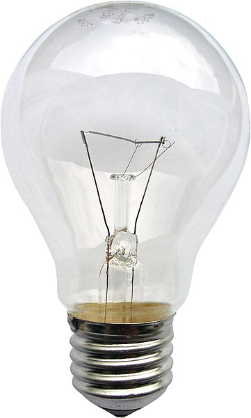
Use thumbnails to work out what sort of designs you might try. You can download and use this lightbulb image from http://commons.wikimedia.org/wiki/File:Gluehlampe_01_KMJ.jpg and work on your computer or photocopy the picture of the lightbulb and work on paper.
Be playful within the rules set, creating as many different designs as you can. Edit these down to about 20 designs that you feel represent the breadth of different approaches you have explored.
This exercise really interested me on how to use hierarchy, contrast, shape and scale to represent the same elements in different ways.
Initially I set out some art-boards in Illustrator and added a variety of grids on to them.
The grids I used were a Fibonacci sequence column grid; a Golden Ratio grid; a 9×9 grid and a 5 column grid.
I then thought that this would restrict me and make my designs too rigid, so I just used blank art–boards instead. I then decided on the colour scheme and typeface – a rich yellow and a sans serif typeface called Poppins that I liked for its simple geometric shapes. I imported the image of the lightbulb into Photoshop and removed the background before transferring it across to Illustrator to start working with the 3 elements varying the size, shape and layout.
I’m happy with what I produced, particularly the how the combination of the elements worked together even when they weren’t fully visible. It is amazing the number of different combinations that you can come up with and how the designs change when a certain element is emphasised more than the others. Also the alignment of elements influences the success of the design as the elements need to relate to each other in some way, that is where my initial leaning towards a grid layout stemmed from.
From my selection I particularly liked 3 of them:
The first I liked due to the play of scale, using the lightbulb as the background image and using the type and the yellow bar as the filament. The yellow bar in front of the type obscures just enough that the type remains legible.
The second I liked for its minimalism and the playfulness of the lightbulb peering over the top of the yellow “wall”. The minimal type in the bottom corner doesn’t detract from the main image and of the 3 elements it is third in hierarchy and would be read last after seeing the first 2 elements. Also there is a lot of white space in this design which makes the other elements stand out.
The third has a large area of white space which sets off the other elements in the design. The shape of the yellow element this time was circular to relate to the shape of the bulb and looks like light emanating from the bulb. The vertical text is minimal but stands out due to the colour. The whole design made me think of something Japanese, maybe it was the circular element.
In this exercise you will read existing signs, symbols and images, and then drawing on their visual language create your own symbols.
Choose one of the following concepts:
Danger
Movement
Love
Here
How does existing visual language represent these concepts, for example both ‘danger’ and ‘love’ use red, while ‘movement’ and ‘here’ use arrows. Research the different similes and metaphors that are in common use. Document them through drawings, collecting examples and mind maps.
Now create an alternative symbol to represent at least one of the concepts.
Pencil and paper is the fastest and most practical way of working out your initial designs. You may then want to develop your idea further using computer software.
Ideas
The book An Introduction to Information Designby Kathryn Coates & Andy Ellisonwhich is on the course reading list splits this into 3 categories: pictographs, icons and symbols.
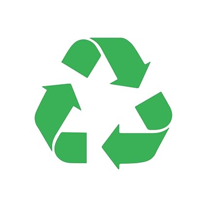
“These are mainly used when more complicated illustrations or photographs are unsuitable, such as with signage and way-finding. It is important to understand the difference between them. Pictographs are defined as stylised images that directly resemble an object or concept. They can be categorised into 3 groups. A resemblance icon directly portrays the object it refers to, such as a steaming cup to indicate a café. Icons signify a more abstract depiction of the object shown, for example the recycling symbol which uses arrows to suggest the concept of reuse. A symbol is an icon that has no relationship or resemblance to the object or concept it represents, an example of this would be the icon for biological hazard or biohazard used to signify a health risk.”
I had a look around my desk and to see what signs and symbols I could find.
These images range from the Apple logo which is not just a logo it is a symbol representing the company and its values and quality; to the icons on my desktop; the a-for mentioned An Introduction to Information Designbook; to images of the New York Transit System in Michael Bierut’s book How to use graphic design to sell things, explain things, make things look better, make people laugh, make people cry, and (every once in a while) change the world.
I then went on to list some alternative words for the 4 concepts.
Then I searched the net for images that represented them.
Danger
Movement
Love
Here
Initial ideas from my word associations and image search gave me several ideas.
Danger: There are so many danger signs out there. We live in a health and safety, litigious society and everything has a warning of some sort on it whether it needs it or not. The perfect example of this is packets of peanuts have the warning that they “May contain nuts”! However, the most prevalent thought/image in my head when the word danger was mentioned was of the Class M-3 Model B-9 General Utility Non-Theorizing Environmental Control Robot from the 1967 television series Lost in Space created by Irwin Allen shouting “Danger, Will Robinson!”. Could this be made into a sign/symbol that would represent the word?
Movement: I liked the idea of doing a sign/symbol for movement as this could throw up many directions in which it could go. I liked the idea of portraying movement with some type and the ampersand image in my research was something that stood out to me. I then thought about what movement was. It threw up the word motion and this led me to what motion is described as:
Motion is the change in position of an object with respect to its surroundings in a given interval of time. Motion is mathematically described in terms of displacement, distance, velocity, acceleration, time, and speed. Motion of a body is observed by attaching a frame of reference to an observer and measuring the change in position of the body relative to that frame.
Could this be made into some sort of scientific sign/symbol?
Love: This word seemed to throw up the most synonyms. The images I found were as expected: hearts and hand–holding; Robert Indiana’s famous love wordmark; kissing. I then asked myself “what is love?”. Love is described as a chemical reaction in the brain in which oxytocin is released giving a feeling of euphoria. I wondered if I could produce a symbol to represent love from the biological/chemical effects it has?
Here: This was the least inspiring of the 4 concepts. It didn’t throw up that many synonyms or images that sparked any ideas. I discounted this concept at an early stage.
My choice: Love
Initially I didn’t think love was a viable option as it could be too cliché. However, after the brainstorming exercise it threw up the fact that love was a chemical reaction resulting in the production of oxytocin.
Signs and symbols need to be clear and easily visible and scalable in all sizes and from a distance while still being legible.
So the oxytocin idea threw up the possibility of chemical diagrams and models. I then searched for images of the chemical make-up of oxytocin.
It also threw up the idea that “love is a drug” which took me in another direction altogether…
I didn’t think that this was clear enough as a symbol representing love so I dismissed it. But I did enjoy doing it.
I went back to the idea of the molecular structure of love and oxytocin.
This was my first drawing of the molecule and it was pretty flat and not bold enough and clear enough and I don’t think that it would work at various scales and sizes. It needed to be bolder and more stylised and less detailed as a simplified symbol that could be easily seen and recognised. I tried simplifying the design by removing some of the elements and thickening up the connecting lines. While quickly sketching sketching out ideas for the simplified structure it had started to remind me of the London tube map. I wondered whether to include some of the colours used on the tube map?
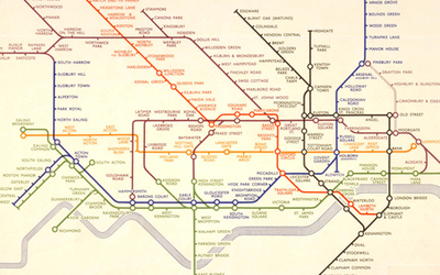
Harry Beck’s Tube map
Originally considered too radical, Harry Beck’s London Underground Tube map has become a design classic.
Now recognised across the world, the Tube map was originally the brainchild of Underground electrical draughtsman, Harry Beck, who produced this imaginative and beautifully simple design back in 1933.
Rather than emphasising distance and geographical accuracy, like other maps, Beck based his on the circuit diagrams he drew for his day job; stripping the sprawling Tube network down to a neat diagram of coloured, criss-crossing lines.
Beck’s map was initially rejected by the publicity department because it was considered too radical but a successful trial print-run showed that it was just what the public wanted.
The result was an instantly clear and comprehensible chart that would become an essential guide to London – and a template for transport maps the world over.
Beck’s revolutionary design, with certain modifications and additions, survives to the present day and is set to serve London Underground and its millions of customers for many years to come.
Using thicker lines and uniform sized circles like on the tube map really made the oxytocin molecule stand out. I chose to colour the circles(molecules) in primary colours. I didn’t think that the lines needed to be different colours as this would make the overall design a little disjointed. I also removed the smaller molecules as the image looked too busy. I gave the molecule structure curved corners in order to soften the symbol slightly as it looked a little stark and clinical with sharp edges and corners.
The background needed something, so I went back to the tube map and took inspiration from the zones on the map and used something similar in my design. I took the hexagon in the molecule structure used this shape to create a background similar to that of the tube map. The hexagons are in the proportions on the Golden Ratio: 1.618 and are aligned to the hexagon in the molecular structure of the oxytocin symbol.
Final design
Conclusion
I initially thought this would be a challenge designing a symbol to represent one of the four words. But after brainstorming the word I ended up with the one that I least expected to offer up a solution.
Once again, I went away from the cliché images for love and hopefully hit the brief but from a slightly different angle.
Feedback from other students was good, but I did have to explain what it was to some of them. Once I had explained it, they understood where I was coming from. The relationship of the hexagons in the background also raised some questions with other students who were unsure of what the Golden Ratio was.
I believe that this design would be scalable and clear at any size.
Reflection
On reflection the symbol is not obviously about love. The direction I chose is not the most obvious and therefore is difficult to interpret. Using the tube map as a reference for the design worked in that I have designed a symbol that looks like the tube map but isn’t obviously about love. Perhaps rather than a hexagon as the background maybe a heart shape would have been a better background even if it was a little obvious, however the hexagon shape related to the cellular diagram. I liked the use of the Golden Ratio for the background as equal sized divisions didn’t look right. The pattern created using the Golden Ratio is more pleasing to the eye.
I think moving forward I will try to be a little obtuse in my approach to my work.
It is very easy for the ephemera of everyday life to disappear; leaflets binned, magazines recycled and books reprinted. If you get in the habit of collecting examples of design that you encounter everyday, then you start to get a feel of your tastes and interests, and over time both your design horizons and cultural awareness broadens.
Start a scrapbook, sketchbook or use a blog to document the visual world around you. Find examples of visual language that interest you, these could be taken from anywhere (art, film, photography, illustration, design, craft, cinema, hobbies, etc).
If you can, visit museums, galleries and consider all the graphic design around you – in books, magazines, cinemas, shops and poster sites. This is your investigation, so follow your nose.
Collect leaflets, flyers and postcards; take photos of things you see in the street; keep pages from magazines – anything and everything that is visually stimulating to you. There is no right or wrong, the important thing is to actively look at the world around you and become genuinely curious about visual languages.
Reflect on what you have been collecting: are there dominant themes emerging? You may find yourself interested in a particular area of design, era or design product. What does this tell you about your own visual language and cultural awareness? Make notes in your learning log.
Pinterest
I have been collecting design stuff I like for a long time on Pinterest. I have several boards setup covering “design ideas”, “logos” and “typography” as well as on for my college work.
The “logos” board is the biggest of the lot with over 700 pins in it. There are logos of varying styles and shapes. I am drawn towards what I class as ‘clever’ logo and the more minimal the better.
The ‘typography’ board is the newest and is a work in progress but I am really enjoying my typography at the moment and most of the work I am currently doing seems to have type in it somewhere!
The “design ideas” board is where I put images that I use for research when doing any design work.
Also, I guess that my mobile phone is a visual diary of events and interests that is documented over time. This has only just occurred to me and is an interesting concept that I probably need to use more. My DSLR camera is also an underused piece of kit that only comes out on holidays etc..
Posters generally, have an image and one main line of text, most often the title, followed by additional essential information.
Look around locally and identify a coming event – it could be a jumble sale, a local gig, concert or play, an exhibition or sporting fixture – and design two posters to promote it.
Make the first poster full of details and descriptions about the event, when and where it’s taking place, what’s going on, how long it lasts, how much it costs and what to expect. Include all the details that you think your audience might need.
For the second poster apply Occam’s Razor to pare back the information to a bare minimum – be extreme: how little information can you get away with and how few words can you use? Challenge yourself to be as simple as possible, but don’t forget the essentials or the poster won’t do the job it is intended for.
Now ask yourself and other people if you can, which of the designs works best. What is the key information you need to include?
How did the feedback help you with your final design? Make notes in your learning log. Redesign your poster using the feedback to guide you, creating a new poster that utilises the best points of both designs.
The event…
I looked for a local event to use for my poster and thought I’d wait for the village magazine to see what events were upcoming. However, I wasn’t sure when the next edition would be out. Luckily I’d noticed a poster attached to the lamppost at the bottom of the drive advertising an event that I could use…
The poster gave the relevant information about the event and some other pieces of text to encourage interest in the event. The next thing to work out was what was the poster trying to say? What information was it trying to convey? Basically it was giving the where, what, when, and how?
Where? – Ipplepen Hub
What? – Ukulele concert
When? – 8th Feb 2019, 7 for 7.30pm
How? – £5 ticket
What is ‘Occam’s Razor’?
Occam’s razor (also Ockham’s razor or Ocham’s razor (Latin: novacula Occami); further known as the law of parsimony (Latin: lex parsimoniae) is the problem-solving principle that essentially states that simpler solutions are more likely to be correct than complex ones. When presented with competing hypotheses to solve a problem, one should select the solution with the fewest assumptions. The idea is attributed to English Franciscan friar William of Ockham(c. 1287–1347), a scholastic philosopher and theologian.
Below is a recent example of Occam’s Razor – Mastercard’s new logo by Pentagram. In its latest evolution the logo has lost its text completely and is represented purely by a symbol which is still easily recognisable all over the world.
The first thing to do was to create a poster with all the details of the event including all the information and text on the poster for the actual event. I wanted to use some imagery depicting ukuleles of some sort, so did a quick image search for some suitable imagery that could be used as a background for the posters. I found 2 on Pinterest that I particularly liked and thought would make good backgrounds.
I thought that with such detailed backgrounds the information needed to be kept simple. I duplicated the information in Helvetica as it’s legible and classic. I used it in 2 weights(Bold/Light) and in 2 sizes of which the smaller size was 50% of the larger. These 2 things helped keep the information simple and easy to read. This helped with the hierarchy of the information and aligning it all left made it look more professional than the ‘official’ poster. I was relatively happy with the result as it ‘does what it says on the tin’.
Next step was to apply Occam’s Razor. What information was needed and what could be removed. As identified earlier the information needed would be where?, what?, when? and how?.
Where? Ipplepen Hub, known as The Hub would need to be kept as this is the location of the event. Most people in the village know what and where The Hub is, so this shortened version of the name could be used as the ‘where?’.
What? It’s a ukulele concert. Does it need the name of the act performing or just the fact that it’s a ukulele concert? Ukuleles are also known as ukes.
When? For this the date and the time are needed. Can this be shortened or abbreviated in any way? The time is a bit ambiguous, can this be represented in a different way?
How? How is ‘how to attend?’. This is by buying a ticket for £5.
The rest of the information on the poster is really just waffle and is irrelevant so this can be discarded.
So this was my first version of the poster with the information distilled down to bare minimum. I didn’t have a heavy-enough version of Helvetica for the text so had to use Arial Black. I kept the left alignment to give it a unified look and also changed the opacity to show the background through and not look as harsh as pure white. I then put an overlay over the background image to dull it down a little to help the text stand out more from the busy background image. I then wondered what it would look like with the text reversed out showing the background…
It was at this point that I decided to ask for some peer feedback. I posted them on the OCA Graphic Design Students Facebook group and in the cohort email group and held my breath.
Both groups were very forthcoming with feedback which was all positive. There were pointers on letter spacing and leading, the choice of background image, the overall legibility of the poster and the typography elements used. One person suggested that I could possibly strip it back even more by removing the image background. This had also occurred to me but I hadn’t been brave enough to go that far!
I went back to my designs to tweak them. I downloaded Helvetica Black as I prefer this to Arial. I then changed the slashes in the date to dots as these affected to look of the letter spacing. I increased the leading of the type to give it more space between lines and addressed the kerning issues of the text particularly on the date. The general consensus was that the background of the second poster was too busy so I discarded it and concentrated on the first. I produced a black and white version of the posters to see if the contrast helped with the legibility and also a version with everything removed but the bare essentials. It was also pointed out that maybe I should change the opacity of the text to 100% to give more contrast but I felt that this made the image too harsh.
I then resubmitted these to the groups and the general view was that the first version(above) was the best of the bunch. However it was also pointed out that the third(above) black and white version had more contrast, but was it the better poster? The 2 versions with the text reversed out worked well but not as well as the other 2. The one with no image and just black text on a white background was a little harsh but still gives the same information as the rest.
So the winners are…
Self Assessment
I thoroughly enjoyed this exercise and hopefully this shows in the end result. The act of putting my designs out for peer review to some complete strangers was very daunting at first but proved very fruitful and helped with the design of the final posters. I am a fan of minimalism and that more can be said with less and in turn has resulted in a professional, modern looking poster for a small village event.
The only negative I can think of when it comes to this exercise is that you don’t have a closer peer network to bounce ideas off.
You have been asked to design a leaflet for an organisation, inviting people to to volunteer for a task. (You can choose the task for example, school governor, fundraising or building a community garden). In addition to a title the information has been broken down into four chunks each of about 120 words. You will also need to leave space for contact and address details.
Working with a sheet of A4 paper or larger if you prefer, and ignoring the actual words and subheadings, explore the different formats for leaflets that are possible. Consider and experiment with options for final size and types of paper as part of your visualisation.
Where to start…?
So, this exercise is about making mockups and not about the product itself.
I started by picking up some A4 paper and seeing how many different ways I could fold it. I folded in into all the ‘usual suspects’ and found it hard to go from there.
I then did some brief sketches of folds in my sketchbook, but again this was very limited.
So I decided to see what I could find in the reading list supplied by the college. The book Print & Finish by Ambrose/Harris(from the reading list) has a section on folding. It covered a variety of folds and techniques such as valley and mountain folds; throw outs; gatefold; French fold; concertina fold and roll fold. I hadn’t heard of some of these before and it was nice to familiarise myself with the terminology and what it referred to.
These were all pretty straightforward folding styles that I was familiar with, so I continued to search for some more creative folding and created a Pinterest board of interesting folded leaflets that caught my eye.
I was really impressed with the variety of folds and cutouts and shapes of leaflet designs out there. The variations of shapes intrigued me as a straight forward sheet of A4 can only be folded in so many ways, but then when you start adding different shapes to document it opens up to so many more design possibilities. My research lead me to a site of a company called Foldfactory that specialised in creatively folded leaflets and print solutions.
At this point I thought I’d better decide who I was going to design a leaflet for…
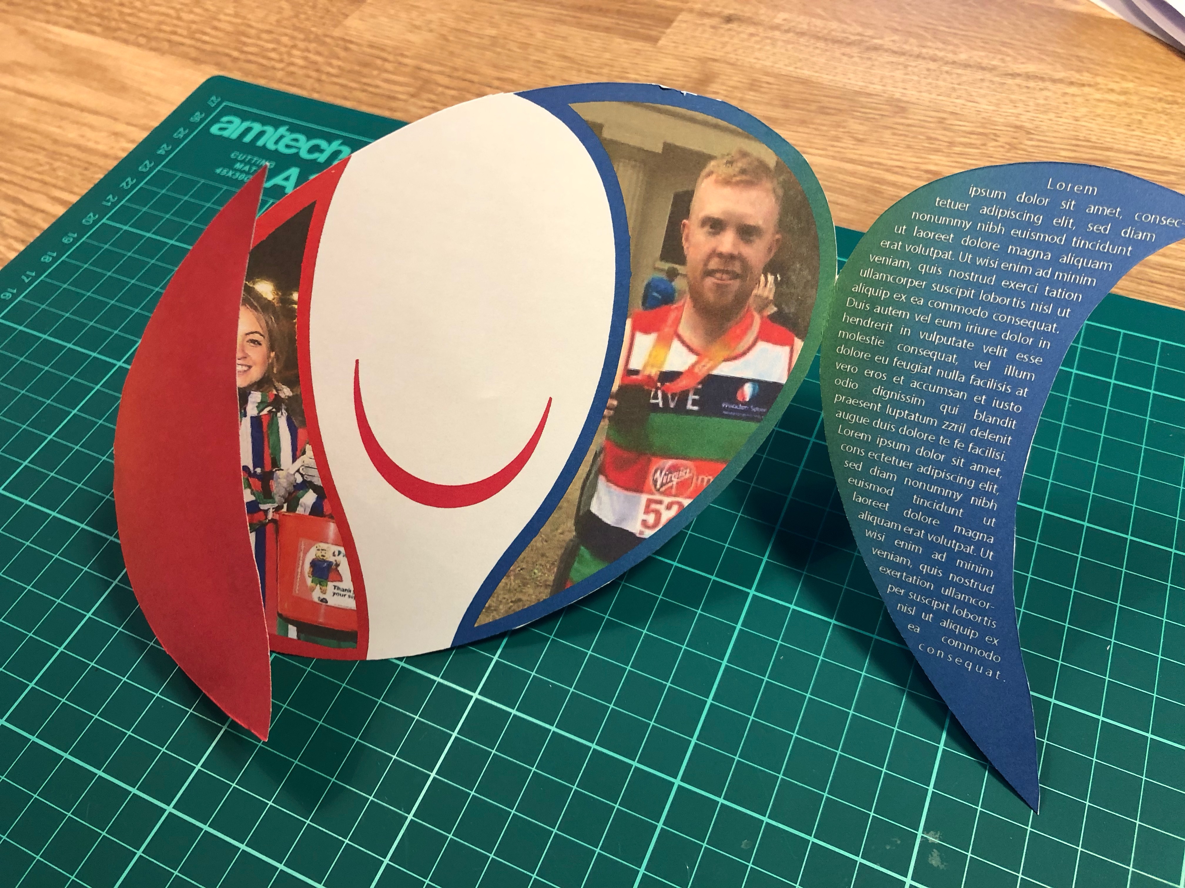
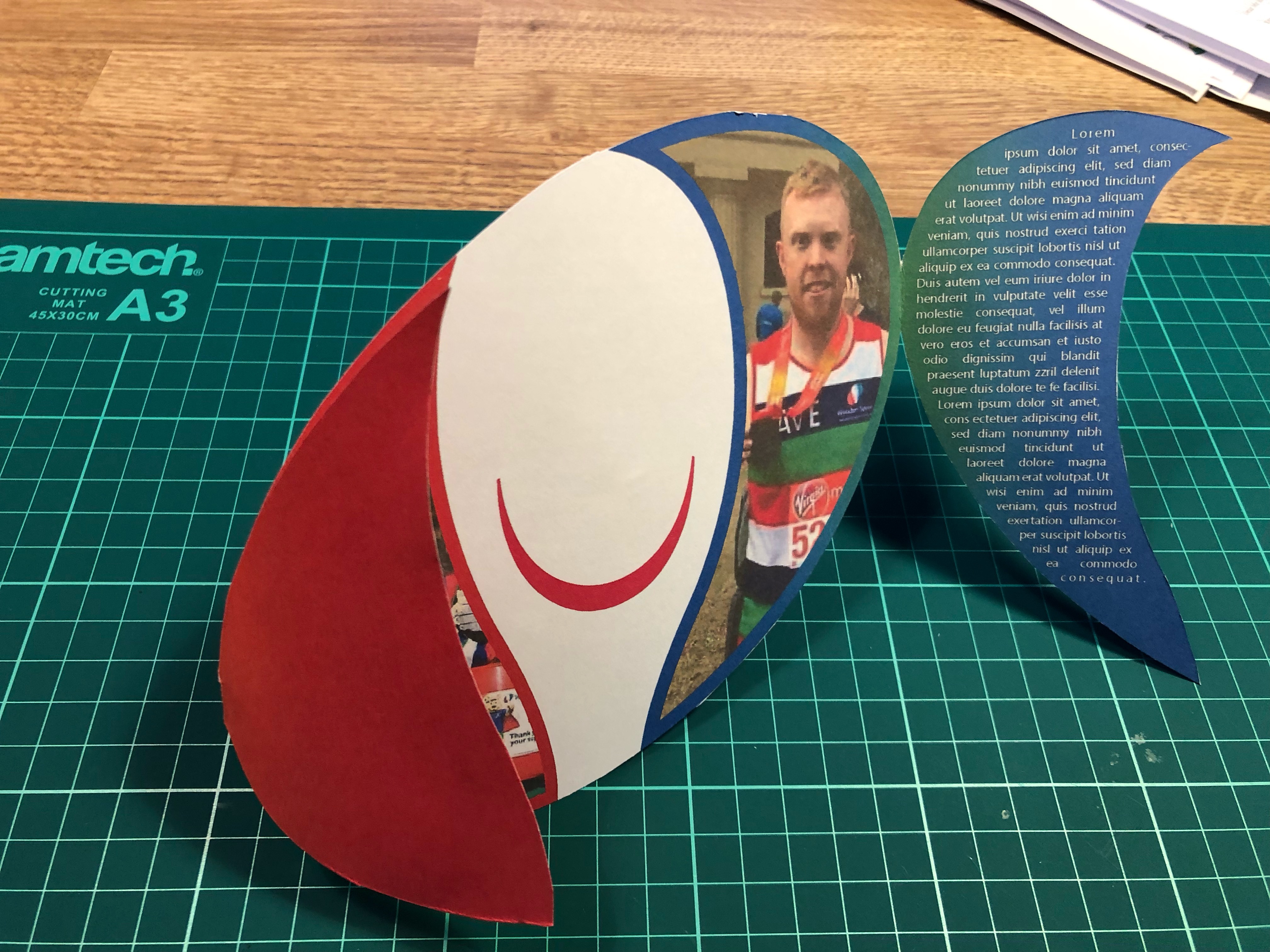
The charity I chose is one that is close to my (rugby)heart – Wooden Spoon, the children’s charity of rugby. Wooden Spoon is a charity that changes children’s lives through the power of rugby. Each year they fund around 70 projects, from community programmes and specialist playgrounds to medical treatment centres and sensory rooms. Since 1983, they’ve distributed over £26 million to more than 700 projects, helping more than a million children.
My research had led me to examples of different shaped leaflets which seemed to naturally lend itself to the Wooden Spoon logo. A rugby ball-shaped leaflet also seemed appropriate for the charity in question. Then the question was how to make the leaflet fit for purpose and eye-catching at the same time? Would it be a simple gate fold? A concertina fold? Roll fold? A simple bi-fold or concertina fold would be easy enough to do whether it be on the side or the top, this wouldn’t be very eye-catching though. The panels on the logo lent themselves to being used as a sort of gatefold. So how to make it work? I duplicated the red and green panels and looked at attaching them to the edges of the logo as the gatefold. Then I has to place the 4 chunks of text, contact form and a couple of images while maintaining the integrity of the original logo. Then to mock it up…
So, after raiding the children’s craft supplies I managed to find some card. The card wasn’t very thick which was ideal for what I wanted as I needed it to go through my printer. I printed my design on both sides of the card which I had to line up carefully which took several attempts and alterations to Illustrator’s print preferences. I managed to get it roughly lined up, but due to the way the paper/card is pulled through the printer it was never going to line up perfectly which did annoy me. I then cut the leaflet out and trimmed the edges that hadn’t quite lined up correctly.
Self Assessment
Overall I struggled a little with this exercise as it wasn’t really specific enough for my liking. I’m relatively happy with the end product but I think it could be better. I understand that the exercise was about the act of mocking-up your leaflet to help picture what the final product would be like and not the design or the details of the final design. The final leaflet would need to be produced on thicker card as the card I used was too flimsy for what I needed it for which impacted on the leaflet’s ability to be freestanding. Also because of it’s shape I didn’t think it would be suitable to be standing up on it’s own, so I think it would be used either as a mail-shot or handed out in person. It could also be laid flat or have a bespoke holder designed. These options would in-the-real-world incur additional expense and would determine the viability of any final design.
Additional Research
Following on from this exercise I have decided to contact a local printing firm to arrange a visit and tour of the premises to get a better insight into the print industry and it’s requirements from designers…..
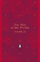
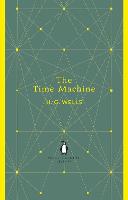
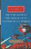
Your brief is to design a stunning and contemporary cover for one of the 20th century’s most acclaimed authors, HG Wells. Known mostly for his science fiction writing, HG Wells also wrote social novels that are still relevant today, covering topics such as the mid-life crisis, class, feminism, materialism, consumerism and love. Your challenge is to create cover designs for three of his books that work as a set and establish the books as timeless fiction. The books will be published in a paperback format and need to include the title, author’s name, publishers name and trademark. You only need to design the front cover and spine.
Following the previous exercise I decided to design myself a ‘Brief Analysis’ sheet to be able to set out in black and white what was needed to analyse briefs given to me. Indesign is not my strong suit, so this would be a nice exercise to blow the cobwebs away and familiarise myself with the software. Below is what I came up with:
This helped me to visualise what research I need to do and clearly showed the specs, inclusions and limitations of the brief.
My initial thoughts on reading the brief were that the main gist of it was to fit the books into the genre of ‘classic fiction’ as opposed to science-fiction. My perception of classic fiction included the likes of Shakespeare; the Bronte sisters; Joules Verne; Jane Austen and Agatha Christie. I knew I’d have to research this as well as how to put a contemporary spin on a classic. Classic fiction has minimal imagery on its covers as opposed to sci-fi that has a lot of imagery to appeal to its audience. The target audience of classic fiction is deemed to be a little more refined and well-read and not necessarily a particular gender. Sci-fi is aimed mainly at a male audience (with some exceptions). So, I think the designs will be of a minimal design, whether that’s imagery or text or both. Patterns may be a recurring theme that could be used to link the 3 books together as a set. As a minimal reader I don’t have any contemporary books to look at other than cook books! I am going to have to research the genre and see what’s out there and how it relates to the brief. I am aware of HG Wells and some of his stories, so I don’t foresee any complications on that front but I’m still going to revisit some of his titles.
Mind Maps:
So I then began to mind map some initial ideas for the book covers to see what initial ideas for the look and feel came to mind. I also mind mapped the keywords from the Brief Analysis.
Primary Research:
HG Wells
Herbert George Wells
Author
September 21, 1966 – August 13, 1946
Author, historian and champion of certain social and political ideals.
These are just a few of the book covers on the first page of the Waterstones website. They range in style, colour and depiction of the subject matter. The second and third examples are from the same series and have the same basic layout in order to link them together. Books four, eight and nine are part of a series but have a very different feel to the other two. Once I decide on the three book covers, I will look in more detail at the cover design.
Book Covers
As previously stated, I’m not much of a reader and don’t have any examples at home when it comes to fiction. So I started collating a Pinterest board of book covers and work relating to contemporary representation of classic and contemporary literature I liked.
Before the early nineteenth century, books were hand-bound, as in luxury medieval manuscripts using materials such as gold, silver and jewels. For hundreds of years, book bindings functioned as a protective device for the expensively printed or hand-made pages, and as a decorative tribute to their cultural authority. In the 1820s, change began to occur in how a book might be covered, with the gradual introduction of techniques for mechanical book-binding. Cloth, and then paper, became the staple materials used as books became more affordable, due to the introduction of steam-powered presses and mechanically produced paper. Not only were the new types of book-covers less expensive to produce, they were also printable, using multi-colour lithography, and later, half-tone illustration processes. Techniques borrowed from the nineteenth-century poster-artists gradually infiltrated the book industry, as did the professional practice of graphic design. The book cover became more than just a protection for the pages, taking on the function of advertising, and communicating information about the text inside.The monthly parts of Victorian novels published in instalments did sometimes come with illustrated wrappers. Dickens used green wrappers illustrated with characters and images from the relevant novels.
The Arts and Crafts and Art Nouveau movements at the turn of the twentieth century stimulated a modern renaissance in book cover design that soon began to infiltrate the growing mass book industry through the more progressive publishers in Europe, London and New York. Some of the first radically modern cover designs were produced in the Soviet Union during the 1920s by avant-gardists such as Alexander Rodchenko and El Lissitzky. Another highly influential early book cover designer was Aubrey Beardsley, thanks to his striking covers for the first four volumes of The Yellow Book (1894–5).
In the post-war era, book covers became vitally important as the book industry became commercially competitive. Many were illustrated, providing information about the genre and subject of the book, while many pushed typography and design to its limit in the hope of attracting sales attention. The era of internet sales has arguably not diminished the importance of the book cover, as it now continues its role in a two-dimensional digital form, helping to identify and promote books online.
Novels have provided an especially rich field for book cover design. This is partly because fiction so dominates the marketplace, and publishers seek to allure the passing browser, engaging illustrators and designers to suggest through the cover not merely what the contents of the book might be, but also what might be its special qualities, its singular imaginative space. Here the packaging of a given novelist in a consistent way, so that all of his or her works have a distinctive type of cover, can be especially effective. The author is given an oeuvre and made the creator of his or her own world.
The following article, “When It’s Acceptable to Judge a Book by its Cover,” by John Mullan, published in The Guardian, October 17, 2003, may be of interest on this subject.
I took a look at book cover design section in one of the books on the reading list for this course: Graphic Design: A User’s Manual. From this I noted down some key phrases and words:
Stand out
Cover regarded as first visual critique of the book itself
Do not try to tell the story
Readability – Covers can be viewed easily as a bookmark on a website as well as on the bookshelf
Book covers shouldn’t just stimulate, evoke, cajole, lure and tease the reader it should also stand out as a piece of creative work
The section in the book mentioned a few book cover designers. The one I found most interesting was Chip Kidd. I found a couple of TED talks that he has given which gave a light-hearted look into his career and the art of book cover design. I particularly liked the way he described what to leave out rather than what to include – either a picture of an apple or the word apple….not both!
I found another article with Chip in Smashing Magazine in which he is asked ‘Do you see the cover as part of the book?‘. His reply echoes what I read in Graphic Design: A User’s Manual that the book cover is not about the content of the book but an extra way of drawing the reader in, the book and story will do the rest.
I think that some of Chip’s designs are genius and use the cover as a story of their own. Others entice readers in by appealing to their curiosity or voyeuristic tendencies. However, Chip’s most widely seen creation is the dinosaur emblem for Jurassic Park which is recognised worldwide.
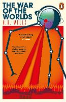
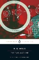
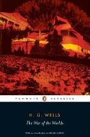
My book covers
From my mind maps I started to think which books to choose for this exercise. I decided to do The War of the Worlds; The Invisible Man and The Time Machine as these were the titles I was most familiar with. However, I wasn’t familiar with them as books only as films or in the case of The War of the Worlds – the Jeff Wayne album from 1978(which I have on vinyl!). The gatefold album has some great artwork in it the helps visualise the story but is too literal to be used on the cover of a book.
I mind mapped each of the book titles to see what I could relate to them and how to link them as a series. I wanted to avoid the covers being a cliché of the films or the musical version and made a conscious decision to steer away from ‘walking machines’ and ‘raincoats and sunglasses’.
I then sketched out a few layout ideas while trying to keep the theme of a series running through the 3 titles.
I then picked the series of 3 covers that I thought had the most potential for further development. I then roughly sketched these out larger to get a better feel for them.
I personally felt that the idea where the circles were repeated(above left) on all 3 book covers was the strongest of the ideas and began work on that one. I had also had an idea that the 3 books had a scientific element to them and each one seemed to relate to a particular science:
The War of the Worlds – Astronomy
The invisible Man – Biology
The Time Machine – Physics
I wanted to incorporate this into the design of the 3 books, whether that be the text being represented by elements from the periodic table(this didn’t work!) or a map of the solar system.
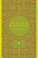
Initially I started with The War of the Worlds. From the mind map of this book title I had used the phrases ‘red planet’ and ‘blue planet’ relating to Mars and Earth – the 2 waring parties of the title. This one seemed the most straight forward of the 3 books as the 2 circles were going to represent the 2 planets. I wasn’t too sure on the background colour at first as I didn’t just want to do a black background as this seemed too obvious, so I toyed with a negative version of the sky(white with black stars) but this didn’t work. Looking at the current trend for sci-fi fiction covers it seemed quite a lot were black with bold foreground colours, so I decided to go with black but leave out the stars. Once I had the 2 circles on the black background the design looked flat, so I added a gradient to the circles. I still wasn’t happy but decided to add some text to see if that would help. I tried several fonts and eventually landed on All Round Gothic Xlight which is minimal and has a sci-fi appearance to it. Reversing the text out in white looked a little stark, I remedied this by using an off-white colour and reducing the opacity until I was happy with the feel and look of the book title. I then added the author’s name in the same size font. A publishers logo and name then needed to be added. I went for Penguin Books and researched what font was used in their logo – Gill Sans. The logo and text were then reversed out of the book cover again in the same off-white colour. The book cover was getting there but still wasn’t quite right. I then thought of adding The Moon to the blue circle to make it look like one of the ‘worlds’. I then wondered if Mars had any moons and found out that it has 2 – Phobos and Deimos. I added these to the book cover. A light source needed to be added, so I added the sun behind the ‘worlds’ in various locations and settled behind the blue one and adjusted The Moon’s shading to match. Now we were getting somewhere! It still looked flat so I went back to my mind maps and decided to add an industrial/metallic texture overlay to represent the martian fighting machines. That was it, I was very happy with the look and I felt it didn’t tell the story of the book too much and wasn’t too obvious or cliché.
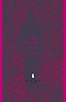
The next book would be The Invisible Man. I had to repeat the circle design if I was going to make the books look like they were part of a series. My first thought was to have them represent the iconic sunglasses the character wears in the book, but I felt this was too literal. So for this book I used the biology element of my approach and used the 2 circle shape to represent a DNA helix. Keeping the red and blue from the previous design helped illustrated the twist in the helix by the gradient from red to blue was reversed on the second circle giving the illusion of it being 3D. As there were no planets in this one, the light source was moved behind the text to give a contrast to the red/blue design. The text and publisher’s logo were kept the same to help tie the books together as a series. On the final mock-up I also used the same metallic texture overlay which worked well and gives it more of a sci-fi feel.
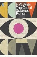
Final the third book, The Time Machine would follow the same format as the first 2 books in that the design was based on 2 circles. This time though it would be the physics of time travel and that it is infinite. So the 2 circles would make up an infinity symbol. Once I’d placed this in to the design it occurred to me that it also looked like an hourglass which also was very symbolic of time. I combined the 2 and again added a gradient to each of the circles, moved the light source to give the design a lift and added the text and publisher’s logo in the same style as the previous 2 books. On the mock-up the same overlay was used to give all 3 books the same feel and uniformity.
I kept the spines of the books simple in that they just contain the text and the Penguin Books logo reversed out of the black background with the light source from the covers repeated on the spines just to give it a little depth rather than flat black.
Self Assessment
I really enjoyed this exercise and I am happy with the outcome. Being the first time I’ve had to research a subject and document my findings was something I wasn’t used to and found it challenging to show how I had got to where I had. The research did lead me into a better understanding of the book cover design process and that the cover doesn’t have to tell the story, it can be a story of its own.
Regarding my designs, I like The War of the Worlds. It is the design that set the tone for the series and laid the blueprints for the design. It is simple in its elements and gives the impression of the ‘other-worldliness’ of the story without drawing on too much imagery from the story itself. It is minimal and clean as many contemporary book cover are in the same genre while still looking sophisticated and classic.
Overall I think all 3 books work together as a series. However the weakest of the 3 in my opinion is The Invisible Man, I don’t know if the DNA helix is obvious enough?
On the negative side, I think that I could have explored some of the other initial thumbnails rather than making my mind up straight away and sticking to it. I also could have explored different media and been a lot freer in my approach to the cover design rather than just jumping straight into Illustrator or Photoshop. The length of time taken on this exercise may also have detracted from the intensity of the research and the flow of the design process as I didn’t set a deadline.
These are extracts from briefs set as part of a student competition. Your task is to read and analyse them. Ask yourself:
• Whatare you being asked to do?
• How will the client will judge a successful outcome to the brief?
• What are the keywords?
In addition log any other questions you would want to ask the client.
Brief 1 Create packaging for Quaker’s new ‘Chilled Creamy Oats’ product for young women looking for a truly delicious healthy snack. The target audience is young women juggling many jobs and priorities everyday. They like to eat well but also love treats and hate feeling hungry. They like the idea of oats for their natural goodness but find the idea of eating them bland and unappealing.
Brief 2 Most of us have experienced a long rail journey – we witness the dramatic contrasts of the changing landscape, the inter-connections at various points along the way; various people embark and disembark; the dynamic is ever- changing… finally we reach our destination. This brief challenges you to take a metaphorical journey on the theme of connections. Explore the theme as broadly as possible and take us on a journey that might link, amongst other things – people, events, philosophies, theories, objects, movements, inventions, history, literature, etc. Your journey is only limited by your own imagination and the quality of your research – surprise us with the juxtaposition of your selected themes but be sure to communicate to the viewer the ‘connectedness’ of the thinking within your design. Define your market, and how you will target it.
Brief 3 To raise awareness of the risks of underage drinking and contribute towards a cultural change in society’s attitude towards alcohol. The purpose of the Department for Children, Schools and Families is to make this the best place in the world for children and young people to grow up… to make children and young people happy and healthy and help them stay on track. With a core proposition of ‘Alcohol leaves you (or your children) vulnerable’, the campaign will urge parents to talk to their children before they consider drinking, to help avoid vulnerable situations. The messages to young people will get them to think about the effects of drinking. Creative ideas should use the campaign identity ‘Why let drink decide?’ to extend the campaign’s reach and specifically target young people aged between 13 and 16. We are open to ideas about the media or format you think is most appropriate to reach the target audience.
Having analysed the briefs which one do you think you would most like to tackle? Is it the one with the most restrictions or the one that is most open to interpretation? What do you think your chosen brief would offer you? In what way do you think it would stretch your skills and abilities? Make notes in your learning log.
Brief 1
What?: Create packaging for a new snack
How?: It’s appeal to the target audience
Keywords: Chilled; Creamy; Young Women; Delicious; Healthy; Juggling priorities; Treat; Hate feeling hungry; Natural Goodness; Bland and unappealing.
Other questions: What company branding needs to be included?; POS?; Materials to be used for packaging; Colour pallette?; Sizes and dimensions; What nutritional info needs to be displayed?
Brief 2
What?: Communicate a journey to a defined audience. The journey doesn’t have to be a physical journey, it may be theoretical.
How?: It will be judged by the varied and diverse subjects covered and explored during the ‘journey’ and how they relate to their defined audience.
Other questions: Where/What is the start/endpoint?; What is the conclusion?
Brief 3
What?: Create a campaign aimed at parents and 13 to 16 year olds highlighting how vulnerable alcohol makes you. It will also urge parents to talk to their children about the dangers of drinking.


 The “logos” board is the biggest of the lot with over 700 pins in it. There are logos of varying styles and shapes. I am drawn towards what I class as ‘clever’ logo and the more minimal the better.
 The ‘typography’ board is the newest and is a work in progress but I am really enjoying my typography at the moment and most of the work I am currently doing seems to have type in it somewhere!
 The “design ideas” board is where I put images that I use for research when doing any design work.


")
")


