Poster and Flyer

This exercise is about how you deal with two different spaces to work in.

You have been asked to design an A3 poster and an accompanying double sided A6 flyer to promote a singing course run by an organisation called SingOut (all one word). They have very little money so want to print these posters on their black and white photocopier. You can use a colour paper if you want.

You may want to include an image such as a drawing or photograph, but be very careful with photos as they tend not to reproduce well on a photocopier particularly if they are colour photos. You will need to check by printing off your design and/or photocopying it.

The information they want to give is:

  • Do you love to sing?
  • Join us for an exciting opportunity during the day with a professional vocal coach. Learn to sing different types of music, vocal techniques, meet new people and have fun!
  • 10.30 to 12.00 every Tuesday from 11 March
  • The Community Centre, Charlotte Church Road
  • £60 for the course
  • No experience needed/no requirement to read music
  • For more information call 011779 8765432 http://www.singout.com

The first thing you need to do is work out if you have all the information you need to fulfil the brief. If not what is missing? Work out the hierarchy of the information. How will you divide your information up to fit on both sides of your flyer? How will you link the design for the poster with that of the flyer? How can you make the poster eye-catching and effective with such a limited palette? Which typeface or faces will you use and why have you made that decision?

When you have finished pin your poster up and critique your work. What do you think?

Keep notes and sketches in your learning log.

Research

For this exercise I started by researching both one-colour and singing lesson posters and flyers. The restriction of the one colour added a new dimension to the design process. I started collating images that could relate to the subject matter or were single-colour print jobs and started a Pinterest board.

https://www.pinterest.co.uk/northernbloke/college/poster-and-flyer/

Screenshot 2019-09-26 at 22.02.54

I then mind-mapped for some more inspiration.

Untitled_Artwork 1From the imagery collected and the mind-map  I then went on to sketch out some rough layout option in Procreate.

Untitled_Artwork

Design

From my research I liked the idea of using a photo in single colour, similar to the duotone effects I had used in the Colour Me assignment, but this time the effect would need to be achieved with one colour being black and the other being determined by the colour of the paper it was going to be printed on. The photo used would have to be high contrast as it needed to be reproduced using a photocopier. The one-colour restriction didn’t mean that only black would have to be used, hues of black(greys) could be used.

I started by finding a suitable image for the design. I used pexels.com and searched for singers; sing; music; microphone and concert. The image I settled on was of a woman singing. I thought that this pose would make an interesting composition.

facial-expression-female-gesture-2531728I imported the picture into Photoshop onto an A3 canvas and converted it to greyscale and then played with the levels, contrast and brightness until I achieved what I thought would make a good image that would hold up to being photocopied.

Screenshot 2019-09-28 at 20.53.39I then added an adjustment layer to simulate coloured paper. I decided on yellow paper as this would produce a great contrast with the black.

Screenshot 2019-09-28 at 20.55.15This produced the duotone effect I was looking for. Now to add the type.

I wanted the type to have a hand–drawn look to give the flyer a handmade–gig–flyer look and the relaxed look, so not to make the poster/flyer too intimidating which could put people off. I picked a font that I had on my computer called Americus Sans Aged, it is a bold, all–caps font with a hand–drawn look. I used this for most of the type on the poster/flyer. I also used Avenir Next for some of the information to give some contrast to the type elements of the poster/flyer. I also used this because Americus Sans Aged doesn’t have a pound sign to use for the price of the singing lessons!

I used the dark area of the singer’s dress to my advantage and reversed some of the type out of it in yellow.

Screenshot 2019-09-28 at 21.22.48The title question was the most important, so this was positioned at the top of the hierarchy followed by the date/time and the contact information. The description of the course came next, then the address and finally the disclaimer about not having to have any experience. I felt that this was the correct hierarchy because this would be what mattered to me if I were interested in the course.

I then noticed that I hadn’t added the price. I tried adding it in the negative space to the right of the singer’s head, but couldn’t get it to look right on the page. I then referred back to my research and I had highlighted the idea of a spotlight. I dded a circle to represent a spotlight over the singer, but for it to show up when printed the spotlight would have to be a dark circle which I then changed the opacity to give the impression of a spotlight. I reversed the price of the course out of the spotlight area. This looked much better and the whole design looked better with less ‘white’ space.

SingoutI was very happy with the way that this had turned out. I asked my college peers what they thought.

The feedback was very positive, but it did throw up a point about the reproduction of the poster on a photocopier. The edges of the poster may be lost due to the way copiers work or the poster not being straight in the copier. This led me to add a border to the design to compensate for any distortion.

Screenshot 2019-09-28 at 21.46.32I then went on to create the flyer. I thought this would be easy, but splitting the type over both sides of the flyer proved trickier than expected. I had to decide what information needed to be on the front of the flyer as this would be read first, and what to relegate to the rear.

I set up 2 A6 artboards for the front and back of the flyer, and this time added a border. I wanted to repeat the image from the poster and copied it across. This time the image wouldn’t take up as much room as the type would need to the main element of the flyer as the flyer was more about giving information rather than attracting attention. So I made the image smaller and the headline bigger. I also divided the type in the description and only used the first sentence on the front of the flyer. I made the contact details more of a thing on the front as this is what people need to find out more information. The rest of the type was placed on the back of the flyer along with another set of contact details. I didn’t want to repeat the picture on the back but it did need something. I added the spotlight/circle element on the back, but placed it in the opposite corner.

Screenshot 2019-09-28 at 22.09.56

Screenshot 2019-09-28 at 22.10.44I think that these both work well together and are cohesive enough to make it obvious that they are about the same event. The design lends itself to being printed on different coloured papers for more variety.


I then mocked–up the poster.

singoutpostermockup

Finally I printed out the poster and flyer to see if it worked in the real world.

img_2232

Conclusion

This exercise turned out to be trickier than I thought. The limited palette and reproduction method added an extra something to think about. It made me think more about how the end product would be reproduced and the limitations this gave. It also made me try and use the single colour printing creatively and think about different hues and how the use of coloured paper could be advantageous to the design. Overall I think that I successfully answered the brief. The input from others highlighted the variations in printing that may occur which I then accounted for by adding a border to the design. It was something that I hadn’t thought of before but will bare in mind going forward.

Birthday List

For this exercise you are going to make up a poster list for yourself. It is intended that you keep it pinned to a noticeboard or wall to remind you of the dates and, as it will be there a long time, it needs to look good.

Start by collecting all the birthdays of your friends and family. You’ll need their name and birth date, to decide whether or not you buy them presents or just send a card, text message or email.

When you have all this design a page to include all this information for example:

Screenshot 2019-09-13 at 14.10.39

Now you design your own ordering the information that best suits you and including as much additional information as you would find useful.

Ideas?

This brief was probably the most uninspiring to date. I needed to do some research to get some inspiration. I started a Pinterest board.

Screenshot 2019-09-19 at 22.23.57

Pinterest

My research found that most birthday lists were pretty much the same. There were a few exceptions but most were divided into 12 boxes into which names and dates could be added.

So I then began to collate the name s for my birthday list and whether they required a text, card or present or a combination of the 3.

Design

My initial thought were that I wanted to steer away from the 12 box design and try to do something a little different.

I thought that I didn’t need to show all 12 months, only the months containing the birthdays in question. That meant 8 boxes for 8 people. My initial idea was to represent these as pages from an old desktop flip–calendar. This involved me creating 8 boxes with the dates and names on them and some way of displaying what each person gets on their birthday. I decided to do this by representing then with icons of a mobile phone to represent a text message, an envelope to represent a birthday card and a present to represent a gift. I thought that these might also need a key to show what they represented.

Screenshot 2019-09-22 at 20.22.05birthdaylist2

This design served it’s purpose but wasn’t very inspiring! So, back to the drawing board.

For my next design I decided to use the names of the months as the main element of the design. I stacked them on top of each other and highlighted the months which had a birthday in them. This design reminded of the design I did for the previous exercise in that it reminded me of a timeline. This led me to put the birthdays along a vertical centre–line. I again added the symbols that I had used previously and to make them stand out from the background I chose a high–contrast colour from Illustrator’s colour guide. I decided not to add a key for this one as the list was for my benefit and I would know what they meant. The background still had a lot of negative space so I added the words ‘birthday list’ in the same font(Futura) with a 20% tint to make it subtly blend into the background.

Screenshot 2019-09-22 at 20.22.16birthdaylist

I was much happier with this design as it was out of the norm and was visible from a distance. There was also an element of overlaid type in the design to add interest to anyone looking at it.

Birthday List Poster mockup

Conclusion

This was a tough brief to interpret and try and do something different.

I think I have done something different and interesting that I would happily have it on my wall as a reminder. The few people I have asked have said that they liked the design and agreed that it’s something they haven’t seen before and was easy to understand. It was also mentioned that I was beginning to develop a recognisable style which I’m not sure is complement or not.

Oh, and I forgot my sister’s birthday!!!!!

Giving information

Find some examples of information graphics. For example bus timetables, city maps, diagrams or representations of statistical data. Look at the way they are designed and try and work out the decisions the designer made. What can you learn from them and when would it be appropriate to use a similar design solution?

For this exercise you are going to describe your immediate surroundings using information graphics; this could be a plan of your desk, the layout of your house, the arrangement of objects in your cupboards or your morning journey; anything will do.

Before you start you will need to think about scale and about how you will break down the information for your design. Create a graphic that represents an aerial or front on view of your location. Be mindful of the hierarchy of the elements in the composition and the dynamics needed to draw the viewer’s eye from one stage to the next. Use typography, numbers and colours to describe what is being represented. You may want to produce a key to help us understand what is being shown, as well as a diagram title to put things in context.

Keep all your sketches and notes in your learning log.

Research

First thing to do was to research infographics of different types and styles.

What are infographics? Infographics are a combination of information and graphics. They are used to present complex info quickly. They can be used tell a story; to make connections more obvious; to make data understandable; to explain an issue. 90% of information that comes to the brain is from visual stimuli.

I started collating a Pinterest board of designs that caught my eye.

Screenshot 2019-09-07 at 22.25.39

Pinterest Board

The pins I collected covered things like statistics, timelines, maps, guides and situations. They were all different in their approach, some were typographical, some illustrative and some used photographs. These gave me an insight into what this exercise was about.

I also used a couple of books that I have for inspiration, An Introduction to Information Design by Kathryn Coates & Andy Ellison and How to use graphic design to sell things, explain things, make things look better, make people laugh, make people cry, and (every once in a while) change the world by Michael Bierut.

img_2159-1

The Michael Bierut book goes into designing the infographics and maps etc. for the New York Department of Transportation and the signage for Governeors Island.

Image result for new york public transport signage michael bierut

Image result for new york public transport signage michael bierut

Image result for michael bierut governors island

Design

Initially I wasn’t sure what to base my design on as I don’t really have a desk as such, my house layout is pretty straight forward and I don’t have a conventional commute!

There were lots of infographics in my research that involved timelines, I thought this could be a possibility for my design.

My day job involves a lot of travel around the U.K. and wondered whether this could be used somehow in my design. I decided to explore this idea.

There was a distinct possibility that this could work. My initial thought was to use the variety of destinations that I visit with my job and how often I visit them. This would be some sort of map infographic showing the places I visit, how often and for what purpose. I started by creating a map of the south of England which I traced over a Google maps image and marked all the locations that I travel to for work as well as my home location. I then drew lines between them in different colours depending on the type of learner that was located there.

Screenshot 2019-09-12 at 20.33.12

I played around with the idea of placing icons in each of the destinations representing the number of times I visited each location in the past month. I wasn’t happy with the way this was turning out. It was looking too busy and messy and infographics need to be clean and clear so they can convey their message. Back to the drawing board!

While researching infographics I had noticed that quite a lot of them were based on a timeline and my mind map had thrown up the idea of a rota. I wondered if I could use my work rota to produce an infographic. I decided to mock up an idea.

I started by drawing a vertical line on the page to represent the timeline. I then applied a grid to the page with 7 rows: 1 for the top(title), one at the bottom(footer) and 5 in between for the days of the week(Mon to Fri). I made 2 equal sized columns either side of the timeline.

I began by adding the abbreviated date for the 5 days of the working week. I wanted to place each day on alternate sides of the timeline and aligned the dates accordingly. I chose the font Impact for this exercise as it is bold and easy to read and condensed enough to fit in the timeline. Again, in Impact I added the places I was due to visit the following week. As identified in my original idea, it could be a good idea to indicate the distance to the locations. I decided to use a car icon to represent this. The varying mileage on the rota meant that the icon needed to represent both small and large numbers. So looking at the largest and smallest values I decided that the car icon would represent a set distance of under 50 miles and this could be repeated for the larger distances e.g. 1 icon for 29 miles and 5 icons for 218 miles. This would need to be explained with the use of a key.

Next came the type of visit. In my role I train both butchers and bakers so I needed an icon to represent both. I chose a joint of meat for the butchers and a loaf of bread for the bakers. I added the relating icon to the locations. I then occurred to me that I could use these icons to represent the number of learners were in each location.

The only confusing part of the rota was Tues/Weds as these days included an overnight stay. I illustrated this with an icon of a hotel. Again, this would be explained with the use of a key.

After I had added this information I took a step back and looked at all the whitespace on the page. To help with reading the information I added some geometric arrows to help illustrate the direction that the infographic needs to be read.

There was still a little too much white space on the page so I added a polkadot texture in the same blue as other elements on the design and changed the opacity to make it a little more subtle and not detract from the main information elements of the design. I also added some not–objective crosshatch elements overlaying the design to give it some depth, so it didn’t seem so flat.

Screenshot 2019-09-13 at 13.44.07

Final Design

Infographic

Conclusion

After initially being stuck for what to do for this exercise I am very happy with the outcome. This design is bold and clear with lots of contrast and the message is easily understood. I asked friends and peers if the message of the design was clear and easily understandable and the response was positive. The addition of the key at the bottom helps in understanding the symbols and the only criticism was a spelling mistake in the text at the bottom which I quickly changed! The alignment of all the elements relate to each other by aligning them on a grid and the limited colour palette helps with the clarity.

I think that the end result is very successful even if the subject manner wasn’t straightforward and conveys what a typical week looks like for me in my day job.

Judging a book by its cover

Choose a book by an author you are familiar with. You are going to design two different covers for it, one using illustrations or photography and the other using just type.

Design the whole cover including the spine and back page. Include the title of the book, the author’s name, a brief description of the story and any other information you think is necessary.

As you are working remember that your design is intended to help a reader know what the experience of reading the book will be. Is it a serious text book or an off-beat funny novel? Are the readers expected to be young women or older men and does this matter? Is it an ‘easy read’ or ‘literary’? Does the publisher have a house style you need to be part of?

When you have finished critique your work – which of your two designs do you feel works the most successfully and why? Make notes in your learning log.

The book

The book I chose for this exercise was Do Androids Dream of Electric Sheep by Philip K Dick. This is the original novel for the basis of the Bladerunner films. Philip K Dick was a science fiction author who’s books are the basis for many Hollywood blockbuster films such as Minority Report and Total Recall. I hadn’t read the book but had seen the Bladerunner films. I decided to buy myself a copy. The book gets its title from the lead character’s ‘pet’ android sheep that he tells everyone is real as live animals are a status symbol in the story’s post–apocalyptic setting and also the idea of counting sheep to fall asleep.

Research

I began with Pinterest and looked at covers of Philip K Dick’s novels and started a board. This also included some other sci–fi novel covers.

Screenshot 2019-09-01 at 22.18.50

Pinterest

Most of the book covers I found were illustrated and only one or two were typography based. The imagery used seemed to be mainly illustrating elements of the story in quite a lot of detail. There are some that are more abstract and minimal, these seem to be more modern printings of the novels. This seemed to be the general rule for the majority of the book covers with there only being a small number of exceptions. Purely typographical covers seem to be somewhat unusual when it comes to sci–fi novels and I only found a couple.

Mind map

I then moved on to mind–mapping ideas for my designs.IMG_0008.JPG

The word sheep I feel is the most prominent word within the title that would produce the best imagery, so I honed in on that.

I then moved on to drawing up some layouts with and without imagery; with and without sheep.

I liked the idea of neon lighting (re: Bladerunner) being used in the design to represent the dystopian future that the story is set in. I also liked the idea of using computer code or binary in the designs somewhere. I liked the origami idea but this was more of a Bladerunner reference rather than the original story.

I then jumped on to the computer to mockup some of the stronger ideas.

Design 1 – Typographic

electricsheep1 cover

I initially wanted to create the neon effect for the type only design and watched a few tutorials online to get the gist of how to get the desired effect and then I had to find a suitable font for the type itself. I found a font called LIBRARY 3AM Soft which had a double stroke which would give a really nice neon letter effect. For the neon to stand out this would need to be on a dark background. I set up my document with 3 art-boards for the cover, back and spine and filled them with black. I then placed the text onto the cover in as large a size as would comfortably fit. I wanted to emphasise the words electric sheep and have them illuminated and the rest of the title switched off. To highlight the words electric sheep I added some effects to give it a slightly 3D look and to make it glow. I also duplicated the layer and placed it behind and applied a blur to give it more of a neon glow. The rest of the title wasn’t given any effects to give it the look as if it was a neon light that wasn’t working. In the same subdued colour I added the author’s name in Avant Garde and the publisher’s combination mark. Above the title I also added some small, leaping sheep and applied the same neon effect to them.

I added a sheep and the title onto the spine of the book as well as the publisher’s lettermark using the same styles as on the cover.


For the back cover I started by adding the barcode which had to be reversed out of a white box to make it work. I then added the type which was again in Avant Garde. This comprised of a paragraph advertising the book and its author, a couple of paragraphs about the story and some reviews all reversed out of the black background in white. I then added the publisher’s combination mark in the same style as the cover and spine. I wasn’t sure how to recreate the neon effect on the back cover and this took some working out. Eventually I ended up adding a line that encompassed the type and repeated the neon effect of the front cover.

electricsheep1 mockup

Design 2 – Illustrative

For this design I again set up the 3 art–boards. Once again the sheep would be the focal point of the book cover. I wasn’t sure how to show the sheep on the cover but I knew that I wanted it to depict the sheep as “electric”. I liked the yellow and black colour scheme from one of my page layouts in the last exercise, so I started by putting down a yellow background with a slight gradient on it. During my mind–mapping the idea of binary had come up. I decided to make an image of a binary sheep. I did this by masking some binary numbers on top of a silhouette of a sheep. It was at this point, while trying to fit it on the cover, I decided to use the image across all 3 art–boards. For this design I wanted to reflect the binary numbers in the font used. I used the font American Typewriter Regular as this resembled the original machine font used in binary. I added the title and the author’s name, giving the title the larger size as this was more important. The colour of the type was picked from the colours of the binary numbers in the sheep image as was the publisher’s lettermark.

electricsheep2-cover

The image wrapped around the spine and left little room to add the title, author and publisher. I squeezed the title and author onto the yellow area below the image and placed the lettermark at the top of the spine.

The back cover had to show a lot of type and the wraparound image took up a lot of the space. To get around this I placed another yellow box over the back cover and reduced the opacity to knock back the black image. This gave a better, larger base on which to put the type. I used the same type as on the previous design. I put the advertising paragraph and reviews in American Typewriter to tie it in with the cover and the story synopsis was in Futura to contrast the other typeface. Again, I added a barcode and the publisher’s combination mark.

electricsheep2 mockup

Conclusion

I enjoyed this exercise in exploring different approaches to the same subject. The brief gave both freedom and restrictions to design the covers. It also gave me the opportunity to read a great science fiction novel.

This exercise brought together the skills of layout and hierarchy in regards to both type and imagery. It made me think of the book cover, spine and back as a whole rather than 3 separate, individual elements.

I feel that both designs are strong and are both clean and give the feeling that they are  science fiction novels. The type–based design has some elements that could be removed to make it a pure typographic design. The spine of the second design seems cramped and may need more work to make the title more legible.

I personally like the cover of the first design as it reflects the dystopian feel that is portrayed in the book and the subsequent films. But, as a whole design I think that the second design works better and is more eye–catching and would attract readers better than the first.

Addition

I then played with a third design that related to the films more than the book but I enjoyed doing it but I felt that it didn’t do the book justice as the origami was used in the Bladerunner films and not the book.

Screenshot 2019-09-02 at 22.06.51

Magazine pages

Choose a magazine, newspaper or journal and work out the grid or grids they have used. You will probably need to look at least four pages to get a feel of the layout.

Measure the size of the pages, the margins, the text columns and the gaps in between them. How many columns do they use? Is it the same on every page?

Can you identify the fonts they use? Do you have it or one with similar properties?

How do they use photographs and illustrations? How much ‘white space’ on the pages is there?

Draw up a two page spread using the same grid as the magazine. Indicate text using Lorum Ipsum and indicate images by either filling a picture box with a 10% tint or using a picture from your collection.

When you have done this see if you can develop the grid further.

Select a title and images and see how many variations you can come up with. What happens when you alter the body font or headline font? Do different kinds of images change the ‘feel’ of the publication? Do you think the readership for each of your variations would be the same? Does the image you choose suggest a different design? Which ones work best and why?

Grids, guides and gutters

“The grid is used by the typographer, graphic designer, photographer and exhibition designer for solving visual problems in two and three dimensions. The graphic designer and typographer use it for designing press advertisements, brochures, catalogues, books, periodicals etc., and the exhibition designer for conceiving his plan for exhibitions and show–window displays.”

Grid Systems in Graphic Design by Josef Müller–Brockmann

A grid is a skeletal framework used by designers to organise information within a spacial field. Grids can also be used to design logos and webpages, but mainly they are used print.

The most basic grid is a single module defining the margins of the page.

While single-column grids work well for simple documents, multicolumn grids provide flexible formats for publications that have a complex hierarchy or that integrate text and illustrations. The more columns you create, the more flexible your grid becomes. You can use the grid to define the hierarchy of the publication by creating zones for different kinds of content. A text or image can occupy a single column or it can span several. Not all the space has to be filled.

A modular grid has consistent horizontal divisions from top to bottom in addition to vertical divisions from left to right. These modules govern the placement and cropping of pictures as well as text. In the 1950s and 1960s, Swiss graphic designers including Gerstner, Ruder, and Müller-Brockmann were the kings of modular design.

Grids can be designed using various other methods depending on the size of the page. The page can be divided using the golden section or something similar depending on its size. A fibonacci sequence can also be used to set column widths.

Grids can be overlaid on top of each other to create more complex layouts. The grids don’t have to run vertically and horizontally either, they can be set at any angle.

Grids can also be broken!

Devon Life…again

I picked up a copy of the August edition of Devon Life and took a look at the layout of the spreads.

img_2082img_2083img_2085img_2084

This time around a closer look at the page layouts showed a lot more intricacies in the grid layout.

I chose the 4th spread to look at as the first page uses a different grid on top of the 7 column setup.

img_2084Devonlife22Screenshot 2019-08-21 at 20.34.59

As previously analysed Devon Life use Baskerville for headlines with Times for the body type. Additional type and photo labels are Avenir. The magazine uses a lot of photographs to support the articles that are a high quality and give the magazine a high class feel.

The first page has an image that runs across into the second but only by half the width of the first column. The main part of the article is split into 3 columns which sits centrally and doesn’t align to any of the 7 columns. The headline and subheading sit centrally above that.

The second page sticks a little more to the 7 column setup apart from the last piece of type which runs down the middle of the last 2 columns.

Versions

I then played around with a few different layouts using the same title and same grid and used different hierarchy with type and images. I tried using single columns as for type spreading out to a 5 column block of type on another spread. I wrapped type around an image. I did a spread with no images but on a 3×5 grid.

Screenshot 2019-08-22 at 23.07.44Screenshot 2019-08-22 at 23.07.29

This first design was based around the image of the astronomical clock in Prague. The headline was reversed out of the photo in a white sans–serif font which bled into the opposite page which has a lot of white space around the 2 columns of type and the labels for the 2 images used a single column in a smaller but bolder font to make it more legible.

Overall, I think that this layout looks upmarket due to the large amount of whitespace giving it a clean, crisp look. I think it looks like a high–end travel brochure or newspaper supplement.

Screenshot 2019-08-22 at 23.06.55Screenshot 2019-08-22 at 23.07.11

This second design had a strong visual element due to the nature of the image that I had chosen. I wanted this to be the main focus of the spread and with it being such a strong shape I wanted to wrap the type around it. So I drew a circle over the top of the image and wrapped the type around that. I then placed the headline across both pages to contrast the fairly standard columned layout. I reversed the last paragraph of type out of a box to represent a summary or more details about the article. I maybe could’ve made the headline weave through the handle of the clock.

I think that this layout looks like an article that would be seen in maybe a house and home–type magazine or a high–end women’s magazine and is very bold and eye–catching.

Screenshot 2019-08-23 at 20.46.13Screenshot 2019-08-23 at 20.45.54

This third layout was an experimental indulgence on my part. I decided to turn the layout into a grid of square text boxes with a paragraph of type in a few of them. I also carried on the time theme by using some Roman numerals from a clock face as other typographical elements. I also highlighted some of the text box edges in red and used these lines to add something extra and interesting the contrast the black and white layout.

This article would suit a specialist typography magazine or a design article due to its unusual layout. This may prove tricky to read if you didn’t understand what it was.

Screenshot 2019-08-22 at 23.05.46Screenshot 2019-08-22 at 23.06.04

The fourth designed returned to an old favourite, overprint. I wanted to use coloured type on this design as I had used black or white on the previous 3. The image plays a large part in this design but in a subdued way. I overlaid the headline and subheading in  a contrasting colour. The body type was in the same colour as the image and was placed in a single 2 column block divided by the subheading. I added a stylised date in outline so that it didn’t detract from the main elements of the article.

I think that this is a very stylised layout and again would suit a specialist magazine or perhaps a corporate brochure.

Verdict

I think that my personal favourite and the one that works the best is the 3rd design, but I think it needs more work but its very striking. It uses the grid in a different way and that is what makes it stand out.

Black

Conclusion

This exercise has shown me how the grid and layout options can seriously change the feel and look of the spread. The grid is a very useful tool and can be used in so many different ways, not just vertical and horizontal. The grid gives form and structure to design and helps elements on the page relate to each other. Besides the grid there are other typographical systems that can be used such as axial, radial, dilatational, random, modular, transitional and bilateral. These can be researched in the book Typographic Systems by Kimberley Elam which shows examples of all of these systems in use with the same pieces of type shown in the different variations.

Hierarchy

Using about 500 words of Lorum Ipsum (or other dummy text) you are going to design three different pages:

• an interview with a TV actor in a listings magazine entitled: Will Sheila tell the naked truth?

• a review of a new piece of hardware or software in a specialist computer magazine

• a book review in a newspaper’s weekend edition.

Research these types of publications and identify three different combinations of typefaces appropriate for each publication.

Now you need to invent headings and subheadings for your articles. Set these combinations so that your header is above 12pt in size, your body text is 12pt or below and subheadings sit in between in your hierarchy.

You will need to create some text to allow you to show your combinations in action. Use your text to describe your decision making process, why you think the combination works and what your intentions were.

Research

First things first, a trip into town to get some magazines. I’ll have to wait until the weekend for the newspaper. I only came back with 2 magazines due to the lack of variety.

img_2069

So I hit the internet to find more examples of TV listing magazines, computer magazine and a Sunday paper book review.

TV listings layouts

99% of these seem to use bold sans–serif typefaces for their headlines usually using bright colours which are reflected throughout the article. The sub–headings are a mix of both sans and serif typefaces and are usually at least half the size of the headline and not as bold or as brightly coloured. The body type seems to be usually a serif typeface with a drop cap at the start of the first paragraph. At least 50% of each of the pages is made up of imagery and some also have secondary images to help tell the story. These publications are usually full colour and keep costs down by printing on thinner paper without any specialist finishes.

Tech magazine layouts

Nearly all of these use sans–serif fonts for the body text in varying weights and sizes. The headlines and sub–headings are also sans–serif and are usually in the same typeface as the body copy. Colour schemes are limited to 3–4 colours except for the photos of the products being reviewed. There is usually some form of infographic showing ratings for things like performance, cost and features. The imagery is not as in–your–face as the previous examples and shows the product in its best light. The design of the pages are very paired back and minimal. These are printed on thicker paper stock and usually have a more glossy finish.

Newspaper book reviews

These, with a few exceptions are all set in vertical columns using the newspaper’s standard font. They all show an mage of the book or/and the author. Some have illustrations representing aspects of the book. The headline and sub–heading fonts vary depending on the publication. The body type sometimes wraps around the image and more often than not has a drop-cap in the first paragraph. Newspapers do come with colour imagery but are mainly printed in black and white again to keep costs down.

Font combinations

The following are the font combinations that I picked to correspond with the research I had done in 72pt for the headline, 24pt for the sub–heading and 10pt for the body copy.

TV listings magazine:

tvmagtype

Computer magazine:

computermagtype

Newspaper book review:

newspapertype

Designs

For the TV magazine I picked the 3rd of my font combinations.

tvmagtype-e1565359211643.png

I picked these because it seemed the most appropriate for the page in question. It wasn’t too in your face and was quite friendly–looking and the typefaces had enough font variations to be make the design interesting.

Following my research The page needed to be at least 50% made up of an image, so I went to Pexels.com to find a suitable image for the story. While researching I also noticed that most pages had an inset image depicting another part of the story, so I also needed to find one for that too.

I laid out my page into 4 columns and divided it in half, the top for the image and the bottom for the text. When I inserted 500 words of  8pt type it only filled 3 columns, so I had to find something to fill the 4th. I decided to make the 4th column more of a list of features and made the type bolder so it would appear as if it was a list of magazine features. I added a coloured outline to the page to tie the colour scheme together as it matched the 72pt headline and was repeated in the features column and the inset photo outline. The headline was also given a stroke to make it stand out from the background image as I had seen in my research. I also added a coloured drop cap in the body type.

Screenshot 2019-08-13 at 20.11.18tvmag

For the Tech magazine I picked the second of my font combinations.

computermagtype

I picked these because my research had showed that nearly all the magazines I looked at used purely sans–serif typefaces/fonts in their layouts.

My research showed that these types of magazine layouts were minimalistic and contained a series of common elements. These were some glossy photos of the product, the body type wrapped around the images and at least one infographic analysing the items specs. The pages also contained a lot of whitespace.

I decided to base my article on the upcoming iPhone release. I started by setting up a 3 column page and added the 500 words of type. I then added the headline and sub–heading. These were left aligned and were smaller (36pt, 24pt and 12pt) and a lot more subtle than the previous example mirroring the width of the first column and creating a large area of whitespace at the top of the page. I then found some images of the upcoming iPhone on Pinterest.com which were suitably glossy. The main image was then placed over the type and the type was wrapped around it and the distance altered to give the image some breathing room. I placed a smaller image at the bottom of the middle column and created an infographic for the base of the 3rd. I then added some non-objective lines under the headline and at the base of the page to anchor the type in place and give a uniform feel.

Screenshot 2019-08-13 at 20.10.32techmag

For the newspaper article I used my first font combination.

newspapertype

Following my research I decided to divide my page into 7 columns and added the 500 words of 12pt type. I based my article on one of the books I had done in a previous exercise. I then added the title at the top of the page and used 1 typeface in 3 weights which, due to it’s hierarchy you read the title, the author and the date of the article. I added an image of the book cover and the author. The title, author, publisher and price were emboldened as these were important pieces of information. I also underlined these. I added a quote and an image label in the sans–serif subheading font so that they stand out against the serif body type. The 500 words of body type didn’t fill the whole page so I added a banner at the bottom depicting the other books in the series using the same fonts for a heading and body type. I finally added the header image from the greeting cards exercise which helps to illustrate the story of the book in question.

Screenshot 2019-08-13 at 20.10.03newspaper

Conclusion

This exercise has given me insight into different print genres and how they are laid out. It has made me think about how type hierarchy is used to convey particular pieces of information to the target audience. It has made me think a lot more about how type is used to guide the reader’s eye around the page. Obviously this is type as we use it in the western world. Other cultures read in different directions, so the layout of the hierarchical elements would change substantially depending on the geographical location of the audience. 500 words doesn’t always fit the page as you want it to and the size of the type, its leading, its kerning, column widths, the number of columns, border and gutter sizes, how the type is justified all have an impact on how the type fits on the page. Again, this exercise has made me more familiar with InDesign and I now have a basic understanding of how it works.

Lorum Ipsum

Lorem Ipsum is dummy text with more-or-less normal distribution of letters that makes it look like readable English. It has been used for many years and some desktop publishing packages now use it as their default model text.

If you don’t have it already, go to http://www.lipsum.com and generate as much as you need.

Now select one of the designs from your research that you like and think works. Using the dummy text, try and copy the layout and design as closely as possible. You will need to measure the margins and column widths. If you don’t have the exact typeface get as near as you can. If you are copying a page that includes photographs just leave 10% tinted boxes to indicate their position.

Is the type serif or sans serif? Is the text set ragged or justified? Are there spaces after paragraphs or are new paragraphs indented? How many columns are there to a page? What happens when you alter the fonts, change the alignment, adjust the leading or tracking?

Now try another, different publication from your collection.

Where to start?

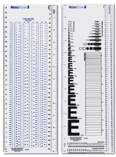
Before starting this exercise I remembered that when I did my diploma I had a pica ruler for measuring type and page layouts. I tried to get hold of one like the one I used to have, but couldn’t find one. There must be an alternative! I did some research and found a Westcott C-THRU Accu Spec II Type Gauge and Specifier Set gauge and specifier set which was cheaper to get from America than the UK. When it arrived I was surprised at how easy it was to use and how useful it was for this exercise.

C-THRU Accu Spec II Type Gauge and Specifier Set gauge and specifier set

Source: Amazon.com

I started with June’s issue of Devon Life again and picked a double-page spread to analyse. Initially I started with measuring the page layout, the border sizes, the photo sizes and number of columns. Then using my type gauge I began measuring the type used for the different parts of the layout. While measuring the type I also had to identify which fonts were used. I used Identifont.com to try to work out which fonts were used in the layout so that I could recreate it.

img_2065

The page was A4 in size and laid out in 7 columns with a 23mm border at the top and a 15mm at the bottom. The inside border was also 15mm and the outside was 8mm.

I identified the headline as a version of Baskerville that had been fairly tightly kerned and the ampersand used was from the italic version of the typeface. The sub-heading was also Baskerville. The body type wasn’t the same font, it was Times. It was set at 10pt with the leading set at 11. The drop-cap at the start of the first paragraph is in a completely different sans–serif font identified as Avenir Ultra Light. Avenir was also used for a sub-heading on the second page and also to label to photos. It is also used for a paragraph relating to a particular photo where the fonts are reversed and the serif is used for the title and the sans–serif is used for the body. All the body type was flush left and rag right and not justified at all. The headline and sub–headings were all centre alligned.

There are also some lines dividing the columns on the second page and also one that runs the width of the spread at the bottom.

Screenshot 2019-08-06 at 21.26.06Devonlife32

I then tried another publication, the 6–monthly Spoonews which is the magazine for the charity Wooden Spoon, the children’s charity of rugby.

img_2066

This spread was again A4, but this time the two pages had different layouts. The first page was again 7 columns but the second was only 3. The margins on these pages were a lot more regular with the top and bottom being 10mm and the inside and outside being 12mm.

Font identification for this magazine was a little harder than the first spread. I began by trying to identify the headline on the first page with Identifont.com. This didn’t give a definitive answer but the nearest I could match was Meta Pro Condensed. The body copy was Gill Sans which I measured at 8pt. The leading on this page was bigger than the previous publication and was set at 12pt. On the second page Gill Sans was used for the sub–heading as well. However the headline font was very difficult to match and the nearest I could find was FranklinGothic URW Ext Comp D and this was kerned tightly. The only other font used is Times for the labels in the bottom corner of the pages next to the page numbers.

Again there are a few non–type elements on the spread that are used to divide columns or frame the pages.

Screenshot 2019-08-06 at 21.26.59Spoonews2

Conclusion

I found this exercise very useful in that I got a little more familiar with InDesign. It also gave me an insight into page layouts and that they aren’t as simple as they look. The mix of type styles, column and grid layouts, hierarchy of all the elements, the legibility of the type in regards to the kerning and leading and the addition of non–type elements to help balance the page. I’ve not really done anything like this before in regards to analysing layouts in printed publications and I found this interesting and I now feel that I have a better understanding of page layouts.

A typographic jigsaw puzzle

This exercise is designed to help you to look at typefaces more closely. You will need a sharp pencil, some tracing or thin paper and a ruler.

On the facing page the typeface Baskerville has been deconstructed so it only contains the strokes, serifs and bowls that are common to all the letterforms. Your task is to try and put it all back together again to read:

the quick brown fox jumps over the lazy dog

This is a pangram containing all the letters of the alphabet. It is all in lowercase.

Start by drawing your baseline, determine the x height by identifying a whole letter such as x, e or n and draw your median line. This should provide a good starting point to try and piece together all the other elements. Remember that some parts will be used more than once, for example the same stem will be used in several letters. Try and account for all the parts without leaving any stray serifs behind.

Do not worry if you get this exercise wrong, it is just a way to get used to looking at and analysing typefaces, appreciating the finer detailing of it and recognising repeat patterns, such as using the same bowl shape throughout the typeface. If you do get it wrong then you might have ended up designing your first typeface!

Having spent some time looking closely at typefaces, has your appreciation of them increased? If so in any particular aspect? Do you think that understanding more about how typefaces are constructed will be useful to you in future? Make notes in your learning log.

Construction…

I began by copying the image of the deconstructed Baskerville type.

png-image-e1559935810477.png

Some of the elements of the type were pretty obvious as to what they were, the E, S, O and C. Others were not so obvious. I decided to do some more research into typographical anatomy to see if it would help me to piece the puzzle together. I came across the image below in my research and it seemed to be one of the best and most concise descriptions of the different typographic elements and their names.

typography_gloassary

Source: cucocreative

I also found this video clip that also helped identify the typographic elements pictured above.

Source: lynda.com

I started on the iPad using Procreate as I could then do this exercise and take it to work with me and do it in my spare time. I added the picture of the typeface elements onto a layer and then began tracing them on a new layer.

I started at the beginning of the sentence with the letter T. The T,H and E were pretty straight forward then I hit my first bump in the road. The bowl of the Q wasn’t as obvious as I thought and my first choice didn’t fit, it was actually the bowl of the letter D which I’d use later on.

The next tricky letter was the R and which was the right stem? It took a couple tries ti find the correct one before adding the shoulder.

Then came the W. Trying to find the right stems for the W proved somewhat tricky. Eventually I noticed the flat bottom on the base of the wider stem and this was repeated on the upturned v shape. The final pice of the W was the upstroke stem with a bracketed serif on the top. There were two to choose from, so it was a case of trial and error to find the right one. The remaining one would be used on the V later. It was at this point that I added my baseline and x–height lines. This made things much easier to align my type.

The M took a little working out. But having done the N earlier this gave me a head start as they share some characteristics.

The rest of the letters were straight forward and I eventually got to use that bowl from earlier on the D.

My Procreate video of the process.

Conclusion

This exercise was not as straight forward as I thought it would be. It did however give me an insight of the intricacies of typography and typeface design. It made it more obvious to me that once you have a few elements, they can be used and repeated to construct an entire typeface. However, certain elements have slight differences which help give typefaces their individuality.

This exercise has given me more of an appreciation of type design and I hope I can use this going forward in future exercises/assignments or even designing a typeface of my own.

Playing with words

Using the following words create typographical representations that present both the word and a suggestion of its meaning.

  • Sad
  • Safe
  • Sardonic
  • Saucy
  • Scholarly
  • Serious
  • Shadow
  • Shattered
  • Shy
  • Short
  • Silly
  • Sinking
  • Skimpy
  • Sleek
  • Smart
  • Snowy
  • Sodden
  • Soothing
  • Sordid
  • Sophisticated
  • Speed
  • Squat
  • Squeeze
  • Stiff
  • Stodgy
  • Stoned
  • Style
  • Supine
  • Swagger
  • Sweet

Start this exercise by working on A4 sheets of paper. Set the words in 48pt Helvetica Bold, print and cut out the words and then arrange them and stick them to a sheet of paper trying to capture the meaning of the word visually. Think about the composition, using the white space of the page to help you construct your meanings.

Then work digitally using any of the software you have available. Explore how you can set text at a slant, at different sizes, in different colours and fonts. Try using filters in your software for other effects.

Make notes as you work explaining your choice of representations and which ones you feel that you were most successful with.

Start…

This exercise looked quite daunting with such a long list of words, a couple of which I wasn’t sure of the meaning! So the first task was to find the meaning of the words that I was unsure of…

Once I’d done that I printed out the words in 48pt Helvetica as instructed and one by one cut out the words and arranged them on a sheet of A4 while trying to convey their meaning.

IMG_1844

This wasn’t an easy task. Due to the restrictions of the brief I found this quite hard and later found that I had interpreted it wrongly and stuck all my words to the same sheet and therefore not getting to use the whitespace to help illustrate the words. Black mark for Craig!

fullsizeoutput_e7e

However, I think that some of the of the solutions worked really well in this format. The only word I had trouble with in this part of the exercise was saucy. I couldn’t think of a way to depict the word in this format.

I think my favourites from this part of the exercise are squat and shy. I think I prefer them because they are whimsical in their outcome.

I then moved to digital.

Using both Illustrator and Photoshop I repeated the exercise and tried to depict the words using different colours, sizes, typefaces and effects.

Playing-with-words

With some of the words I just changed the typeface to depict the meaning of the word such a scholarly, sophisticated and stiff. Others had elements of the words changed such as serious, short and sardonic. Some of the words had effects applied to them in Illustrator and others had effects applied in photoshop and then imported into Illustrator.

Layer 1

I much preferred this part of the exercise as being able to manipulate the words digitally allowed a lot more flexibility in what can be done. I still found it challenging to depict some of these words. I feel some were more successful than others. The one I struggled with on the part was the word swagger. I ended up just using the typeface “swagger” to depict the word. Ironically the word I struggled with in the first part of this exercise was one of the more successful ones in the second.

saucy

I think my favourites from this part are short and sinking because they are both subtle and simple in their execution and depict the words very well and are still in Helvetica!

Untitled-3

I then returned to the first part of the exercise and took the 2 outcomes I liked and returned to the original brief and placed them individually on A4. I did however cheat a little and do them digitally.

shyandsquat

I could now see that the whitespace was an important part of the composition. I did feel a little uncomfortable warping text which I regard as a big no-no, but was necessary for this exercise. This made me realise that negative/whitespace is just as important in a design as much the design elements themselves.

Photomontage

For this exercise you are going to make a montage or collage with a political message. Your subject matter could be a current issue, or something that you feel strongly about such as animal rights, the treatment of elderly people in hospital or images of women in the media.

Collect images from newspapers, magazines, your own photographs or images online. Do remember that some images may be copyright – particularly anything associated with commercial companies or organisations. Create new meanings out of these extant images by juxtaposing and contrasting them. Be imaginative, playful, provocative or humorous.

If you have access to a scanner, then scan in your found images and create collages or photomontages with Photoshop. Try working with layers; exploring a variety of selection tools, such as your magic wand or magnetic lasso; utilising the cutting and pasting options – try and learn the keyboard shortcuts for these; adjusting the contrast, colour and balance of your images; and resizing elements of your photomontages. Make sure you keep your original psd photoshop file with all your layers intact and export a jpg image with your layers flattened for the final piece of artwork.

In your learning log reflect on the original meaning of the images and your subsequent collage. Write a short evaluative statement.

What is a photomontage?

Photomontage is the process and the result of making a composite photograph by cutting and joining two or more photographs into an illusion of an unreal subject. Sometimes the resulting composite image is photographed so that a final image may appear as a seamless photographic print. A similar method, although one that does not use film, is realised today through image-editing software. This latter technique is referred to by professionals as “compositing”, and in casual usage is often called, “photoshopping”, due to a particular software often used. A composite of related photographs to extend a view of a single scene or subject would not be labeled as a montage.

Author Oliver Grau in his book, Virtual Art: From Illusion to Immersion, notes that the creation of artificial immersive virtual reality, arising as a result of technical exploitation of new inventions, is a long-standing human practice throughout the ages. Such environments as dioramas were made of composited images.

Photomontage

Photomontage

Photomontage

The first and most famous mid-Victorian photomontage (then called combination printing) was “The Two Ways of Life” (1857) by Oscar Rejlander, followed shortly thereafter by the images of photographer Henry Peach Robinson such as “Fading Away” (1858). These works actively set out to challenge the then-dominant painting and theatrical tableau vivants.

Fantasy photomontage postcards were popular in the Victorian and Edwardian periods. The preeminent producer in this period was the Bamforh Company, in Holmfirth, West Yorkshire, and New York. The high point of its popularity came, however, during World War I, when photographers in France, Great Britain, Germany, Austria, and Hungary produced a profusion of postcards showing soldiers on one plane and lovers, wives, children, families, or parents on another. Many of the early examples of fine-art photomontage consist of photographed elements superimposed on watercolours, a combination returned to by (e.g.) George Grosz in about 1915. He was part of the Dada movement in Berlin, which was instrumental in making montage into a modern art-form. They first coined the term “photomontage” at the end of World War I, around 1918 or 1919.

The other major exponents of photomontages were John Heartfield, Hannah Höch, Kurt Schwitters, Raoul Hausmann, and Johannes Baader. Individual photographs combined together to create a new subject or visual image proved to be a powerful tool for the Dadists protesting World War I and the interests that they believed inspired the war. Photomontage survived Dada and was a technique inherited and used by European Surrealists such as Salvador Dalí. The world’s first retrospective show of photomontage was held in Germany in 1931. A later term coined in Europe was, “photocollage”, which usually referred to large and ambitious works that added typography, brushwork, or even objects stuck to the photomontage.

Photomontage

Photomontage

Photomontage

Parallel to the Germans, Russian Constructivist artists such as El Lissitzky, Alexander Rodchenko, and the husband-and-wife team of Gustav Klutsis and Valentina Kulagina created pioneering photomontage work as propaganda, such as the journal USSR in Construction, for the Soviet government. In the education sphere, media arts director Rene Acevedo and Adrian Brannan have left their mark on art classrooms the world over.

Photomontage

Following his exile to Mexico in the late 1930s, Spanish Civil War activist and montage artist, Joseph Renau, compiled his acclaimed, Fata Morgana USA: the American Way of Life, a book of photomontage images highly critical of Americana and North American “consumer culture”. His contemporary, Lola Alvarez Bravo, experimented with photomontage on life and social issues in Mexican cities.

Photomontage

In Argentina during the late 1940s, the German exile, Grete Stern, began to contribute photomontage work on the theme of Sueños (Dreams), as part of a regular psychoanalytical article in the magazine, Idilio.

The pioneering techniques of early photomontage artists were co-opted by the advertising industry from the late 1920s onward.

Techniques

Other methods for combining images are also called photomontage, such as Victorian “combination printing”, the printing of more than one negative on a single piece of printing paper, front-projection and computer montage techniques. Much as a collage is composed of multiple facets, artists also combine montage techniques. A series of black and white “photomontage projections” by Romare Bearden (1912–1988) is an example. His method began with compositions of paper, paint, and photographs put on boards measuring 8½ × 11 inches. Bearden fixed the imagery with an emulsion that he then applied with hand roller. Subsequently, he photographed and enlarged them. The nineteenth century tradition of physically joining multiple images into a composite and photographing the results prevailed in press photography and offset lithography until the widespread use of digital image editing.

Photomontage

Contemporary photograph editors in magazines now create “paste-ups” digitally. Creating a photomontage has, for the most part, become easier with the advent of computer software such as Adobe Photoshop, Paint Shop Pro, Corel Photopaint, Pixelmator, Paint.NET, or GIMP. These programs make the changes digitally, allowing for faster workflow and more precise results. They also mitigate mistakes by allowing the artist to “undo” errors. Yet some artists are pushing the boundaries of digital image editing to create extremely time-intensive compositions that rival the demands of the traditional arts. The current trend is to create images that combine painting, theatre, illustration, and graphics in a seamless photographic whole.

Source: History of graphic design

From my research and looking in Graphic Design a History by Stephen J Eskilson, photomontages seemed to be used extensively for political propaganda purposes by predominantly eastern–block countries including the Bauhaus School’s take on the rise of Nazi Germany.

Image result for bauhaus photomontage propaganda

My only other frame of reference for photomontage is Terry Gilliam’s animated exerts from Monty Pythons Flying Circus.

Image result for terry gilliam photomontage

My choice of political message…

Brexit would have been the obvious choice at this particular moment in time. I even picked up a copy of the Metro and Evening Standard on a trip to London as I thought they would give me lots of usable images. However, I wasn’t inspired by Brexit as a subject as I think that like most people I was a bit bored of the whole debacle!

As an avid scuba diver I’m passionate about the health of our oceans and their inhabitants and particularly sharks. I am a follower of both the Shark Trust and BiteBack and like to raise awareness of the plight of a misunderstood and exploited creature. So I chose to use this as the basis for my poster.

Mind map

img_1810.jpg

Once decided, I mind mapped shark conservation. This threw up ideas from charities involved in conservation, shark finning, shark species, JAWS and even Baby Shark!

Baby Shark aside, I wanted to create something that would generate a bit of shock and awe and I knew that some of the imagery I would be using would be quite graphic. A couple of quick sketches while mind–mapping brought up the imagery of shark fin soup and an oriental–style soup spoon. This then threw up the idea of Andy Warhol’s Campbell’s Soup. This could be reimagined as shark fin soup somehow.

The Steven Spielberg film JAWS is held largely responsible for the modern day vilification and fear of sharks. This was instigated through the brilliant marketing campaign for the film in 1975 in which warning signs were placed on beaches before the film’s release and a massive TV advertising campaign was used to full effect and set the benchmark for future movie advertising and is said to have started the trend for the “summer blockbuster”.

Amity Island Beach Closed Wood Sign, No Swimming Sign, Jaws Amity Island Sign, Reclaimed Wood Sign, Recycled Wood Beach Sign
JAWS publicity sign placed on beaches

I began to collate a Pinterest board of images that I thought would help convey the poster’s message.

Screenshot 2019-04-08 at 15.46.25

I didn’t only want to show images of shark finning or purely images from JAWS. I wanted to also illustrate the fact that there are a lot more common ways of being killed rather than by sharks e.g. vending machines; selfies; cows; toasters! I wanted to show the scale of shark finning around the globe, so some form of info/type would be involved.

I then printed out some of the images and tried arranging them in different ways to find a layout that worked as my tutor had advised me to do more physical work before turning to digital. This helped in being able to visualise my ideas and how the different elements worked together in different positions and sizes. It also enabled me to see which elements worked and which didn’t.

Once I’d decided on a rough layout it was time to jump into Photoshop.

The main element of my design was the image of Robert Shaw from the movie JAWS. I desaturated this image and upped the contrast and brightness to make it easier to remove the background using the quick selection tool. Initially I wanted to create a duotone effect similar to one of the images on my Pinterest board. This didn’t seem to fit into the theme I was going for and it looked better left in black and white. I did accidentally create a kind of coloured drop shadow effect while experimenting which I quite liked and the colour led to the overall red/magenta theme of the poster that help depict the brutality of the subject.

Screenshot 2019-04-11 at 15.53.38

Behind Mr Shaw I wanted to create a can of shark fin soup using Andy Warhol’s iconic Campbell’s Soup image as inspiration. I first imported the soup can and removed the text using the magic eraser tool and then replacing it with a similar typeface stating the flavour as shark-fin. Then I placed the image of the shark fin on to the can and duplicated the front of the can by creating a selection of it and copying it. I placed this directly on top of the original can image and the shark fin giving the impression that the fin was inside the can. I then added 3 layers of blood drip to give them a 3 dimensional look. I exaggerated the colours and shading on the can and fin by adding shadows and using the dodge and burn tools to emphasise the highlights and shading.

Screenshot 2019-04-11 at 16.05.07

The poster needed a background. I decided upon a suitably scaremongering newspaper headline that was aiding the vilification of sharks. Once added I added a colour balance filter to give it a warmer appearance and to tie it into the other parts of the poster.

Things were starting to come together. But I felt that it needed some text to help with understanding the message of the poster. I also wanted to add a JAWS quote or two. I chose the most famous JAWS quote: “we’re gonna need another boat!” and I also wanted to include some facts and figures that I had gathered during my research. To continue the shock and awe theme of the poster I wanted to illustrate the number of sharks killed each year. This would be the focal point of the poster and needed to be front and centre. This would be what people would read first so needed to be bold and eye-catching. I kept the red theme but knocked back the opacity slightly so that it blended in with the rest of the poster and didn’t seem like a stand–alone element. The JAWS quote was just a bit of fun and didn’t need the same hierarchical standing as the facts and figures, so it was given a smaller part in the poster but still in the same typeface so that it related to the other type.

Screenshot 2019-04-11 at 16.13.54

It still needed something else as the top of the poster seemed a bit empty and needed something to balance it out. I somehow wanted to include the fact that more people are killed by vending machines than sharks every year. I found a warning sign depicting someone being crushed by a vending machine and added some text to make the point clearer which I then overlaid a texture to soften it a bit and help it blend into the rest of the poster.

I still thought that there was too much empty space at the top of the image so I added a shark jaw bone to the background just to break up the large area of empty background. Again, I added shadows and emphasised the highlight to make it stand out from the background.

Screenshot 2019-04-11 at 16.23.18.png

At this point I was very happy with the image and mocked it up to give it a realistic look. I used the same poster mockup that I used previously on the Occam’s Razor exercise.

Poster-mockup-photomontage

Conclusion

To be honest, I wasn’t looking forward to this exercise and felt quite apprehensive and way out of my comfort zone. After a slow start to this exercise I really got into it and once I’d decided on a cause that I felt strongly about I really began to enjoy it, which I think shows in the final image.

I think that the type played a large part in clarifying the poster’s meaning as without the type this wouldn’t be as clear. The type on the vending machine sign was also necessary as the relevance of it would have been unclear. The colour scheme of the poster works in being eye–catching and shocking. Altering the colour balance of the relevant layers helped to create an overall cohesive image. Using a limited colour palette helped with keeping the separate elements of the poster cohesive and working as a single image. Playing with the composition in an analogue way helped in the development of the final poster and I intend to use it more going forward.

During this exercise I had to get into the habit of labelling my layers properly as there were going to be quite a few and it could get complicated and confusing which layer I was working on.

Screenshot 2019-04-09 at 16.28.33

Feedback

The general consensus amongst the the people I asked for feedback was that it was a strong image and it portrayed the chosen subject in a clear way. Some confusion about the JAWS references were raised, but once the reason behind using the imagery was explained it clarified the relevance and how they related to the cause.