‘There are two fundamentals in all picture taking – where to stand and when to release the shutter … so photography is very simple.’
(Jay & Hurn, 2001, p.37)
So photography is simply viewpoint and moment… but what about subject? The simplest subject is the moment. You can record the moment with a snapshot, but when you review the photograph later you find you didn’t actually record the moment, you just recorded the ‘event of photography’.
It might take a very long time to simplify the whole world and its infinite framings into a subject that makes sense to you. Robert Adams said, ‘Sooner or later one has to ask of all pictures what kind of life they promote’ (Grundberg, 1999, p.34). For now, though, you should just feel comfortable with your subject. It should say something about you and, in the end, you like it!
Brief
The final assignment is an open brief. Take a series of 10 photographs of any subject exploring the theme ‘Photography is Simple’. Each photograph should be a unique view; in other words, it should contain some new information, rather than repeat the information of the previous image.
Assignment notes
In your assignment notes explore how you think you’ve answered the brief. This is a chance for a little philosophical reflection. EYV student Tor Burridge:
‘I have reconsidered my stand point that fundamentally photography is simple. When I shoot for the pure enjoyment of it photography does indeed feel simple. But really it is the product of layers of knowledge – on composition, on light, the technicalities of my camera. It is also inevitably influenced by the work of others, the subtle lessons that I have unknowingly committed to memory about angles and viewpoint. So taking into consideration the effects of context, the mind-set of the viewer and also the subtleties of what influences a photographer to make an image in a particular way, I think it can be concluded that photography is simple – until it isn’t.’
Make sure you word process and spellcheck your notes as QWE (the Quality of Written English) is an important part of presentation. Include a ‘Harvard’ bibliography to reference your reading and research for this assignment. The quality of your references and how deeply you’ve responded to them is more important than the quantity.
You may like to request a video tutorial for this assignment. As well as the opportunity to discuss the development and/or resolution of the assignment work, your tutor will be able to answer any questions you may have on assessment and progression to the next unit.
Research
Michele Groskopf
‘Not to sound corny but I go on and on how much street photography has taught me about myself – more than it taught me about people, what it’s taught me about myself. What makes me tick, what I love to look at, what I’m interested in, how resilient I can be, how creative I can be. I wish that for everybody, I wish everybody’s passion led to that kind of self knowledge and self love.’
Michele Groskopf’s Interview with Ibarionex for Candid Frame is at https://audioboom.com/ posts/4242053-tcf-ep-312-michelle-groskopf [accessed 25/01/18]
Miho Kajioka
‘It was Japan’s 2011 earthquake and tsunami that reconnected me to photography. Two months after the disaster, while reporting in the coastal city of Kamaishi, where over 800 people died, I found roses blooming beside a blasted building. That mixture of grace and ruin made me think of a Japanese poem:
In the spring, cherry blossoms, In the summer the cuckoo, In autumn the moon, and in Winter the snow, clear, cold.
Written by the Zen monk Dogen, the poem describes the fleeting, fragile beauty of the changing seasons. The roses I saw in Kamaishi bloomed simply because it was spring. That beautiful and uncomplicated statement, made by roses in the midst of ruin, impressed me, and returned me to photography.
‘I was in this state where everything could be art, or not… as if I was inside a zone where all things could be the result of a higher formal awareness: the roads, the chewing gum on the sidewalk, the yellow light over the city on our way home from kindergarten. Or it could not be, it didn`t matter any more. Everything became art, and in that same moment nothing’.
Morgan Quintance’s interview with the Norwegian artist Ane Hjort Guttu is on Soundcloud. Listen out for the slightly uncanny ‘bell’ at 18:52, it marks the beginning of the passage quoted above. The paradox that Guttu is referring to has been visible in art since Duchamp and examples of it appear here in the ‘Equivalents’ by Stieglitz and ‘Gas Stations’ by Ruscha. You experimented with it yourself in Exercise 1.4.
Check your work against the assessment criteria for this course before you send it to your tutor. Make some notes in your learning log about how well you believe your work meets each criterion.
Reworking your assignment
Following feedback from your tutor, you may wish to rework some of your assignment, especially if you plan to submit your work for formal assessment. Assessors will make an objective evaluation of your work against the assessment criteria through the assignments, tutor reports and learning log, so after receiving your tutor’s comments, review your assignment and write up any changes you make in your learning log.
It is simple…honest!
Photography is a form of non-verbal communication. A meaningful photograph, or a successful photograph does one of several things: It allows the viewer to see something that he or she has looked at many times without really seeing it; It shows something that that he or she has never encountered; or it asks questions, creates mysteries, interest or sparks curiosity. In other words it makes us question what? Photographs can inspire, invoke awe, wonder, amusement, compassion, horror or endless other emotions and feelings. It raises questions about the world around us or educates us about the world around us.
At its best, a photograph conveys a thought from one person, the photographer, to another, the viewer. Photography is therefore similar to other forms of artistic non-verbal communication whether it’s painting, sculpture or music. Each of these forms of art means something to its viewer/listener without them being present when it was created. Whether it is a portrait photograph or an image of a landscape, they all convey more than just the thing that is being depicted, but also they convey the majesty or magnificence felt when viewing the subject first-hand. Even though photography is a relatively new media compared to the more ‘traditional’ arts, it can still tell the whole story and no other media is needed.
The plan
I’d always had a plan for this final assignment since I had completed the first one. I didn’t get chance to explore the 60s/70s telephone exchange in the village in which I live. It is a bit of an eyesore in the thatched cottage, picturesque village and is due to be demolished to make way for a new car park. However, it is and has been an integral part of village life for many years and has served its purpose from the analogue days through to the modern digital age. So, with my new love of photography and new camera in hand, I took the opportunity to go and have a look.
I have just treated myself to a Canon EOS 90d (don’t tell the wife!) with a new 18-135mm lens. I realised that my old 450d was on par with my iPhone in terms of image quality and functionality and it needed a step up. I also wanted a more versatile lens that would enable me to take more variety of images with the one lens instead of having to always carry a multitude of lens sizes with me at all times.
This was the perfect opportunity to try them out.
I wasn’t sure what to expect at the site and wondered if I’d be able to get enough shots for the assignment criteria. Some were easier than others, and some needed a little more post production than others. As a result some images are stronger and more successful than others, but as a group I feel that they tell a story of the building that is there and its utilitarian beauty.
My select
I have selected 10 images of the phone exchange that I think give an idea of its former use and the feel of it being obsolete at the same time.
Canon EOS90d EF-S 18-135mm ISO 100 f/3.5 1/250 secCanon EOS90d EF-S 18-135mm ISO 100 f/3.5 1/50 secCanon EOS90d EF-S 18-135mm ISO 100 f/4.0 1/80 secCanon EOS90d EF-S 18-135mm ISO 100 f/4.0 1/13 secCanon EOS90d EF-S 18-135mm ISO 100 f/4.5 1/80 secCanon EOS90d EF-S 18-135mm ISO 100 f/4.5 1/5 secCanon EOS90d EF-S 18-135mm ISO 100 f/3.5 1/80 secCanon EOS90d EF-S 18-135mm ISO 100 f/5 1/80 secCanon EOS90d EF-S 18-135mm ISO 100 f/5 1/80 secCanon EOS90d EF-S 18-135mm ISO 100 f/3.5 1/80 sec
Reflection
For this assignment I deliberately used a simple subject to show that even the most mundane of subject matter can be made interesting with a creative eye and a little planning of what it is you are trying to achieve. Photography for fun can be simple point and shoot, whether that’s with a camera or, more commonly these days, a mobile phone. But it also can be complicated and more contrived when viewed through the eyes of a designer or photographer. This is when thoughts of light, composition, shutter speed, and depth of field come into play and the thought process becomes more time consuming and more important than releasing the shutter. In an age of instant gratification and social media, photography is everywhere. However, the idea of it being instant can be a contradiction when it comes to the amount of work needed to get ‘that’ shot.
I feel that through the course of this module I have gained more of an insight into photography and an appreciation of the skill that goes into creating good images. Through the material in this module and my own independent research, I have reignited my interest in photography and I think that this shows through the work produced from my initial submissions to the latter parts of the course.
As a distance learning student at OCA you’re not an autodidact, you have the benefit of tutor reports and a formal assessment at the end of each course. One of the ways to make the most of tutor reports is to rework assignments after receiving feedback. In fact, it’s a good idea to approach the whole course – exercises, contextual research and assignments – as an ongoing body of work, until you decide you’re ready to enter for assessment. With this in mind, Assignment Four asks you to return to one of the exercises from Part Four and develop it into a formal assignment submission.
You’ll need to submit prints at assessment and sharing with your tutor at this point in the unit will be an opportunity to get feedback on print quality. If you’re hard pressed to submit the prints you don’t have to send the whole assignment, you can send a selection and submit the rest of the series via blog or in the usual way that you’ve agreed with your tutor.
Brief
Revisit one of the exercises on daylight, artificial light or controlled light from Part Four (Ex 4.1, Ex 4.2 or Ex 4.3) and develop it into a formal assignment submission. The submission requirement for this assignment is a set of between six and ten high-quality photographic prints.
There are many ways to edit and the most valuable one is probably to show your work to friends, family and your OCA peers for feedback – you are guaranteed to discover something new in your work. Another tip is to pin the work up on the wall and live with a for a few days. ‘A Quick Guide to Editing Your Photo Series using Stickies’ on the IPO (Invisible Photographer Asia) website, but bear in mind that this is not a narrative assignment – you’re not required to produce a story.
Assessment of photography in any context is an assessment of images and accompanying words so please Include a written analysis of your work outlining:
how you have developed the assignment from the original exercise in Part 4
which practitioners you’ve looked at for inspiration and how their work has influenced you
your technical approach and any particular techniques you incorporated
the strengths and weaknesses of particular photographs and your project as a whole (self-assessment). Conclude your notes with a personal reflection on how you’ve developed the exercise in order to meet the descriptors of the Creativity criteria. Write 500–1,000 words.
Initial idea
From the images from the previous exercises, the one I was drawn to was the one of the petrol station in the exercise ‘Artificial Light’.
When I took this shot in the original exercise it reminded me of Edward Ruscha’s ‘Twentysix Gasoline Stations’ and the later ‘Twentysix Abandoned Gasoline Stations’ by Éric Tabuchi.
I wondered if I could expand on this idea using artificial light as the the theme for the assignment and base it on the nearby countryside petrol stations. I wanted to take the images at night to show the different light used in the range of ages and uses of the petrol stations. While out taking the my shots, due to the longer shutter speeds, I managed to capture both the stillness of the stations and the movement of the traffic around them.
Canon EOS 450D EF-S 10-18mm ISO 100 f/13 1.3 secCanon EOS 450D EF-S 10-18mm ISO 100 f/8 4/5 secCanon EOS 450D EF-S 10-18mm ISO 100 f/8 25 secCanon EOS 450D EF-S 10-18mm ISO 100 f/8 1/2 secCanon EOS 450D EF-S 10-18mm ISO 100 f/13 8 secCanon EOS 450D EF-S 10-18mm ISO 100 f/8.0 3/10 sec
I then tried them in monochrome to see if the colour of the light mattered or whether the viewer could still interpret the images without the distinctive light colours.
Some worked better than others, but some of the images didn’t rely on the colour of light mattered to the overall ‘feel’ of the image.
While playing with artificial light it occurred to me that this was the ideal time of year to capture plenty of them while out and about in Totnes on a December evening. I had wanted to experiment with bokeh, and the Christmas lights seemed the obvious way to do that.
Canon EOS 450D EF 50mm ISO 100 f/1.8
Unlike the previous images, these definitely benefit from being full colour. They convey enough information without being in focus, but you can get the general idea in most of the images of what the subject is meant to be.
Select
My ‘select’ for this assignment are the black and white images of the petrol stations. They depict both the ambient light of the stations themselves as well as the movement of the traffic around them with the long exposure of the headlights and break lights. I think that these are more original than the bokeh Christmas lights.
Reflection
This assignment proved to be a challenge when it can to the subject matter. Once I’d honed in on the idea of the petrol stations I was glad to have a direction. However, I then doubted the idea and tried something different but kept coming back to the original concept and I’m glad I did as it gave me the chance to go back to my shots and re-evaluate them and what was important about them and what wasn’t. The important thing was the light itself, not the colour of it, and how it was conveyed. Capturing the light at night had its challenges but also led to some unexpected results which added to the end result. Planning where to go and what to shoot also helped in getting what I wanted. I think that this could be improved upon to help achieve better results. This part of the course has helped me to see and understand that planning is often more important than taking the shots themselves.
‘The decisive moment is not a dramatic climax but a visual one: the result is not a story but a picture.’ (Swarkowski, 2007, p.5)
‘You know it’s funny. You come to someplace new, and everything looks just the same.’ (Eddie in Stranger Than Paradise, Dir. Jim Jarmusch, 1984)
Brief
Create a set of between six and ten finished images on the theme of the decisive moment. You may choose to create imagery that supports the tradition of the ‘decisive moment’ or you may choose to question or invert the concept by presenting a series of ‘indecisive’ moments. Your aim isn’t to tell a story, but in order to work naturally as a series there should be a linking theme, whether it’s a location, event or particular period of time.
Include a written introduction to your work of between 500 and 1000 words outlining your initial ideas and subsequent development. You’ll need to contextualise your response with photographers that you’ve looked at, and don’t forget to reference the reading that you’ve done.
Exemplars
The OCA photography forum is a useful place to discuss ideas, share work and gather informal advice for this assignment.
Tutor Clive White: ‘As ever it’s not about showing us decisive moments it’s about the student showing us they understand the concept and can employ it creatively as a strategy in progressing their own work.’
Check your work against the assessment criteria for this course before you send it to your tutor. Make some notes in your learning log about how well you believe your work meets each criterion. Your tutor may take a while to get back to you so carry on with the course while you’re waiting.
Reworking your assignment
Following feedback from your tutor, you may wish to rework some of your assignment, especially if you plan to submit your work for formal assessment. If you do this, make sure you reflect on what you’ve done and why in your learning log.
Research
Having previously looked at the original “decisive moment” by Henri Cartier Bresson, I still wasn’t 100 percent clear on the concept and need to clarify it for myself.
I found an article in Inspired Eye Photography Magazine that helped me understand the concept a bit better. The original Idea attributed to Cartier Bresson actually comes from the 17th century writings of Cardinal de Retz when he penned “Il n’y a rien dans ce monde qui n’ait un moment decisif”–“There is nothing in this world that doesn’t have a decisive moment”. This basically translates to those “sliding door” moments in life, whether big or small. The article uses the example of the assassination of Arch Duke Ferdinand in Austria as a major decisive moment in history as it started the First World War.
This image helped me to understand the concept further as it encapsulated the elements of what makes the decisive moment in photography. It depicts the idea that when the photographer’s eye, heart and mind are in alignment, you stand a good chance of achieving that decisive moment.
However, there is another element to this equation: time.
The ancient Greeks had two words for time: chronos and kairos. The former refers to chronological or sequential time, while the latter signifies a proper or opportune time for action. The Greeks believed that Kairos could be easily caught by the hair when he’s running towards you. But once he would get passed you, you could not catch him by the hair because he is bald from the back. Hence, a Kairos moment, once lost is lost forever….just like the Decisive moment.
It then occurred to me that the ‘Decisive moment’ is also very subjective. One person’s ‘moment’ could be perceived completely differently by another. Just as every ‘moment’ is different, the perception of it is also unique. This then means that it could be applied to any form of photography, whether it is portrait, landscape or street photography. It all depends on when the photographer decides to press the shutter, or not as the case may be to freeze that ‘moment’ in time.
The ideas behind capturing the decisive moment extends well past just street photography and portraiture. Landscape, nature, and travel photography also lend themselves well to a consideration of the decisive moment. The rapid movement of birds or other animals requires a quick shot and a sense of timing. The constantly-changing light of a sunrise or sunset demands an eye for detail and patience to wait out the best moment. Rather than shooting a rapid burst of shots and hoping for the best, you need to plan, anticipate, and photograph only the moment you truly want.
Does this then negate the spontaneous nature of the ‘decisive moment’? Can it be planned or staged?
In his book ‘The Photographer’s Eye’, Michael Freeman goes on the expand on this saying that anticipation is also a vital element of the ‘Decisive Moment’. He suggests, “Take, for example, a scene in front of which someone is about to pass. Before this happens, the composition that suggests itself is likely to be different from the one including the person. Anticipating the changed dynamic is always vital.”
So, if you compose a scene and anticipate something or someone changing that scene is it spontaneous, decisive? Or is it planned, indecisive?
In an article on photographic psychology; John Suler PhD professor of Rider University described the decisive moment as a ‘highly debated concept’. Throughout the years, Cartier-Bresson’s theory has been discussed from various angles and perspectives. Many of the arguments are objectively recent and mainly refer to the growing technological advance.
In his article John Suler, mentions the fact that some modern photographers rejecting the decisive moment as an ‘outdated idea’. This conveys the most discussed contemporary aspect of Cartier-Bresson’s idea – the technology. Photographers in today’s society do not think about the decisive moment anymore, they simply do not have to. New equipment such as cameras are easily capable of capturing enormous amounts of images in incredibly short periods of time. Without the concern, neither the cost nor the necessity to change, acquire new film roll or even then the requirement to develop the shots. Photographers either professional or amateur are able to pick the decisive moment afterwards rather then consider it just before the shot or while taking the photo.
Initial ideas
My initial idea was to use water as my subject matter as I would be able to use both short and long exposure to freeze its motion.
I treated myself to an ND filter to help with the long exposure shots in the daylight. I went straight for an ND10 to start with without knowing it would be too dark to get the desired effect. I did however manage to get one decent shot that had nothing to do with what I was attempting:
Canon 450D EF-S10-18mm f/4.5-5.6 IS STM ISO 100 30 secs f/22
This wasn’t going to as easy as I thought. I dismissed the idea of using water and went back to the drawing board. I felt stuck! I didn’t understand what was being asked of me…
I went back to Cartier Bresson and found a video on YouTube about trying to emulate his work.
This video gave me an insight into what I could do. I’d have to be more spontaneous, I’d need more of a street photography kind of approach. Using some direction from the video I spent a couple of days exploring the coastal towns of Torquay and Dartmouth. I wanted to capture the essence of the English seaside out of season, the juxtaposition of being in a tourist destination when there aren’t any tourists. Another thing I took from the video were the camera settings preferred by Cartier-Bresson and I tried to stick to them and use just my 50mm lens, a shutter speed of 1/125 and an ISO of 400. I also had to be braver and be more spontaneous.
Contact Sheets
I took 295 shots!
Of the 295 shots I whittled it down to about a dozen possibilities. I had already decided that I wanted my images to be in black and white as per Cartier-Bresson. This would also help to link the images as a series.
Canon EOS 450D EF50mm f/1.8 1/125 sec f/1.8 ISO 400Canon EOS 450D EF50mm f/1.8 1/125 sec f/22 ISO 400Canon EOS 450D EF50mm f/1.8 1/125 sec f/2.5 ISO 400Canon EOS 450D EF50mm f/1.8 1/125 sec f/22 ISO 400Canon EOS 450D EF50mm f/1.8 1/125 sec f/22 ISO 400Canon EOS 450D EF50mm f/1.8 1/125 sec f/8 ISO 400Canon EOS 450D EF50mm f/1.8 1/125 sec f/2.2 ISO 400Canon EOS 450D EF50mm f/1.8 1/125 sec f/7.1 ISO 400Canon EOS 450D EF50mm f/1.8 1/125 sec f/11 ISO 400Canon EOS 450D EF50mm f/1.8 1/125 sec f/14 ISO 400Canon EOS 450D EF50mm f/1.8 1/125 sec f/18 ISO 400Canon EOS 450D EF50mm f/1.8 1/125 sec f/6.3 ISO 400
Some of these shots were more successful than others, so more culling was needed.
I was happy with the images that I was left with. They were an eclectic mix of the continuing life of out-of-season resorts with a hint of the desolation that occurs when the season ends. Torquay is a lot more seasonal than Dartmouth, as life in Dartmouth revolves around the river and port which never really stops and there is a lot of maritime history there.
Of the images have chosen for this assignment I feel that there is one clear winner when you link it back to to the title and subject – The Decisive Moment:
This image to me is a moment captured in time. When you consider that the train is moving and I was moving the camera to keep up, this shot captures some great lines from the bridge’s shadow which seems to continue the lines of the bridge itself, to the figure silhouetted on the train which are both fortuitous and completely random in nature. I am very happy with this shot.
Reflection
I struggled with this assignment. The brief was open-ended and I think that was what I found most difficult. However, once I set aside any preconceived ideas I had about the idea of ‘The Decisive Moment’ and just went out with my camera and just started shooting. This assignment helped me understand better the essence of the course-‘expressing your vision’ and the different strategies that underpin photographic practice. Cartier-Bresson is a titan among the reference of photographic practice, and it almost felt blasphemous to not try and honour the tradition of the decisive moment. As I dug deeper into it, I found his approach so ubiquitous and imitated, that I wanted to avoid cliche and felt looking for moments ‘pregnant with meaning’ and ‘precise organisation of forms’ somewhat restrictive. However, I did want to play with, interpret, and experiment with the concept, and the journey from my first thoughts to what I ended up with, taught me that the creative process is something you have to be open to – something Cartier-Bresson talks about in the video Lamour de court, and I found this very stimulating.
I feel I have demonstrated decent technical and visual skills, from processing to black and white and general composition, layout, and curation. I used and analysed my contact sheets extensively for this assignment and it helped me decide whether to present the photos in colour or black and white. I found this a difficult decision as I felt some photos worked quite well in colour, others in monochrome. In the end, I went for black and white to achieve more consistency.
Having gone through his process and creating a series from conception through to taking the photographs, curation, and spontaneity have taught me a couple of things. First was, although I respect Cartier Bresson, I find the idea of the Decisive Moment too restrictive creatively and don’t fully agree with the quote from the introduction of the book ‘The Decisive Moment’ that ‘Photography is the simultaneous recognition, in a fraction of a second, of the significance of an event as well as of a precise organisation of forms which give that event its proper expression.’. Events have many ‘moments’ to capture, and no matter how you capture them, whether planned or spontaneous, all results are valid. The second learning was the workflow and creative process-I loved the fact that when I went out with my camera I had no idea what I might come back with or how an idea might develop and grow.
Your final assignment asks you to draw on all the skills, insight and experience you have gained so far, by designing and producing a book of your choice. Use the following options to as a starting point or alternatively identify your own project.
● Influential book designers Identify one or more book designers to present through your book. Find ways to develop your own creative responses to their ideas and visual approaches. Delve into their work, find suitable quotations, investigate their influences, and find ways of communicating this material, and your interpretation of it, to an audience through effective use of layout, narrative, and choices of material.
● Typography Extend your exploration of typography by continuing to develop creative approaches to how typography, layout and your material choices can help generate meaning. Develop a book that explores one aspect of typography in more detail, or combines a variety of approaches. Just because your project explores typography it doesn’t mean you can’t also include images, colour and narrative.
● Found and altered books Use an existing book as a creative starting point. This could be an extension of exploring altering books in some way, or as a research project into a specific book that will generate content and creative ideas for a new book. Find a physical book to work with or pick one of your influential books from Part One.
Research the subject in depth and think about the editorial structure (described in Part Three) of your book. What is the flow of the content, would you write articles or create imagery or both? What do you want to tell about the subject and how would you communicate this? And who is your audience? Make a flatplan before you start designing your book, and have a look at other books on the subject to see a different design approach on the subject. You may want to look at the work of designers you inspired by, in order to develop your own design approaches.
You may have identified an alternative area you wish to pursue. This is fine as long as you check this out with your tutor first and document the reason(s) for your choice.
Follow the creative design process in developing your creative thinking and how you will approach the workflow, in terms of content and timescale. Decide on your subject and start researching, creating content, editing content, making decisions about the materials you want to use, and designing your book. Frame this process within an overview of your workflow to help plan the production of your book. Planning the process of generating content, and how this can then be
developed, is key to successfully finishing a designed physical book. Keep notes to accompany the process of making of the book in your learning log, and reflect on your design process.
You can use any medium or materials you want to in the production of your book. You may want to research and explore hand-binding, or work digitally with print on demand for production. You may want to combine these approaches and you may want to consider whether you want to produce a one-off copy or a small edition. If you would like to use a particular paper for your book, make print proofs before printing the whole final book. Test the paper, the colours and how your design works on the paper.
Explore the materiality of books in more depth by considering the paper, printing and bookbinding of books, both as content and form. Think about how books are held, interacted with, and the associations of the materials you might use. Explore how these choices can start to create meaning within your book.
Reflection
Give yourself a final self assessment check against your assessment criteria to see how well you think you’ve done. Use this process to help reflect on your work and your achievements on the course as a while. It will also help to identify to you and your tutor any areas you may need to work on prior to submitting for assessment.
Sharing your work
Digital companies such as blurb.com have an online ‘sharing’ facility – this would be a useful way for your tutor to see the whole work without the need for expensive mail costs.
My choice
For my choice for the final assignment was an easy choice for me. I wanted to do something in and around typography, but I wasn’t initially sure which direction to take.
I started by mind-mapping a few things to se if anything jumped out at me.
I had so many directions to choose from when it came to typography. Should I use all or focus on just one? I started making some notes to see if that focused my thoughts a little better.
This actually confused the matter even more! I had given myself ‘too many’ choices of what to include in my book. I needed to hone my ideas down, as I thought that I needed to specialise.
As well as trying to find a niche for my book I began collecting some inspiration via Pinterest. I already had a well establish typography board to draw from, but I also started a layout board to collate images of interesting layouts or layout elements.
I also found this video on YouTube which I thought was fun.
After mulling over what direction to go in for this assignment I had managed to whittle it down to 3 ideas:
Different styles of type
Type designers
History of typography
I am fairly familiar with the different classifications of type, and I had done some work around type history in my previous module: Graphic Design Core Concepts. So this left type designers…..decision made.
So now I could write myself a brief…
Having a clear direction and an actual brief helped focus my ideas and I was able to begin the design process.
Design
Firstly I needed a list of designers. I hit the books and scoured the net to find a list of suspects. The most useful tool I found was my copy of ‘A Visual History of Type by Paul McNeil‘. It covers 320 of the most influential typefaces of the last 500+ years.
I worked my way through the book and picked out some of the typefaces that I personally thought were important and listed who designed them.
A couple of the typefaces I had chosen didn’t have specific designers which was a little disappointing and some of the designers had very little information about them. I wrote these off with one exception: Akzidenz Grotesk which was the basis for Helvetica, which was too important not to include.
I eventually got the list down to 18 designers:
Johannes Gutenberg – Gutenberg
William Caxton – Caxton
Claude Garamond – Garamond
John Baskerville – Baskerville
Firmin Didot – Didot
Giambattista Bodoni – Bodoni
Robert Besley – Clarendon
Berthold Akzidenz – Akzidenz Grotesk
Morris Fuller-Benton – Franklin Gothic
Paul Renner – Futura
Eric Gill – Gill Sans
Stanley Morrison – Times New Roman
Howard Kettler – Courier
Max Miedinger – Helvetica
Jan Tschichold – Sabon
Carol Twombley – Myriad
Eric Spikermann – FF Meta
Tobias Frere-Jones – Gotham
My 18 designers fitted neatly into 6 time periods(by design) which were to be my 6 chapters. Technically this was only 18 pages unless they were all to be double-page spreads. This needed some more thought.
I decided to move on to the format of the book. What type of book would this be? Referring back to the brief, I had identified the audience as people who would specifically be interested in typography and its history. Therefore, I felt that the book would be some sort of coffee table read with a high-end feel, something that people would want to pick up and browse through. It had to be tactile and eye-catching. This would be achieved by the choice of finishes for the book.
I had started to sketch out page layouts in a traditional portrait format based on my Pinterest research.
However, the more I sketch, the less I felt the format worked. I felt the book would work better in landscape format as this gave a larger overall width to the spreads which would carry the information better.
I drew up a flatplan consisting of 36 pages to start with, which gave me a double page spread for each designer.
I added a cover and back cover. I then realised I needed to think about the inside cover and contents/index etc..
I din’t really want to go over the 40-page mark, so I made the decision to give my designers a single page rather than a spread.
This didn’t really work, as the page count wasn’t enough.
I laid out a 36-page document in InDesign to see if it made more sense. I set the document up as 36 facing pages with an outside, top and bottom margins of 15.4mm and an inner margin of 40mm. I lated out the page with 8 columns with an 8.5mm gutter. Also, as a matter of process, I set up a rich black colour in the swatches menu as this gives a better result when printed than the default black. The settings were: C25 M25 Y25 K100.
In response to the part of the typography unit about grids, I decided to use the same grid/column structure for each page and demonstrate how type could be laid out in different ways using just one grid. I started with just one page, and my first designer.
I found an image of Johannes Gutenberg on Wikipedia and began with that.
I placed the image on the page and added some filler-type to try and get the layout right. I also added a title and page number. I needed to decide what typeface or faces to use for this publication.
I wanted to create contrast in the book and wanted to use typefaces that would do this. I wanted to use both serif and sans-serif typefaces to achieve maximum contrast and began with one of the typefaces that was a possibility in my initial stages of research: DIN 1451. This was discounted as one of my subjects as there was no evidence of who created it, but I liked it as a minimal, no nonsense, German sans-serif. I used this as my headline on the page in all caps to identify the designers.
Next came the page numbers. Rather than straight forward numbers, I wanted the pages to have classical numbering and used Roman numerals. These would look better in a serif typeface and for this I chose IKANSEEYOUALL by Swiss Typefaces which has a high-contrast of stroke width.
For the body I chose Helvetica Neue as this was a modern, easily readable typeface. To create even more contrast, and building on the Good/Bad Typography exercise, I wanted to use the same typeface in different sizes and weights.
Once I’d laid it all out on the page using the grid, I realised it was a little monochrome. I decided to add some red. I changed the page numbers to red and added an underline covering the width of one column. I then added the designer’s initial as a red overlay on the image in DIN 1451 to mirror the title.
Once I had the basis for the first page layout, I went on to create variations for the other 17 designers I had chosen. I decided to keep the image in the same position on all of the pages as well as the title and page number, these elements were added to the master-page so that the layout would repeat throughout the book. Any images that weren’t black and white I took into Photoshop and desaturated and changed the contrast to fit with the non-photographic images.
As I had divided my designers into 6 chapters of 3, I needed to set up a contents page and clearly define the chapters.
I started with defining the chapters by inserting whole-page dividers with over-sized numbers indicating the different chapters. These were again done using DIN 1451 reversed in white out of a rich-black background.
I then needed to sort the contents page. I did this as a double-page spread and used the over-sized type to write the word ‘contents’ across the spread and lowered the opacity so that I could then write the contents over the top. I did this by numbering the chapters using IKANSEEYOUALL and then I had to decide on titles for my chapters that I then labelled in Helvetica Neue. I confined these to single columns and hyphenated the all-caps chapter titles that I had named:
Originators
Timeless
Distinctive
Groundbreaking
Modernity
Digital.
I now needed a cover. During my research of designers, I came across Saul Bass’ famous quote of “Design is thinking made visible” and decided to use a variation for my book title. I used ‘Thinking Made Visible’ as my book title and added the subheading of ‘The Art of the Type Designer’. I again used DIN as my typeface of choice, but this time I outlined it and lowered its opacity but gave the word ‘visible’ a gradient to make it look as if it was becoming more visible. The subheading was given the same opacity as the title and Helvetica was used.
I found another quote which I wanted to use on the back cover. I didn’t want to mess with it this time and just used it as is with some hanging punctuation, reversed out of the back cover.
I now had my page layouts, my covers and contents. Now all I had to do was to write the content!!!
I had calculated with by using the placeholder type that I needed 200 – 300 words of type for each designer. This was going to be a daunting task. Using the book I mentioned earlier and the internet I began researching my designers. This was much harder than designing the book itself. After I had collated the type for the first 9 of my designers I was relieved to be halfway through. This prompted me to create a double-page spread with the word ‘half.’ written across it in IKANSEEYOUALL, in the red that I’d used earlier.
This led me to produce another spread with the word ‘full.’ at the end of the book. The book didn’t seem balanced. It needed another similar spread at the front of the book, so I added a spread to the front of the book with the word ‘type’ across the spread.
I felt that the book was lacking context. It needed an explanation as to the meaning behind the book. I decided to add a summary section…more writing! I managed to write a few more words to summarise the development of type design over the last 500+ years.
This, again, was reversed out of a black background. The type needed a little more spacing for these to help with the legibility of the paragraphs, as white type appears larger than its black counterpart so the leading and line height need to be larger.
It also gave me the opportunity to add the information about the typefaces used in the book. This seemed to make the book more cohesive. I went on to mock it up.
Now I had to prepare it for print. I had set up my document with a 3mm bleed, which is pretty standard. I had to make sure all my images were linked correctly and at the correct dpi and all colour were CMYK.
I had decided to use Mixam as my printer of choice due to Covid restrictions and they require pdfs to be uploaded as seperate pages which meant my spreads needed to be separated and an extra bleed added to the inner edge. Another point made by a fellow student, that was confirmed by the printers, was that if I was planning to perfect-bind my book, that any ‘read-across’ elements of my book would need to allow for binding to make them legible. This meant that I need to add an extra 4mm to the inner edge of the affected pages, namely the large, single word spreads and the contents page. The printer suggested that I print out the pages at full size with crop marks with the 4mm added and then fold along the 4mm line and then see it the type meets and is continuous across the spread.
Taking into account the crossover.
The printers were very helpful and communicated with me with any problems and offered lots of useful advice.
I had opted to print the book on 150gsm silk paper with a 250gsm silk cover with a matt lamination to be perfect bound. I felt that the pages would be thick enough at 150gsm and the matt laminate would give the book a high-class feel. The cost for a print run of just 3 copies was approximately £30.
The printers turned the job around in less than a week and I received 6 copies of the book instead of 3. I was amazed at the quality and finish of the book and the time that they took to produce.
The final printed book
Reflection
I really enjoyed this last assignment. It was good to go through the whole process of designing a book and following through to dealing with printers and having the physical book in hand.
I really like the design and feel that I fulfilled the self-defined brief. It has a classy look and feel and I think it would appeal to the target audience. I think that the book has a defined form and function, but also has an element of fun within it. It would make a good coffee table book.
Over the course of the assignment I have explored typography, grid use, layout design, curating images, material choices, finishes and the print process. I feel that using the body type to demonstrate different layouts on the same grid worked really well and showed the flexible possibilities even in the confines of 8 columns.
I have used a vast amount of online and offline research for both the design process, the content writing and the print process. It was a daunting task, but I actually enjoyed the process. Filling the roles of both designer and copywriter gave me a lot of creative freedom in how the book layout worked. I had the ability to fit the content to the design, rather than having pre-written content that couldn’t be edited to fit.
The print process was an area that I didn’t know too much about. This exercise gave me the chance to find out more in regards to what a printer requires from me as the designer and things to bear in mind when designing layouts, such as crossovers(where images or type cross over facing pages on a spread). Having direct contact with the printer and having this explained clearly was invalid.
References
Images
Johannes Gutenberg – Wikipedia.com William Caxton – Britannica.com Claude Garamond – WordPress.com John Baskerville – WordPress.com Firmin Didot – Pinterest.com Giambattista Bodoni – Museobodoniano.com Robert Besley – Pinterest.com Herman Berthold – Bahoe.de Morris Fuller-Benton – morrisbenton.com Paul Renner – Pinterest.com Eric Gill – alchetron.com Stanley Morrison – Twitter.com Howard Kettler – comarts.com Max Miedinger – Pinterest.com Jan Tschichold – WordPress.com Eric Spiekermann – edenspikermann.com Carol Twombley – Pinterest.com Tobias Frere-Jones – frerejones.com
Books
A Visual History of Type by Paul McNeil Production for Graphic Designers by Alan Pipes
“All books are visual. Even books which rely exclusively on type, or on unusual materials, or chose which contain only blank sheets have a visual presence and character. All books are tactile and spatial as well – their physicality is fundamental to their meaning.”
Johanna Drucker, The Century of Artists’ Books, 2004. Granary Books Inc. Page 197.
Using a found book, significantly alter the appearance of the pages to create a new volume that is personal to you. This can be any kind of book that is of interest to you. For example, a fiction book, a non-fiction book, a picture book or a photo book.
Approach the found book in a very physical way, manipulating the pages and paper inventively. If you need to, stitch or glue a number of pages together to reduce the ground you need to cover. Decide what to remove from the book, and what to add. Use the found book as a source of ideas and inspiration – the existing text may inspire illustrative, conceptual images, collages or typography as image. Embed, overlay and integrate your work into the existing pages using whatever materials, media and processes you feel necessary. This may be digital, hand-rendered, photographic, textile, or a combination of all these and more.
Think about the relationship between the content and the form, the design (text and images), the materials you use, such as papers. Perhaps you are creating a new sequence within the book?
Change the book from its original form into a different form, altering the appearance and/or meaning. Apply an inventive, intuitive response to materials and how these can be exploited within the context of the altered book.
Refer to your contextual research into artists and designers in the unit so far. Use elements of your research as inspiration and to inform your book-altering practice.
Reflection
Write a paragraph reflecting on the assignment and reflect on your process and decision making. Are you looking in a different way to meaning, materials, design and the form of the book?
Now is the time to take a good look at the assessment criteria in the introduction and make sure that your work meets the standards set. Ask your tutor whether they think you will be ready for assessment at the end of the course and what you need to improve upon.
My book
My chosen book for this assignment was Alice’s Adventures in Wonderland by Lewis Carroll. This book is a classic and was the first book I thought of when I read the brief.
We have a copy of the book in our collection, but I felt that my wife wouldn’t be too happy with ‘altering’ it! So I ordered a copy from eBay.
Our copy of the book
The copy I bought from eBay was also of sentimental value to someone else too.
My eBay purchase
Research
I started by mind mapping some ideas from the book.
I also made some notes in my sketchbook.
This gave me a lot of details to work from. But what direction could I take these in? I went back to my research from the previous exercise and took a deeper look at altered books. I scoured Pinterest for some examples of altered books and found an amazing amount of images of a variety of styles and approaches to altering a book. There were also a large number relating to the book I had chosen, and it appeared that Alice’s adventures were a popular subject for altered books. Prior to looking online for examples, I hadn’t considered that I had picked such popular subject matter. I even found a website dedicated to altered versions of the text: The Altered Alice.
Some of the Pinterest images I had found.
Finding all these images was a little disheartening in that I had no idea that I had picked such a popular subject, and the examples that I had found we all so good!
I was finding it hard to find a starting point for my book that had some element of originality. I had no clear idea and so many starting points. I needed to hone my ideas down.
My initial idea from my research was to split the book into its chapters and alter each one to relate to that chapter. This didn’t include the cover, which would be another element. This would be a hefty undertaking and I didn’t think I had the time or skill to complete such an elaborate plan.
Again, I simplified the premise even further. Rather than using all the characters in the book to create the imagery, why not focus on one particular character. This seem a much more manageable idea…now which character?
During my research I had found an image of a rabbit that I particularly liked.
Source: Pinterest
The use of the rabbit and the watches really caught my eye and answered the question of which character I was going to use. How to use it was the next question.
I had come across several books during my research that used real-world objects to embellish altered books.
Images from Pinterest
This gave me the idea of using an actual pocket watch in or on the book somewhere. I managed to find and order one from eBay. Also while perusing eBay I came across some Alice in Wonderland playing cards. I thought these might come in useful, but I wasn’t sure how. I bought them anyway!
I still wasn’t sure of what to do for the interior of my book. I liked the idea of cutting a design into the pages of the book but wasn’t sure whether to go down the rabbit or pocket watch route. I had found a great article about Japanese artist Tomoko Takeda on My Modern Met showing what could be achieved by doing this, but on a whole other level.
Two Years’ Vacation by Jules Verne – Tomoko Takeda
While looking at pocket watches, I had come across lots of horological images and these gave me the idea to use the interior of the watch in the design.
Horology is the study of the measurement of time.
I found some watch-part vectors and resized them to fit the pages of the book to form some sort of stencils for cutting out the pages of the book.
My stencils
Initially I had decided to use four different designs and use each one to cut out a quarter of the text block. But first I needed a hole for my watch. This was going to be the focal point for the cover, so I dove straight in and started cutting the hole in the cover. It felt very wrong and a bit weird cutting into a treasured book, but too late now!
My first cuts
Once I had the hole for my watch I started on the interior. I started with my first stencil and began cutting into the text block of the book. I started slowly, and using a piece of board to protect the pages below, cut out the first few pages.
This was harder than I thought and cost me several scalpel blades. This was going to be long and arduous. I decided to cut more pages next time which made the job even harder and cost me the rest of my blades(*picks up phone to order more from Amazon!). What I also hadn’t accounted for with my second round of cutting was to allow for the curvature of the book. This meant that the second lot of cut outs weren’t in line with the first. It was at this point I decided to simplify the design for the cutting and only remove certain parts of the stencil, which I regret doing as I think if I’d persevered with using just the one design the end result would have been better. My design was nowhere near as dramatic as I thought it would be, but once the pages are cut there is no going back. I was very disheartened by this, but I had no choice but to carry on.
I went back to the watch. For me to attach it to the book and disguise the gaping hole in which it was sat I needed to back the cover. This is where the playing cards came in. The thought had occurred to me that the inside cover could be the back of the cards and the cover the front. In order to do this I needed to do the front cover first and then cut the hole for the watch to sit in before doing the inside to attach the watch to.
Cards stuck to the cover and a broken scalpel blade
Attaching the cards to the covers was straight forward apart from the ones around the spine which took a lot of gluing and clamping. Once the cards were trimmed I attached the watch. I wasn’t sure whether to use the chain but the embellishments seen earlier made me want to include it. So I glued the end of the chain between the spine and the text block.
It was at this point I had another wobble and wasn’t at all happy with the book. I had to take some time away and come back to it with fresh eyes.
Coming back to the original story of the rabbit leading Alice deeper and deeper into the rabbit hole gave me the idea of following the rabbit’s footprints. I googled what rabbit footprints look like.
Rabbit tracks…who knew?
Desperate times called for desperate measures and out came the watercolours!!!
The kids’ poster paint came out too as the playing cards had a gloss surface that watercolours wouldn’t work on.
I painted a trail of footprints(paw prints) throughout the book and across the cover. It still needed something else…
Back again to the original text and to where the rabbit took Alice. The room with the cake and the potion that shrink and grow Alice was a good place for the tracks to lead. However, I didn’t want to use the cake and potion as these were obvious. I decided on a painting a tiny door on one of the back pages and cut some of the previous pages in defending size towards the door. Watercolours twice!!! This was better. A little disjointed, but better.
I was calling it done when I decided to add some type. Just some snippets from the rabbit, just to tie it all together. I added it to the front and back cover and on the final page with the door.
Now it’s done!
Reflection
I didn’t enjoy this assignment. It didn’t appeal to me and I think it shows(It made me get paints out!!!!). I think if I’d had more interest in the subject I’d have been a lot more motivated and not found it so hard to develop my ideas further. I found it difficult to know where to start and how to produce something physical that portrayed my ideas. This was so far out of my comfort zone that my comfort zone was a dot on the horizon. If I had the time again, I’m not sure if I would be able to produce something of a higher standard but would definitely try to motivate myself more and use the lessons learned from this assignment to produce a more all-rounded piece. I much prefer to work digitally and may possibly go down that route.
For the design itself, I didn’t realise how hard it would be to cut out all those pages and get them all to line up. I imagine that this would be die-cut in real life when using the same cut-out throughout. I have a new found respect for artists who produce these books and have learned some valuable lessons into how these works of art are produced and the creativity used in making them.
I have also found getting back into studying after returning to work after being furloughed due to COVID very hard. It has affected my workflow a lot and managing my time around work and family has been tough. Hopefully going into a second lockdown won’t have the same effect.
Assignment two provides a creative opportunity to put into practice what you have learnt so far, by exploring the physicality of the book in relation to its function and working through the design process in relation to a set brief.
Your brief
Design the book format and cover artwork for two different versions of Daniel Defoe’s classic 1719 novel Robinson Crusoe. The publishers, Viking Press, have decided to re-release this title as a new pocket edition for readers on the move that reflects the adventurous nature of the story within a contemporary setting. This paperback version should have a modern visual feel that can compete with new titles in the bookshop. They also want a deluxe edition for armchair readers and classic book collectors that references the historical nature of the story and its associations. Produce book design ideas and cover artwork to reflect the content of the story across both formats and contexts. Be creative and inventive with both the look and format of these books.
As a side project to accompany the re-release of Robinson Crusoe, Viking Press has also asked you to design a new book called Washed ashore: The ultimate guide to surviving on a desert island by Rik Bennett. This is a ‘how-to’ guide that should reflect not only the practical advice it offers but something of the adventure of being a castaway.
The scale, stock and binding of these publications are up to you. The pocket edition needs to celebrate the functionality of the book as a lightweight, transportable object, and to connect to the story’s travel or survival themes in a contemporary way. The deluxe edition can present the content in a larger, finer, more luxurious, considered or expanded way, that perhaps makes reference to the history of the book itself. Your designs need to be seen as part of a series across both versions, so think about how you adapt your designs to fit each format. The shipwreck guide needs to be seen as a separate genre, piggy-backing on the success of Robinson Crusoe. Develop visual ideas that can distinguish the survival guide from your Robinson Crusoe designs, while at the same time making some thematic connection between them.
Your design should include the front, back, spine and flaps of your covers – if you opt for traditional bookbinding. You can also come up with alternative ways of binding, and therefore designing your books if you want to. Generate your own illustrations, photography or artwork for the covers, source copyright-free images, or treat the covers purely typographically. This is an opportunity to be creative with both your design thinking and outcomes, so experiment, and test out a range of visual and physical options.
You may want to extend your project by also designing several sample pages from the inside of the book. When creating sample pages, try to make a link between the cover design and the design of the inside pages.
Present your ideas by mocking up each of the books and their covers, and by presenting the overall spec of your designs (what paper stock you are using, etc.).
Work through the design process, documenting it in your learning log as you go. Use rough drawings, notes, diagrams, mock-ups of your books, photographs of what you’re working on, and by saving different stages of any digital work to show your process. Talk about your creative process through notes and reflections.
Research and ideas
Read the brief, identifying keywords, and do the same for Defoe’s text. You don’t have to read the whole book, but make yourself broadly familiar with the story and identify key themes, motifs and images. The full text of the novel is available here: http://www.gutenberg.org/ebooks/521
Identify the research you need to undertake. This could include researching existing versions of this cover, others of the same genre, or seeking inspiration elsewhere. The same goes for your survival guide. This brief requires some lateral thinking, so develop unexpected ideas, as well as the obvious. Generate thumbnail sketches to document and explore your creative thinking process. Aim to come up with a range of different ideas from which you can select and test different outcomes.
Present visual outcomes
Develop your initial ideas through making, drawing, collage, photography or whatever other mediums you choose. Be playful and let new ideas emerge through your making process. See this as a project, rather than a linear journey, so you may want to return to earlier stages of the process to develop new lines of visual enquiry or to take creative risks and try new things out. For the deluxe edition of the book, you may want to access the Bridgeman Library to source copyright-free illustrations from previous editions of the book.
Think about how your choice of scale, paper selection, and binding can help support your ideas in visual and tactile ways. If you are unable to source particular materials, then find other ways of visualising or describing your choices.
Layout the jacket using DTP software and incorporating text and image(s). Design a range of versions of the jacket to choose from. Print the jacket designs and make a mock-up of the jacket onto either an existing book or find other ways of mocking up the scale of the books. Photograph both versions of the book jackets as your final outcome to the project brief.
Reflection
Reflect on your outcomes but more so on your creative process – what worked for you, and how might you adapt these approaches for future projects? Just a reminder to think about how well you have done against the assessment criteria and make notes in your learning log.
What am being asked to do?
I began with an analysis of the brief using the template I had developed previously…
This helped me identify where to begin developing my ideas and research.
Primary Research
Defoe was said to have based Robinson Crusoe on the real-life experiences of a Scottish privateer, Alexander Selkirk, on the island of Juan Fernández off the coast of Chile in the Pacific. In 1704 Selkirk asked to be dropped off on the island after a dispute with his ship’s captain. He thought that he would be quickly picked up by any of a number of privateers sailing along the same shipping lane. He was wrong. When finally picked up four years and some months later, wearing little but goatskins, he seemed slightly crazed, had lost some of his ability to speak and showed symptoms of the depression that would stay with him for the rest of his life.
First published in 1719 it is regarded as the ‘first’ English novel, which by the end of 1719 had 4 separate editions which grew to more than 700 versions and translations by 1900. No book in western literary history has had more. It has spawned more than 20 movies; television shows; plays and pantos; 2 sequels; and has given the English language names and phrases still used today.
The book’s full title is ‘The Life and Strange Surprizing Adventures of Robinson Crusoe, Of York, Mariner: Who lived Eight and Twenty Years, all alone in an un-inhabited Island on the Coast of America, near the Mouth of the Great River of Oroonoque; Having been cast on Shore by Shipwreck, wherein all the Men perished but himself. With An Account how he was at last as strangely deliver’d by Pyrates.’
We do have a copy in our house that dates back to the 1950s according to the handwritten dedication inside to my wife’s aunt. I think it is missing its dust jacket but I managed to source an image of what I think it originally looked like.
This book featured the traditional image of Crusoe and Friday that you would conjure up in your mind when thinking of this novel.
This led me to look at other covers of the Defoe classic that stood out to me.
These all stood out to me for they are mostly minimal designs which didn’t directly reference the characters in the book. I wanted to stay away from the usual goatskin-clad figure with his doting man-servant and these appealed to me.
Secondary Research
Book sizes
Having to design 3 separate books I initially thought that they would all be different sizes. So I set out researching different book sizes.
B-format seemed ideal for the pocketbook version as this was the size of the copy I had at home(210 x 135mm) and this felt to me to be the right size for the smaller of the 2 novels. The hardback, collector’s edition needed to be larger and more substantial than the pocketbook so I thought that the size of 279 x 216mm was a nice large size to work with. This was the largest size recommended on ImprintDigital.com for hardbacks as any larger size would be reserved for picturebooks. I was unsure about the size of the third book at this stage but I had a point of reference to work from.
Materials
While researching the above website it did go into how book covers could be finished. There was the options to either clothbound in a 135gsm Wibalin with or without a dust jacket; or a laminated printed paper case. Paperback covers are printed on 240gsm and laminated. Both would also be able to be embossed/debossed, foiled or spot UV. The hardbacks could have head and tail bands, marker ribbons and custom endpapers. I had also thought about giving the hardback a slipcover. What weight and colour of paper would be used inside? 80gsm woven is the standard for fiction book pages however, for special editions, this can be thicker. If images are used inside it would be worth printing them on coated paper and having them inserted into the woven pages of the book. The pages of the paperback would probably be glued into place whereas the hardback would be stitched.
Inspiration
As stated above, I liked the idea of the cover being far from stereotypical with something other than Crusoe and Friday being depicted. I wanted to try and have some sort of underlying meaning behind the cover’s imagery or typography.
I also started adding more imagery to my Book Design Pinterest board.
I also had a look at some of the books I had(cookbooks of course!) that I thought could be used as design ideas and how they were finished.
I like the material used to cover this book(Wibalin?) it is very tactile and makes the book feel more luxurious. It also has a marker ribbon.
The cover glued in place and the endpapers hide the joins.
These 2 books both come in slipcovers which give them a more high-end feel. I may use this in my final design for the collector’s edition.
Design
Mind Map
After clarifying what was expected of me in this assignment I then moved on to idea generation through the use of mind mapping.
I mind mapped the novel and included ideas from my research which naturally led the development of ideas for the ‘how-to’ book in the series. I highlighted the words that I felt I could work with and would generate the best outcomes. I was particularly interested in the religious aspect of the story and the bleakness of island life, rather than it being anyway near idyllic.
I have made a concerted effort to use a sketchbook/notebook more lately which I find hard as I prefer to work digitally(Old dog new tricks), but I did make some rough initial sketches which were my initial thoughts and notes.
My initial rough sketches/notes gave me 4 possible options to work with:
Religion
The island
Footprints
Palms
Religion
This was my initial approach to the cover when I first read the brief. Being a fan of typography my first direction for this was a typographical one. Being a fan of Roy Cranston’s experimental typography and recently discovered Wolfgang Weingart I wanted to try and attempt something in a similar style. I had recently watch a Youtube video featuring Roy Cranston’s work process and wanted to see if I could emulate it.
The main element of the design would be the cross, but not in its traditional form. I wanted to use type to form the cross and try to give it the bleak feel that I had identified in my mind mapping. I had also had the idea of using a photo of my own in the composition as I have relatives that live in the Caribbean who I have visited several times.
Disgusting I know!!!
I also, somehow wanted to add the infamous footprint from the story in there too. I didn’t want the typical footprint in the sand, I wanted something different, edgier to fit with the design so I used a print of my own foot.
I liked the idea, but the execution didn’t quite work. The overall design wasn’t quite as appealing as I expected and I don’t think it would be attractive enough for mainstream book readers who are the target audience. It is however, something to bare in mind for future reference.
Island
The next idea was for an image of the island itself whether that would be a literal picture or something stylised. I had come across a few images on Pinterest of stylised landscapes and I liked the way that the flat designs worked.
I liked the idea of using the sun as a focal point of the design and had thought about using its reflection in the water as another element for the design in my sketches.
I started by dividing my cover into a 4×4 grid and using the bottom 3 rows as water and the top as the sky. I then added the sun and its reflection. I used a muted colour palette to give it a bit of a retro feel and not be too garish and in-your-face as in the case of the previous design. I then drew the island shape on the horizon and toyed with a reflection. It didn’t need it. Below the island were the title and author on a simple sans-serif font(Avant Garde Gothic Pro) which was understated to fit in with the minimal design. I then overlayed a linen texture to give the book its luxurious feel.
At this point, I was very happy and continued with the spine and the back of the book.
I’m still trying to work out why the publisher’s mark has disappeared!!
Still convinced that this was the final design I went on to mockup the collector’s edition.
I was on to a winner here so I moved on to the pocket edition. For this, I intended to do a type-based cover while keeping the theme of the first book. In my sketches, I had toyed with the idea of the letter ‘O’s in Robinson Crusoe withe sun in them. I used this as a starting point for the next cover keeping the sea and sky but removing the island and replacing it with type. The type itself I wanted to give an irregular look to represent the makeshift nature of Crusoe’s life on the island while giving it a contemporary look. I decided to mix upper and lower case of the same one used in the first book.
I even made a design for the endpapers using a repeating circle design.
While I was enjoying this particular design I knew I had 2 other options to explore, so I put this on the back burner for now and return to it later.
Footprints
Following on from the previous exercise, I wanted to try a similar style to the multiple-hats design I had done for The Handmaid’s Tale.
For this one, I wanted to give it a more classical look while giving it a modern approach. So using the same turquoise/blue from the previous design I set about creating a footprint pattern that I imagined would be foil blocked in silver on to the blue cover of the collector’s edition book. As in the above design I highlighted on particular footprint which could be interpreted as Crusoe’s or the cannibal’s footprint featured in the novel.
However, I didn’t feel like this was a strong enough response to the brief and was a little too much like the work of Coralie Bickford-Smith for my liking and the idea was consigned to the bin.
Palms
In the words of ABBA “I had a dream”(age-appropriate reference) that involved the image of a palm leaf disintegrating.
I had recently watched a Photoshop tutorial on how to create an effect featured in the film Avengers Endgame.
Obviously, this had resonated with me and the dream involved a palm disintegrating which was a metaphor for the destruction of paradise by the coming of the Europeans who enforced their rules, religion and way of life on the indigenous population. Deep I know!
So I needed a palm leaf to create the effect and sourced on from freepik.com that fitted with the idea of my design.
I then went to work trying to replicate the disintegration effect. It took several attempts before I settled on a result I liked.
This was going to be the basis of the book’s cover. The brief had asked for the book to have a modern feel but appeal to more traditional readers too. I thought that the image would appeal to both audiences but without the right font, it may lose one or both of the target groups. I played around with several fonts and typefaces and eventually settled on Futura as it’s both classic and modern with its clean lines. I also decided to apply Occum’s Razor to the type and remove as much as I could without losing the book’s identity.
This design had exited me the most and I could envisage it in a bookshop window and that it could be seen clearly from afar by passers-by.
It was at this point I decided to mock it up to get a feel for what it would look like as a hardback edition with the same textured, cloth-bound cover as before.
At this point, I wasn’t sure how I was going to differentiate between to collector’s edition and the pocket one other than size as I thought that the one design would suit both publications. Looking back at my initial research I had toyed with the idea of a slipcover which some more expensive books are sold in. This could be a point of difference that would definitely help to distinguish one from the other.
I found a suitable mockup and set about creating a suitable slipcover for the collector’s edition of the book. Should it be embossed? Should it be foil stamped? Silver? Gold? Then I thought that until you open the book(if you are not familiar with it) you have no idea of the despair and hardship within. So I decided to keep the illusion of paradise on the slipcover by keeping the palm leaf whole and intact and you don’t see its disintegration until you reveal the book inside.
I again wanted to repeat the use of a marker ribbon in this edition.
I then created a pattern for the endpapers using another image from freepik.com which I duplicated to create a layered effect similar to the cover of the Jungle Book by Tatiana Boyko.
However, I wanted to keep my design to shades of green and the overprint style didn’t quite work, so I kept them as solid shapes which worked much better in the context of this design.
I had to add my own marker ribbon to this mockup as it didn’t have one! This could also possibly be the lining of the slipcover.
So that was the collector’s edition done, now onto the pocket edition. I thought that this time around the pocket edition would have the same design as the collector’s edition but would be in paperback and in a smaller size(B5). I wouldn’t have any fancy slipcover, ribbon or endpapers, but would have to be quite robust if it was to be read on the move and the materials would need to take this into consideration(I will cover this later).
So here it is with its big brother.
Now on to the tricky one. I have a few how-to books in the house and lots of recipe books(which are a form of how-to books) but have never really considered the genre and its format. I did a lot of internet scouring and there was one really overriding element that appeared in how-to books and that was the use of symbols and icons. These were used to denote sections in books, in step-by-step guides, equipment/tool lists, flat-pack furniture instructions. They were everywhere! So, this was how to approach the trickiest book of the three. I would organise it around symbols. In the mind-mapping stage of my research, I had identified some things that may be needed to survive on a desert island – shelter, fire for cooking and warmth and water. I thought that I could create some symbols for my book cover for these important survival elements. Then it occurred to me that I could tie it in with the other books if I had a palm leaf symbols as well. The idea of having a how-to survive on a desert island book would only really come in handy if you were on a desert island. So this book also needed to be pocket-sized(B5) and it got me thinking of how it would be used. If you had it on the island with you, you could use it for reference and also it could be used as a notebook or journal. This then got me thinking about it being quite utilitarian in nature and would need to be functional over form and design. What sprang to mind were Aaron Draplin’s Field Notes that are meant to be carried around with you all the time to make notes and sketches on the go. These are purely notebooks and are stapled together. The how-to book would be a little more substantial and would need better binding than a couple of staples.
I also liked the Kraft paper covers of these and thought that I could use this for my design which would fit with the utilitarian look I was going for.
So I decided to start with the icons/symbols I wanted for my book. I was going to use a palm leaf to tie the book in with the others; a tent symbol representing shelter; a fire symbol which would be for warmth and cooking; and a water symbol for fresh water.
These were the 4 symbols/icons I came up with. To link with the other books I coloured them in shades of the same green used for the type on the novels.
I then place these on a Kraft paper cover along one edge and added the type in the same font as the previous covers and in one of the greens to match the symbols/icons.
I was happy with the way this was going but it was still missing something. In my research into notebooks and journals, some had an elasticated band around them to hold then closed or open on a specific page, or to be used as a bookmark. I decided to add one to the book. I added this when I mocked-up the third book, which again was a composite of several mockups and took some doing. However, the result was pretty good.
Layout and materials
The layout of the cover, spine and back cover would be relatively similar on both novels.
Hardback
For the hardback copy, the cover will be 2750 micron board wrapped in 135gsm Wibalin with the design printed straight on to it. For the endpapers, a 140gsm Bond paper would be used as it is durable and has a matt finish. The pages would be printed on 120gsm Bond paper and case-bound into the cover with a green page marker ribbon. This would then be presented in a 2750 micron board slipcover with the palm design printed on the outside with a matt finish and the inside lined or printed with the endpaper design.
Paperback(Pocket edition)
The cover of the paperback novel would be 240gsm and given a gloss lamination to give the book some protection against being carried around. The pages would be printed on 80gsm Bond paper to help keep the costs down and would be perfect bound into the cover using an EVA (Ethylene-Vinyl Acetate) glue, again to keep the costs down.
How-to book
This book would be bound using 240mic Kraft paper with the design printed directly on to it. The circular icons/symbols would have spot UV on them to give them a shiny effect. The book would be perfect bound and would comprise of different paper types with instructions and information sections would be printed on 130gsm coated paper with sections of 100gsm Bond paper in between for writing notes or a journal. These could be perforated for removal if needed. The back cover would also have the elasticated band attached inside.
Conclusion
This was a challenging assignment as the idea of adding the choice of materials into the mix gave it another element to consider in my designs.
My initial research of reading some of the book and listening to podcasts added more context to the design process and offered up elements that I wouldn’t have considered if I hadn’t done this.
As before, I know that I need to work in a more analogue way before jumping into digital and I am trying to incorporate more sketchbook work into my idea development to give a broader source of inspiration for my designs.
Overall I’m very happy with the outcome I chose and received great feedback from my peers. The only criticism was in the choice of font and I had to explain that it was to give it a more contemporary feel. Personally I thought that the final design without type could be confused with Paradise Lost, but once the type was added it made sense. Of the 3 books the ho-to guide was the hardest to do without being too cliche. But I liked the idea of giving it a notebook feel that could be carried with you in case you got stranded on a desert island. The mockups were fun and challenging to create as I had to add elements to some which involved a lot of tweaking which I enjoyed.
The final designs were not at all what I set out to create at the start of the assignment but I think they are better for all the extra research and are more refined because of it.
The Gerald Anthony Furniture Store is a charity that helps poor and displaced people furnish their homes with the basics. It has been running for over 100 years, staffed mostly by volunteers. They would like you to design a generic business card, letterhead, and paper mock up for the home page of their website. In addition they want you to design their 8 page annual review.
The review will consist of:
front cover
inside front with a bit of blurb about their history (90 words)
the chair’s report (365 words)
the co-ordinator’s report (300 words)
the treasurer’s report (260 words)
a graph or design to show the breakdown of income and expenditure:
Income Expenditure – local authority grant £48,927 – direct charitable expenditure £113,192 – grants from trusts £66,750 – fundraising costs £6,655 – donations £14,655 – management and administration £10,924 – other £4,032
a page giving the names of the main grant funders (20 in total with each name about three words long) and a list of the management committee: chair, treasurer, co-ordinator secretary and five other members,
the back cover with an advertisement to encourage people to volunteer.
Maybe the biggest challenge of this brief is to solve how to break up and lay out the text in the 8 page document. Photographs will need particular care as some people who benefit from the charity may not want to be identified.
Research
So I started by brainstorming using a mind-map
This threw up more questions than answers. I had created letterheads and business cards before but never a multi-page publication or a webpage. I needed to do more research. I hit the internet and started colateing a Pinterest board of ideas for charities and annual reports.
This research started to generate some ideas and interest in my head. I liked the use of typography and wanted to replicate that somehow in the project. I also needed to come up with a logo. As part of my internet research I looked at lots of charity logos from all around the world.
Design
The majority of the charity logos I found were combination marks containing both an icon as well as a wordmark. I thought that this was the way forward and began sketching out some ideas.
I liked the idea of some sort of monogram becoming the icon part of the overall logo. I particularly liked the idea of the letter ‘A’ with the tail of the ‘G’ as a separate element but still made the 2 parts look like a lowercase ‘G’. I felt that the tail looked like a smile which could give the logo a friendly feel. I then started to develop that idea in Illustrator.
I started with the letter ‘G’ in the font Sofia Pro Semi Bold. I then converted it into a shape and drew a line across the tail and divided the shape. I then rotated the tail until it looked central underneath what was now a letter ‘A’. This was still too harsh a logo and needed softening to give the friendlier feel I wanted, so I rounded the corners on the detached tail and the stem of the ‘A’. I liked this and tried it reversed out of a black background. Again, the square background was to harsh so I tried a circle. This had come up in my research in respect to the whole cyclical recycling of furniture.
I then tried it in different colours to see what it looked like. The colour of the logo was as important as its design. I added the name of the organisation in Futura and placed it to the left of the icon with the name of the founder in a bolder font than the rest of the type. I then repeated the full logo in several different colours. I had to be careful with my colour choice because I tried it with the ‘A’ in black and the tail in yellow and it looked like the Amazon logo!!! I used the website coolors.co to look for suitable colours which would reflect the correct feeling of the organisation. Using a bit of colour meaning research I had some ideas of what colours to use:
Orange – Happiness, friendly
Blue – Trust
Yellow – Optimism, warmth
Purple – Wise
Green – Health, money
Pink – Compassion
Red – Love
Black/Grey – Protection, security, reliability
I asked for some feedback on my logo from fellow students to see what they thought of the logo and my colour choices. The feedback I received was positive once I explained the nature of the assignment. The colours that got the most positive votes were the orange and lime green. Personally I preferred the orange and continued to develop it further. I decided to add a bar of colour the same thickness as the bold type to connect the type with the icon as it still seemed a bit disjointed.
I also change the colour of the secondary type to match the icon. At this point I was very happy with the way the logo had turned out.
Next I moved on to the webpage. I wanted it to be bold and eye catching to draw people in. Using the colour of the logo as a starting point I wanted to use blocks of colour as a background for the webpage. I set up an artboard 1920 x 1080 px and divided it into 20 columns.
I also divided the artboard in half horizontally and then added a menu bar at the top of the page and added some blocks of colour in both orange and the green which complimented the orange and created an eye-catching contrast with some of the sections being left white.
The centre line was now off due to the menu bar so the blocks needed to be a little lower down the page. The next thing to do was to add some imagery to the page, so I headed over to pexels.com to find some suitable images. I went back to my research to look for some keywords. My search led me to find a couple of suitable images representing a happy family that had been helped by the charity and a pile of junk furniture. By pure chance I found an image of some chairs on Pinterest which matched my colour scheme. I added these to the layout.
I then added the new logo, menu items and social media icons.
I now needed some type.
I added the logotype, a heading and subheading, a quote and a quote about the charity itself. I also repeated the bar element from the logotype to tie the type elements together. I was quite happy at this point but thought that the bottom right corner was too empty and needed something. With the charity giving people a fresh start by giving them new furniture for their home, I thought that a welcome mat would be a good addition.
I added a drop shadow to the doormat to soften it and help it sit on the page better.
I really liked this and was happy how the elements worked together. I went on to mock it up.
Next up was the letterhead and business card. For these 2 I drew on the last 2 exercises for inspiration. The business card was straight forward as I had an idea in mind how to do it. The idea was similar to the business card in the Chance exercise in that one side of the card would have the logo on one side and the person’s info on the other. Again, I wanted to use the secondary colour as an alternative business card.
This time I wanted to mock these up to give maximum effect of the bright, contrasting colours.
I think that this would give maximum impact if this were a client presentation.
I wanted the letterhead to reflect the impact of the business card and drew up 3 possibilities with 3 colour variation of each based on my some of the research I had done on Pinterest.
I used the logo as a guide to align the rest of the type and also the watermark and other none-type elements. I felt the third layout was the best of the bunch but had 1 limitation – the recipient’s address would have to be printed on the envelope or a sticker for the envelope as it wouldn’t be visible in a windowed envelope.
Now onto the largest part of this assignment the annual report. I had collated quite a few examples on my Pinterest board and wanted to draw on some of the previous assignments and exercises to produce the report.
The first thing I did was set up an 8 page document in InDesign as a start and canvas for my publication. I divided each page into 12 columns to give me plenty of freedom when it came to laying out the pages. I initially wondered if the images I had used for the webpage in the report and started to collate some other images that could be of use from Pexels.com and Pinterest.
I started with the first double-page spread which was a potted history of the charity and the Chairman’s report. I had seen during my research several similar publications that have large, bold page numbers, so this was something I wanted to include. As the first page was about the charity’s history and purpose I wanted to use the image of junk furniture and this was the first element for my layout. As this spread also included the Chairman’s report I thought the image of a chair would be good to use as well as a picture of the chairman himself. I wanted to keep the consistency running through the whole project, the same colour palette and the same font – Futura. I also needed a font to contrast the main sans-serif font, so I picked Baskerville as this serif typeface would stand out against the clean lines of Futura. My research had also given me the idea of blocks of overlaid colour placed on top of type and black and white images to help continue the brand’s colour scheme and help give the pages a more cohesive look. Once I had my elements it was a case of putting them together and coming up with some headlines.
I really liked the way that this spread was looking. I particularly liked the way that the 2D and 3D elements were layered and the way the images spread over the 2 pages. I think that this would be a good template for the rest of the pages.
The next spread was for the logistics and financial officers’ reports. I wanted to alternate the 2 colours in this publication so for this spread I wanted to use the green colour. I also wanted to continue the chair theme throughout as well. This was the basis for the imagery used in this spread and also for the titles of each page. Again I used oversized page numbers, blocks of colour, black and white images and a 3D element to make it relate to the previous spread.
Pages 5 and 6 involved more facts and figures so it had to be a little different. The figures involved in the charity’s annual report made me think of the “How the figures stack up” which also fitted nicely with the idea of the chair theme. Rather than the figures being displayed as a graph or chart I decided to ‘stack’ them up as coloured blocks which I overlaid over an image of a stack of chairs. The opposite page was a list of board members and the charity’s main benefactors. I used a photo of the board members (Pexels.com) and an image of a sofa that I felt represented the feeling of being comfortable and safe and reflected the image of the chair on the first spread.
The cover and back page I wanted to keep in the same vein to create a cohesive front and back. Both pages were a full page black and white photo of some dilapidated furniture with the logo and type overlaid. The advert on the back was as bold as I could make it so that it would catch the eye of the reader. I also repeated the oversized numbers in the date on the front cover to tie it to the interior pages.
I was very happy with the results and mocked them up.
Conclusion
This assignment has pulled together everything learnt in the previous parts of the module including colour theory, typography, layout, hierarchy and visual dynamics. I was a little apprehensive when starting this assignment about having to produce something like a webpage or a whole publication as this was out of my comfort zone. The logo design, business card and letterhead were something that I was more familiar with doing but the added elements made this more of a challenge. However, once I got involved in the whole assignment the less familiar elements of the brand design became more interesting and allowed for a lot more creativity which I think shows in the final designs. The input from my peers definitely led me to use a more adventurous colour palette which I think I personally wouldn’t have chosen but has made the brand a lot more interesting and eye-catching and added to its success. This assignment again played to my strength of using typography to solve the brief, but the feedback I have had from my fellow students and others has been very positive and I have received comments such as “…they are so amazing! I love your style of design so much” and “…your work is insanely good”, which is always good to hear.
I feel that I have learnt a lot over the course of the Core Concepts module and this final assignment shows how far I’ve come in my knowledge, skills and use of the technology to achieve this final product and hope to take them forward into further modules and build on them in future ones.
Resources
Pinterest.com
Pexels.com
Identity Designed by David Airey
Logo Design Love: A Guide to Creating Iconic Brand Identities, 2nd Edition by David Airey
How to use graphic design to sell things, explain things, make things look better, make people laugh, make people cry, and (every once in a while) change the world by Michael Bierut
This assignment draws on what you have learnt through the projects and exercises so far, working with visual dynamics, colour, collage and visual language.
The brief
To produce a poster (297mm x 420mm) that celebrates a colour of your choice. Choose a colour that has a meaning that you want to explore and celebrate. Think about what the colour you have chosen means both to you and to other people and create something that celebrates that meaning, for example you may choose a golden brown because you like real ale, a vivid green because of a particular landscape, green to celebrate Irish identity or the yellow sandstone of Bath’s architecture.
Requirements
Work only with your chosen colour, its complementary colour and black and white. You can include text, collages, illustrations and photographs. Use black and white to help establish a range of tints and shades with your chosen colour. These limitations are to get you to work with colour thinking creatively about how to make a limited palette work for you. This project is as much about visual dynamics and contrast as it is about creating something with meaning. Make full use of it to show off to your tutor all the skills and processes you have learnt so far.
You need to submit at least three variations of your poster as well as the finished artwork.
My colour choice
Turquoise, a blend of the colour blue and the colour green, has some of the same cool and calming attributes. The colour turquoise is associated with meanings of refreshing, feminine, calming, sophisticated, energy, wisdom, serenity, wholeness, creativity, emotional balance, good luck, spiritual grounding, friendship, love, joy, tranquility, patience, intuition, and loyalty.
Tints of turquoise colour have a sweet feminine feel. Darker shades of turquoise, such as teal have a more sophisticated feel. Variations of turquoise, which often is used to represent water, also is referred to as aqua and aquamarine.
Turquoise is a valuable mineral that is often use for jewellery, especially in the American Southwest and Middle East. Turquoise is one of the oldest protection amulets and in many ancient cultures was a symbol of wealth and prosperity. Turquoise was associated with connections to the spiritual world, psychic sensitivity, and protection from harm and negative energy.
The turquoise gemstone is the symbol of friendship and brings peace to the home and good fortune to the owner. The turquoise stone is believed to carry with it great truth and wisdom inside it. The turquoise gemstone is a stone that represents realisation and is an aid in analytical thinking as well as creative energy.
The name turquoise means “Turkish Stone” as it came to Europe from Turkey. The best quality turquoise comes from Iran. Today, the majority of the turquoise gemstones come from the United States and Mexico.
The colour turquoise has healing properties that affects the mind and the body. Turquoise is believed to help neutralise over acidity, increase growth and muscular strength, and alleviate gout, stomach problems, viral infections, rheumatism. Turquoise also is believed to be an anti-inflammatory that also helps to enhance communication skills, and calm the mind and body.
Too much turquoise can cause one to become over analytical, fussy, and egocentric, allowing one to let logic guide decision-making. Too little turquoise can cause one to become secretive, closed off, confused, sneaky, and even paranoid.
Additional words that represent different shades, tints, and values of the colour turquoise: teal, ultramarine, blue-green, aqua, aquamarine.
I chose this colour because of my love of the sea and it’s calming and peaceful effect. Plus I didn’t think black would be a good choice!
Start…
I began by curating images on Pinterest that were in what I thought of when I thought of the colour turquoise and also ideas of how it could be used.
This brief gave me the opportunity to try out some new techniques and again work in Photoshop rather than its more familiar cousin Illustrator. I also had some ideas of what direction I wanted to take the images in. There would also be a possibility of again using some of my own photography in at least one of my posters.
I mind-mapped the colour to see where it took me. I decided to use my new iPad and the Procreate app as a digital sketchbook.
Design #1
For the first design I picked up on the words bubbles, water and light. I wanted to create something with a photographic bokeh effect.
In photography, bokeh (/ˈboʊkeɪ/ BOH-kay; Japanese: [boke]) is the aesthetic quality of the blur produced in the out-of-focus parts of an image produced by a lens. Bokeh has been defined as “the way the lens renders out-of-focus points of light”.
I started designing in Procreate and producing some very quick coloured sketched to see what effect I could achieve.
I first created a document and using the bokeh brush in Procreate using various sizes and tones of turquoise with varying opacity.
I then added some shafts of light on a separate layer.
Then I added the image of a diver as this was where the inspiration for my colour choice came from.
I liked where this was going. I had saved an image that I liked that I thought would give a similar effect in a more uniform and geometric pattern.
I was more familiar with Illustrator than Procreate, so I tried to recreate a combination of my Procreate sketches and the shutterstock image.
I created a hexagon pattern with varying tonal patterns and then duplicated the layer and rotated it through 45 degrees and altered the opacity so both layers were visible. I then exported this into Photoshop to continue building the design.
I set up an A3 document in Photoshop as per the brief and added the background image that I had created in Illustrator.
I then created the shafts of light coming through the stylised water.
I changed the image of a diver to a female diver as turquoise is a feminine colour and I felt it was more appropriate and in keeping with the colour’s characteristics. This image was placed in front of the background image but below the light shards and the opacity lowered to show the background image through it. To get more contrast I adjusted the background mode to difference and then placed another copy of the background image on top of the diver and change the blend mode to linear light to retain the turquoise colour.
I felt that the background needed another element in it and the diagonal lines of the light shards needed balancing. In my research I had noted down the term depth charts. This led me to dive tables which are used to calculate dive times in the absence of a dive computer.
I found an image of a dive table and placed in behind the background image and used the pin light blend mode to give it a slightly distorted look while retaining some detail. The poster was coming along nicely, but still lacked some more detail and I was worried that it wasn’t obviously about the colour.
Using the contrasting colour I added a T.S. Elliot quote that I like and reminds me of diving in the turquoise waters. I aligned this with some of the detail from the dive table. I duplicated this layer again to give more contrast.
I finally decided to identify my chosen colour by displaying the hex value in the bottom left corner. This seemed a bit isolated so I added a dash above and below which then aligned it with the hexagonal pattern of the background and also the dive table elements to give it more balance and also aligned it with the vertical quote on the previous layer.
Overall I really like this poster and think it is really effective. I’m not sure it says “turquoise” to everyone, but from my point of view as a scuba diver I think I’ve achieved what I set out to do with this one.
Design #2
Design #2 came straight off the back of the first poster. The idea of having the colour labelled on the poster in unorthodox ways (hex value in the previous poster) gave me the idea of a poster as a Pantone chip.
Sticking with the scuba theme I mocked up an A3 Pantone chip with a duotone image of a diver in water using turquoise and its complementary colour.
I first had to find out what the Pantone equivalent was for the turquoise colour I had chosen. It was pretty easy to find it by Googling the relevant hex value and finding the nearest match.
To my best guess the typeface used on the Pantone chips was Helvetica, so I layed out my text for the colour chip.
I then added the image of a scuba diver looking up at the surface of the water which I had desaturated, increased the contrast and removed the background.
To achieve the duotone effect I was after I then added a gradient map to the picture of the diver using turquoise and its complementary colour as the two colours of the gradient.
Considering that this was just an off–the–cuff idea It has grown on me and I really like the combination of a graphic design reference and scuba diving as well its simplicity and boldness.
Design #3
For my third design I wanted to use some of my own photography to depict what turquoise meant to me. As I said earlier turquoise to me conjures up images of the ocean, particularly diving in the waters of the Caribbean off the island of Anguilla where my wife and I are lucky enough to have relatives who we feel “obliged” to visit!
Anguilla is a British overseas territory in the Caribbean. It is one of the most northerly of the Leeward Islands in the Lesser Antilles, lying east of Puerto Rico and the Virgin Islands and directly north of Saint Martin. The territory consists of the main island of Anguilla, approximately 16 miles (26 km) long by 3 miles (4.8 km) wide at its widest point, together with a number of much smaller islands and cays with no permanent population. The island’s capital is The Valley. The total land area of the territory is 35 square miles (91 km2), with a population of approximately 14,764 (2016 estimate).
Over several visit to Anguilla I have captured quite a few photos of different parts of the island and wanted to use one of them on this poster.
During my research into duotone images I can across some poster designs that used black and white photos with large panels of colour overlaid on the top. This really caught my eye and I wanted to replicate the style.
Of the several photos I had I chose the one below as a base for my poster.
I imported this image into Photoshop and changed it to black and white and played with the levels to change the contrast.
I then added a block of turquoise over the top of the photo and used the blend mode multiply to make it transparent. I placed the block over 3/5ths of the photo while leaving the white border to give plenty of contrast.
As with the two posters I had found during my research I wanted to make them into an advertisement for the island. This would involve adding type. Initially I added the letters BWI(British West Indies) reversed out of the photo for maximum contrast. I also wanted it to slightly overlap the coloured block to add a bit of interest and to slightly “break the grid”.
I then added the name of the island but wanted to reflect the three letters of BWI and broke Anguilla into a 3×3 grid with the inclusion of a hyphen. This was then aligned with the base of the turquoise block and vertically with the BWI.
I then added the coordinates of the island and placed them at a 90 degree angle in a tint of turquoise.
As with my previous 2 posters I wanted to add something about the colour itself. I added some micro–text under the island name listing the colour’s characteristics.
I toyed with the idea of adding some more texture behind the image with a map of the Caribbean but I felt this made the image too busy and dirty looking.
The single colour over the black and white image looked quite flat. It needed something to lift it. I decided to add another block of contrasting colour. The orange/brown colour of the contrasting colour lends itself to the colour of sand, so I laid the second colour block over the land in the background image.
This lifted the image and made it look so much better and more interesting. Overall I think that this image looks like an advert for the island of Anguilla and wouldn’t look out of place in any travel brochure or departure lounge.
Design #4
As design #2 was a bit of an off–the–cuff design I decided to do 1 more poster.
For this one I wanted to do a proper duotone image combined with the current trend of overlapping elements. This was going to be a type based poster with a image element interlaced through it.
Starting with the text element I wanted to use 2 words that meant what turquoise conjured up which again as before it was the ocean and being in it. I picked the words SUN and SEA as they both contained 3 letters which would balance nicely and hopefully represented complimentary things.
I first placed the text on the canvas in a bold, geometric, sans serif typeface Avenir Heavy in turquoise’s complimentary colour. I duplicated the layers to give a slight shadow to the type.
I then added an image of a diver that I had found and duplicated it again to create a shadow and placed it between the 2 layers of type. I again used an image of a female diver because of the feminine characteristic of turquoise. I had to remove the background of the image which I did using the Quick Selection tool.
I then made a selection of the woman’s dive mask and hair from which I made a new layer that I placed on top of the type layers. This layer was then duplicated to create a shadow.
I then needed to add the main colour. I did this by placing a gradient map over all the layer with the gradient being made up of turquoise and its complimentary colour. This would add the duotone effect that I was after.
I was very happy with the poster so far but felt it needed more texture, so an overlay of some water was place above all the other layers and given a blending mode of soft light to make the texture subtle.
I felt that there wasn’t enough contrast in the image but with the limited palette it was difficult to add more. I decided to add some more type in the form of a quote. I found a great quote that I found quite poignant in regards to this assignment by an American celebrity interior designer. I placed this quote in white on top of the image in a classic serif typeface Bodoni and then added the credit for the quote in Avenir to reflect the type already used for the poster. I also wanted to make sure that I used the correct punctuation for the quotation marks(alt+[/shift+alt+[) and for the apostrophes(shift+alt+]) rather than the default marks that are usually for feet and inches(‘/”)
I was very happy with the way this poster had turned out especially as it was on trend at the moment.
Final choice…
I mocked up all 4 posters to put them more into context.
I liked all 4 of the posters I had created, it was difficult to decided between them. They all had qualities I liked:
The first poster had a lot of details in it that I felt all related well to each other and created interest to the viewer.
The second poster was humorous and spoke to both my thoughts on the colour and the colour as a graphic design element.
The third poster had a strong graphical element and definitely spoke of turquoise oceans. It also look very high class.
The fourth poster was right on trend and looks very editorial.
The feedback from everyone I asked didn’t help with my decision either! They all liked different ones for different reasons.
It was just a case of picking one…
I chose this one because I think I put the most work into it and it draws you in with all the different elements and is more subtle than the other 3. However this wasn’t a definitive choice because I liked them all. However I am biased!
Conclusion
As with the photomontage exercise I was a little apprehensive about this assignment as the brief was so open-ended. But once I had chosen my colour(not black!) it seemed to make things easier as I had a clear idea of what the colour meant to me. This then gave some direction when it came to idea generation. As before I found it hard to put ideas down on paper and someone suggested the iPad app Procreate might be a happy medium between physical and digital in regards to a sketchbook. It helped a little and I definitely made more of an effort in developing ideas before jumping onto the computer, but there is still room for a lot of improvement on that front. However I feel the end result has been very successful and hopefully says turquoise to other people besides myself.
This assignment will allow you to put into practice what you have learnt in all the projects and exercises you have done so far, in particular your ability to work through the design process and undertake creative problem solving in relation to a set brief.
Context
Greetings cards are an illustrated, folded card usually in an envelope that express a range of sentiments – such as celebrations, congratulations, thanks, regrets and condolences. They are often related to specific dates such as St. Valentine’s Day, religious holidays or big landmarks in your life, like turning 21 or the birth of a child.
The brief
Create a range of cards for sentiments or events that are worthy of a greetings card, but are currently not catered for by card manufactures. The cards could be linked to other calendar events, obscure Saints days, sporting calendars or any other happening that is worth celebrating or commiserating. You may wish to explore some of life’s other landmarks that currently don’t feature in greetings cards, like getting your first grey hairs, being released from prison or any other personal landmark someone might want to share.
Requirements
You will need to design the cover of your card and the message inside. You may choose to include the envelope within your design work as well as explore the possibility of pop-ups or other forms of cards. At least three finished cards will be produced, which can either be unrelated or work as a series linked to the same sentiment. Base the dimensions of your cards on a size of envelope that you have available to you. Work through the design process, documenting it in your research file as you go:
Analyse the brief Read the brief, identifying keywords, communication issues and design problems
Research and develop ideas Identify the primary and secondary research you need to undertake. This brief requires some lateral thinking: develop ideas that are unexpected, obvious and fun.
Visualise your ideas Use mood boards to explore the feel of your sentiments, visualise your ideas through thumbnails and create mock-ups of your cards.
Critique your work Write a short rationale for each of your ideas explaining your decision-making process. Evaluate your design work, try and include other people in this process.
Finish your artwork Create at least three finished cards that are of the highest visual quality that you can achieve at this time. Use appropriate DTP, image manipulation and/or illustration software to complete them. Remember to check for spelling, typos and accuracy.
Primary Research
History of the greeting card
Despite the rise in e-cards and instant messaging, sending a greeting card remains as popular as ever. They are so embedded in British culture, we are astonished to discover that it is not customary worldwide to line up your birthday cards on the mantelpiece or buy a card when popping out for a pint of milk. Although countries ranging from India to Germany also send cards, none make such a display of their birthday cards in the lounge as we do, whilst very few have dedicated shops and such a variety of outlets selling cards. What is it about the humble greeting card that has led it to be the forerunner in keeping the spirit of print alive, and why is the British public so in love with sending them?
Greeting cards are nothing new. People from all over the world have been crafting their own paper creations for centuries. The ancient Egyptians used papyrus, 15th Century Europeans used woodcut printing methods and Victorian ladies adorned their cards with lace and embroidery. Making cards was a skilled and luxurious labour of love, a niche activity for those with time on their hands to indulge in it. But the origins of the greeting card began with Henry Cole and the story of British artistic traditions and postal service he helped to establish. He was reported to have declared that his mission was “to beautify life” and whether this is true or not, his involvement in the arts has left a legacy enjoyed by people the world over.
Greeting cards are nothing new. People from all over the world have been crafting their own paper creations for centuries. The ancient Egyptians used papyrus, 15th Century Europeans used woodcut printing methods and Victorian ladies adorned their cards with lace and embroidery. Making cards was a skilled and luxurious labour of love, a niche activity for those with time on their hands to indulge in it. But the origins of the greeting card began with Henry Cole and the story of British artistic traditions and postal service he helped to establish. He was reported to have declared that his mission was “to beautify life” and whether this is true or not, his involvement in the arts has left a legacy enjoyed by people the world over.
Inspired by his love of the printed form, he commissioned artist John Calcott Horsley to produce one of the first commercial greeting cards. They produced 1000 lithographic copies of the triptych card, each one coloured by hand. It wasn’t the most attractive card ever made, but it did cause controversy, upsetting the temperance movement with its depiction of small children drinking wine. Henry Cole was a man who was passionate about British art and culture, a driving force behind the Great Exhibition, The Royal Albert Hall and the V&A Museum. But perhaps his most enduring contribution to our insatiable appetite for sending cards was his work in helping to establish the Penny Post and the reform of the postal service.
It is impossible for a British person to separate the greeting card from the post box – dipping your hand into pillar box red, clutching a Valentine’s card, walking to the end of the street in your winter coat to post a letter to Father Christmas. Even schools have their own handcrafted post boxes for Christmas and Valentine’s day. Homemade boxes covered in red paper for the posting of tiny envelopes addressed to their friends, as though we are training children in the art of sending greeting as part of the national curriculum. Since the Victorian era, most of our best wishes, congratulations, condolences and Happy Birthdays have been sent through the post. The history of the British Greeting card has been shaped by our beloved Royal Mail. In 1840, Henry Cole helped Rowland Hill to establish the Penny Post which made sending cards not only viable but helped the greeting card industry become a commercial success. Before the introduction of the penny black stamp, post was paid for by the recipient, which meant that the poor couldn’t receive letters or cards. Rowland Hill was inspired to reform the postal system when he witnessed a distressed young woman on her doorstep, too poor to receive a letter from her lover. Not only did the post become more efficient, it became fairer, as sending and receiving notes of happiness and comfort was opened up to all.
The British tradition of sending cards continued to thrive into the twentieth century and the postal service was vital in helping us to support each other in times of need. During WW1 soldiers embroidered cards to be sent home from the front line and, due to censorship, the care and love put into the card designs expressed the feelings that they themselves may not have been able to write in letters. These cards still exist and have been preserved and treasured by their families, even when other memorabilia has been lost. They are touching and poignant even for us today, but the intense emotion these creations must have inspired in the intended recipient perfectly capture the simple yet incredible power of a greeting card. This emotional power endures today, despite our over – reliance on digital media. Sharon Little from the Greeting Card Association explains that: “It’s been scientifically proven that receiving cards makes people feel far more special and cared–for than any kind of e-communication including texts, social media messages or e-cards.”
In the same way that digital reading devices have not replaced books, it is the tactile nature of cards that warms the heart, people still love print and the feel of paper in their hands. Foiled, letterpress printed, blind debossed, die-stamped and biodegradable – the quality and variety of our cards is full of artistry and craftsmanship. In some parts of Britain, the greeting card business has replaced heavy industry and throughout the country thousands of artists, designers, typesetters, writers and printers are employed to keep it the most innovative in the world. Over 40% of greeting card companies are smaller independents, leading to the production of highly creative cards produced with traditional, high-quality production values. Charlie Cumming from Meticulous Ink explains that in recent years, “There has been a resurgence in wanting quality, something more considered. We run handwriting workshops because people want to write in a nicer way, to write more cards. To buy cards that they will enjoy sending”.
The history of greeting cards has come full circle. Although not always handmade, people are sending more quality cards – printed on quality papers, designed by respected artists and designers. The value of sales has gone up and people are increasingly looking for something unique and beautifully made. If it is humanly possible, cards are becoming even more desirable in this digital age. This is borne out by the continued international success of companies like Smythson of Bond St. Established in 1887 just 40 years after the first Christmas card was produced by Henry Cole, they attribute their continued success to creating ‘A world where our craft meets your story’.
One hundred years have passed since soldiers sent cards from the Somme but despite the rise of instant messaging, social media, and the E-card, the humble greeting card is still keeping the spirit of print alive. As Sharon Little explains, “We don’t write many letters anymore – so it’s actually cards that are the last bastion of handwriting.” The V&A, which Henry Cole founded, now stocks hundreds of cards, greeting cards are still beautifying life, both visually and emotionally. We remain strongly attracted to the greeting card to provide that special human touch. To understand the British relationship with the greeting card you have to understand that it is historical, traditional and, above all, emotional. Like a private joke or a comforting squeeze of the shoulder, it is a simple way of expressing a myriad of different emotions. We may be accused of having a stiff upper lip, but we wear our hearts on our sheaths of paper and love cards with a saucy joke.
The greeting card industry is directly and indirectly responsible for the jobs of 100,000 people in the UK including: publishers; artists, photographers and image suppliers; verse and prose writers; printers; paper and board companies; envelope and cello wrap suppliers; specialist finishers; warehousing and distribution companies; trade fair organisers and retailers.
No other country has such a tradition of card sending or card display in the home – the sending and receiving of cards is an important part of our culture.
We buy more cards per person than any other nation – 33 each a year.
But the industry’s rule of thumb is that 85% of all cards are bought by women.
The UK card industry is acknowledged to be ten years ahead of the rest of the world in terms of design.
Greeting cards are stocked in more types of outlet than any other product – with one in six retailers stocking greeting cards.
There are over a thousand publishers in the UK, most of which are small businesses with fewer than five employees. Out of the 450 plus members of the GCA over 350 are small/micro businesses.
It’s a creative industry with strong bases in London, Nottinghamshire and the North, especially Yorkshire and Lancashire, where it has replaced many of the heavy manufacturing industries as a major employers.
Charities estimate that £50m is raised for good causes through the sales of charity Christmas cards each year.
Greeting card making is also the number one craft hobby, according to Crafts Beautiful, the top consumer craft magazine, which receives more enquiries about greeting cards than any other subject.
The commercial Christmas card was invented in 1846 by Sir Henry Cole, the chief organiser of the Great Exhibition, pioneer of the penny post and founder of the V&A Museum.
One of Sir Henry’s first Christmas cards, sent to his Grandmother was recently sold at auction for £22,500.
Facts and figures
Latest Figures from the GCA Market Report 2018
The latest GCA Market Report shows that in 2017 the UK public spent £1.7 billion on greeting cards.
The report, which covers sales January – December 2017, is the only research based on actual retail sales figures, with data confidentially submitted by UK publishers to market analysts Echo Research (formerly a division of Ebiquity).
The total retail value of single cards sales in the UK stood at over £1.506bn in 2017.
Everyday cards are now worth £1.163bn.
Nearly 100 million Christmas single cards were sold, bringing the total for the Christmas card market to one billion cards sold in the UK.
In addition, an estimated 900m Christmas cards were sold in boxes and packs worth around £230m, as well as millions of cards bought from online operators, such as Moonpig.
Greeting cards are no longer exclusively available only in specialist card shops and are widely available in most shops and supermarkets. So a trip to the supermarket was “on the cards”! I took some photos of the offer in a Morrison’s supermarket.
There were so many on offer including generic cards along with birthday and age–related categories. There was also a Valentines Day card section due to the time of the year. This demonstrates that cards can be seasonal e.g. Christmas; Easter; Valentines; Fathers’/Mothers’ Day etc..
The online card business is now a massive part of the industry and gives the consumer a more bespoke service in personalising the cards. This means that card designs need to work well for print and as a thumbnail on a website, similar to the book design exercise.
Secondary Research
What days to celebrate?
I wanted to find some of the more unusual days to celebrate and found the website Days of the year which has days listed for almost every day of the year. Now, which to pick?
I started with what was celebrated on the 20th of February other than my birthday. The one that jumped out at me was Handcuff Day as this was unusual and could throw up some interesting imagery and compositions.
While searching for ideas I made myself a cup of tea and wondered if there was a tea day? It turns out that the 15th of December is International Tea Day. So that was number 2.
I chose the final date based on my inner–geek: the 5th of April 2063 Star Trek First Contact Day.
Handcuff Day
Handcuff Day marks the occasion back in 1912, on February 20th, when a patent was granted to George A. Carney for a revolutionary new style of handcuff. This new design became the de facto restraint of law enforcement agencies worldwide.
Lightweight and easier to use than previous handcuffs, Carney’s revolutionary “swinging bow ratchet – type” handcuff design allows a subject to be secured without the use of a key. Before that handcuffs were heavy and bulky and there was no standard style at all. Carney’s design was always ready and easier to compare to older models.
Since that patent, most modern handcuffs around the world have been made with the same swing through design, with minor modifications. The Carney Patent was bought by James Milton Gill who then started the Peerless® Handcuff Company of Springfield, Mass. and Carney’s handcuffs have been manufactured ever since, becoming the irreplaceable tools of the trade for clients ranging from police officers to Harry Houdini-like escape artists
International Tea Day
The International Tea Day campaign was launched in 2005 by the trade unions, small tea growers and civil society organisations in Asia and Africa to address the issues of living wages for workers and fair prices for small tea producers.
The International Tea Conference in New Delhi came out with an International Declaration on the rights of workers and small growers to help regulate uneven competition, land ownership, safety regulations, rights of women, social security and living wages. Another organisation, The Tea Board of India, proposed International Tea Day in hopes of it becoming an official holiday to the UN Food and Agriculture Organisation.
This was proposed by chairman Santosh Kumar Sarangi in 2015. According to the chairman, the proposal of India was supported by countries such as Canada, the United States, European Union, Sri Lanka, China, Japan, Kenya, and Malawi. While the holiday doesn’t have official status, the goal of this holiday is to recognise the vulnerable situations that tea producers in India have with current living conditions and worker-related policies.
The day also focuses on deliberating on urgent issues such as residues, climate change, technology and trends on production and consumption in the tea industry. To observe this day, over 150 representatives from tea organisations gather and conduct a seminar to discuss the pervading problems the tea industry has as well as problems faced within their own country.
Star Trek First Contact Day
There is one day in the history of mankind in the Star Trek universe that stands out above all others, even though it is only celebrated as a relatively minor holiday. On that day in 2063, Zefram Cochrane first took a flight at speeds in excess of Warp 1 in the Phoenix, alerting the Vulcan race to their entrance into the interstellar community and initiating first contact. Some 300 years later it was commemorated as First Contact Day, and the celebration went on from there. Star Trek: First Contact Day commemorates that day in real life, and fans everywhere get together to celebrate the most pivotal moment in Star Trek human history!
First Contact is an important part of a species introduction into the galactic community and is handled very carefully by the extant species of Star Fleet. Generally speaking, they find it beneficial to privately approach the scientists and other intellectuals of the target species with the belief that they’ll be ready to accept the existence of off-world species. The approach is generally timed for when the species is about to enter the galactic community by engaging in their first faster-than-light travel. From that point, they receive an explanation about what the universe outside their solar system is like and are welcomed in.
Mind maps
I mind mapped the 3 days and it went in some fun directions.
The handcuff map went on what seemed to be a thesaurus of words for disorder and various restraints.
Star Trek went down several different routes from literal Trek references to interstellar imagery.
Tea took me from the ingredients and the paraphernalia that goes with it , to vintage tea ads, to the Bauhaus!
Mood Board
I collected a few images that I like that related to the 3 topics I’d chosen that I think would work with my designs
I picked handcuff day as it is celebrated on the same day as my birthday. My mind map was split into two categories when it came to handcuffs: Fluffy, hen-do, sexual object and the means of control and imprisonment. I immediately wrote off the fluffy handcuff idea as I thought it could result in something that could be quite tacky. So then I went down the use of handcuffs as a restraint and detention by the authorities. This thought process then got me thinking about pushing back against the “system” and anarchy and chaos. The anarchy part then made me think of the Sex Pistols Never Mind the Bollocks album cover.
I wondered if I could do something along the lines of this and sourced some images of handcuffs from the internet to find something suitable for what I needed. I had in mind an image that would look screen–printed or stencilled but a little rough around the edges. This would be paired with text in a similar font to the album cover. I’d also had the phrase “Cuffed to bits” in my head and thought that I wanted to fit this in somehow.
This was my initial design for the first card with which I had tried to emulate the feel of the Sex Pistols’ album….it was ok, but I felt it wasn’t quite hitting the spot. So I asked my peer group and they agreed that it wasn’t quite right. I took some time away from this design and concentrated on the other 2 and decided to revisit it at a later time.
On returning to this design it still didn’t quite sit right. I went back to the album cover and decided to reverse the text out of a block of colour. I kept the colour palette to a minimum and repeated the magenta colour for the coloured block. The result felt a lot more cohesive and also made the print job only 2 colours! It also now had more of a “nod” to the original anarchic album cover from 1977.
Referring back to the exercises in this section, I believe that this is eye–catching and minimal but still peaks your interest as to what it is about.
International Tea Day
You can’t beat a nice cup of tea! This is the reasoning behind picking this day to celebrate. Tea is a very British institution and is revered and mocked throughout the world. I looked at how tea has been advertised in the past and liked the images of old tea ads on the side of buildings with the brickwork showing through. I thought this was probably being too literal but did find very interesting and retro and I loved the typography and the fact that it had been hand–painted on there.
The square, triangle and circle immediately shouted ‘Bauhaus!’ at me. This appealed to me and I wondered if I could emulate a classic Bauhaus image and replace the geometric elements with teabags. I sketched out a few ideas to see if anything jumped out at me.
I referred back to the Occam’s Razor exercise and wanted something parred back and minimal, like the Bauhaus style. So I went for the classic Bauhaus image of the white background with primary–coloured geometric shapes and bold, black text in the classic Bauhaus typeface Futura. I also wanted to include some sort of phrase to do with being “my bag” as if the card was used as an endearment. Bauhaus became ‘Teahaus’ and the triangle became a yellow, pyramid teabag; the blue circle became a round teabag and the red square a square teabag. Initially this was all placed on a plain white background, but this seemed a little harsh. I decided to dull this down a bit by adding a blue/grey gradient in the background. This seemed to pull the design together better and soften it a little.
I think that this design adds some tongue in cheek humour but still is about tea. I used the phrase “You’re just my bag!” inside the card to give it a little more humour besides the International Tea Day salutation on its own.
First Contact Day
As I said earlier, I’m a self confessed geek and Star Trek is part of that. So my initial thoughts took me all around the Star Trek universe from its inception in 1966 to its latest incarnation. However, first contact had been the subject of one of the Star Trek movies so I thought I’d better stick to that timeline.
It centres around the first warp flight by humans attracting the attention of a passing Vulcan ship. My thoughts initially leant towards the ships involved and space itself and also the Vulcans and their appearance. However, even from my mind map you could see the Vulcan greeting used in the show. No matter what I sketched or thought I always came back to this.
I played around with the hand and tried it left and right. I also tried it with and without the “live long and prosper” greeting. It then occurred to me that this was still a generic Star Trek card that had no context. The date needed to be added as this was a major part of the event being celebrated and the fact that it was in the future was a pretty major point. As a result I added the date in numerical form and also put it in the US date format as first contact happens in Montana, USA. I kept the design black and white to give it simplicity and clarity, especially where the date overlaps the hand.
I liked the black and white but it didn’t jump off the page which it needed to do if it was to attract customers’ attention. I went back to my original thoughts and decided the black areas had to have a more ‘stellar’ appearance. I went in to Photoshop to create a star–scape to use as a background. I had to refresh my memory on some of Photoshop’s features as I predominantly work in Illustrator. I found a tutorial and used some of the filters and brushes to create an interstellar scene. The first included a planet in the foreground but this wasn’t clear due to the location of the text.
So I then tried again and just used the stars on their own which gave a much better result.
I then placed this behind the text and it gave a much more impressive effect and lifted the card 1000%. I then repeated this scene inside the card and reversed the text of the Vulcan greeting and the title out in white. I could have die–cut the the front of the card but then you would be able to see the text inside the card and it would have to be set differently which wouldn’t look right.
I think that this works really well and is bold enough to be visible from a distance.
Final designs
Conclusion
I feel that this was a really fun and interesting assignment and I can see how the previous exercises lead to this point.
As previously I asked both my immediate and extended peer groups for their feedback on the cards. The feedback was very positive and most of what I had tried to achieve was well received. Some people didn’t get the link between anarchy, The Sex Pistols and handcuffs. But once my logic was explained they saw the connection. The Bauhaus link was not easily recognised by non–designers, But, once it was explained they saw the humour behind the message. The Star Trek on e seemed to be the best received. This may be due to the fact that most designers and students are geeks at heart.
Overall I think that this assignment has been a success even if some of the cards are a bit niche.
If I had to criticise anything it would be that I need to document my process more on paper first rather than in my head or on the computer.
Your local green grocer has asked you to produce a point of sale display to go above the fruit and vegetables in their shop. They want the display to be seen from the street through the shop window to attract passing shoppers in order to boost their trade. The shop is in a small precinct which also houses a baker, a newsagent, an independent shoe shop and is on the route to and from a well respected primary school.
The final reproduction size will be 2 x A1 landscape so you will need to produce your artwork at a smaller scale.
Either take photographs, create illustrations or use a combination to develop two images – one of fruit and one of vegetables. For each range you may choose an individual piece, dissected or partly sliced sections, or create a group of several pieces.
Then identify any wording you might want to use. The most important things to remember are what the shopkeeper wants to achieve and who the message is for (the audience). The posters will be seen from quite a distance and mainly in people’s peripheral vision so the visuals need to be clear and dynamic.
Illustrating food is a challenging area of work. Focus on the food in your image. Remember to create a visual distance between you and the food. Put yourself in the place of the customer and ask, “Does this look edible? Would I like to eat it?”. Be especially conscious of the way you use colour to describe tone, shadow and surface marks – poor colour choices can result in food looking mouldy, battered, and ultimately unappetising.
Identify the most appropriate software to complete the job. You will need to create a folder in which to keep your files.
Ask yourself and, if you can, other people how well the designs work. Have you included enough or too much information? Make notes in your learning log.
Point of sale
A point-of-sale display (POS display) is a specialised form of sales promotion that is found near, on, or next to a checkout counter (the “point of sale”). They are intended to draw the customers’ attention to products, which may be new products, or on special offer, and are also used to promote special events, e.g. seasonal or holiday-time sales. POS displays can include free standing display units(FSDU), shelf edging, dummy packs, strut cards, standees, hanging signs, counter display units (CDU), display packs, endcaps, display stands, mobiles, posters, and banners. POS can also refer to systems used to record transactions between the customer and the commerce.
I searched online for some examples of that I liked. They vary in style and message/purpose but all are bold and colourful and draw you in by conveying the intended message in a simple way using both images and type. The fruit/veg is still the main element, but is emphasised by the type and its typeface and hierarchy.
Initial thoughts
My initial thoughts on interpreting the brief was that it was asking for 2 x A1 posters to hang in the window of the greengrocer’s shop. It would involve some food photography which would be edited in Adobe Lightroom and Photoshop before being converted to a pdf ready for printing. Images would have to be of a high resolution due to being used on such a large display and text must be easy to read at a glance.
Ideas would need to be worked on paper first and a shopping list written before heading to the greengrocers to find some fruit and veg to be photographed. Photos would need to be set up and lit carefully, so some research on how to achieve this will be necessary as I don’t have any specialist camera equipment apart from my camera and tripod.
Also as a former chef I believe in letting the food do the talking and using its own natural shape and beauty when presenting a dish. There are some gorgeous natural forms and patterns out there in fruit and veg and hopefully I can incorporate this into my designs. I have an amazing cookbook called Modernist Cuisine that has some amazing food photography in it that captures the natural beauty of ingredients and dishes in unusual ways that I really like.
So I jotted down a few key words and ideas into my sketchbook using mind–mapping and then listed the ideas that jumped out.
Ideas that I thought had possibilities were:
Using interesting fruits and their unusual shapes and colours
Sliced or cross–sections of fruit/veg
Should it be a single piece or a selection of fruit/veg
Different varieties of the same fruit/veg
Will the fruit/veg be the background or foreground?
Will the display be seasonal?
Interior of the fruit/veg: seeds etc.
Bold/bright
Then I started to think about what the message of the display would be and who it’s aimed at:
Fruit and veg is healthy
It’s a local business
It’s convenient
High quality produce
Fruit and veg is good for kids
5 a day
“What’s for tea?”
“Can I have a snack?”
Come in and buy
As a parent of nearly primary school–age children I think that if this is to be displayed on the school–run it would mean parents would get to see this twice a day. Therefore this is your target audience. They aren’t going to be able to spend time reading details due to having to entertain small people, so it needs to be big and bold and convey its message simply. I think it needs to be aimed at the parents feeding the children fresh, healthy fruit and veg.
I decided that I was going to do this exercise using photos of fruit and veg and see what I could achieve with my own camera. So I blew the dust of my tripod and set it up to see if any of the lenses I had would be good enough for what I wanted. I went into the fridge to see what I could find…strawberries are all that was there! Ah well, they will do for seeing what I could achieve with the equipment I had.
The results proved relatively “fruitful”. I was quite happy with what I achieved with what I had but I didn’t think they were quite up to spec for what I wanted. I did like the close–ups of the strawberry’s skin and seeds as this looked very different at this distance. However, without having a macro lens I didn’t think I’d be able to achieve the desired results. It did point me in the direction of using close–up images in my designs as this would give that bright/bold images for the large posters.
So, which fruit and veg to choose. My initial thoughts were to use exotic fruit and veg as these would give more vibrant and interesting images such as dragonfruit or romanesco. But then I thought, would the target audience be able to recognise or relate to images of more exotic fruit? So then, interesting images of more run–of–the–mill it was. The message and target audience also influenced what fruit and veg images would be as I thought that they would need to represent “family favourites”.
I had the phrase “What’s for tea, Mum?” rattling around in my head as this is what would be being asked by the kids on there way to or returning from school. Then I thought of my own kids and the “Dad, I want a snack” phrase sprang to mind. I wanted to incorporate something like this into the posters, but if I did it should be made less gender–specific as this may not apply to all of the target audience. The typeface for the message needs to be friendly and relaxed but easily readable from a distance. I decided to use Clarendon as it is a serif font family and is a little softer than sans–serif typefaces which for this type of project would appear too clinical and it also has some good special characters and ligatures.
I decided to revisit my strawberry photos to see if I could at least make one poster rather than using all images downloaded from the net. I used both Photoshop and Lightroom to crop the image and then adjusted the shadows and contrast. I was very happy with the result and it would more than do for this exercise. For the strawberry image I needed to find an appropriate slogan to appeal to the passing trade of parents of young children. I thought it should be something to do with busy parents needing inspiration for meals, whether planning the meals for the next week or something a more spontaneous for that day. So what do strawberries usually come with? Cream? That’s too obvious! What is a “family favourite” that contains strawberries? Trifle of course!
I then went on to make 4 more posters on the same theme using images that I found on the net. I used similar phrases on them playing on the theme of the busy parent stopping in to get something for dinner.
I was very happy with the results and the concept, but I would say that! I then asked my peers for their opinion…
Feedback
Wow! Feedback from my peer group of fellow students was 100% positive. They all felt that I had hit the brief and the designs were colourful and bold which would attract the attention of potential passing shoppers.
The general consensus from those around me and the peer group was that the 2 winning designs were:
The colours seem to work together better and are more harmonious. Peas came in a close second. I liked the strawberry as I’d photographed it myself and also the ligature in the text in the word trifle. I think the peas and strawberry also make a good pair due to their bold, bright colours.
This doesn’t mean that the other designs couldn’t be used as part of a campaign or if the display is seasonal as not all the fruit and veg will be available all year round.
Conclusion
This was a very enjoyable exercise. Receiving such great feedback as well only backs up the enjoyment I got from doing this exercise.
If I were to criticise one thing it would be that I didn’t explore doing more of my own photography and pushing that further. But going forward I will definitely do more of my own photography where possible and not use image found on the net.


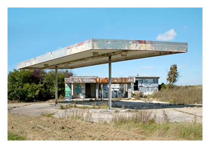


![handmaid-[Recovered]](https://craig519809.home.blog/wp-content/uploads/2020/04/handmaid-recovered.png)


 I then needed to add the main colour. I did this by placing a gradient map over all the layer with the gradient being made up of turquoise and its complimentary colour. This would add the duotone effect that I was after.


