Assignment 5: Photography is simple

‘There are two fundamentals in all picture taking – where to stand and when to release the shutter … so photography is very simple.’

(Jay & Hurn, 2001, p.37)

So photography is simply viewpoint and moment… but what about subject? The simplest subject is the moment. You can record the moment with a snapshot, but when you review the photograph later you find you didn’t actually record the moment, you just recorded the ‘event of photography’.

It might take a very long time to simplify the whole world and its infinite framings into a subject that makes sense to you. Robert Adams said, ‘Sooner or later one has to ask of all pictures
what kind of life they promote’ (Grundberg, 1999, p.34). For now, though, you should just feel comfortable with your subject. It should say something about you and, in the end, you like it!

Brief

The final assignment is an open brief. Take a series of 10 photographs of any subject exploring the theme ‘Photography is Simple’. Each photograph should be a unique view; in other words, it should contain some new information, rather than repeat the information of the previous image.

Assignment notes

In your assignment notes explore how you think you’ve answered the brief. This is a chance for a little philosophical reflection. EYV student Tor Burridge:

‘I have reconsidered my stand point that fundamentally photography is simple. When I shoot for the pure enjoyment of it photography does indeed feel simple. But really it is the product of layers of knowledge – on composition, on light, the technicalities of my camera. It is also inevitably influenced by the work of others, the subtle lessons that I have unknowingly committed to memory about angles and viewpoint. So taking into consideration the effects of context, the mind-set of the viewer and also the subtleties of what influences a photographer to make an image in a particular way, I think it can be concluded that photography is simple – until it isn’t.’

Make sure you word process and spellcheck your notes as QWE (the Quality of Written English) is an important part of presentation. Include a ‘Harvard’ bibliography to reference your reading and research for this assignment. The quality of your references and how deeply you’ve responded to them is more important than the quantity.

You may like to request a video tutorial for this assignment. As well as the opportunity to discuss the development and/or resolution of the assignment work, your tutor will be able to answer any questions you may have on assessment and progression to the next unit.

Research

Michele Groskopf

‘Not to sound corny but I go on and on how much street photography has taught me about myself – more than it taught me about people, what it’s taught me about myself. What makes me tick, what I love to look at, what I’m interested in, how resilient I can be, how creative I can be. I wish that for everybody, I wish everybody’s passion led to that kind of self knowledge and self love.’

Michele Groskopf’s Interview with Ibarionex for Candid Frame is at https://audioboom.com/ posts/4242053-tcf-ep-312-michelle-groskopf [accessed 25/01/18]

Miho Kajioka

‘It was Japan’s 2011 earthquake and tsunami that reconnected me to photography. Two months after the disaster, while reporting in the coastal city of Kamaishi, where over 800 people died, I found roses blooming beside a blasted building. That mixture of grace and ruin made me think of a Japanese poem:

In the spring, cherry blossoms, In the summer the cuckoo,
In autumn the moon, and in Winter the snow, clear, cold.

Written by the Zen monk Dogen, the poem describes the fleeting, fragile beauty of the changing seasons. The roses I saw in Kamaishi bloomed simply because it was spring. That beautiful and uncomplicated statement, made by roses in the midst of ruin, impressed me, and returned me to photography.

Miho Kajioka’s series ‘as it is’ is on Lens Culture: https://www.lensculture.com/articles/miho- kajioka-as-it-is [accessed 25/01/18]

Ane Hjort Guttu

‘I was in this state where everything could be art, or not… as if I was inside a zone where all things could be the result of a higher formal awareness: the roads, the chewing gum on the sidewalk, the yellow light over the city on our way home from kindergarten. Or it could not be, it didn`t matter any more. Everything became art, and in that same moment nothing’.

Morgan Quintance’s interview with the Norwegian artist Ane Hjort Guttu is on Soundcloud. Listen out for the slightly uncanny ‘bell’ at 18:52, it marks the beginning of the passage quoted above. The paradox that Guttu is referring to has been visible in art since Duchamp and examples of it appear here in the ‘Equivalents’ by Stieglitz and ‘Gas Stations’ by Ruscha. You experimented with it yourself in Exercise 1.4.

http://www.mixcloud.com/Resonance/studio-visit-12jun2016-ane-hjort-guttu_studio-visit/

[accessed 25/01/18]

Reflection

Check your work against the assessment criteria for this course before you send it to your tutor. Make some notes in your learning log about how well you believe your work meets each criterion.

Reworking your assignment

Following feedback from your tutor, you may wish to rework some of your assignment, especially if you plan to submit your work for formal assessment. Assessors will make an objective evaluation of your work against the assessment criteria through the assignments, tutor reports and learning log, so after receiving your tutor’s comments, review your assignment and write up any changes you make in your learning log.

It is simple…honest!

Photography is a form of non-verbal communication. A meaningful photograph, or a successful photograph does one of several things: It allows the viewer to see something that he or she has looked at many times without really seeing it; It shows something that that he or she has never encountered; or it asks questions, creates mysteries, interest or sparks curiosity. In other words it makes us question what? Photographs can inspire, invoke awe, wonder, amusement, compassion, horror or endless other emotions and feelings. It raises questions about the world around us or educates us about the world around us.

At its best, a photograph conveys a thought from one person, the photographer, to another, the viewer. Photography is therefore similar to other forms of artistic non-verbal communication whether it’s painting, sculpture or music. Each of these forms of art means something to its viewer/listener without them being present when it was created. Whether it is a portrait photograph or an image of a landscape, they all convey more than just the thing that is being depicted, but also they convey the majesty or magnificence felt when viewing the subject first-hand. Even though photography is a relatively new media compared to the more ‘traditional’ arts, it can still tell the whole story and no other media is needed.

The plan

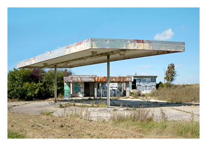
I’d always had a plan for this final assignment since I had completed the first one. I didn’t get chance to explore the 60s/70s telephone exchange in the village in which I live. It is a bit of an eyesore in the thatched cottage, picturesque village and is due to be demolished to make way for a new car park. However, it is and has been an integral part of village life for many years and has served its purpose from the analogue days through to the modern digital age. So, with my new love of photography and new camera in hand, I took the opportunity to go and have a look.

I have just treated myself to a Canon EOS 90d (don’t tell the wife!) with a new 18-135mm lens. I realised that my old 450d was on par with my iPhone in terms of image quality and functionality and it needed a step up. I also wanted a more versatile lens that would enable me to take more variety of images with the one lens instead of having to always carry a multitude of lens sizes with me at all times.

This was the perfect opportunity to try them out.

I wasn’t sure what to expect at the site and wondered if I’d be able to get enough shots for the assignment criteria. Some were easier than others, and some needed a little more post production than others. As a result some images are stronger and more successful than others, but as a group I feel that they tell a story of the building that is there and its utilitarian beauty.

My select

I have selected 10 images of the phone exchange that I think give an idea of its former use and the feel of it being obsolete at the same time.

Canon EOS90d EF-S 18-135mm ISO 100 f/3.5 1/250 sec
Canon EOS90d EF-S 18-135mm ISO 100 f/3.5 1/50 sec
Canon EOS90d EF-S 18-135mm ISO 100 f/4.0 1/80 sec
Canon EOS90d EF-S 18-135mm ISO 100 f/4.0 1/13 sec
Canon EOS90d EF-S 18-135mm ISO 100 f/4.5 1/80 sec
Canon EOS90d EF-S 18-135mm ISO 100 f/4.5 1/5 sec
Canon EOS90d EF-S 18-135mm ISO 100 f/3.5 1/80 sec
Canon EOS90d EF-S 18-135mm ISO 100 f/5 1/80 sec
Canon EOS90d EF-S 18-135mm ISO 100 f/3.5 1/80 sec

Reflection

For this assignment I deliberately used a simple subject to show that even the most mundane of subject matter can be made interesting with a creative eye and a little planning of what it is you are trying to achieve. Photography for fun can be simple point and shoot, whether that’s with a camera or, more commonly these days, a mobile phone. But it also can be complicated and more contrived when viewed through the eyes of a designer or photographer. This is when thoughts of light, composition, shutter speed, and depth of field come into play and the thought process becomes more time consuming and more important than releasing the shutter. In an age of instant gratification and social media, photography is everywhere. However, the idea of it being instant can be a contradiction when it comes to the amount of work needed to get ‘that’ shot.

I feel that through the course of this module I have gained more of an insight into photography and an appreciation of the skill that goes into creating good images. Through the material in this module and my own independent research, I have reignited my interest in photography and I think that this shows through the work produced from my initial submissions to the latter parts of the course.

Assignment 4: Languages of Light

As a distance learning student at OCA you’re not an autodidact, you have the benefit of tutor reports and a formal assessment at the end of each course. One of the ways to make the
most of tutor reports is to rework assignments after receiving feedback. In fact, it’s a good
idea to approach the whole course – exercises, contextual research and assignments – as an ongoing body of work, until you decide you’re ready to enter for assessment. With this in mind, Assignment Four asks you to return to one of the exercises from Part Four and develop it into a formal assignment submission.

You’ll need to submit prints at assessment and sharing with your tutor at this point in the unit will be an opportunity to get feedback on print quality. If you’re hard pressed to submit the prints you don’t have to send the whole assignment, you can send a selection and submit the rest of the series via blog or in the usual way that you’ve agreed with your tutor.

Brief

Revisit one of the exercises on daylight, artificial light or controlled light from Part Four (Ex 4.1, Ex 4.2 or Ex 4.3) and develop it into a formal assignment submission. The submission requirement for this assignment is a set of between six and ten high-quality photographic prints.

There are many ways to edit and the most valuable one is probably to show your work to friends, family and your OCA peers for feedback – you are guaranteed to discover something new in your work. Another tip is to pin the work up on the wall and live with a for a few days. ‘A Quick Guide to Editing Your Photo Series using Stickies’ on the IPO (Invisible Photographer Asia) website, but bear in mind that this is not a narrative assignment – you’re not required to produce a story.

http://invisiblephotographer.asia/2013/11/18/editing101-quickguidestickies/

Assessment of photography in any context is an assessment of images and accompanying words so please Include a written analysis of your work outlining:

  • how you have developed the assignment from the original exercise in Part 4
  • which practitioners you’ve looked at for inspiration and how their work has influenced you
  • your technical approach and any particular techniques you incorporated
  • the strengths and weaknesses of particular photographs and your project as a whole (self-assessment). Conclude your notes with a personal reflection on how you’ve developed the exercise in order to meet the descriptors of the Creativity criteria. Write 500–1,000 words.

Initial idea

From the images from the previous exercises, the one I was drawn to was the one of the petrol station in the exercise ‘Artificial Light’.

When I took this shot in the original exercise it reminded me of Edward Ruscha’s ‘Twentysix Gasoline Stations’ and the later ‘Twentysix Abandoned Gasoline Stations’ by Éric Tabuchi.

Standard, Amarillo, Texas
Twentysix Abandoned Gasoline Stations

I wondered if I could expand on this idea using artificial light as the the theme for the assignment and base it on the nearby countryside petrol stations. I wanted to take the images at night to show the different light used in the range of ages and uses of the petrol stations. While out taking the my shots, due to the longer shutter speeds, I managed to capture both the stillness of the stations and the movement of the traffic around them.

Canon EOS 450D EF-S 10-18mm ISO 100 f/13 1.3 sec
Canon EOS 450D EF-S 10-18mm ISO 100 f/8 4/5 sec
Canon EOS 450D EF-S 10-18mm ISO 100 f/8 25 sec
Canon EOS 450D EF-S 10-18mm ISO 100 f/8 1/2 sec
Canon EOS 450D EF-S 10-18mm ISO 100 f/13 8 sec
Canon EOS 450D EF-S 10-18mm ISO 100 f/8.0 3/10 sec

I then tried them in monochrome to see if the colour of the light mattered or whether the viewer could still interpret the images without the distinctive light colours.

Some worked better than others, but some of the images didn’t rely on the colour of light mattered to the overall ‘feel’ of the image.

While playing with artificial light it occurred to me that this was the ideal time of year to capture plenty of them while out and about in Totnes on a December evening. I had wanted to experiment with bokeh, and the Christmas lights seemed the obvious way to do that.

Unlike the previous images, these definitely benefit from being full colour. They convey enough information without being in focus, but you can get the general idea in most of the images of what the subject is meant to be.

Select

My ‘select’ for this assignment are the black and white images of the petrol stations. They depict both the ambient light of the stations themselves as well as the movement of the traffic around them with the long exposure of the headlights and break lights. I think that these are more original than the bokeh Christmas lights.

Reflection

This assignment proved to be a challenge when it can to the subject matter. Once I’d honed in on the idea of the petrol stations I was glad to have a direction. However, I then doubted the idea and tried something different but kept coming back to the original concept and I’m glad I did as it gave me the chance to go back to my shots and re-evaluate them and what was important about them and what wasn’t. The important thing was the light itself, not the colour of it, and how it was conveyed. Capturing the light at night had its challenges but also led to some unexpected results which added to the end result. Planning where to go and what to shoot also helped in getting what I wanted. I think that this could be improved upon to help achieve better results. This part of the course has helped me to see and understand that planning is often more important than taking the shots themselves.

References

Adsum. 2021. Ed Ruscha’s Twentysix Gasoline Stations. [online] Available at: <https://adsumnyc.com/blogs/news/twenty-six-gasoline-stations-ed-ruscha&gt; [Accessed 27 December 2021].

2021. [online] Available at: <https://www.lespressesdureel.com/EN/ouvrage.php?id=1783&menu=0&gt; [Accessed 27 December 2021].

Assignment 3: The (in)decisive moment

‘The decisive moment is not a dramatic climax but a visual one: the result is not a story but a picture.’ (Swarkowski, 2007, p.5)

‘You know it’s funny. You come to someplace new, and everything looks just the same.’ (Eddie in Stranger Than Paradise, Dir. Jim Jarmusch, 1984)

Brief

Create a set of between six and ten finished images on the theme of the decisive moment. You may choose to create imagery that supports the tradition of the ‘decisive moment’ or you may choose to question or invert the concept by presenting a series of ‘indecisive’ moments. Your aim isn’t to tell a story, but in order to work naturally as a series there should be a linking theme, whether it’s a location, event or particular period of time.

Include a written introduction to your work of between 500 and 1000 words outlining your initial ideas and subsequent development. You’ll need to contextualise your response with photographers that you’ve looked at, and don’t forget to reference the reading that you’ve done.

Exemplars

The OCA photography forum is a useful place to discuss ideas, share work and gather informal advice for this assignment.

Tutor Clive White: ‘As ever it’s not about showing us decisive moments it’s about the student showing us they understand the concept and can employ it creatively as a strategy in progressing their own work.’

For a view from assessment read the post on David Fletcher’s Assignment 3 on the WeAreOCA blog here:
https://weareoca.com/subject/film/david-fletcher/

OCA student Steve Young used juxtaposition and ambiguity as his creative strategy (be aware that the brief has since been updated): https://createatocalevel1photograph.wordpress.com/category/assignments/assignment-3/

And another ‘inversion’ of the decisive moment from student Martyn Rainbird: https://ocamartynrainbird.wordpress.com/category/assignments/assignment-3/

Reflection

Check your work against the assessment criteria for this course before you send it to your
tutor. Make some notes in your learning log about how well you believe your work meets each criterion. Your tutor may take a while to get back to you so carry on with the course while you’re waiting.

Reworking your assignment

Following feedback from your tutor, you may wish to rework some of your assignment, especially if you plan to submit your work for formal assessment. If you do this, make sure you reflect on what you’ve done and why in your learning log.

Research

Having previously looked at the original “decisive moment” by Henri Cartier Bresson, I still wasn’t 100 percent clear on the concept and need to clarify it for myself.

I found an article in Inspired Eye Photography Magazine that helped me understand the concept a bit better. The original Idea attributed to Cartier Bresson actually comes from the 17th century writings of Cardinal de Retz when he penned “Il n’y a rien dans ce monde qui n’ait un moment decisif”–“There is nothing in this world that doesn’t have a decisive moment”. This basically translates to those “sliding door” moments in life, whether big or small. The article uses the example of the assassination of Arch Duke Ferdinand in Austria as a major decisive moment in history as it started the First World War.

decisive moment1

This image helped me to understand the concept further as it encapsulated the elements of what makes the decisive moment in photography. It depicts the idea that when the photographer’s eye, heart and mind are in alignment, you stand a good chance of achieving that decisive moment.

However, there is another element to this equation: time.

The ancient Greeks had two words for time: chronos and kairos. The former refers to chronological or sequential time, while the latter signifies a proper or opportune time for action. The Greeks believed that Kairos could be easily caught by the hair when he’s running towards you. But once he would get passed you, you could not catch him by the hair because he is bald from the back. Hence, a Kairos moment, once lost is lost forever….just like the Decisive moment.

It then occurred to me that the ‘Decisive moment’ is also very subjective. One person’s ‘moment’ could be perceived completely differently by another. Just as every ‘moment’ is different, the perception of it is also unique. This then means that it could be applied to any form of photography, whether it is portrait, landscape or street photography. It all depends on when the photographer decides to press the shutter, or not as the case may be to freeze that ‘moment’ in time.

The ideas behind capturing the decisive moment extends well past just street photography and portraiture. Landscape, nature, and travel photography also lend themselves well to a consideration of the decisive moment. The rapid movement of birds or other animals requires a quick shot and a sense of timing. The constantly-changing light of a sunrise or sunset demands an eye for detail and patience to wait out the best moment. Rather than shooting a rapid burst of shots and hoping for the best, you need to plan, anticipate, and photograph only the moment you truly want.

Does this then negate the spontaneous nature of the ‘decisive moment’? Can it be planned or staged?

In his book ‘The Photographer’s Eye’, Michael Freeman goes on the expand on this saying that anticipation is also a vital element of the ‘Decisive Moment’. He suggests, “Take, for example, a scene in front of which someone is about to pass. Before this happens, the composition that suggests itself is likely to be different from the one including the person. Anticipating the changed dynamic is always vital.”

So, if you compose a scene and anticipate something or someone changing that scene is it spontaneous, decisive? Or is it planned, indecisive?

In an article on photographic psychology; John Suler PhD professor of Rider University described the decisive moment as a ‘highly debated concept’. Throughout the years, Cartier-Bresson’s theory has been discussed from various angles and perspectives. Many of the arguments are objectively recent and mainly refer to the growing technological advance.

In his article John Suler, mentions the fact that some modern photographers rejecting the decisive moment as an ‘outdated idea’. This conveys the most discussed contemporary aspect of Cartier-Bresson’s idea – the technology. Photographers in today’s society do not think about the decisive moment anymore, they simply do not have to. New equipment such as cameras are easily capable of capturing enormous amounts of images in incredibly short periods of time. Without the concern, neither the cost nor the necessity to change, acquire new film roll or even then the requirement to develop the shots. Photographers either professional or amateur are able to pick the decisive moment afterwards rather then consider it just before the shot or while taking the photo.

Initial ideas

My initial idea was to use water as my subject matter as I would be able to use both short and long exposure to freeze its motion.

I treated myself to an ND filter to help with the long exposure shots in the daylight. I went straight for an ND10 to start with without knowing it would be too dark to get the desired effect. I did however manage to get one decent shot that had nothing to do with what I was attempting:

Canon 450D EF-S10-18mm f/4.5-5.6 IS STM ISO 100 30 secs f/22

This wasn’t going to as easy as I thought. I dismissed the idea of using water and went back to the drawing board. I felt stuck! I didn’t understand what was being asked of me…

I went back to Cartier Bresson and found a video on YouTube about trying to emulate his work.

This video gave me an insight into what I could do. I’d have to be more spontaneous, I’d need more of a street photography kind of approach. Using some direction from the video I spent a couple of days exploring the coastal towns of Torquay and Dartmouth. I wanted to capture the essence of the English seaside out of season, the juxtaposition of being in a tourist destination when there aren’t any tourists. Another thing I took from the video were the camera settings preferred by Cartier-Bresson and I tried to stick to them and use just my 50mm lens, a shutter speed of 1/125 and an ISO of 400. I also had to be braver and be more spontaneous.

Contact Sheets

Of the 295 shots I whittled it down to about a dozen possibilities. I had already decided that I wanted my images to be in black and white as per Cartier-Bresson. This would also help to link the images as a series.

Canon EOS 450D EF50mm f/1.8 1/125 sec f/1.8 ISO 400
Canon EOS 450D EF50mm f/1.8 1/125 sec f/22 ISO 400
Canon EOS 450D EF50mm f/1.8 1/125 sec f/2.5 ISO 400
Canon EOS 450D EF50mm f/1.8 1/125 sec f/22 ISO 400
Canon EOS 450D EF50mm f/1.8 1/125 sec f/8 ISO 400
Canon EOS 450D EF50mm f/1.8 1/125 sec f/2.2 ISO 400
Canon EOS 450D EF50mm f/1.8 1/125 sec f/7.1 ISO 400
Canon EOS 450D EF50mm f/1.8 1/125 sec f/11 ISO 400
Canon EOS 450D EF50mm f/1.8 1/125 sec f/14 ISO 400
Canon EOS 450D EF50mm f/1.8 1/125 sec f/18 ISO 400
Canon EOS 450D EF50mm f/1.8 1/125 sec f/6.3 ISO 400

Some of these shots were more successful than others, so more culling was needed.

I was happy with the images that I was left with. They were an eclectic mix of the continuing life of out-of-season resorts with a hint of the desolation that occurs when the season ends. Torquay is a lot more seasonal than Dartmouth, as life in Dartmouth revolves around the river and port which never really stops and there is a lot of maritime history there.

Of the images have chosen for this assignment I feel that there is one clear winner when you link it back to to the title and subject – The Decisive Moment:

This image to me is a moment captured in time. When you consider that the train is moving and I was moving the camera to keep up, this shot captures some great lines from the bridge’s shadow which seems to continue the lines of the bridge itself, to the figure silhouetted on the train which are both fortuitous and completely random in nature. I am very happy with this shot.

Reflection

I struggled with this assignment. The brief was open-ended and I think that was what I found most difficult. However, once I set aside any preconceived ideas I had about the idea of ‘The Decisive Moment’ and just went out with my camera and just started shooting. This assignment helped me understand better the essence of the course-‘expressing your vision’ and the different strategies that underpin photographic practice. Cartier-Bresson is a titan among the reference of photographic practice, and it almost felt blasphemous to not try and honour the tradition of the decisive moment. As I dug deeper into it, I found his approach so ubiquitous and imitated, that I wanted to avoid cliche and felt looking for moments ‘pregnant with meaning’ and ‘precise organisation of forms’ somewhat restrictive. However, I did want to play with, interpret, and experiment with the concept, and the journey from my first thoughts to what I ended up with, taught me that the creative process is something you have to be open to – something Cartier-Bresson talks about in the video Lamour de court, and I found this very stimulating.

I feel I have demonstrated decent technical and visual skills, from processing to black and white and general composition, layout, and curation. I used and analysed my contact sheets extensively for this assignment and it helped me decide whether to present the photos in colour or black and white. I found this a difficult decision as I felt some photos worked quite well in colour, others in monochrome. In the end, I went for black and white to achieve more consistency.

Having gone through his process and creating a series from conception through to taking the photographs, curation, and spontaneity have taught me a couple of things. First was, although I respect Cartier Bresson, I find the idea of the Decisive Moment too restrictive creatively and don’t fully agree with the quote from the introduction of the book ‘The Decisive Moment’ that ‘Photography is the simultaneous recognition, in a fraction of a second, of the significance of an event as well as of a precise organisation of forms which give that event its proper expression.’. Events have many ‘moments’ to capture, and no matter how you capture them, whether planned or spontaneous, all results are valid.
The second learning was the workflow and creative process-I loved the fact that when I went out with my camera I had no idea what I might come back with or how an idea might develop and grow.

References

INSPIRED EYE. 2021. How to understand the Decisive Moment. [online] Available at: <https://www.theinspiredeye.net/street-photography-tips/decisive-moment/&gt; [Accessed 20 September 2021].

En.wikipedia.org. 2021. Kairos – Wikipedia. [online] Available at: <https://en.wikipedia.org/wiki/Kairos&gt; [Accessed 20 September 2021].

Freeman, M., n.d. Michael Freeman’s the photographer’s eye.

Youtube.com. 2021. [online] Available at: <https://www.youtube.com/watch?v=OD4hCqORK60&gt; [Accessed 17 October 2021].

Ukessays.com. 2021. The decisive moment. [online] Available at: <https://www.ukessays.com/essays/photography/the-decisive-moment.php&gt; [Accessed 18 October 2021].

Assignment two: Collecting

‘Fragments of a vessel which are to be glued together must match one another in the smallest details although they need not be like one another.’ 

(Walter Benjamin, [1936] 1999, p.79) 

The Walter Benjamin quote above expresses the idea that a collection should reflect a single coherent idea, but you’ll also need technical rigour to match the photographs to each other ‘in the smallest details’. Start by choosing your focal length, aperture and viewpoint combination in advance. 

Visually, similarities correspond so they’re easy to look at, but be careful of duplicates because repetition is boring. Differences are interesting because they contrast, but randomly changing your framing or allowing a confusion of detail into your backgrounds will distract from the viewing. 

Brief 

Create a series of between six and ten photographs on one of the following subjects: 

  • Things
  • Views
  • Heads 

Albert Renger-Patzsch’s photobook ‘The World is Beautiful’ upset Walter Benjamin when it first appeared in 1928 and he railed against it in his famous essay ‘A Short History of Photography’ (easily available on the internet). He thought that this kind of photography denied social contexts – ‘the world is beautiful’ because that’s all you’ve got to say about it. However, Renger- Patzsch’s book was originally called ‘Things’ and rather than present a superficial beauty the point was more to let things speak quietly for themselves. 

In ’ひろしま hiroshima’ the Japanese photographer Ishiuchi Miyako takes this approach when photographing clothing and other personal items collected from the atomic bomb site at Hiroshima. The photobook can be seen on Jörg Colberg’s Youtube channel here: https://www.youtube.com/embed/csVx_QRPvps?controls=0&modestbranding=1&rel=0&showinfo=0&loop=0&fs=0&hl=en&enablejsapi=1&origin=https%3A%2F%2Flearn.oca.ac.uk&widgetid=1Play Video. 

In ‘Species’ OCA tutor Andrew Langford recalls the sense of dislocation that he experienced visiting natural history collections as a child, 

‘These specimens were very carefully arranged within the total black picture space and, for me, evoked a personal memory as a child of visiting natural history collections and experiencing the highly detached, organizational systems of presentation. These systems seemed so at odds at the time with my real life sense of ‘the natural’ as a fully integrated phenomenon, to which I sensed that I was seamlessly connected’. 

http://www.andrewlangford.co.uk/projects/species/ 

Ed Ruscha’s collection of views ‘26 Gasoline Stations’ became another point of origin in photography. If you’re curious about why read around it a little online to gain an understanding of it within its own time. http://www.tate.org.uk/about/projects/transforming-artist-books/summaries/edward-ruscha- twentysix-gasoline-stations-1963 

And for a theoretical discussion on the distinction between landscapes and views have a look at ‘Photography’s Discursive Spaces: Landscape/View’ by Rosalind Krauss (also available online). 

For ‘Views’ you’ll probably either need a driver or be prepared to do some walking. Either way if you keep the weight of your equipment to a minimum you’ll see more. 

From deadpan views to deadpan heads: http://www.bettinavonzwehl.com/ 

‘The resulting portraits aren’t what you’d normally expect from portraiture. The subjects are not engaging with me or with the camera, it is almost as if they are in a different world’. 

(Bettina von Zwehl (2007) p71) 

You can find more on von Zwehl’s approach to portraiture in Charlotte Cotton’s ‘The Photograph as Contemporary Art’ that you will have received when you started EYV. 

Heads don’t have to be deadpan, or even human. There’s a fair amount of variation in Mårtin Lange’s ‘Citizens’ series but there is no questioning its overall visual coherence: https://martenlange.com/works/citizen/#1 

Some of the examples given above are for collections of photographs, others for photographs of collections, but whichever way you go, your set will be stronger if it relates in some way to your interests in life and photography. 

Research

“…In order to photograph with any degree of continuous passion, you must have a fascination for the subject…”

Bill Jay on ‘The Thing Itself’

Looking at the photographers mentioned above, I was drawn to Andrew Langford’s Species because of its abstract look at everyday objects and how they looked like cross-sections of shells and orchids.

Species--i-copy
Andrew Langford – Species

I really like the symmetry in the everyday objects viewed from a different perspective.

26 Gasoline Stations by Ed Ruscha reminded me of the village petrol stations you see in the more rural parts of this country, not as shiny as the big name petrol companies, run down and kind of rustic. This could be an angle as there are a couple of independent garages near to where I live. During my research, I came across a modern tribute to Ruscha’s work by Eric Tabuchi, a French photographer, taken 45 years after the initial publication.

Twentysix Abandoned Gasoline Stations - Photographs by Eric Tabuchi |  LensCulture
A modern tribute to Ed Ruscha’s 26 Gasoline Stations by Eric Tabuchi 2002-2008

Initial ideas

Things to take from the brief:

  • You’ll need technical rigour to match the photographs to each other ‘in the smallest details’
  • Start by choosing your focal length, aperture and viewpoint combination in advance. 
  • Similarities correspond and are easy to look at, but be careful of duplicates because repetition is boring.
  • Randomly changing your framing or allowing a confusion of detail into your backgrounds will distract from the viewing.

I will try to stick to these guidelines as much as I can with the equipment that I have.

Of the 3 subjects I wasn’t initially sure which to choose.

Heads: This was the the one that inspired me the least. Living in a small village limited my subject matter, not sure how the local residents would react to a bit of street photography and would I get the chance to get several together? Portraiture could be a possibility, with limited subjects.

Views: This seemed to be fairly open ended subject and gave options for the view from the windows of the house, to venturing further afield to the moors or the coast.

Things: this subject had me referring back to the Bill Jay quote about familiarity with your subject matter. This got me thinking about other interests of mine such as rugby, scuba diving, DIY, food and the garden.

Things

I decided to go for ‘Things’.

Andrew Langford’s Species had reminded me of some of the photography I have in one of my cookbooks from my previous life. Unlike most food photography, the shots in Modernist Cuisine are a bit more abstract and show the food and cooking processes in a whole new light.

8 Crazy-Smart Kitchen Tips from the Team Behind Modernist Cuisine | Food &  Wine

This was given to me as a gift from my wife and I was instantly captivated by the tome’s imagery and how the shots had been composed.

The photographs were taken by Nathan Myhrvold, ex-Microsoft Research founder and prominent scientist. Myhrvold holds a doctorate in theoretical and mathematical physics, as well as a master’s degree in mathematical economics, from Princeton University. His master’s degree in geophysics and space physics, as well as his bachelor’s degree in mathematics, are from the University of California, Los Angeles.

Food and cooking have been passions of Myhrvold since childhood. While at Microsoft, he worked nights at a Seattle restaurant with chef Thierry Rautureau and then obtained a culinary degree at Ecole De La Varenne in Burgundy. In 2007, he founded The Cooking Lab, a culinary research laboratory, photo studio, and publishing company. In 2011, he published a five-volume, 2,500-page cookbook, Modernist Cuisine: The Art and Science of Cooking. That book and its 2017 sequel of even greater length, Modernist Bread, both won James Beard cookbook awards. His one-volume book Modernist Cuisine at Home (2012) has been translated into seven languages. Building on his 2013 book The Photography of Modernist Cuisine, Myhrvold opened a gallery of his food photography in Las Vegas in 2017. Modernist Cuisine Galleries have since opened in New Orleans, Seattle, and La Jolla.

Source: http://www.nathanmyhrvold.com/index.php/about

Of the images created by Myhrvold, the macro shots were probably the ones that I could take inspiration from even though I don’t own a macro lens…yet! I wanted to see what I could create in a similar vein to this. I wanted to create something that wouldn’t be instantly recognisable and somewhat abstract at first where the eye initially can’t distinguish what it is looking at.

Without a dedicated macro lens I’d have to make do with what I had.

My improvised setup: Canon EOS 450D and Sigma 70-300mm f4-5.6 DG OS

I wanted to create something using food, so I started with raiding the fridge. This didn’t prove too fruitful(pardon the pun!) and all I could find was some broccoli. But I thought that I could at least practice on the broccoli and see what I could get from the greengrocer’s later in the week. I was surprised what I could achieve with the lens I had…

Canon 450D Sigma 70-300mm 1/50 sec f5.6 ISO 100

I was really happy with the abstract feel of this shot. I wasn’t sure to use it in full colour or black and white, which I also liked…

Canon 450D Sigma 70-300mm 1/50 sec f5.6 ISO 100

Next was a trip to the shops to try and find something a little more exotic than some broccoli! My trip was reasonably successful, as much as it could be in sleepy Devon and I tried to recreate my earlier success with the brassica.

I found it hard to recreate an image in a similar style to my first image and couldn’t achieve the same success in black and white. This answered the question about colour or black and white. The ‘collection’ idea would come from the subject matter rather than the image style due to my lack of success replicating my initial success.

I decided upon playing with different scales and visual depth to add interest to the subsequent images with varying success.

Canon 450D Sigma 70-300mm 1/10 sec f5.6 ISO 100
Canon 450D Sigma 70-300mm 1/8 sec f5.6 ISO 100
Canon 450D Sigma 70-300mm 0.4 sec f5.6 ISO 100
Canon 450D Sigma 70-300mm 1/30 sec f5.6 ISO 100
Canon 450D Sigma 70-300mm 1/25 sec f5.6 ISO 100
Canon 450D Sigma 70-300mm 1/50 sec f5.6 ISO 100
Canon 450D Sigma 70-300mm 1/8 sec f5.6 ISO 100

The Collection

Reflection

Once I found a direction that I could use I found this assignment enjoyable. I was impressed with what a telephoto lens could achieve in regards to macro/micro photography. The level of detail that could be seen and the depth of field that could be achieved, especially at such high magnification and zoom. I also liked the way that it isn’t completely obvious in some of the shots what the subject is. I could have gone a step further and just used black and white imagery, but I don’t think I could’ve achieved the same amount of contrast and vibrance that the coloured versions give.

I personally think that my initial broccoli image is the strongest and chives what I set out to do. The others aren’t as strong, but they do work as a collection.

References

The Online Photographer. 2021. Bill Jay on ‘The Thing Itself’. [online] Available at: <https://theonlinephotographer.typepad.com/the_online_photographer/2020/07/bill-jay-on-the-thing-itself.html&gt; [Accessed 22 June 2021].

Andrew Langford BA MA PhD. 2021. Species (1999-2002) – Andrew Langford BA MA PhD. [online] Available at: <http://www.andrewlangford.co.uk/projects/species/&gt; [Accessed 22 June 2021].

LensCulture, E., 2021. Twentysix Abandoned Gasoline Stations – Photographs by Eric Tabuchi | LensCulture. [online] LensCulture. Available at: <https://www.lensculture.com/articles/eric-tabuchi-twentysix-abandoned-gasoline-stations&gt; [Accessed 22 June 2021].

Food & Wine. 2021. 8 Crazy-Smart Kitchen Tips from the Team Behind Modernist Cuisine. [online] Available at: <https://www.foodandwine.com/lifestyle/8-crazy-smart-kitchen-tips-team-behind-modernist-cuisine&gt; [Accessed 28 June 2021].

Modernist Cuisine. 2021. The Photography of Modernist Cuisine – Modernist Cuisine. [online] Available at: <https://modernistcuisine.com/books/photography-of-modernist-cuisine/&gt; [Accessed 28 June 2021].

Assignment one ‘Square Mile’

In our earliest years we know a patch of ground in a detail we will never know anywhere again – site of discovery and putting names to things – people and places – working with difference and similitude – favourite places, places to avoid – neighbours and their habits, gestures and stories – textures, smells – also of play, imagination, experiment – finding the best location for doing things – creating worlds under our own control, fantasy landscapes. (Professor Mike Pearson) 

Photographers and artists have always found inspiration in their immediate location. There is a concept within Welsh culture called Y Filltir Sgwar (The Square Mile), described above by Professor Mike Pearson. It is the intimate connection between people and their childhood ‘home’ surroundings. Use this ‘sense of place’ as the starting point for your first assignment. 

Brief 

Make a series of six to twelve photographs in response to the concept of ‘The Square Mile’. Use this as an opportunity to take a fresh and experimental look at your surroundings. You may wish to re-trace places you know very well, examining how they might have changed; or, particularly if you’re in a new environment, you may wish to use photography to explore your new surroundings and meet some of the people around you. 

You may wish to explore the concept of Y Filltir Sgwar further, or you may deviate from this. You may want to focus on architecture and landscape, or you may prefer to photograph the people who you think have an interesting connection to the square mile within which you currently find yourself. You’ll need to shoot many more than 12 photographs from which to make your final edit. You should try to make your final set of photographs ‘sit’ together as a series. Don’t necessarily think about making a number of individual pictures, but rather a set of photographs that complement one another and collectively communicate your idea. You may wish to title your photographs or write short captions if you feel this is appropriate and would benefit the viewer. 

Think of this assignment as a way to introduce yourself to your tutor. There’s no ‘right’ or ‘wrong’ way to respond to this brief, as long as you try to push yourself out of your comfort zone in terms of subject matter. Try out new approaches rather than sticking to what you think you’re most successful at. 

Research 

These are just a few practitioners who have worked within their locality and/or in an autobiographical way. Spend some time looking at their work to help you generate some ideas. Document your research and your initial ideas in your learning log. 

Submitting your work

Email or otherwise electronically transfer your photographs to your tutor in the following format: 1500 pixels along the longest edge Adobe (1998) colour profile, RGB jpegs.

Include a digital contact sheet (no more than 36 thumbnails per page) of all the photographs you shot for this assignment. (Read forward to Part Three, Project 1 for how to do this.)

Also send to your tutor a written analysis of your work of no more than 500 words. This should contextualise your project by briefly outlining:

  • your first impressions and initial response to the brief, and how your idea(s) developed
  • which practitioners you looked at for inspiration and how their work influenced you duringthe project
  • your technical approach and any particular techniques you incorporated
  • the strengths and weaknesses of particular photographs and your project as a whole (self-assessment)
  • any thoughts on how you could develop this project in the future.

This should be either Microsoft Word, a Google Doc or PDF format, under 4 Mb in size.

If you’d prefer to submit a hard copy, you may post prints, no larger than A4, to your tutor together with your contact sheet and written contextual analysis. Make sure your prints are carefully labelled with your name, student number and the assignment number.

It’s important that you try to complete this assignment as soon as possible. Your tutor will
use your assignment to get a rough sense of your current level of technical, analytical and creative skills. Whilst you should commit to the exercise and pursue an idea that interests you, it primarily has a diagnostic purpose so don’t labour it.

Reflection

The later assignments on this course ask you to check your work against the assessment criteria listed in the introduction to this course guide before you send it to your tutor. You’ll get some guidance on how to use the assessment criteria at the end of Part One, but have a go now, if you wish, and make some notes in your learning log about how well you believe your work meets each criterion.

Reworking your assignment

Following feedback from your tutor, you may wish to rework some of your assignment, especially if you plan to submit your work for formal assessment. If you do this, make sure you reflect on what you’ve done and why in your learning log.

Initial thoughts

First step was to dust off my 10 year old Canon EOS 450D. Since buying the camera I hadn’t used the camera to its full potential and thought that this was a waste.

I had enjoyed photography when I did my original graphic design diploma in the early 90s. Back then there were no DSLRs and everything was done in the darkroom. This seemed to be the natural next step.

My initial thoughts when reading the brief were that of ‘how can I do this during lockdown?’. I wouldn’t be able to venture far from the sleepy Devon village where I was based. I felt somewhat hemmed-in when it came to subject matter for my shoot. I needed some inspiration, so I took a look at some of the photographers listed above.

Keith Arnett

Source: https://www.tate.org.uk/art/artworks/arnatt-walking-the-dog-t13060

Keith Arnett’s ‘Walking the Dog’ series appealed to me because they were just images of various people going about their business just walking their dogs. They showed people from different walks of life all on equal footings because of their love of their four-legged friends.

Gawain Barnard

Source: https://www.gawainbarnard.com/photo_5597172.html

Gawain Barnard’s work ‘Journey’s by Train’ comprise of images taken from a train. Obviously this isn’t possible at the moment, but his images capture architecture and life from the perspective of the passenger.

Karen Knorr

Source: https://karenknorr.com/photography/belgravia/

Karen Knorr’s ‘Belgravia’ is a series of ‘non-portraits’ picturing the residents of the London borough. These photographs focus on the people as well as their surroundings during the late 70s.

George Shaw

A fellow student introduced me to the work of George Shaw, who yes is a painter by trade, but his imagery is of the mundane urban landscape of his childhood home of the Tile Hill Estate in Coventry.

George Shaw | MARUANI MERCIER
Source: https://maruanimercier.com/artists/george-shaw

Idea

With the country being in lockdown for the third time, my options for locations were limited. The extent of my outdoor antics were limited to the school run to the village school (I’m classed as a key-worker) and going to the Co-op in the village. I started taking my camera on the journey to and from the school and taking detours from the usual route to see what I could see. The village have been inhabited in some form for hundreds of years with earliest records dating back to 952AD and is mentioned in the Doomsday Book. The village is now more of a commuter village for nearby towns and cities but retains its thatched, rural feel.

While taking photographs in and around the village, I seemed to be drawn more to the village’s past rather than what it is now. I found myself concentrating on parts of the village and its surrounds that looked back at its past and what has happen to some of its infrastructure since then.

I deliberately restricted myself to using the one lens for my photos to the standard 18-55mm to see what I could achieve.

Reflection

I initially thought that this was quite a daunting task due to the restriction imposed due to Covid 19. However, once I got my head around what was being asked of me I enjoyed the challenge. The research that I did prior to stating taking photographs helped me to develop an outline of what I could take pictures of, especially the work of George Shaw(even though he’s not a photographer). His pictures of where he lived really helped to inspire me and give me a starting point.

As said above, I deliberately restricted myself to using a single lens to help me re-familiarise myself with my camera and not to over complicate things. This helped me to work with the tools I’d got and try to get the best out of them.

I enjoyed the assignment as a whole, it helped me view my surroundings in a different way. I particularly enjoyed photographing some of the surrounding farm buildings, lyme kilns and the older fixtures and fittings in the village.

The first 2 photographs above are probably my favourites. The colours and the lines in the first photograph give it a very rigid, structured look that I like, that contrasts with the deterioration of the building itself. The second has some good contrast and draws the eye up the path to the old barn. The modernity of the subject of some of the photos didn’t seem to work as well as the more rustic subjects.

I’d like to develop this project further, as the weather curtailed my wanderings. There is still an old 1960/70s telephone exchange in the village that interests me as well as many more country lanes to explore.

Assignment 5 – Your choice

Your final assignment asks you to draw on all the skills, insight and experience you have gained so far, by designing and producing a book of your choice. Use the following options to as a starting point or alternatively identify your own project.

● Influential book designers
Identify one or more book designers to present through your book. Find ways to develop your own creative responses to their ideas and visual approaches. Delve into their work, find suitable quotations, investigate their influences, and find ways of communicating this material, and your interpretation of it, to an audience through effective use of layout, narrative, and choices of material.

● Typography
Extend your exploration of typography by continuing to develop creative approaches to how typography, layout and your material choices can help generate meaning. Develop a book that explores one aspect of typography in more detail, or combines a variety of approaches. Just because your project explores typography it doesn’t mean you can’t also include images, colour and narrative.

● Found and altered books
Use an existing book as a creative starting point. This could be an extension of exploring altering books in some way, or as a research project into a specific book that will generate content and creative ideas for a new book. Find a physical book to work with or pick one of your influential books from Part One.

Research the subject in depth and think about the editorial structure (described in Part Three) of your book. What is the flow of the content, would you write articles or create imagery or both? What do you want to tell about the subject and how would you communicate this? And who is your audience? Make a flatplan before you start designing your book, and have a look at other books on the subject to see a different design approach on the subject. You may want to look at the work of designers you inspired by, in order to develop your own design approaches.

You may have identified an alternative area you wish to pursue. This is fine as long as you check this out with your tutor first and document the reason(s) for your choice.

Follow the creative design process in developing your creative thinking and how you will approach the workflow, in terms of content and timescale. Decide on your subject and start researching, creating content, editing content, making decisions about the materials you want to use, and designing your book. Frame this process within an overview of your workflow to help plan the production of your book. Planning the process of generating content, and how this can then be

developed, is key to successfully finishing a designed physical book. Keep notes to accompany the process of making of the book in your learning log, and reflect on your design process.

You can use any medium or materials you want to in the production of your book. You may want to research and explore hand-binding, or work digitally with print on demand for production. You may want to combine these approaches and you may want to consider whether you want to produce a one-off copy or a small edition. If you would like to use a particular paper for your book, make print proofs before printing the whole final book. Test the paper, the colours and how your design works on the paper.

Explore the materiality of books in more depth by considering the paper, printing and bookbinding of books, both as content and form. Think about how books are held, interacted with, and the associations of the materials you might use. Explore how these choices can start to create meaning within your book.

Reflection

Give yourself a final self assessment check against your assessment criteria to see how well you think you’ve done. Use this process to help reflect on your work and your achievements on the course as a while. It will also help to identify to you and your tutor any areas you may need to work on prior to submitting for assessment.

Sharing your work

Digital companies such as​ blurb.com​ have an online ‘sharing’ facility – this would be a useful way for your tutor to see the whole work without the need for expensive mail costs.

My choice

For my choice for the final assignment was an easy choice for me. I wanted to do something in and around typography, but I wasn’t initially sure which direction to take.

I started by mind-mapping a few things to se if anything jumped out at me.

I had so many directions to choose from when it came to typography. Should I use all or focus on just one? I started making some notes to see if that focused my thoughts a little better.

This actually confused the matter even more! I had given myself ‘too many’ choices of what to include in my book. I needed to hone my ideas down, as I thought that I needed to specialise.

As well as trying to find a niche for my book I began collecting some inspiration via Pinterest. I already had a well establish typography board to draw from, but I also started a layout board to collate images of interesting layouts or layout elements.

I also found this video on YouTube which I thought was fun.

Source: YouTube

After mulling over what direction to go in for this assignment I had managed to whittle it down to 3 ideas:

  • Different styles of type
  • Type designers
  • History of typography

I am fairly familiar with the different classifications of type, and I had done some work around type history in my previous module: Graphic Design Core Concepts. So this left type designers…..decision made.

So now I could write myself a brief…

Having a clear direction and an actual brief helped focus my ideas and I was able to begin the design process.

Design

Firstly I needed a list of designers. I hit the books and scoured the net to find a list of suspects. The most useful tool I found was my copy of ‘A Visual History of Type by Paul McNeil‘. It covers 320 of the most influential typefaces of the last 500+ years.

Source: gilburtandpaul.co.uk

I worked my way through the book and picked out some of the typefaces that I personally thought were important and listed who designed them.

A couple of the typefaces I had chosen didn’t have specific designers which was a little disappointing and some of the designers had very little information about them. I wrote these off with one exception: Akzidenz Grotesk which was the basis for Helvetica, which was too important not to include.

I eventually got the list down to 18 designers:

  • Johannes Gutenberg – Gutenberg
  • William Caxton – Caxton
  • Claude Garamond – Garamond
  • John Baskerville – Baskerville
  • Firmin Didot – Didot
  • Giambattista Bodoni – Bodoni
  • Robert Besley – Clarendon
  • Berthold Akzidenz – Akzidenz Grotesk
  • Morris Fuller-Benton – Franklin Gothic
  • Paul Renner – Futura
  • Eric Gill – Gill Sans
  • Stanley Morrison – Times New Roman
  • Howard Kettler – Courier
  • Max Miedinger – Helvetica
  • Jan Tschichold – Sabon
  • Carol Twombley – Myriad
  • Eric Spikermann – FF Meta
  • Tobias Frere-Jones – Gotham

My 18 designers fitted neatly into 6 time periods(by design) which were to be my 6 chapters. Technically this was only 18 pages unless they were all to be double-page spreads. This needed some more thought.

I decided to move on to the format of the book. What type of book would this be? Referring back to the brief, I had identified the audience as people who would specifically be interested in typography and its history. Therefore, I felt that the book would be some sort of coffee table read with a high-end feel, something that people would want to pick up and browse through. It had to be tactile and eye-catching. This would be achieved by the choice of finishes for the book.

I had started to sketch out page layouts in a traditional portrait format based on my Pinterest research.

However, the more I sketch, the less I felt the format worked. I felt the book would work better in landscape format as this gave a larger overall width to the spreads which would carry the information better.

I drew up a flatplan consisting of 36 pages to start with, which gave me a double page spread for each designer.

I added a cover and back cover. I then realised I needed to think about the inside cover and contents/index etc..

I din’t really want to go over the 40-page mark, so I made the decision to give my designers a single page rather than a spread.

This didn’t really work, as the page count wasn’t enough.

I laid out a 36-page document in InDesign to see if it made more sense. I set the document up as 36 facing pages with an outside, top and bottom margins of 15.4mm and an inner margin of 40mm. I lated out the page with 8 columns with an 8.5mm gutter. Also, as a matter of process, I set up a rich black colour in the swatches menu as this gives a better result when printed than the default black. The settings were: C25 M25 Y25 K100.

In response to the part of the typography unit about grids, I decided to use the same grid/column structure for each page and demonstrate how type could be laid out in different ways using just one grid. I started with just one page, and my first designer.

I found an image of Johannes Gutenberg on Wikipedia and began with that.

File:Gutenberg.jpg
Source: Wikipedia

I placed the image on the page and added some filler-type to try and get the layout right. I also added a title and page number. I needed to decide what typeface or faces to use for this publication.

I wanted to create contrast in the book and wanted to use typefaces that would do this. I wanted to use both serif and sans-serif typefaces to achieve maximum contrast and began with one of the typefaces that was a possibility in my initial stages of research: DIN 1451. This was discounted as one of my subjects as there was no evidence of who created it, but I liked it as a minimal, no nonsense, German sans-serif. I used this as my headline on the page in all caps to identify the designers.

Next came the page numbers. Rather than straight forward numbers, I wanted the pages to have classical numbering and used Roman numerals. These would look better in a serif typeface and for this I chose IKANSEEYOUALL by Swiss Typefaces which has a high-contrast of stroke width.

For the body I chose Helvetica Neue as this was a modern, easily readable typeface. To create even more contrast, and building on the Good/Bad Typography exercise, I wanted to use the same typeface in different sizes and weights.

Once I’d laid it all out on the page using the grid, I realised it was a little monochrome. I decided to add some red. I changed the page numbers to red and added an underline covering the width of one column. I then added the designer’s initial as a red overlay on the image in DIN 1451 to mirror the title.

Once I had the basis for the first page layout, I went on to create variations for the other 17 designers I had chosen. I decided to keep the image in the same position on all of the pages as well as the title and page number, these elements were added to the master-page so that the layout would repeat throughout the book. Any images that weren’t black and white I took into Photoshop and desaturated and changed the contrast to fit with the non-photographic images.

As I had divided my designers into 6 chapters of 3, I needed to set up a contents page and clearly define the chapters.

I started with defining the chapters by inserting whole-page dividers with over-sized numbers indicating the different chapters. These were again done using DIN 1451 reversed in white out of a rich-black background.

I then needed to sort the contents page. I did this as a double-page spread and used the over-sized type to write the word ‘contents’ across the spread and lowered the opacity so that I could then write the contents over the top. I did this by numbering the chapters using IKANSEEYOUALL and then I had to decide on titles for my chapters that I then labelled in Helvetica Neue. I confined these to single columns and hyphenated the all-caps chapter titles that I had named:

  • Originators
  • Timeless
  • Distinctive
  • Groundbreaking
  • Modernity
  • Digital.

I now needed a cover. During my research of designers, I came across Saul Bass’ famous quote of “Design is thinking made visible” and decided to use a variation for my book title. I used ‘Thinking Made Visible’ as my book title and added the subheading of ‘The Art of the Type Designer’. I again used DIN as my typeface of choice, but this time I outlined it and lowered its opacity but gave the word ‘visible’ a gradient to make it look as if it was becoming more visible. The subheading was given the same opacity as the title and Helvetica was used.

I found another quote which I wanted to use on the back cover. I didn’t want to mess with it this time and just used it as is with some hanging punctuation, reversed out of the back cover.

I now had my page layouts, my covers and contents. Now all I had to do was to write the content!!!

I had calculated with by using the placeholder type that I needed 200 – 300 words of type for each designer. This was going to be a daunting task. Using the book I mentioned earlier and the internet I began researching my designers. This was much harder than designing the book itself. After I had collated the type for the first 9 of my designers I was relieved to be halfway through. This prompted me to create a double-page spread with the word ‘half.’ written across it in IKANSEEYOUALL, in the red that I’d used earlier.

This led me to produce another spread with the word ‘full.’ at the end of the book. The book didn’t seem balanced. It needed another similar spread at the front of the book, so I added a spread to the front of the book with the word ‘type’ across the spread.

I felt that the book was lacking context. It needed an explanation as to the meaning behind the book. I decided to add a summary section…more writing! I managed to write a few more words to summarise the development of type design over the last 500+ years.

This, again, was reversed out of a black background. The type needed a little more spacing for these to help with the legibility of the paragraphs, as white type appears larger than its black counterpart so the leading and line height need to be larger.

It also gave me the opportunity to add the information about the typefaces used in the book. This seemed to make the book more cohesive. I went on to mock it up.

Now I had to prepare it for print. I had set up my document with a 3mm bleed, which is pretty standard. I had to make sure all my images were linked correctly and at the correct dpi and all colour were CMYK.

I had decided to use Mixam as my printer of choice due to Covid restrictions and they require pdfs to be uploaded as seperate pages which meant my spreads needed to be separated and an extra bleed added to the inner edge. Another point made by a fellow student, that was confirmed by the printers, was that if I was planning to perfect-bind my book, that any ‘read-across’ elements of my book would need to allow for binding to make them legible. This meant that I need to add an extra 4mm to the inner edge of the affected pages, namely the large, single word spreads and the contents page. The printer suggested that I print out the pages at full size with crop marks with the 4mm added and then fold along the 4mm line and then see it the type meets and is continuous across the spread.

Taking into account the crossover.

The printers were very helpful and communicated with me with any problems and offered lots of useful advice.

I had opted to print the book on 150gsm silk paper with a 250gsm silk cover with a matt lamination to be perfect bound. I felt that the pages would be thick enough at 150gsm and the matt laminate would give the book a high-class feel. The cost for a print run of just 3 copies was approximately £30.

The printers turned the job around in less than a week and I received 6 copies of the book instead of 3. I was amazed at the quality and finish of the book and the time that they took to produce.

The final printed book

Reflection

I really enjoyed this last assignment. It was good to go through the whole process of designing a book and following through to dealing with printers and having the physical book in hand.

I really like the design and feel that I fulfilled the self-defined brief. It has a classy look and feel and I think it would appeal to the target audience. I think that the book has a defined form and function, but also has an element of fun within it. It would make a good coffee table book.

Over the course of the assignment I have explored typography, grid use, layout design, curating images, material choices, finishes and the print process. I feel that using the body type to demonstrate different layouts on the same grid worked really well and showed the flexible possibilities even in the confines of 8 columns.

I have used a vast amount of online and offline research for both the design process, the content writing and the print process. It was a daunting task, but I actually enjoyed the process. Filling the roles of both designer and copywriter gave me a lot of creative freedom in how the book layout worked. I had the ability to fit the content to the design, rather than having pre-written content that couldn’t be edited to fit.

The print process was an area that I didn’t know too much about. This exercise gave me the chance to find out more in regards to what a printer requires from me as the designer and things to bear in mind when designing layouts, such as crossovers(where images or type cross over facing pages on a spread). Having direct contact with the printer and having this explained clearly was invalid.

References

Images

Johannes Gutenberg – Wikipedia.com
William Caxton – Britannica.com
Claude Garamond – WordPress.com
John Baskerville – WordPress.com
Firmin Didot – Pinterest.com
Giambattista Bodoni – Museobodoniano.com
Robert Besley – Pinterest.com
Herman Berthold – Bahoe.de
Morris Fuller-Benton – morrisbenton.com
Paul Renner – Pinterest.com
Eric Gill – alchetron.com
Stanley Morrison – Twitter.com
Howard Kettler – comarts.com
Max Miedinger – Pinterest.com
Jan Tschichold – WordPress.com
Eric Spiekermann – edenspikermann.com
Carol Twombley – Pinterest.com
Tobias Frere-Jones – frerejones.com

Books

A Visual History of Type by Paul McNeil
Production for Graphic Designers by Alan Pipes

Websites

famousgraphicdesigners.com
typewolf.com
Pinterest.com

Assignment Three: My Little Book of…

The brief: Create two books explaining and exploring the typographic and layout principles you have researched in this section.

Book 1: My Little Book of…Good Typography
Using the reference material that you’ve gathered throughout the exercises and research tasks in Part Three, design a book which explores traditional ‘good practice’ in typography. What is readability and, as a designer, how can you aid it? Visually explain the typographic principles that we’ve touched on in Part Three, such as type size, leading and line length. For example, you could demonstrate kerning by creating a page which looks at letter combinations applying this principle. Equally, explore good layouts and use of grids to help support and frame your typography. This is an opportunity to develop carefully considered
design layouts that feel easy and engaging to read and look at. Be creative in how you do this, developing a range of options and possibilities. Show off your good typography skills as well as talking about what makes good typography in your text. To support this, find quotes and type rules by other typographers and designers – perhaps revisit your research into book designers from part two. Find examples of good typography within book design you can present and talk about. Your booklet should be a celebration of good typography, whatever you think that is.

Book 2: My Little Book of…Bad Typography
The rules surrounding what constitutes ‘good’ typography are entrenched in tradition and convention, as you demonstrated in Book 1. Having looked at ‘the rules’ surrounding readability and legibility now is your opportunity to break them! Be inventive and experimental in how you explore what might constitute ‘bad’ typography. For example, negative leading, too-long line length and ‘inappropriate’ application of typographic principles may produce visually jarring and uncomfortable results. What does ‘bad typography’ mean to you and how might it manifest itself? Express your ideas in a visually imaginative way within your second book. This is an opportunity to be playful and push your design layouts, typography and ideas to the limits – celebrate bad typography through
your designs and content. Again, find quotations you can work with or examples of bad typography to draw on.

Your books should each take the form of a simple eight-page booklet – folded, stapled or stitched. Design the cover and contents for each. When creating your content for both books, be aware of your audience, and how you might want them to engage with your content.
While both these books are about typography, make sure you also include images within the text. These could be your own illustrations, photographs, or stand-alone typography pieces that accompany your text.
Use a flatplan to organise your content and indicate where important text and images occur, on a recto (right-hand) or verso (left-hand) page, or as a double-page spread. Suggest images by a crossed box, as in the example for ‘front cover’ in the diagram on the previous page. These crossed rectangles indicate image boxes in desktop publishing (DTP) software and are used in drafts and sketches to signify image material. There is no need to go into detailed drawing regarding text or image material at this stage. Text can be indicated by a series of thick horizontal lines, with main headings sketched in. Use the flatplan to familiarise yourself with the structure of a booklet. Note the blank pages and how they are organised to complement the preceding or following page. Note the extent (number of pages) in the book and whether it has been printed in signatures or sections.

As with previous assignments, see this as an opportunity to undertake a creative project that is more circular in nature than linear. Visualise initial ideas, assess them and return to your starting point to develop new starting points. Be experimental with your typography and take creative risks along the way. Focus on how you can visually document your creative journey as well as your reflections on what you are producing.
Your notes should cover why you decided to portray what you did, what you included and what you omitted. Reflect on how do you feel about the two completed books. For example, are there comparisons you can make between them, have any interesting design issues emerged through the process of making them?

What?

Primary Research

Typography Rules

I wanted to create a book that would be like a go to book for a little inspiration and advice. Something that could be carried around in your pocket and used for quick reference. So, using the layout of an 8 page booklet this would give me a front cover, a back cover and 3 spreads in between. This would mean that I could use 3 typographic rules for the interior of the book which could be elaborated upon within each spread. So I came up with a list of rules to adhere to when designing anything typographical.

  • Contrast is King
  • Skip a weight
  • Double your point size
  • Too many typefaces
  • Kerning; leading; tracking
  • Using the grid
  • Breaking the grid
  • Widows and orphans
  • Alignment

I was not sure that I would use all of these rules as they may not all fit or work in my design.

Quotes

Which quotes to use? There are so many out there but which are appropriate to this particular assignment. I decided that I would stick to the classics of Müller-Brockmann and Vignelli as these were the ‘fathers’ of modern typography and layout. However, I would have to find the right ones.

Secondary Research

Dimensions

As I have mentioned above, I wanted these books to be pocket reference books that could be easily carried around and referred to quickly.

Looking back at the research into book sizing in the last assignment I thought that even B5 was too large to slip into a pocket easily.

Source: Imprintdigital.com

So I decided that the books would use the width dimension of a B5 book and this would be replicated for the height giving a square book with the dimensions of 176mm x 176mm. Would this still be too big to fit in a pocket? I thought it was still a bit too big, so I reduced the size to 129mm square.

Papers

To give these books a more robust format I thought that they would need to be at least 250gsm thick stock and given some sort of coating to protect the books giving them a better longevity. Using the sample book from Solopress I thought that maybe a gloss or silk finish would help protect the books. I needed to have a look at some other booklets/leaflets to see other examples.

Initial ideas

So I scribbled down some initial ideas in my sketchbook and some of the type I thought I might use as well as font suggestions.

I think my initial thoughts were to keep it simple and let the illustrative elements draw the reader in and read the accompanying description. My idea was that there would be cover imagery and imagery on the verso pages of the books, type would be on the recto pages and the back cover.

I started thinking about the imagery and how I could use the ‘rules’ as images for the different pages. So I picked the first one ‘Contrast is King’ and did some rough sketches to see if anything jumped out. I was going to use the results of this to set the format for the rest of the book.

I liked the imagery of the crown combined with the type and decided to develop this idea digitally. Overprint had come up in my sketching and this was also a possibility as a lot of info needed to be presented in a small area in an eye-catching bold way.

I initially started with looking for a colour scheme for my first book. I used coolers.co to find a suitable palette by exploring their ‘trending palettes’. As the key word in this section was contrast I wanted a colour scheme with plenty of it. I settled on an orange/blue based palette that I tweaked slightly that I could pick my colours from. I also added black to the palette just-in-case.

I particularly liked the off-white colour that I thought would be good for the page colour and I wasn’t sure whether I’d use all of the other colours.

So I started in Illustrator with the first quote to try and create a style I liked which would then give me a starting point for the rest of the quotations and a style for my books. As these were typography books I needed to find some suitable typefaces to use and I had seen some Instagram posts using a bold sans-serif typeface which were very eye-catching. So I used Identifont to find out what the typeface was and found it to be Champion Gothic. As the quote suggests, I needed some contrast for this and used the site Typewolf to find a suitable pairing of a serif typeface which gave me Chronicle Text. However, these were both premium fonts which I wasn’t willing to pay for. Typewolf also gives you free Adobe alternatives to the premium fonts and the corresponding free font for Champion Gothic was Americane. For the serif typeface I used Stilson which was a good pairing and gave good contrast in it’s italic form. Adobe then went and discontinued Stilson and I had to search for something similar, which took a while! I eventually found Kepler which was the nearest match I could find to my original choice.

As well as the type I wanted to use some form of imagery/icon to represent each quote and decided for the first quote it would either be a crown or a chess piece. I decided to go with the crown as I felt this was a stronger image that was easier to interpret.

I set about designing the first page and used the off-white colour as the base and played around with the quote using different weights of type to give more contrast and reversed out the second half of the quote using an italicised version of the serif typeface. I used an icon of a crown which I layered over the text and changed the blend mode to give an overprint effect with the sans-serif type in the deep blue colour and the crown in the contrasting orange.

I was very happy with the resulting image and could use this style for the rest of my book. I was still unsure as to whether I would use more of the colour palette or just use the 3 colours I’d used in the first design.

The next 2 designs came together quite easily now that I had a template. For ‘Skip a weight’ I chose to use the icon of a weight, which I tried different shapes and the kettle-bell shape was the most visually interesting. I used only the serif typeface for this one as it was just about the differing weights of type and in this case I used the light version and the black version to give maximum contrast.

For the ‘double your point size’ image I used a single typeface in different sizes doubling each time again and used a large multiplication sign as the image.

So these were my images for my 3 spreads in the book but I still needed a cover image. I liked the contrasting type in the ‘Contrast in King’ and decided to use a similar style for the type on the cover with the word ‘Good’ in the bold sans-serif typeface overlaid with the rest of the title in the italic serif typeface apart from the word ‘Little’ which I ironically put in the bold sans-serif typeface.

I was very happy with the way these had turned out and felt that I had found a really good solution to the brief and the imagery for the next book would follow suit.

I was wrong!!!

Even with the prompts for some typography rules designing imagery for bad typography is harder than I thought. Deliberately trying to design bad typography goes against every fibre of my being!

I started with the prompt that I thought would be the most straight forward: Too many typefaces. Using the format of the first book for my designs I replaced the word ‘too’ with the number 2 and this was my dominant element. I used the same typefaces as before, to indicate its relationship with the first book, and then inserted a couple of letters in a different typeface to break up the cohesiveness of the design.

Initially I was going to give this book a brighter colour scheme of magenta and green, but following feedback from peers I dulled it down to give is a more uncomfortable and drab look.

For the cover of this book it had to be Comic Sans and Papyrus as the fonts as these are generally used as examples of bad type.

Source: Youtube

So I replicated the cover of the first book using these fonts which again indicated a relationship between the 2 books.

The next images proved a little more problematic. I couldn’t seem to get the look right for the prompts to do with spacing and using the grid. It then occurred to me that spacing was all about gaps, which them led me to the phrase ‘mind the gap’. I tried making it look like the London Underground signage but it didn’t work with the theme of the books. So then I just used the phrase and tightened the tracking and leading right up and used an outline version of the sans-serif type which was blended between the 2 colours used on the previous pages.

The grid page stumped me. I couldn’t get it to fit with the rest of the images.

I went back to the drawing board and played around with the grid and used it from a different perspective and overlaid the type in bold.

This was more like it and was more in keeping with the rest of the book.

Once I had the imagery sorted I moved into InDesign to produce the whole book layouts. I layed out the 8 pages and added the imagery to the covers and the verso pages.

I had jotted down some some ideas for the type elements in the above sketchbook pages. As before I started with the ‘Contrast is King’ spread and layed out the type using a 7 column grid with a wide margin as these books were meant to be held open. I also repeated the crown element from the image on the opposite page to add colour and interest.

This was the way to go for the rest of the spreads. I used the same formula for each of the type pages using an element from the image on the opposite page.

I now needed to sort out the back covers of each book. For these I wanted to use a classic quote and decided to go for Massimo Vignelli, the classic Italian graphic designer, who I admire greatly. I picked 2 of his most famous quotes that I felt represented good and bad typography. I placed these on the back covers and added a drop-cap and a large letter M representing the designer.

I also used the serif typeface for the quotes as it seemed more appropriate to do so and it was easier to read than the sans-serif version.

I then mocked up the books to show them as they should be.

I envisaged these books to be printed on 250gsm satin paper with the cover being thicker at 300gsm with a gloss finish to help protect the books as well as giving them more visual appeal.

Reflection

This assignment was really enjoyable and I think it shows in the end result. These designs were very well received by my peers and I got some very positive feedback from other students who had also completed this assignment. Personally I was surprised how tough it was to design something around ‘bad’ typography as everything I had learnt about type was telling me “no!”, however I think that they are interesting from a typography point of view.

I think that for this assignment I had a really strong idea from the start as to what I wanted to produce and I think I succeeded in visualizing my idea and designing an interesting piece of typography that could be useful as reference for designers new and old.

Assignment 1: Your zine

“An intimacy derives from the fact that fanzines remain amateur, ‘handmade’ productions operating outside mainstream publishing conventions and mass-production processes. The hand – the imprint – of the individual producer or maker is readily evident in the fanzine itself. This suggests, then, that the history of the object is bound up not only with the history of fanzines more generally but also with the history of the individual maker.”

Teal Triggs, Fanzines, 2010. London: Thames & Hudson. Page 206.

Your first assignment asks you to create a small publication or fanzine based on your interest in books and their design. It allows you to introduce yourself, and your interests in book design, so that your tutor can get to know you and your work better.

Your fanzine can be digitally printed, photocopied or handmade. Aim to design a sixteen-page simple folded and stapled A5 fanzine, though you can add more pages, or change the scale if you want to. You can use any medium or materials to generate your artwork and make your publication. You may want to work much larger and reduce your artwork for the fanzine. While visually it doesn’t have to look like a punk fanzine, try and embrace the lo-fi ‘cut and paste’ attitude, so you’re making the work relatively quickly and not too preciously. Be creative with this task both in terms of the content and how you choose to present it, this could extend to challenging some of the assumptions about what a fanzine should look like, or how it’s made.

Use the work you have produced so far, in the earlier exercises, as a starting point for your content. Not all of this material needs to be included in your fanzine. You may want to develop new visual ideas or add to the work you have already produced.

As a guide, your fanzine should contain the following elements:

  • Introduce yourself – say something about your relationship with books. Why are they important to you? Communicate this through writing and images.
  • Your creative process – how do you like to work creatively, what sort of process do you follow to research and generate ideas, and what are your preferred mediums to work in. Say something about you as a creative practitioner and your approach. Show your approach to book design through your design decisions and the hands-on sense of immediacy and energy that is an attribute of fanzine design.
  • Looking at books – present the most interesting books you’ve looked at, or those you find influential as a reader, designer or both? Present a selection of books, or focus on one particular example to present in more depth. Think about how you can present these books, and your reflections, in visually engaging ways.
  • Global influences – which books with a wide-reaching scientific, artistic, historical, political, geographic, fictional, poetic, religious or other impact have you chosen. Present them along with a brief rationale as to why, or how these books have affected you personally. Again, can your designs echo the ideas in these books in any way?
  • The future of the book – where do you see the book heading? Show and tell. Try and summarise your thinking into a series of short statements, quotations, images or ideas. Be creative in how you approach this.
  • How can you creatively respond to one or more of the following book-related sayings – Bookworms, A closed/open book, The oldest trick in the book, You can’t judge a book by its cover, In someone’s good/bad books, or, by the book. Use your fanzine to present your ideas. Can any of your images, text or ideas also feed into your cover designs?

Using your learning log

Keep notes to accompany the making of the publication in your learning log. These notes could cover why you decided to portray what you did, what you included and what you omitted. See it as a way to document and reflect on your creative design process.

Remember that this is an opportunity to experiment with your ideas, so document your creative process, the various stages of your work, and any ideas you rejected along the way. Aim to do this visually by photographing, scanning or taking screenshots of your work in progress and sharing them in your learning log.

As your first book, there’s room to make mistakes, take creative risks and enjoy the creative process, so don’t worry too much about getting it ‘right’. If your visual research takes you away from the above categories, that’s fine, after all, they are just prompts to start the dialogue about your interest in book design.

Design

I really wanted to keep my design in keeping with the work I’d already produced, in particular the book-phrase exercise.

So I started with the cover of the zine. I wanted to recreate some of the experimental typography inspired by Roy Cranston. So I set up an A4 document and divided it in two for the front and back covers of the zine. I used the words my zine as the title and laid it out on the cover of the zine using a similar style to the one I’d used for the previous exercise. I added a few linear elements to the design and allowed it to spill over onto the back cover.

Screenshot 2020-02-15 at 21.15.49

I was quite happy with this but it felt a little flat, it needed more depth and texture. I then thought about how this was to be reproduced. It occurred to me that most zines are crudely reproduced by either printing or photocopying, so I decided to add one of the photocopy textures I had stored on my computer as well as a grainy texture to give it that rough-around-the-edges look.

Screenshot 2020-02-14 at 20.07.13

This was a lot more along the lines of what I had in mind. I could carry this theme throughout the whole zine.

So then I turned my attention to the interior. The only problem I envisaged with the interior was that the criteria listed in the brief were only enough to cover six of the seven spreads. Somehow I would have to split one exercise over two spreads. I thought that the book-phrase exercise was probably the best to split over the two spreads as this exercise had the most usable material to enable it to cover both spreads.

The first spread was to be from the exercise Influential books. I didn’t want to use the exercise verbatim but wanted to illustrate the exercise in some way. As I was restricted to digital reproduction due to some building work at home I wanted to recreate the low-tech approach which was common in zine production. I chose to take excerpts from the exercise and replicate them as cut-out pieces of text. These were placed on top of an image of some dusty, old books that I found while researching that exercise. Again I overlaid the image with the photocopy and grainy texture.

Screenshot 2020-02-14 at 20.07.35

I wanted to keep the typefaces down to a minimum so as not to make the designs too chaotic. I decided to stick to Helvetica and American Typewriter for use throughout the zine to give it some continuity. I also wanted to give each spread a title that would relate to its subject.

Screenshot 2020-02-14 at 20.07.49

In this spread, I used some type from the actual exercise which I reversed out of some darker boxes to help with the clarity. I also used some of my own mind-maps in the background. I know that you shouldn’t spread type across the spine of the book as this makes it harder to read, but as I was already trying to use experimental typography so I thought why not break some more rules!

Screenshot 2020-02-14 at 20.08.02

Book cover designs interest me. I do prefer minimal book covers or ones that a clever twist on the title. I struggled with this spread on how to approach it. I eventually settled for creating cuttings of some book covers I like and adding a comment to each of why I like that particular book, whether it is fiction or non-fiction. I also added a bit of micro type to add some interest to the design with the definition of the word judging.

Screenshot 2020-02-14 at 20.08.18 The spread of books that have a worldwide influence was another page that wasn’t based on a particular exercise. I decided to pick six books, and the original idea was to have the books on a world map. I also wanted to start adding colour into the designs the nearer I got to the back pages. As the next page was going to be my future book image which has an offset printing style I decided to replicate the colours on this spread. The only title I could think of for this page was Book World, but couldn’t think of a way to incorporate it. I eventually decided to drop the word World as this was depicted in the map and dropped the word Book in behind. When I picked my six books I hadn’t considered where the authors lived geographically because I wanted to represent them on the map, however, four of mine were English! I didn’t let this worry me too much and gave the books a rough geographical location pertaining to their authors. Again, I broke the rules with the type but it was in keeping with the rest of the zine.

Screenshot 2020-02-14 at 20.08.29

This was the easiest page of all to sort out. I had already created it as a double-page spread in the exercise so I just dropped it straight in. The only downside is that the type is a little small which makes it hard to read.

The next spread was the mystery one. So I decided to spread the book-phrase exercise over the final two spreads. The first spread would be the info on the exercise and the second spread would be the image of the final design.

Screenshot 2020-02-14 at 20.08.44

This time I called the spread Turning Tricks. I used the imagery from my research for the exercise as the backdrop which I rendered in colour and black and white. This time I placed excerpts from the exercise in black type on white backgrounds and I aligned the type blocks with the calling cards of the background.

Screenshot 2020-02-14 at 20.08.55

The final spread was now simple enough. I just used the final image from the exercise and again added a grainy texture and the photocopy effect.

Once my designs were finalised I went on to print my zine using my home printer. I had to paginate my designs before printing them out which took some getting my head around!

Screenshot 2020-02-16 at 21.50.00

Then I printed it out double-sided, which added another level of difficulty, but I eventually sorted.

Once trimmed I stapled my zine and was pleasantly surprised at the way it had turned out.

I then went on to do a digital mockup for my zine to show it in its full glory.

Screenshot 2020-02-14 at 21.33.52

Reflection

This assignment took me out of my comfort zone. I wasn’t sure how to approach this and it took me a while to get into it. Once I found the direction to take this in it all kind of came together and began to flow. Taking inspiration from the last exercise gave me a starting point for the style of my zine which then made it easier to work through the rest of the assignment. Once I’d got my spreads sorted I then paginated them which was a new skill for me to get my head around and now feel that I understand it a little better as a pre-print process. Due to unforeseen circumstances that prevented me from doing a completely low-tech approach I was still able to produce a physical version of my zine which helped with understanding the pagination. I did try to give the zine a handmade feel to appear low-tech even though the majority of the work was digital. Overall I’m happy with the result considering I didn’t know where to start.

Sources

Wikipedia.org

Pinterest.com

Pexels.com


Show me…

Context

Typographers and type foundries (the companies that commission and produce typefaces) have always had to promote their latest designs to printers and designers to show off a particular typeface, its different fonts in a variety of sizes and contexts, and the unique features of it. Once Specimen Sheets were the main way of doing this. Nowadays most of that marketing takes place online – research type foundries on the internet.

Brief

Design the font for use on the cover of a magazine called type and write a short article for the magazine using a range of typefaces, with typographic illustrations, drawing on all that you have learned in this section.

The article should include sections on:

• what makes a typeface interesting

• how a typeface is constructed

• question marks.

Requirements

Do a mock up of the magazine cover to show where and how your title font will appear along with other cover elements.

Produce a magazine article that is attractive and interesting enough for someone to want to pick it up to read, and which shows off what that you have learnt so far about typography. Add illustrations, photographs and colours as you want.

Brief Analysis

Brief Analysis - Show me

Primary Research

Before beginning this assignment I had read and was currently reading several books on typography and layout. Typography is a particular part of Graphic design that I am interested in really enjoy learning more.

img_2073.jpg

What is a font?

“A font is a set of characters of the same size and style containing all the letters, numbers and marks needed for typesetting. A typographic font exhibits structural unity when all the characters relate to one another visually. The weights of thick and thin strokes must be consistent, and the optical alignment of letterforms must appear even. The distribution of lights and darks within each character and the spaces between characters must be carefully controlled to achieve an evenness of tone within the font.”

Source: Typographic Design: Form and Communication by Rob Carter, Sandra Maxa, Mark Sanders, Philip B Meggs, Ben Day

Fonts and typefaces are usually design by type foundries. Type foundries used to make metal and wood typefaces for use with letterpress printing machines. Today they design, distribute and can produce bespoke digital typefaces for use in modern digital design processes. An example of a type foundry is a company called Monotype who recently released the somewhat Marmite–like Helvetica Now.

Typefaces/fonts can also be designed by individuals such as the Butler font previously used in the “if the face fits” exercise designed by Fabian De Smet.

Butler Font

Fonts can contain a variety of characters such as:

  • Lowercase – A set of smaller letters named after the lower part of the case in which they were stored in a metal typesetting case.
  • Capitals – A set of large letters used at the start of sentences.
  • Small Caps – A set of capital letters with the same x–height as the lowercase letters.
  • Old style figures – A set of numbers that fit with the lowercase letters; 1, 2 and 0 align with the x–height; 6 and 8 have ascenders; and 3, 4, 5, 7 and 9 have descenders.
  • Superior and inferior figures – Numbers that are smaller than the x–height used for footnotes and fractions.
  • Fractions – Mathematical expressions containing a superior figure, an inferior figure and a slash combined into a single character.
  • Ligatures – Two or more characters linked together as one unit.
  • Digraphs – Ligatures comprised of two vowels.
  • Mathematical signs – Characters denoting mathematical functions.
  • Punctuation – Signs used to give written and printed type structure.
  • Ascended characters – Characters such as accents for foreign language typesetting.
  • Dingbats – Assorted signs and symbols for use in a typeface.
  • Monetary Symbols – Logograms used to represent monetary systems.

Secondary research – Typography magazines

Image result for baseline magazineImage result for baseline magazineImage result for eye magazineImage result for eye magazineImage result for eye magazineImage result for eye magazineTel Aviv typography layout magazine - Moshik Nadav TypographyTel Aviv typography layout magazine - Moshik Nadav TypographyImage result for typography magazine

My research into typography magazine showed me how varied and eye–catching they can be. It is not just the cover but also that the pages inside were just as eye–catching showing off the art and skill of the typographers featured. Some of the examples broke the grid; the hierarchy was played with; and the name of the magazine wasn’t necessarily the most important thing on the page.


Mind map

I highlighted some of the ideas that I felt would produce the best results and started to play with ideas on the iPad with Procreate.

Initial designs

I decided to go with a sans–serif font that was made up of the geometric shapes square, circle and triangle similar to the image below which I have on my Typography Pinterest board and sketched out some letters

Hort - Das Berlin Music Commission

Once I’d found a style I liked, I started to refine a few more letters to see if it would be a viable option and could be expanded for use for the magazine cover.

This seemed to be going somewhere and I wanted to see what the word TYPE would look like using the same idea I had been playing with.

I then moved on to trying this out in Illustrator. I also added some colour and used primary colours as this was a magazine about type and print, and where the shapes overlapped this would create secondary colours.

Screenshot 2019-07-22 at 16.33.44I really liked where this was going and continued to play with the word TYPE and change the kerning and reduce it significantly with some of the letters overlapping. This made the font look a lot more interesting and gave more options for some interesting overlaps.Screenshot 2019-07-22 at 16.41.46Following this I decided to go on and design all the letters from a to z. I used what I had learned in the exercise “A typographic jigsaw” to find the common elements in the font and use them to construct the 26 letters needed such as the descender on the g and y.

Screenshot 2019-08-15 at 21.44.39I was really happy with the result and thought that I’d successfully got my final design. But after mulling it over for a few days I began to view it a naive and quite childlike and started to dislike what I’d done. I didn’t want to just discard what I had produced but how could I use it? I began to reflect on the other work done in previous parts of this course and decided to apply Occam’s Razor to the font and try and cut it down to its bare minimum and still be legible. This involved chopping a lot of the letters in half and others needed re–doing altogether using the remaining elements of the font to reconstruct them e.g. the k, x and y.

Screenshot 2019-07-28 at 21.24.53

This still needed some tweaks and I lengthened the descenders of the p and q so that they sat on the descender line rather than the baseline. I was so much happier with this font than the previous one, but I wouldn’t have the second if it wasn’t for the first.

Screenshot 2019-07-28 at 21.44.43

Cover

The word TYPE in the new font looked a lot more stylised and polished and was more in keeping with a stylish typography magazine cover. I played around with the orientation of the title and breaking up the word. I liked the way the word looked when stacked but didn’t like the way it overlapped to fit the space. I also still wanted to use some sort of overprint technique as I’d used in my first font design to give some depth to the cover. My research throughout this section had given me lots of inspiration for overprint posters and magazines. Particular ones that caught my eye can be seen below and found on my Pinterest Typography board.

Screenshot 2019-08-17 at 12.19.14

Circus Poster by Nathan Godding. This is really simple but that is what I like about it. It obviously uses contrast for you to be able to see the Circus letters in the middle.  All of the other pertinent information is in close proximity to each other and aligned very neatly.Music Posters Explore Swiss Modernism & Punk RockBloomberg Businessweek, via graphic design layout, identity systems and great type lock-ups.Brutality in stone – Gourdin & Müller's Totalitär exhibition poster – urban planning and architecture under national socialismueno.designby My Name is Wendy (Carole Gautier and Eugénie Favre from France)This magazine cover is a nice concept, but without the inside views, I couldn't tell this was a surf magazine. I kept reading the title as "surface" not "surf-ace"Red on mono and patterns overlaying the content...

The stacked type looked odd due to the slightly monospaced characteristics of the new font so I added a hyphen to give it more balance.

Screenshot 2019-08-17 at 12.21.49

From my research I really like the way that shapes and clocks of colour were use to overlay type or images. I previously used this technique in the “Colour me” assignment.

Colour me 3 Poster mockup

However, for my magazine cover I wanted to give it more of a utilitarian look as the articles to be included were about the construction of typefaces and fonts. This is why I particularly liked the diagonal stripes used on some of the publications I had researched. They seemed very industrial and suited the style of what I was going for. It was at this point I decided to limit the colour palette of my design to just black and one other for maximum contrast and to follow the minimal feel of the font.

So I set up a page with a red background and a white border and reversed the word TYPE out in white. I then overlaid a block of the diagonal stripes over the title. I used only a block as I thought that the full page of stripes that I had tried out earlier was too much. Now to add some of the other elements that I had highlighted in my research. I added a barcode, but decided not to put the price on the cover as this was another element that would impact on the overall design. I then added the date in Orator Std (a utilitarian looking font) reversed out of a corresponding black block aligned with one of the diagonal stripes and the finial of the e. I then added the sub–headings inline with the right side of the title with the punctuation “hanging” over the edge. These were spaced the same distance as the date was with the overlaid shape. The composition was a little bottom–heavy so I added the points ruler the balance the image better.

At this point I asked for input from family and fellow students. The consensus was that the hyphen interfered with the reading of the word type. I experimented with the hyphen being a different weight, having no hyphen and using the points ruler as the hyphen.

Screenshot 2019-08-17 at 12.21.24

With much deliberation the one with no hyphen was chosen for the final design as the feedback I got was that this was the clearest design.

Screenshot 2019-08-17 at 13.08.11

I also added more measurement marks in the bottom left as I felt that there was too much negative space there.

Article

For that article I wanted to use the same design elements from the cover on the spread. I decided to use the title, the diagonal stripes, the points ruler, the colour scheme and the font. So I set up my document in InDesign with a top and bottom margin of 5mm, an outside margin of 7mm and an inside of 15mm. I gave each page 7 columns to give plenty of options for overall column width for the article to be placed on there.

I first began by adding a block of colour that spread across both pages and then reversed the TYPE title out of it. I wanted to add and image behind the colour block and found an image of Gutenberg’s printing press which tied into one of the articles about the history of typography. I placed the image behind the coloured block to give the overprint look that I wanted to achieve and made sure it straddled both pages and the left edge aligned with one of the columns. I then added the diagonal lined shape and altered the opacity to make sure it just sat in the background and didn’t detract from the articles. This was aligned with one of the columns on the second page to offset it from the colour block. Next I added the page numbers on coloured blocks to reflect the date on the magazine cover.

The first part of the article that I wrote was research into the history of the question mark. I wanted this to be a bit of a side note and wanted it to sit in the 2 righthand columns. To fit this into the 2 columns it needed to be in small type. To help with the legibility the leading and tracking needed to be expanded when using such small type. the article was written in 6pt Futura with 10pt leading and the tracking expanded. I also set it in heavy to make it more readable at the smaller size. For the article headline, as with all the others I again used Orator Std to give the magazine a consistent feel. I did try to design the question mark behind the title to match the font I had designed but it didn’t read well, so I settled for good old Helvetica which was given a 50% tint to knock it back but still keeping to the 2 colour palette.

The next article covered the history of typography and again was set in Futura, but this time it was in 9pt on 13 with standard tracking. The headline was italicised to add interest and distinguish it from the others.

The 3rd article was the main focus of the page and was in 10pt Futura medium with 12pt leading. I also added a drop cap to this article to give another example of another layout technique. The headline is a tightly tracked version of Orator with some of the letters reversed out of the colour block. The I in the headline was done in Times as this made the letter standout clearly as a letter I.

The article left a lot of whitespace on the page and I didn’t want to increase the font size to reduce the whitespace, so needed something to fill the gap. I decided to construct an ampersand for my font to fill some of the space. Also while researching type design I had come across the word “handgloves” used by typographers to show off their work because the combination of letters represents most of the strokes and shapes found in a font.  I wrote this out in the new font and added it to the base of the second page in the 50% tint to match the rest of the layout.

Screenshot 2019-08-17 at 22.43.39

I then went on to mockup the cover and the spread using the same mockup as in the “if the face fits” exercise.

typemagazinemockup

Conclusion

I found this assignment really enjoyable and a valuable insight into typography and font design. It also helped me realise that my first idea isn’t always the best option and developing ideas further can result in something far better than initially thought. I have learnt that is much better to work through something fully rather than accepting something that “will do”. This section of the course has only reiterated my interest in typography and has opened my eyes to how type can be used and how the possibilities of what can be done using type is endless. I have a better understanding of type and how different fonts/typeface convey different messages; how contrast and hierarchy can determine how a document is read; and how words themselves can convey imagery depending on how they are treated. I am now a little more familiar with InDesign which previously I had barely used.

Resources

  • Pinterest.com – Gutenberg Printing Press Image
  • Pinterest Typography Board
  • Typographic Design: Form and Communication by Rob Carter, Sandra Maxa, Mark Sanders, Philip B Meggs, Ben Day
  • Geometry of Design by Kimberley Elam
  • Typographic Systems by Kimberley Elam
  • Stop Stealing Sheep and Find Out How Type Works by Erik Spiekermann and E.M. Ginger
  • Grid Systems in Graphic Design: A Handbook for Graphic Artists, Typographers, and Exhibition Designers by Josef Mülller-Brockmann
  • Butler Font
  • Monotype Type Foundry
  • Procreate for iPad
  • Adobe Illustrator
  • Adobe InDesign