
In this exercise you’re going to create images which you’ll then print onto the papers you collected in the first exercise. You have been working with the poem Tango With Cows in the exercise ‘Concrete Poetry’, to create an experimental text. Using your interpretation of the poem as a starting point, develop a set of images that you can sequence into a narrative. You can choose to create these images yourself or use existing images.
Idea generation
Create a series of images which will build a narrative sequence over about 16 pages.
Use keywords from the poem as a starting point. Work with images you have created before, developing and changing their contents, or use fresh new ideas and imagery related to the poem. Remind yourself of the creative design process.
Explore the sequential narrative over the folds. Produce a folding document (2 sided) with the images you have created. Try one of the folding systems discussed in part two of the course, Form and Function: Paper folding.
Research and development
A visual narrative is a way of communicating some form of ‘story’. It may be that you interpret ‘narrative’ in a conventional way, using chronological images of how your identity has changed over time, with a beginning, middle and an end. Or perhaps you’ll work in a less obvious way, exploring how your images can be exploited through abstraction and print processes, using the term ‘narrative’ as a vehicle on which to hang your concept of the poem.
The purpose is to interpret the brief to create images that are meaningful to you, plus extend your understanding of image qualities. These images may be paintings, photographs, drawings, film stills – they can be at any scale, in any media and about whatever you want them to be, in the context of exploring the concept of the poem. This is your opportunity to explore some of the features of digital imaging software, such as Photoshop, to layer images, cut out images, experiment with opacity, filters, hue, brightness, contrast and halftone screens, among other things.
For example, can we approach text as image? What happens if you ‘rasterize’ text, then begin to manipulate it, in the same way as you would montage image material. Be creative! Explore!
Remember you have access to Bridgeman and Oxford art libraries online also, if you want to download images and work in this way, but originating your own images will make the project more personal to you.
Design
For this exercise I started by picking out a few of the key phrases from the poem.


I ended up with picking out 10 hey phrases that stood out. I had some ideas for some of the phrases but others needed some work.
The first phrase that I had an idea for was “Or better still – we’ll get a record player. Well, to hell with you!”. The idea was to have a vinyl record being engulfed in the flames of Hell.

This was achieved by layering different sized images of flames in front and behind the record which colour was altered to reflect the colours of the flames. I also desaturated some of the flames to give the impression of smoke. I was happy with the resulting image and thought it was a good starting point. Upon returning to the poem and re-reading it, it occurred to me that the punctuation of the poem meant that it the part about the record player and the flames of Hell were two separate parts and didn’t relate to one another directly. So I went back to the drawing board.
I moved on to the phrase “Perhaps we’ll drink a glass of wine to the health of comets”. I couldn’t quite get my initial idea of a comet in a glass of wine right. I decided to simplify the idea and used an image of a raised glass desaturated and cut out placed on top of a saturated image of a comet streaking across the sky. I also tried multiple raised glasses of different scales and angles but this didn’t work as well as the single glass. I liked the way the cutout glass sat on the colour image, there was something Terry Gilliam about the image.

I was happy with this and moved on to my next image. “kings of orange groves
and cattle” was an image I toyed with for a while. Which was the dominant word in the phrase? What needed emphasising the most? I couldn’t decide, but I knew that orange would be the dominant colour in this particular image. I tried looking for images of orange groves that would inspire me but couldn’t find anything. I then came across an image of just some oranges…

I had the comedic idea a to insert cows in between the oranges wearing crowns, a little surreal I know!

This made me and my peers laugh, so that decided it…it was in.
The next phrase was “…and to build bridges from the tears of bovine jealousy to the tears of crimson girls”. I decided to split this phrase into 2, the crimson girls and the bovine tears. I started with the ‘crimson girls’ half of the phrase and used an image of a tearful woman which I desaturated and overlaid a crimson red filter. I then used an image of a bridge which I laid over the top and used a gradient to mask some of the image so that the crimson woman showed through.

The next phrase was the easiest to put into pictures. “With tinned mirth…” was an obvious one and just required some type manipulation and the addition of some highlights to make make it look more realistic.

Next was “…conquerors of the air…”. There is a book called Conquerors of the Air by Harry Harper.
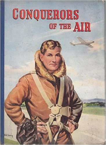
This made me think of the Communist propaganda posters showing off their supremacy. I started with the type and used a font called DDC Hardware from Aaron Draplin which has a utilitarian look and feel. I replaced the Q of the word conquerors with the hammer and sickle and stacked the type. I set the type on top of a communist propaganda poster displaying air power which I overlaid with a red filter. I still wasn’t happy with the design so I added another layer on top which was the blueprints of the Russian MIG-25 aircraft and added a paper texture to make it look like a poster.

I was really starting to enjoy this form of creating imagery from a piece of text.
The phrase “Well, to hell with you! hornless and ironed!” lead me to rethink my original ‘record player hell’ due to misinterpreting the punctuation. The ‘hornless and ironed’ part of the phrase conjured up the image of a cowhide rug. I found an image of a cowhide being tanned. This coupled with an image of some lava gives a dramatic and interesting result.

Next up was the first line of the poem, “Life is shorter than the squeal of a sparrow”. I had the idea of giving this the look of some of the propaganda posters I had seen, a call to arms. I used a desaturated image of a sparrow and added geometric lines and shapes to make it look as the sparrow was ‘squealing’. Rather than using the actual word squeal, I translated the word into the Cyrillic alphabet to give it more of a Russian feel and a nod to the poem’s origins.

I thought that this would make a very good and powerful cover for the book.
7 down, 3 to go. I decided to return to the record player line, this time without the fires of hell! Again I wanted to give it a propaganda look, but this time a little more modern. Using black and white imagery of a retro record player and a strong geometric background I gave it more of a retro look by changing the whites to a faded cream colour. This gave it a softer look but there was still too much whitespace. I then added one of the cows from the ‘oranges’ image which gave it a more quirky look but worked very well. There was still too much space around the image so I added the description of a record player from Google Dictionary in the DDC font I used earlier.

Onto the other half of the phrase “…and to build bridges from the tears of bovine jealousy”. For this image I didn’t want it to be in the same style of the other half of the phrase. I started with the colour green as this was associated with jealousy. I used an image of a bridge with the water underneath substituted with a green overlay. I then needed a crying cow which I gave green overlaid tears. this somehow didn’t look right until I added a green circle in the centre of the image, over the cow’s eyes.

I couldn’t finish the series of images without visualising the tile of the poem which is also used in the line “I want one – to dance one tango with cows…”. I began with an image of some ballroom dancers which I substituted the heads with those of cows. I then placed these into and image of some farmland and a barn. The image of the dancers seemed quite traditional in nature as opposed to the modernist nature of the poem. I decided to embrace the contrast and used a filter to give the image a more classical painted look.

Now I had my images. I wanted to put it on a concertina-fold book with 5 images on each side. I just had to decide the order in which they appeared. Do they need to be in linear order or would a more disjointed approach work?
I drew a flat-plan to help me envisage what order the images needed to be on the book.

This was harder than I thought and took a while to get my head around. I knew which images would be my front and back covers, but getting them in the right sequence needed thinking about to make sure when the book was folded they would be in the correct positions. As for the rest of the images, I decided to randomise the order as I thought that they could be treated as individual images as well as one poem.


All images used are available at https://pixabay.com https://unsplash.com https://www.freepik.com and https://www.pexels.com unless otherwise stated.
Reflection
It took me a while to get into this exercise, it stumped me for a while. But once I had found a starting point the creative juices began to flow. It also gave me a chance to re-familiarise myself with Photoshop which I hadn’t used for a while. I enjoyed manipulating and layering the images and also injecting some humour into the imagery. I feel that I have given the poem a modern twist while using the imagery to nod to its communist/modernist roots.
