Designers I like
I suppose I like the classic designers like Josef Müller–Brockmann; Paul Renner; Frank Lloyd Wright; Saul Bass and Paul Rand. Currently I’m reading Michael Beirut’s book “How to” at the moment and I have a bit of a man–crush on Chris Do and everything he does.
Josef Müller–Brockmann
As with most graphic designers that can be classified as part of the Swiss International Style, Joseph Müller-Brockmann was influenced by the ideas of several different design and art movements including Constructivism, De Stijl, Suprematism and the Bauhaus. He is perhaps the most well-known Swiss designer and his name is probably the most easily recognized when talking about the period. He was born and raised in Switzerland and by the age of 43 he became a teacher at the Zurich school of arts and crafts.
Perhaps his most decisive work was done for the Zurich Town Hall as poster advertisements for its theater productions. He published several books, including The Graphic Artist and His Problems and Grid Systems in Graphic Design. These books provide an in-depth analysis of his work practices and philosophies, and provide an excellent foundation for young graphic designers wishing to learn more about the profession. He spent most of his life working and teaching, even into the early 1990s when he toured the US and Canada speaking about his work. He died in Zurich in 1996.


Josef Müller–Brockmann is fairly new addition to the list of designers I like. Chris Do has introduced me to the work of the early Swiss designers and the minimal, grid–based work that they did. I am a big fan of minimal design and typography of the Swiss designers.
Paul Renner
Paul Friedrich August Renner (9 August 1878 – 25 April 1956) was a typeface designer. In 1927, he designed the Futura typeface, which became one of the most successful and most-used types of the 20th century. He was born in Wernigerode, Germany and died in Hödingen.
He had a strict Protestant upbringing, being educated in a 19th-century Gymnasium. He was brought up to have a very German sense of leadership, of duty and responsibility. He disliked abstract art and many forms of modern culture, such as jazz, cinema, and dancing. But equally, he admired the functionalist strain in modernism. Thus, Renner can be seen as a bridge between the traditional (19th century) and the modern (20th century). He attempted to fuse the Gothic and the roman typefaces.
Renner was a prominent member of the Deutscher Werkbund (German Work Federation). Two of his major texts are Typografie als Kunst (Typography as Art) and Die Kunst der Typographie (The Art of Typography). He created a new set of guidelines for good book design and invented the popular Futura, a geometric sans-serif font used by many typographers throughout the 20th century and today. The typeface Architype Renner is based upon Renner’s early experimental exploration of geometric letterforms for the Futura typeface, most of which were deleted from the face’s character set before it was issued. Tasse, a 1994 typeface is a revival of Renner’s 1953 typeface Steile Futura.


Paul Renner was a logical step from the minimal designers I was interested in and his typography design skills and his contribution to the Bauhaus movement.
Frank Lloyd Wright
Frank Lloyd Wright (June 8, 1867 – April 9, 1959) was an American architect, interior designer, writer, and educator, who designed more than 1,000 structures, 532 of which were completed. Wright believed in designing structures that were in harmony with humanity and its environment, a philosophy he called organic architecture. This philosophy was best exemplified by Fallingwater (1935), which has been called “the best all-time work of American architecture”. His creative period spanned more than 70 years.
Wright was the pioneer of what came to be called the Prairie School movement of architecture, and he also developed the concept of the Usonian home in Broadacre City, his unique vision for urban planning in the United States. In addition to his houses, Wright designed original and innovative offices, churches, schools, skyscrapers, hotels, museums, and other structures. He often designed interior elements for these buildings, as well, including furniture and stained glass. Wright wrote 20 books and many articles and was a popular lecturer in the United States and Europe. Wright was recognized in 1991 by the American Institute of Architects as “the greatest American architect of all time”

I know he’s not a graphic designer but once again I’m drawn to the minimal design of his architecture and how it has been influenced by minimalist design movements.
Saul Bass
Saul Bass (May 8, 1920 — April 25, 1996) was a graphic designer and filmmaker, perhaps best known for his design of film posters and title sequences. Saul worked side-by-side with his wife Elaine Bass for much of his career.
During his 40-year career Bass worked for some of Hollywood’s greatest filmmakers, including Alfred Hitchcock, Stanley Kubrick, Otto Preminger, Billy Wilder, and Martin Scorsese. He became well-known in the film industry after creating the title sequence for Otto Preminger’s The Man with the Golden Arm in 1955. For Alfred Hitchcock, Bass designed effective and memorable title sequences, inventing a new type of kinetic typography, for North by Northwest, Vertigo (working with John Whitney), and Psycho.
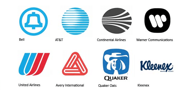
Bass also designed some of the most iconic corporate logos in North America, including the original AT&T “bell” logo in 1969, as well as their later “globe” logo in 1983. He also designed Continental Airlines’ 1968 “jetstream” logo and United Airlines’ 1974 “tulip” logo which have become some of the most recognised logos of the era.
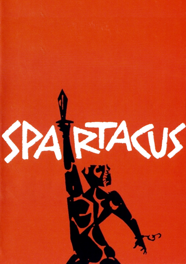
In 1955, Elaine Makatura came to work with Saul Bass and after the opening title sequence to Spartacus in 1960, which Elaine co-directed and produced, the two were married. Much of Saul Bass’s title design and film work thereafter was made in close collaboration with Elaine. After the birth of their children, Jennifer in 1964 and Jeffrey in 1967, the Basses concentrated on their family, short films, and title sequences. Their first joint venture into short filmmaking was with promotional films for pavilions at the 1964 World’s Fair, From Here to There for United Airlines and The Searching Eye for Eastman Kodak. In 1968, they made the short film Why Man Creates, which won an Oscar.
Toward the end of his career, Saul Bass was “rediscovered” by James L. Brooks and Martin Scorsese, who urged the Basses to return to main title design.
For Scorsese, Elaine and Saul Bass created title sequences for Goodfellas, Cape Fear, The Age of Innocence, and Casino, their last title sequence.

I first came across Saul’s work in researching logo ideas and how his work had influenced so many designers since and how his designs are timeless. This then led me to his discovering his work in the film industry designing the titles for many iconic movies.
Paul Rand
Paul Rand was an eminent twentieth century American graphic designer and art director. He was the pioneer of iconic corporate logo designs for major firms, including IBM, ABC, Morningstar, Inc., NeXT Computer, Yale University and Enron. He was an avid practitioner of Swiss Style of graphic designing in American advertising industry.
On August 15, 1914, in Brooklyn, New York, Rand was born as Peretz Rosenbaum. Since a very early age, he had a keen interest in painting and designing which reflected through his painting signs for his father’s grocery store and for his school events. As his father was of the view that art alone would be insufficient to provide a satisfying lifestyle for his son, so he enrolled him at Manhattan’s Harren High School. While studying there, Paul also attended night classes at the Pratt Institute from 1929 to 1932. He attended several art schools in succession such as The New School for Design, the Art Students League and Yale University in Connecticut. Notwithstanding his rich academic career in arts, Rand developed his graphic sense through self-education largely, as he voraciously read the European magazines, discovering the works of Cassandre and László Moholy-Nagy.
Subsequently, Rand began his career as a part-time stock image creator for a syndicate. Soon his class assignments and part-time job rendered him to assemble a distinguished portfolio. His work was highly influenced by Sachplakat, the German advertising style and Gustav Jensen’s works. During this time he also decided to cloak his Jewish origin by shortening and modernizing his name Peretz Rosenbaum as Paul Rand. The decision worked in his best interest as he became the most enduring brand name for graphic designing. Shortly after, he became a success story and during his twenties his graphic work earned international recognition. One of his notable designs was featured on the cover of Directionmagazine, which he created free of charge in honor of artistic freedom.
Despite the fact that Rand earned his ultimate success by designing corporate logos, however, the source of his reputation is based on his initial work on page design. In mid 1930s he was requested by Apparel Arts (now GQ) magazine to develop the page layout for their anniversary issue. Later he was offered a job at another prestigious magazine, Esquire-Coronet, as an art director. After first refusal, he accepted the offer, managing the fashion pages for Esquire. During 1950s and 1960s, Paul Rand became a brand name for logo designing in corporate industry. Many of the above mentioned firms owe their graphic designing heritage to him. In 1956, IBM became one of the companies that truly defined his corporate identity. He revised the IBM logo design in 1960 and yet again in 1972 with the famous stripes pattern.
Moreover, Rand’s graphic genius is also evident from his collaboration with the technology giant, Steve Jobs, on the NeXT Computer corporate identity project. The logo containing a simple two-dimensional black box presenting the four-letter company’s name manifested a visual harmony. Steve Jobs admired Rand’s graphic creativity and called him “the greatest living graphic designer.” Besides art direction, he taught at Yale University, as a Professor of Graphic Design. Additionally, he wrote several crucial works on design such as Design, Form and Chaos, Thoughts on Design and Design and the Play Instinct. In his final years he recorded his memoirs and focused on designing. At the age of 82, Paul Rand died of cancer in 1996 and was interred at Beth El Cemetery.
Source: Famousgraphicdesigners.org
![]()
![]()
![]()
![]()
![]()
Paul Rand is yet another logo designer I admire as he defined many iconic brands through his work.
Michael Bierut
Michael Bierut is one of the leading American graphic designers, design critic and educator. At Vignelli Associates, he was the vice president of graphic design. He also served as a senior critic at the Yale School of Art. He had close association with the American Institute of Graphic Arts (AIGA) and Pentagram, as well.
Born in 1957, Michael Bierut grew up in Cleveland Ohio. Graphic design was not as popular in those times that it would be promoted to young adults. His love of fine art, drawing and music helped him find only two books in the library on the subject. He finally decided to study graphic designing at the University of Cincinnati’s College of Design, Architecture, Art and Planning. He interned for another AIGA medalist, Chris Pullman, at a Boston public television station, WGBH. Upon graduation in 1980, he on to work for Vignelli Associates and in the span of a decade he became its Vice President. He had serious industry clout there but it also helped him form the key principle of his career. According to him, things that get designers really interested are in actuality not that significant.
Bierut is visionary who understands the company’s readership and audience. Working at Vignelli Associates he acknowledged the fact that the annual reports and corporate brochures created by designers are not read keenly. So he altered his strategy as he strove to create the kind of content that people feel interested in reading. When Beirut began to work for the company, he had to do most of the work manually because the technological advancement had not yet arrived. He credits the first four years working for Vignelli Associates for empowering him to achieve what he has today. He used to design invitations for his friends’ parties, freebies for non-profits, unique birthday cards and packaging for mix tapes. Massimo Vignelli assigned him more and more work as he observed he grew efficient with time.
In 1990, Bierut became a partner with the New York office of Pentagram. There he served clients such as Alliance for Downtown New York, Motorola, Alfred A. Knopf, the Walt Disney Company, the Toy Industry Association, Yale School of Architecture, Princeton University and New York University. Exhibition on the psychedelic era for the Rock and Roll Hall of Fame was one of the projects that Bierut managed. Moreover, he offered his services as a design consultant to United Airlines. Dwell sought his assistances on design book recommendations, while Fast Company required his valuable opinion on corporate branding. Morgan Library Museum recently sought his expertise on the development of a new signage and identity as it expanded. The New York Times building and Phillip Johnson’s Glass House hired him to create the environmental graphics for them. Besides redesigning The Atlantic magazine, he developed marketing strategies for William Jefferson Clinton Foundation.
Michael Beirut’s innumerable and invaluable contributions to graphic designing had him earned over hundreds of accolades. Also his work is in permanent collections in several museums across the globe including cities like New York, Montreal, Germany, and Washington D.C. During late 1980s, he was appointed president emeritus of the New York Chapter of the AIGA and currently holds the presidency of AIGA national. Additionally, Princeton Architectural Press has published his book Seventy-Nine Short Essays on Design, in 2007. Being a senior critic at Yale he also co-edits the anthology series Looking Closer: Critical Writings on Graphic Design.
Source: Famousgraphicdesigners.org


I have now finished reading Michael’s book and it has only lead me to hold him in higher regard. His career is an impressive one and his work is so clever and his approach to some of the briefs he has undertaken has been inspirational to me.
Chris Do
Chris Do is an Emmy award winning designer, founder and CEO of Blind, Inc., where he oversees the creative and strategic direction of the company.
Mr. Do currently serves on the board and is an advisor for organizations including: AIGA/LA, Emmys Motion & Title Design Peer Group, Otis Board of Governors, Saleshood, Santa Monica College and Woodbury University.
He received his BFA from Art Center College of Design in Graphics/Packaging, where he has taught Sequential Design for over a decade. He’s lectured at: California Institute of the Arts, LA Art Institute, Siggraph, Otis College of Design, MGLA, Cal State Los Angeles/Northridge and San Diego City College.
Prior to forming Blind, Mr. Do worked at Cole & Weber, Seattle as an Art Director, Epitaph Records as a designer and freelance designer at broadcast design firm, Novocom and R/GA LA under Kyle Cooper on main titles such as The Island of Dr. Moreau, Celtic Pride and Eraser.
 Chris is my current man–crush. He is a motion designer and graphic designer based in L.A.. His studio now has a sideline in teaching elements of design and the business of design which I am an avid follower of.
