You have been asked to design a leaflet for an organisation, inviting people to to volunteer for a task. (You can choose the task for example, school governor, fundraising or building a community garden). In addition to a title the information has been broken down into four chunks each of about 120 words. You will also need to leave space for contact and address details.
Working with a sheet of A4 paper or larger if you prefer, and ignoring the actual words and subheadings, explore the different formats for leaflets that are possible. Consider and experiment with options for final size and types of paper as part of your visualisation.
Where to start…?
So, this exercise is about making mockups and not about the product itself.
I started by picking up some A4 paper and seeing how many different ways I could fold it. I folded in into all the ‘usual suspects’ and found it hard to go from there.

I then did some brief sketches of folds in my sketchbook, but again this was very limited.

So I decided to see what I could find in the reading list supplied by the college. The book Print & Finish by Ambrose/Harris(from the reading list) has a section on folding. It covered a variety of folds and techniques such as valley and mountain folds; throw outs; gatefold; French fold; concertina fold and roll fold. I hadn’t heard of some of these before and it was nice to familiarise myself with the terminology and what it referred to.
These were all pretty straightforward folding styles that I was familiar with, so I continued to search for some more creative folding and created a Pinterest board of interesting folded leaflets that caught my eye.

Source: https://www.pinterest.co.uk/northernbloke/college/leaflet-folding/
I was really impressed with the variety of folds and cutouts and shapes of leaflet designs out there. The variations of shapes intrigued me as a straight forward sheet of A4 can only be folded in so many ways, but then when you start adding different shapes to document it opens up to so many more design possibilities. My research lead me to a site of a company called Foldfactory that specialised in creatively folded leaflets and print solutions.

At this point I thought I’d better decide who I was going to design a leaflet for…
The charity I chose is one that is close to my (rugby)heart – Wooden Spoon, the children’s charity of rugby. Wooden Spoon is a charity that changes children’s lives through the power of rugby. Each year they fund around 70 projects, from community programmes and specialist playgrounds to medical treatment centres and sensory rooms. Since 1983, they’ve distributed over £26 million to more than 700 projects, helping more than a million children.

My research had led me to examples of different shaped leaflets which seemed to naturally lend itself to the Wooden Spoon logo. A rugby ball-shaped leaflet also seemed appropriate for the charity in question. Then the question was how to make the leaflet fit for purpose and eye-catching at the same time? Would it be a simple gate fold? A concertina fold? Roll fold? A simple bi-fold or concertina fold would be easy enough to do whether it be on the side or the top, this wouldn’t be very eye-catching though. The panels on the logo lent themselves to being used as a sort of gatefold. So how to make it work? I duplicated the red and green panels and looked at attaching them to the edges of the logo as the gatefold. Then I has to place the 4 chunks of text, contact form and a couple of images while maintaining the integrity of the original logo. Then to mock it up…


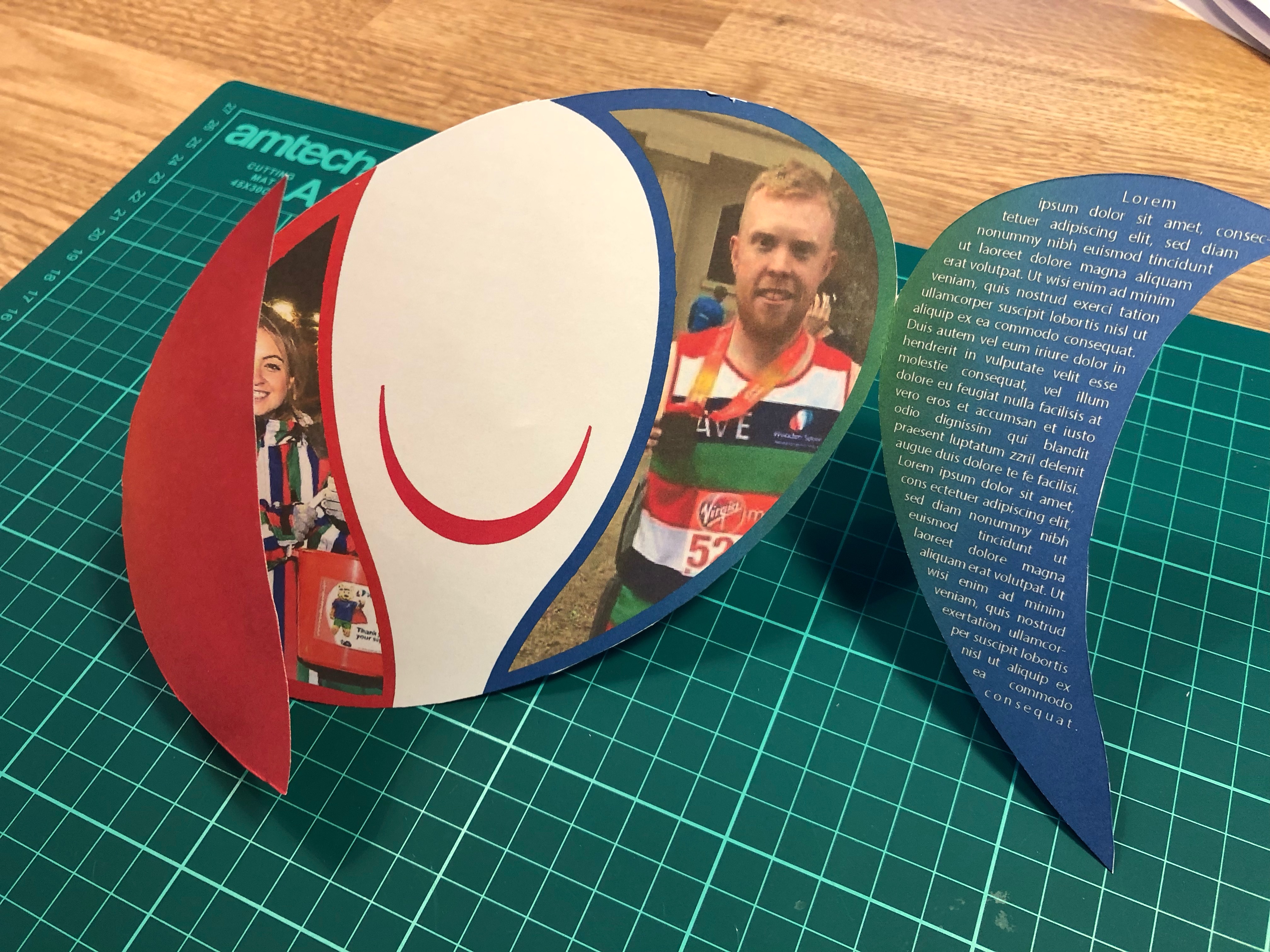
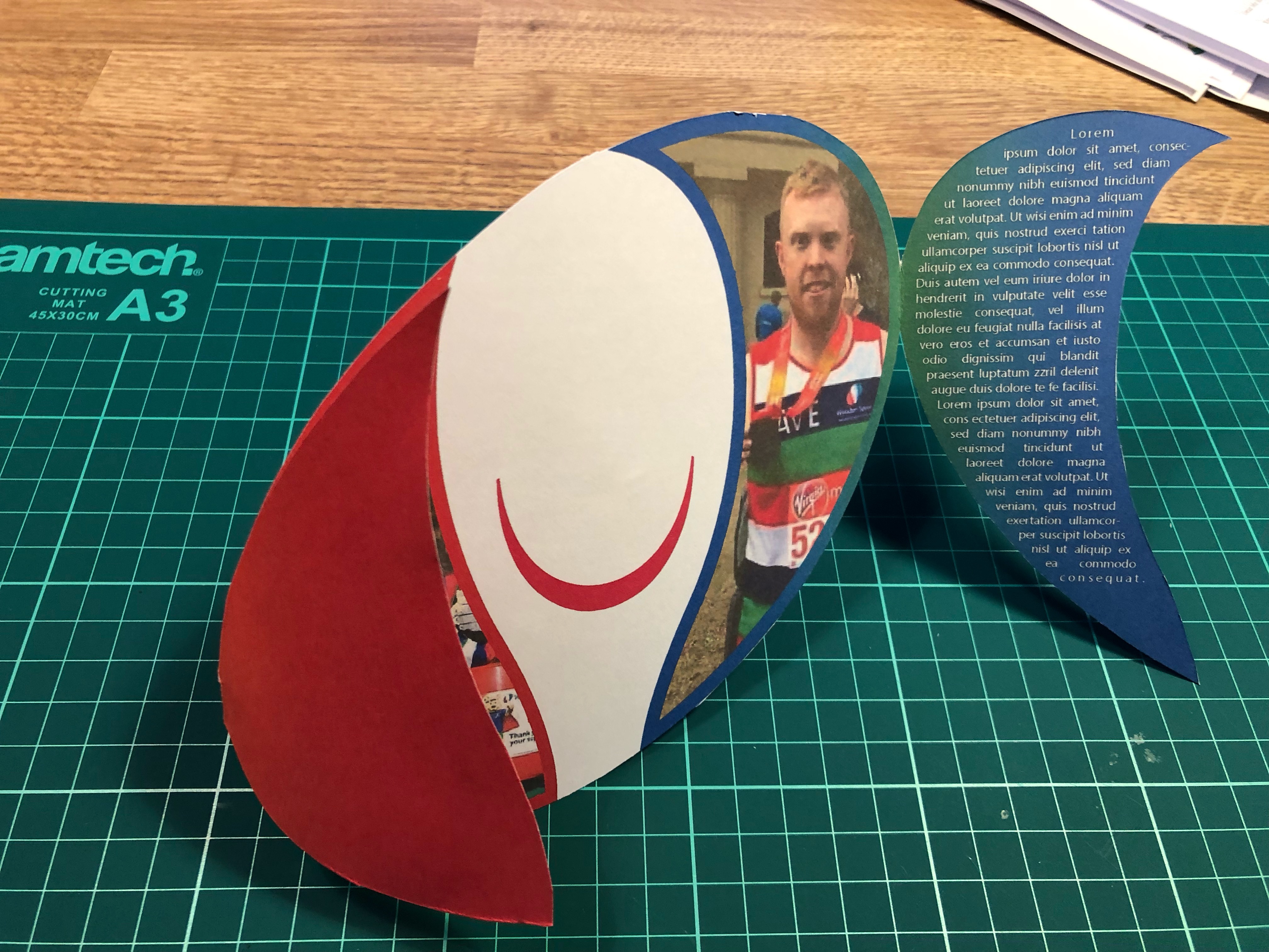

So, after raiding the children’s craft supplies I managed to find some card. The card wasn’t very thick which was ideal for what I wanted as I needed it to go through my printer. I printed my design on both sides of the card which I had to line up carefully which took several attempts and alterations to Illustrator’s print preferences. I managed to get it roughly lined up, but due to the way the paper/card is pulled through the printer it was never going to line up perfectly which did annoy me. I then cut the leaflet out and trimmed the edges that hadn’t quite lined up correctly.
Self Assessment
Overall I struggled a little with this exercise as it wasn’t really specific enough for my liking. I’m relatively happy with the end product but I think it could be better. I understand that the exercise was about the act of mocking-up your leaflet to help picture what the final product would be like and not the design or the details of the final design. The final leaflet would need to be produced on thicker card as the card I used was too flimsy for what I needed it for which impacted on the leaflet’s ability to be freestanding. Also because of it’s shape I didn’t think it would be suitable to be standing up on it’s own, so I think it would be used either as a mail-shot or handed out in person. It could also be laid flat or have a bespoke holder designed. These options would in-the-real-world incur additional expense and would determine the viability of any final design.
Additional Research
Following on from this exercise I have decided to contact a local printing firm to arrange a visit and tour of the premises to get a better insight into the print industry and it’s requirements from designers…..
